


residential
residential
residential
residential
residential
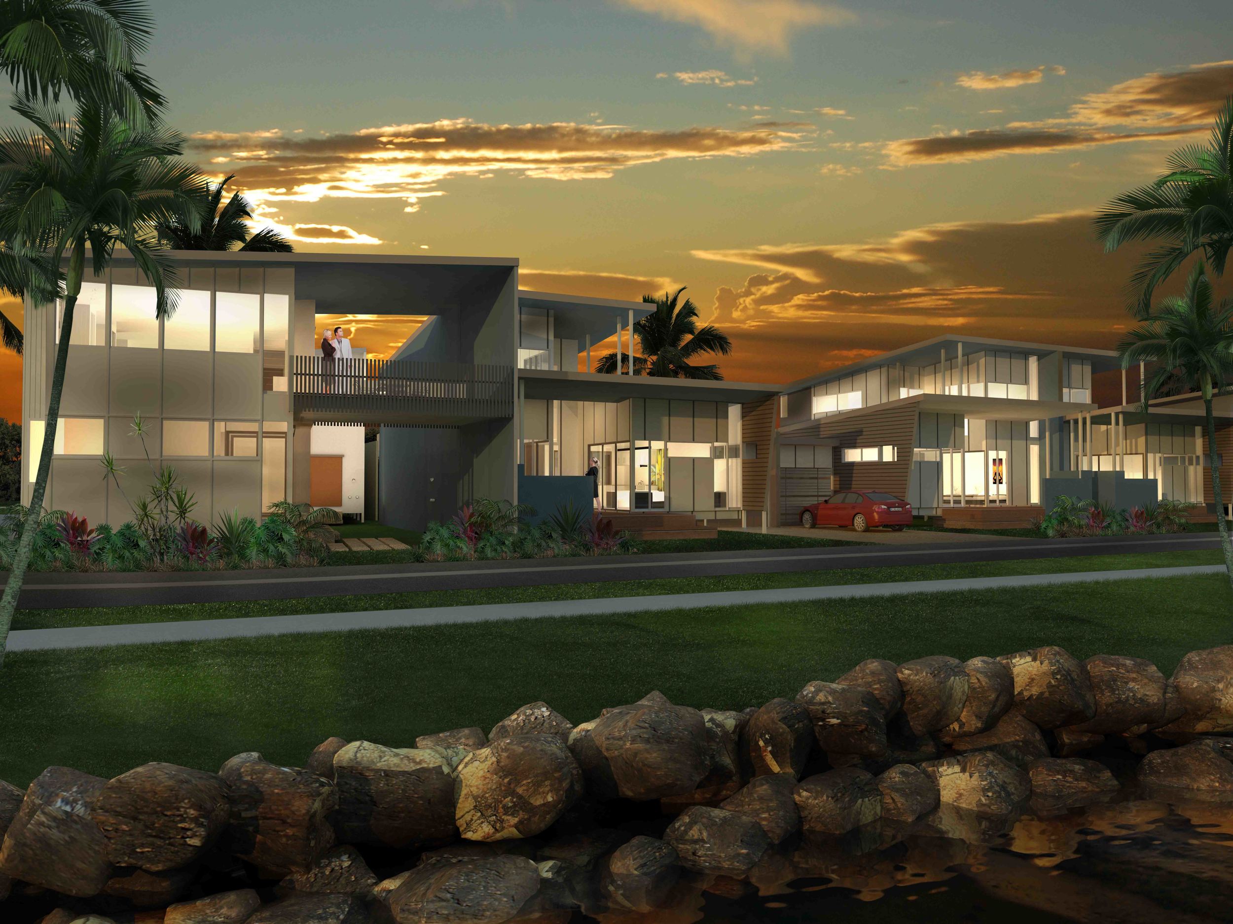
Residential architecture is such a personal experience and is always a step into the unknown. There can be no set style to follow as individual tastes need to be reflected in each project. As an architect it is always exciting to see designs develop that reflect the clients individual desires. A successful project can only be achieved when an architect acts as an interpreter of these requirements and facilitates them into the built form.
multi residential
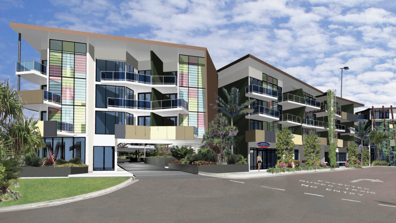
With a strong history in multi-residential and mixed use developments we understand the fine line between delivering unique salable product vs the commercial reality of development. An acrhitectural response that brings good, efficient planning rationale and simplicity in construction allows fine detail in those high impact areas. Consideration of privacy, natural ventilation, community and light distribution all combine to provide a quality of space that can be achieved within budget and planning constraints.

el house
el house
el house
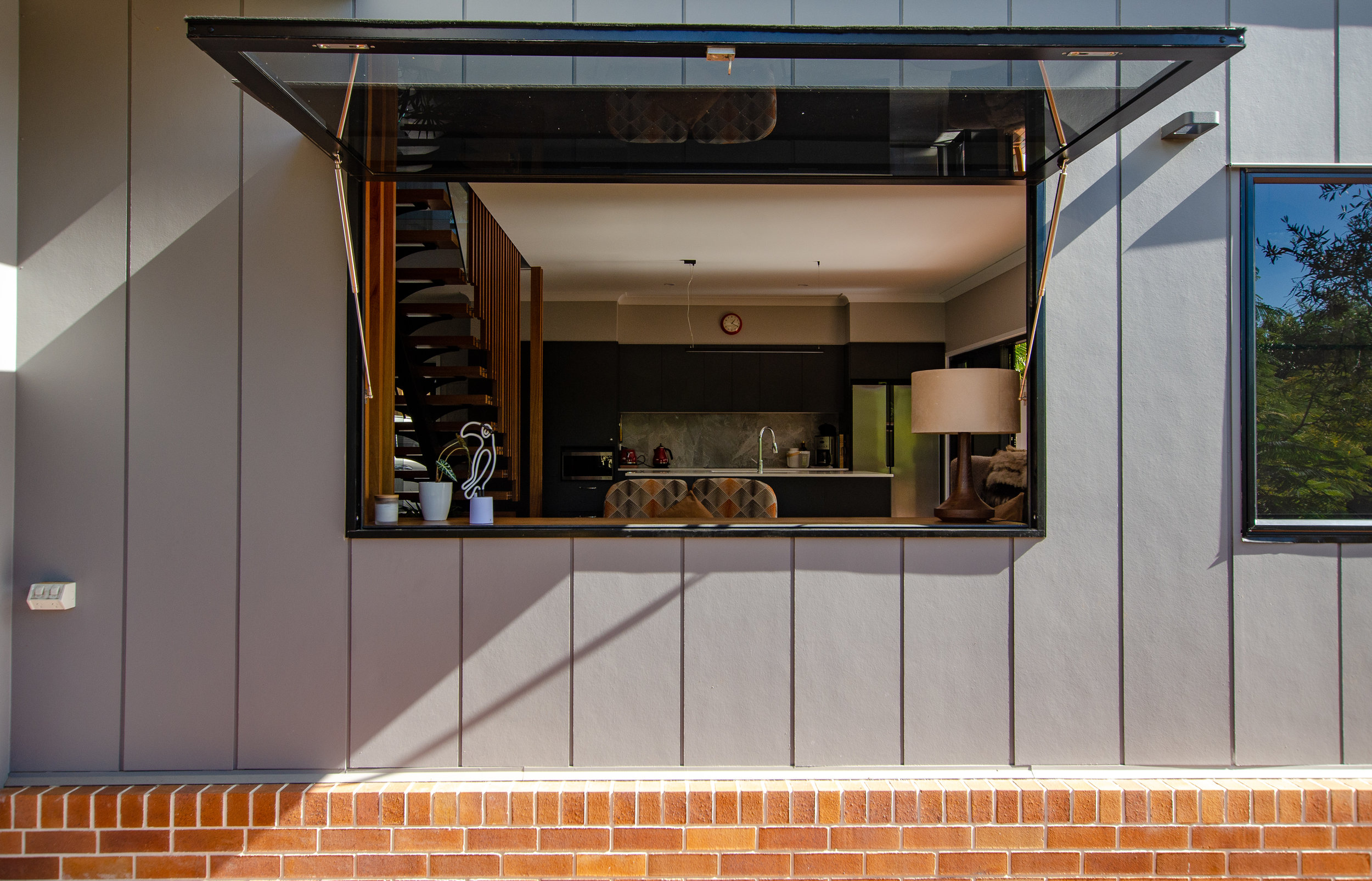
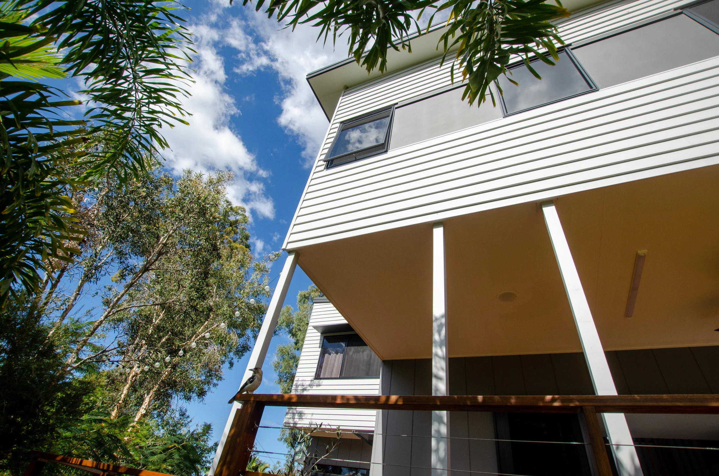
Set on a rural residential property the EL house is designed with family in mind. The second dwelling on the family property this is all about lifestyle, passive design and external living. With the land gently sloping North the L shaped house allows all rooms to open to both the east and the north and overlook the north facing courtyard. Set underneath a few large existing gum trees the courtyard is enclosed by 2 storey elements to the South East and South West, shading the space from the low summer sun while keeping it open to allow the winter sun to penetrate deep into the house. A perfect setting for music and socialising under the trees the outdoor room completes the house merging with the on grade living room.
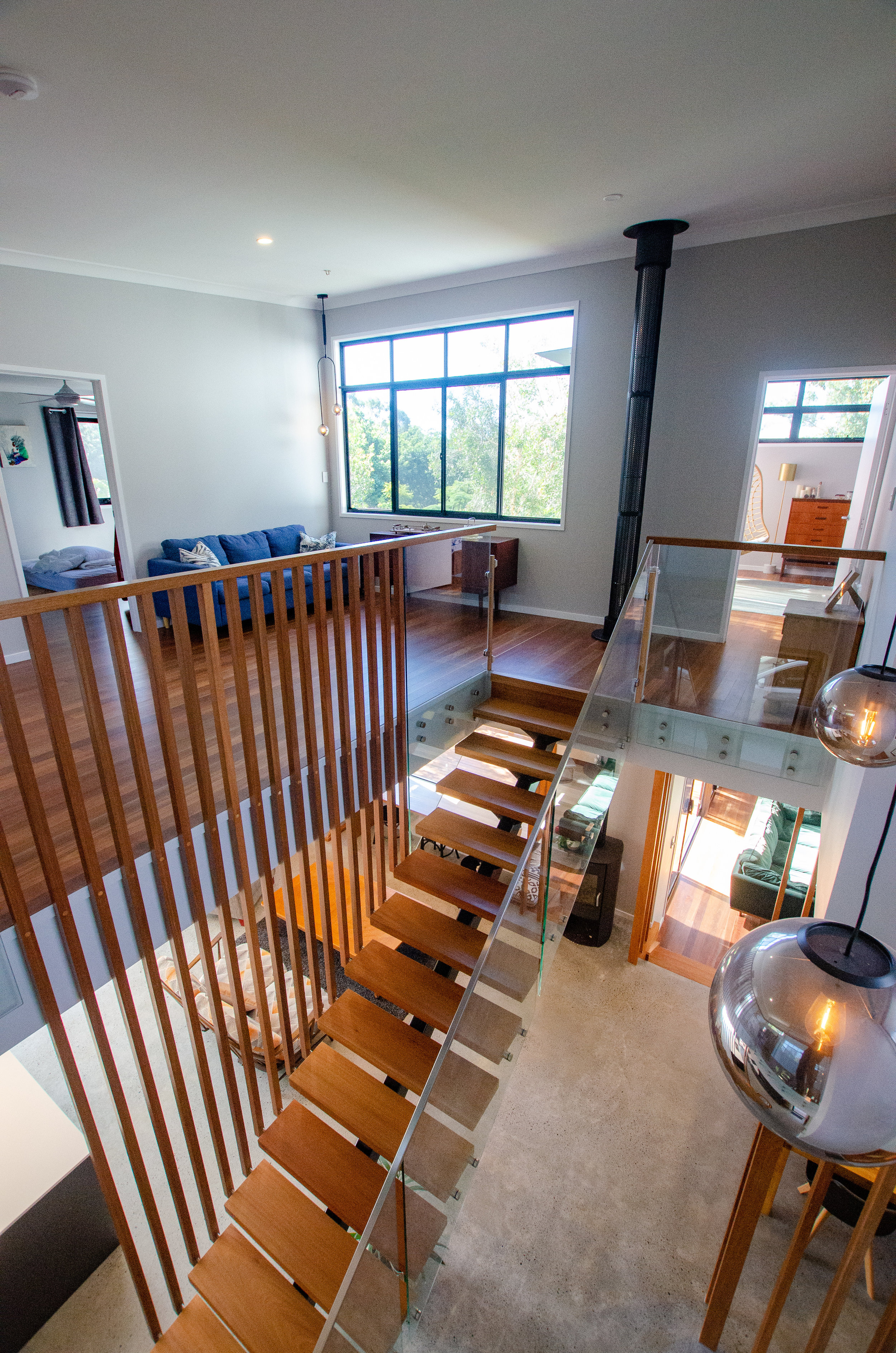
Internally the staircase and entry void is the heart of the house. It provides a volume that connects all spaces on ground level and through to the second floor, flooding the house with light and allowing warm air to vent vertically. With the polished concrete slab as thermal mass this house relays on passive thermal control throughout the year, boosted by the comfort of a wood stove heater.
The upper level consists of the bedrooms and messy spaces. Overlooking the northern courtyard the open study and kids space flank a void over the entry and provide glimpses into the living, kitchen and dining rooms.

moorooka studio
moorooka studio
moorooka studio
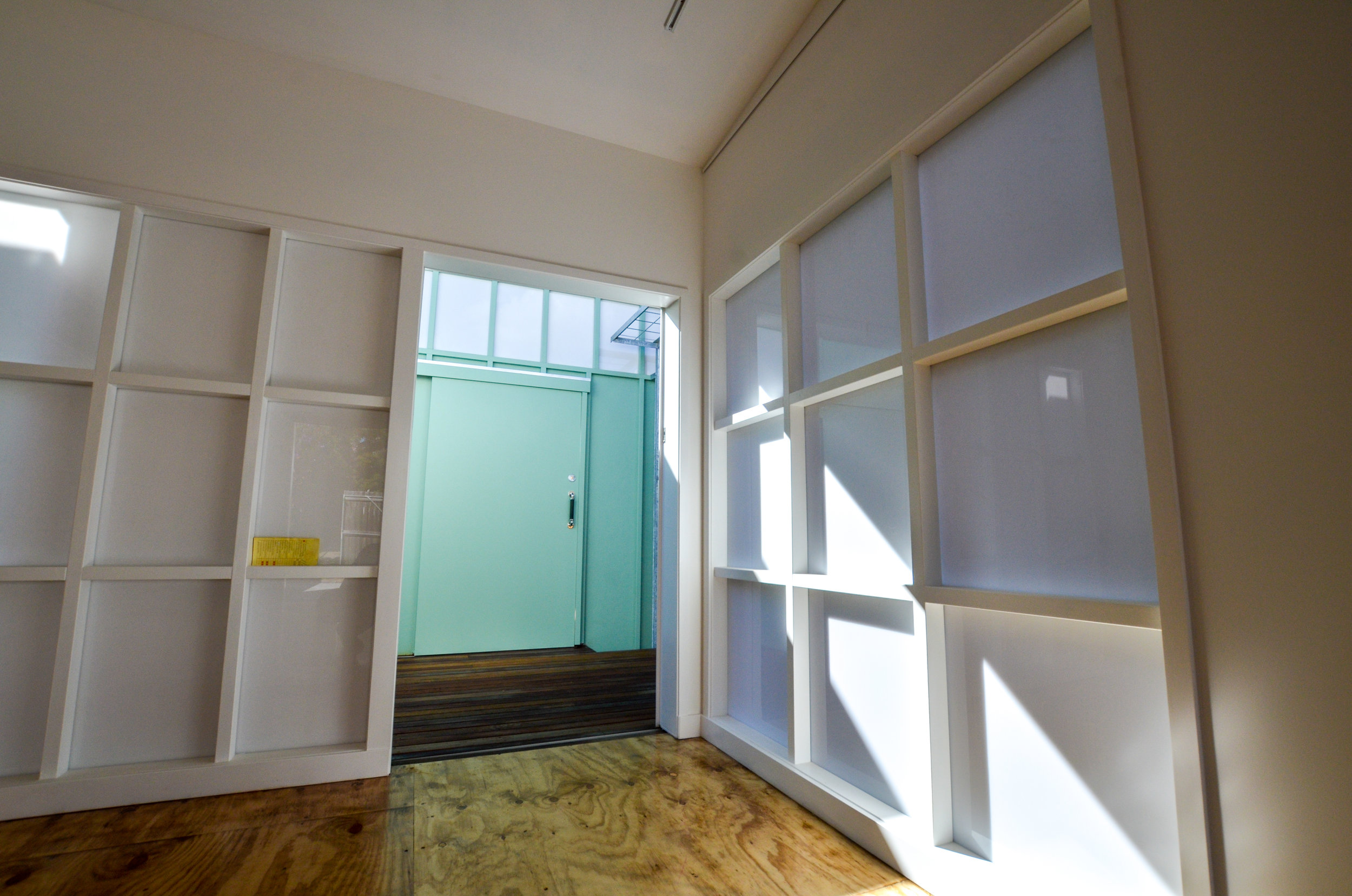
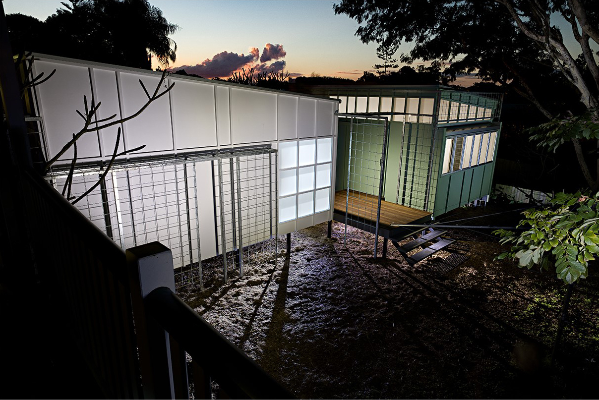
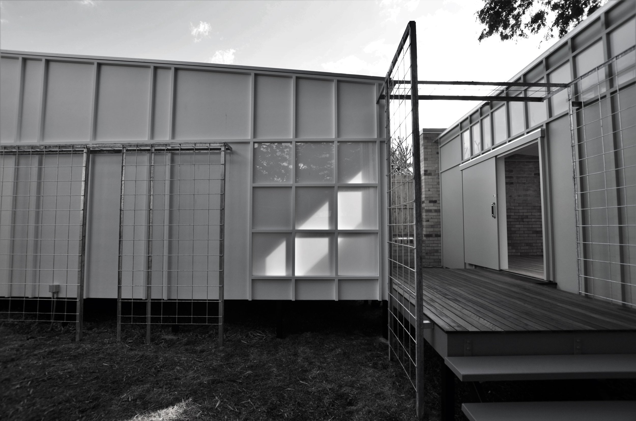
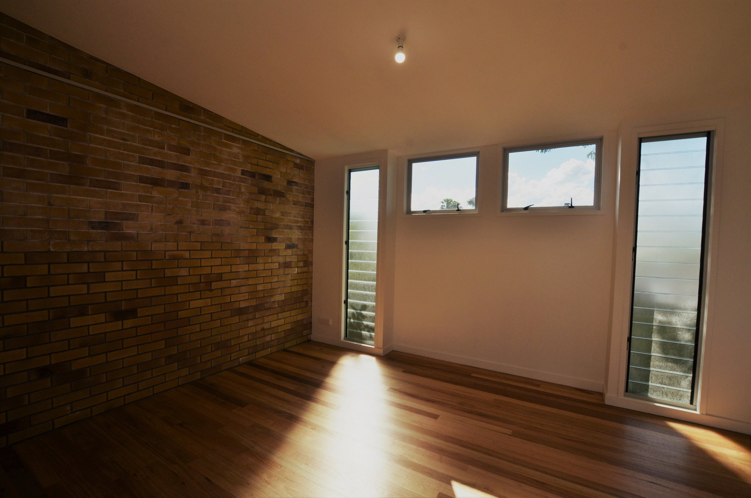
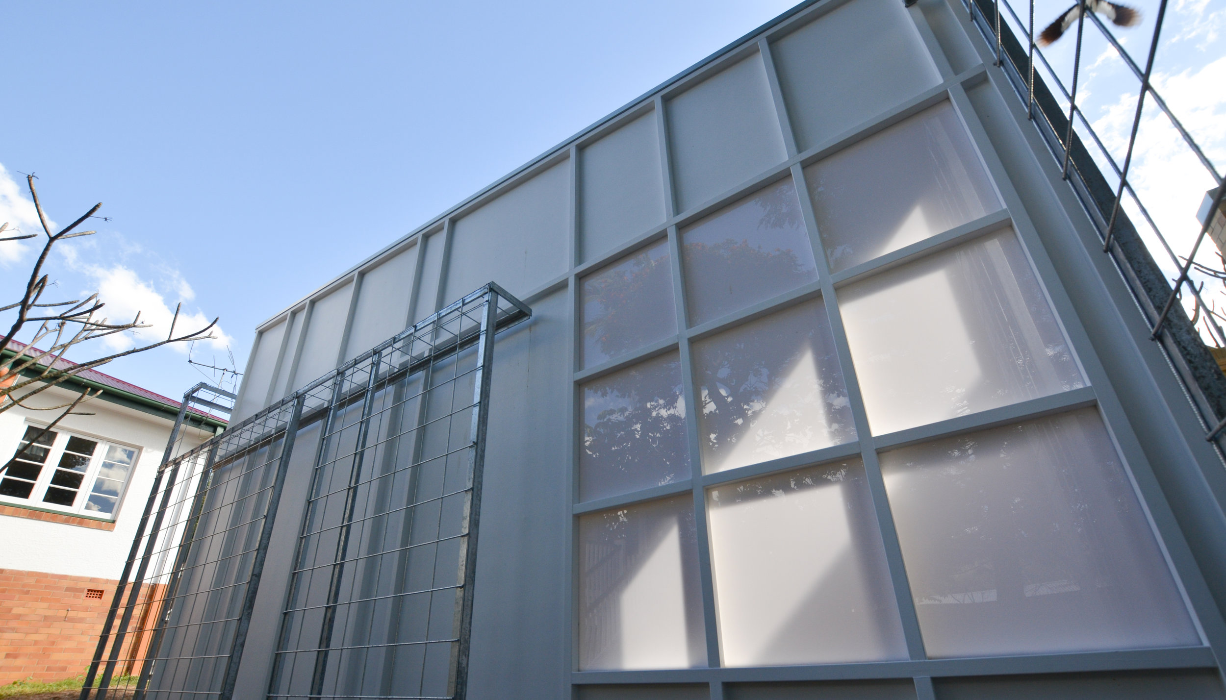
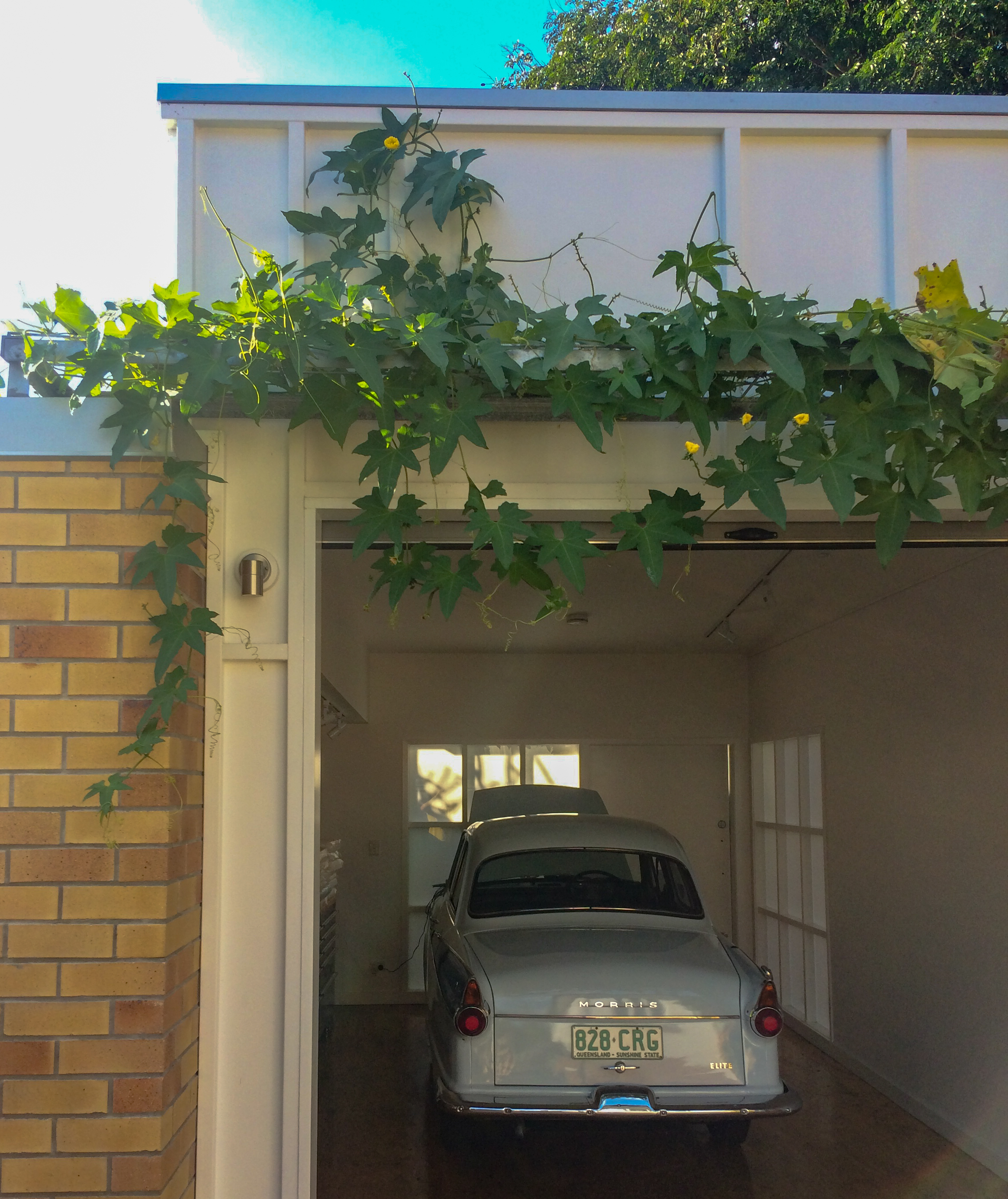
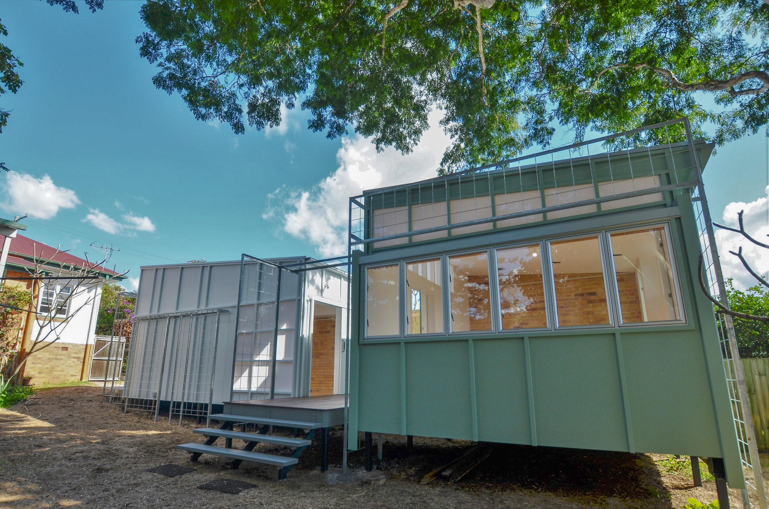
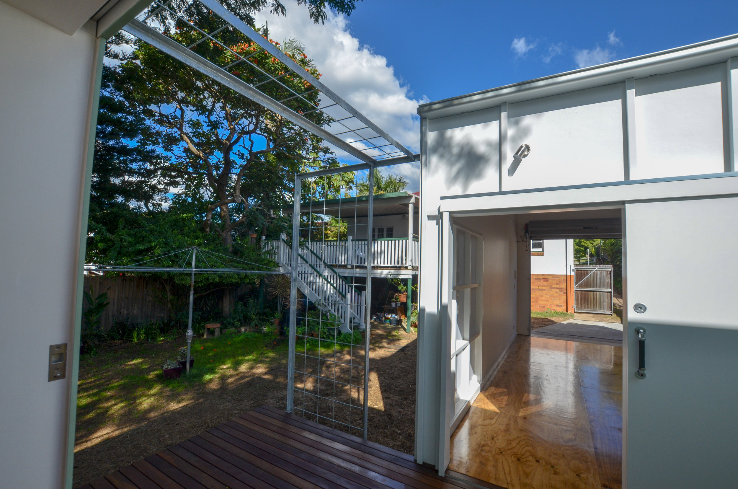
This was one of the first project undertaken for Resonance d+a and we are very pleased to finally see this completed. The artist clients were overcrowded in their house utilising living and dining spaces as studio space, so they were looking to provide a dedicated studio space in the back yard to free up the house areas and separate work from relaxation. The space needed to provide several functions including artist studio for sine arts, sewing, photography, garage for the morris and exhibition space. Rather than providing these as individual areas we doubled up on function to limit the size and costs. The garage becomes the exhibition space and the studio and storage work as one.
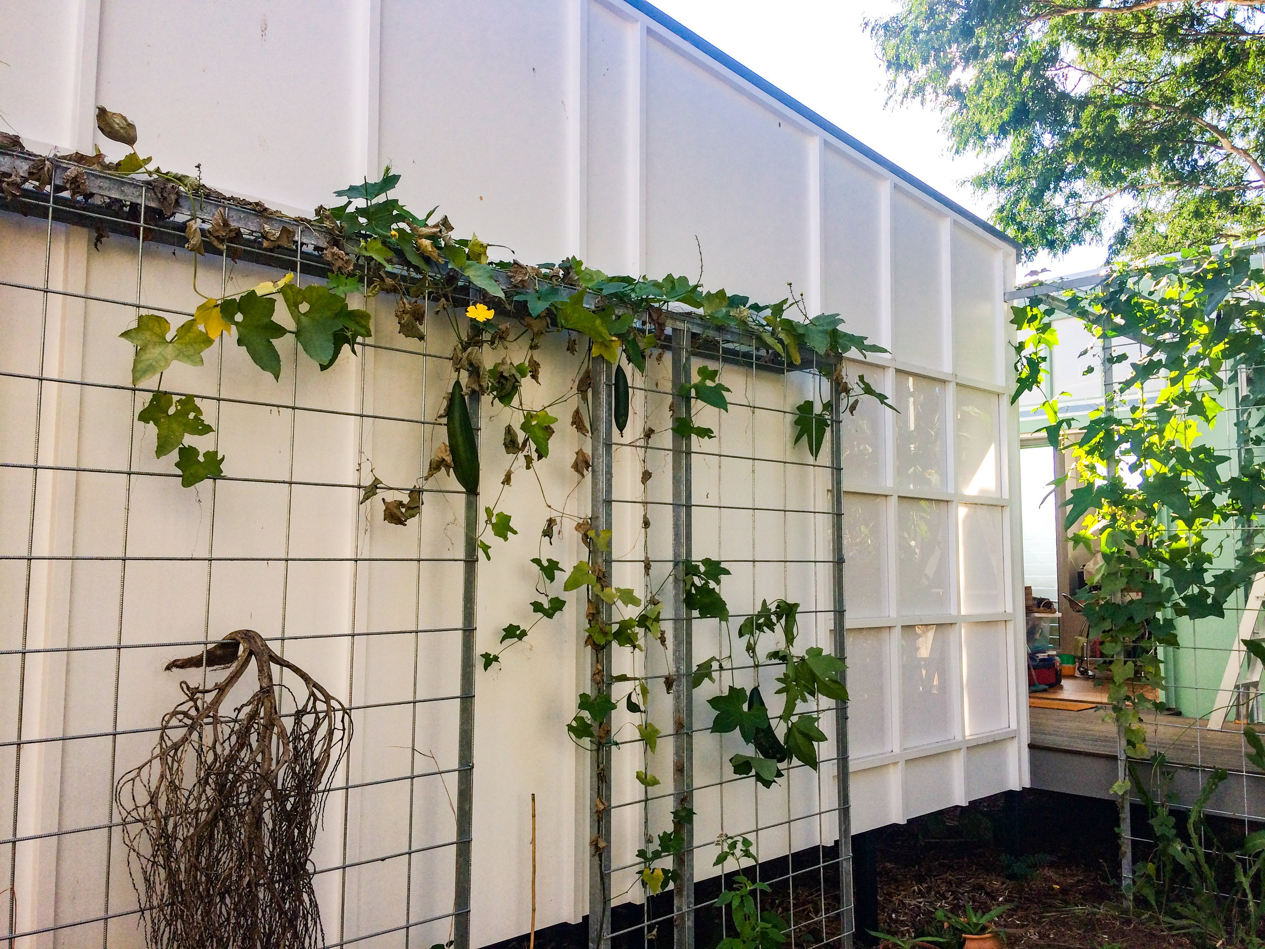
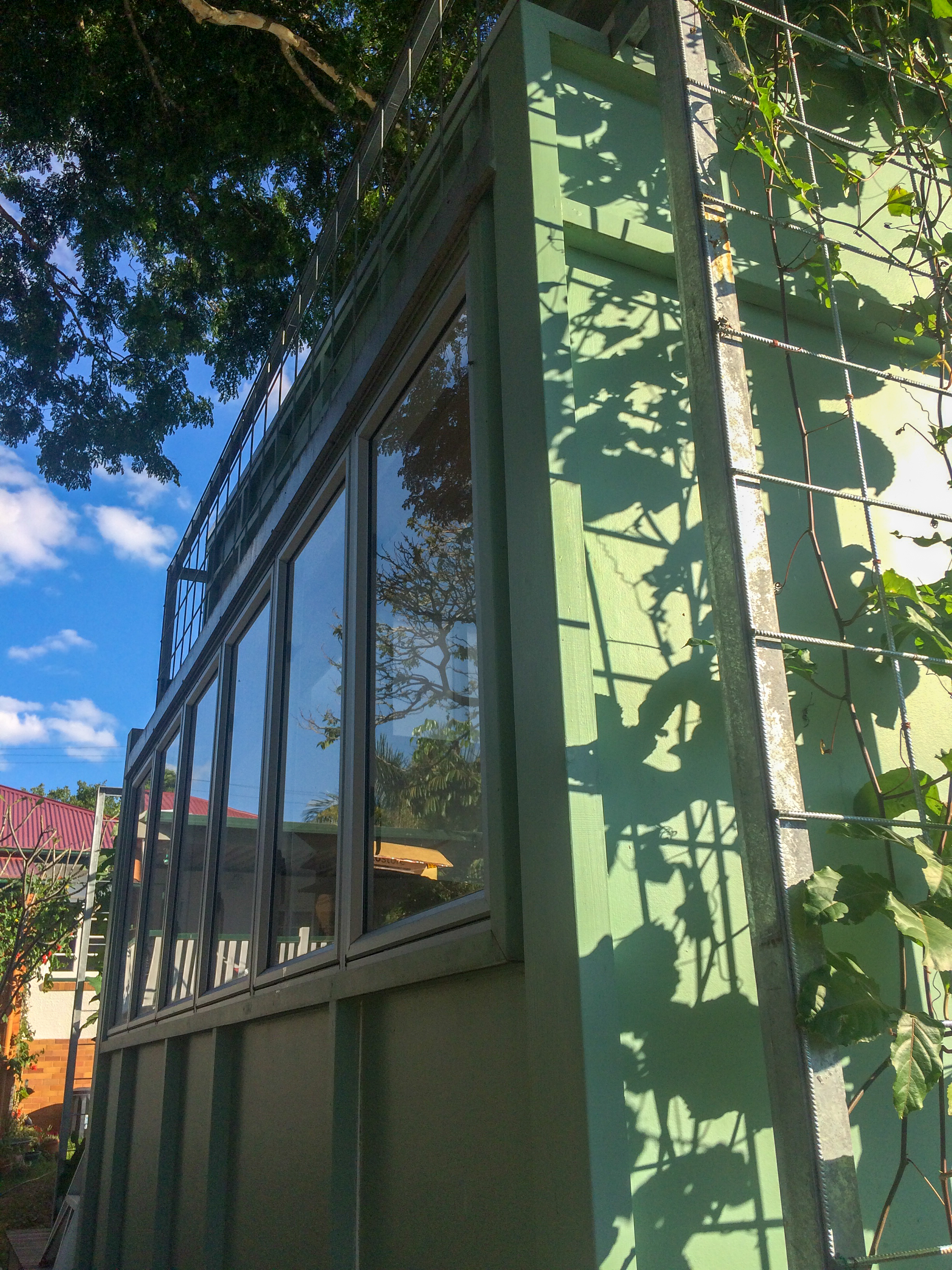
The clients were nostalgic about the existing collapsing brick garage covered in vines but knew it was too small for re-use and beyond saving, so the new design references the old garage through the use of brickwork and a trellis that covers the new building. The trellis acts as an extruded facade that shades the walls and provides shadows from the vines moving across the translucent wall sheeting (visible from inside). The simple fc sheeting is interspersed with flat acrylic so the walls become light boxes, bringing in diffused light during the day and becoming a lantern at night. The 2 simple structures behind the trellis poke through in various locations to provide access and visual connections to the yard.
The spaces are connected via a small deck and sliding doors that mimic a gallery experience moving between different space, providing separation and connection while including a usable outdoor space, softened by a courtyard garden. The deck acts like a threshold between doorway spaces, providing a space between that is transition and habitable. The trellis extends over the deck creating an organic portal from the back yard into the studio space.

riverdene gatehouse
riverdene gatehouse
riverdene gatehouse
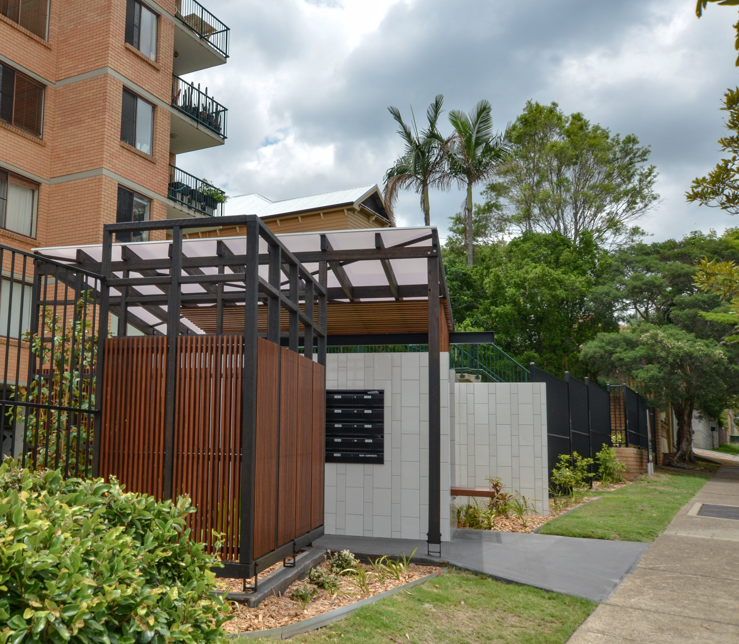
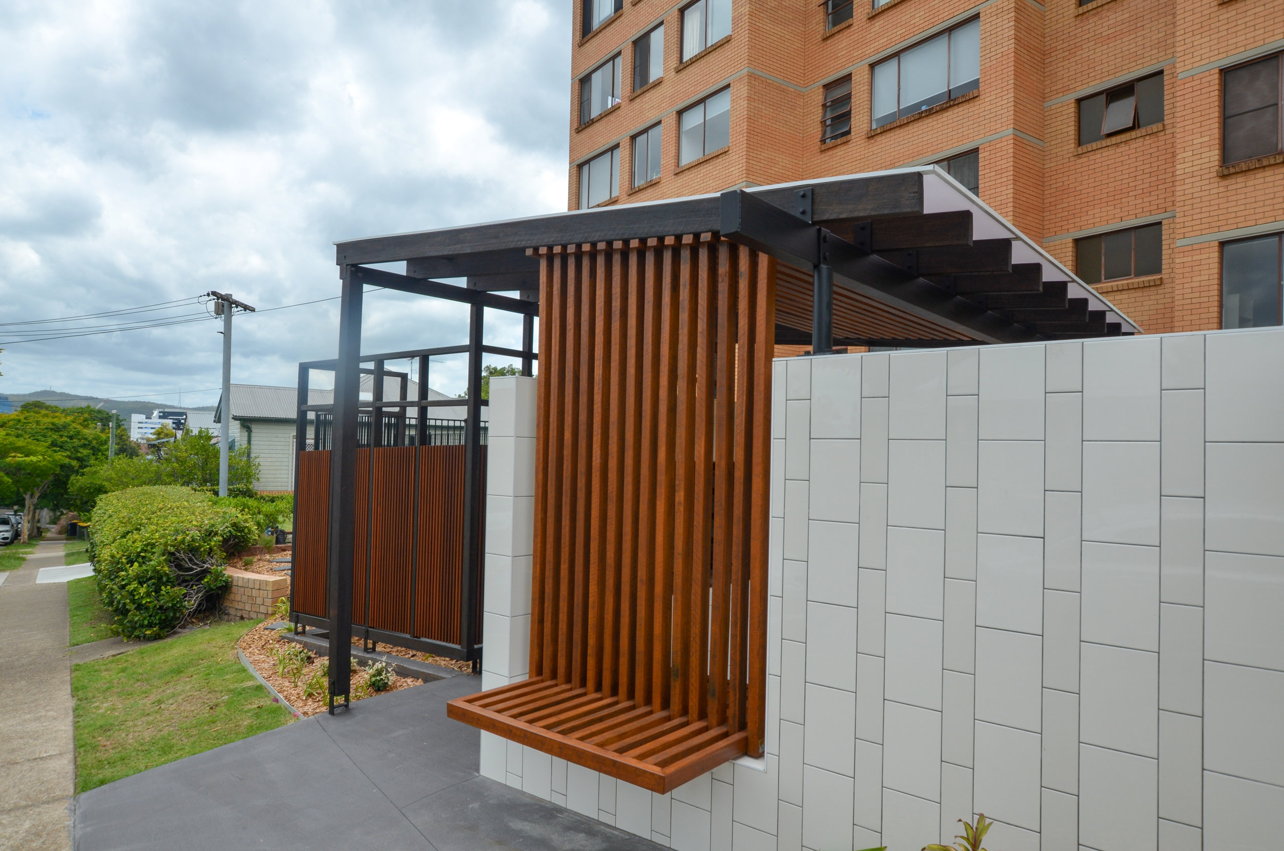
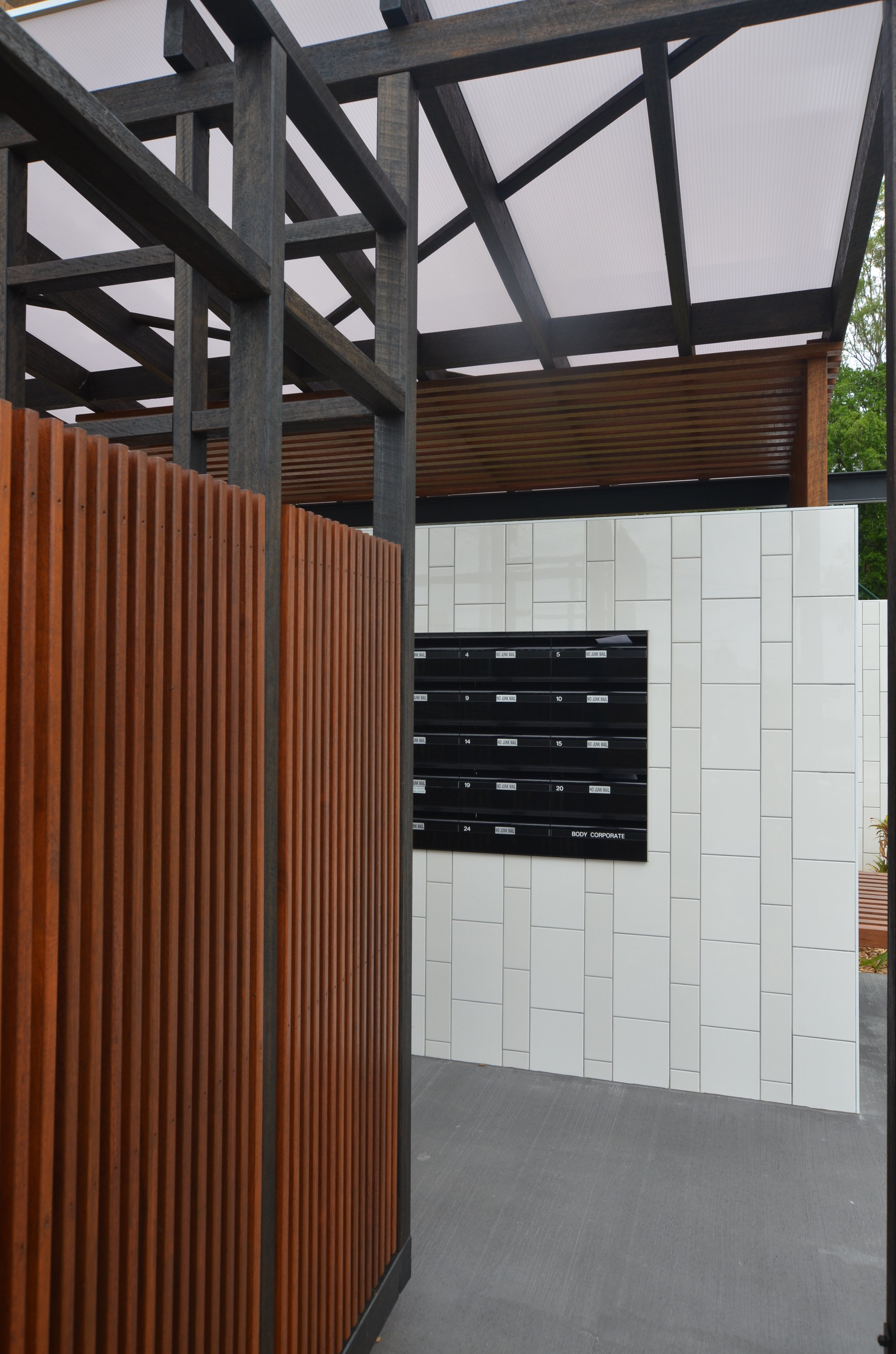
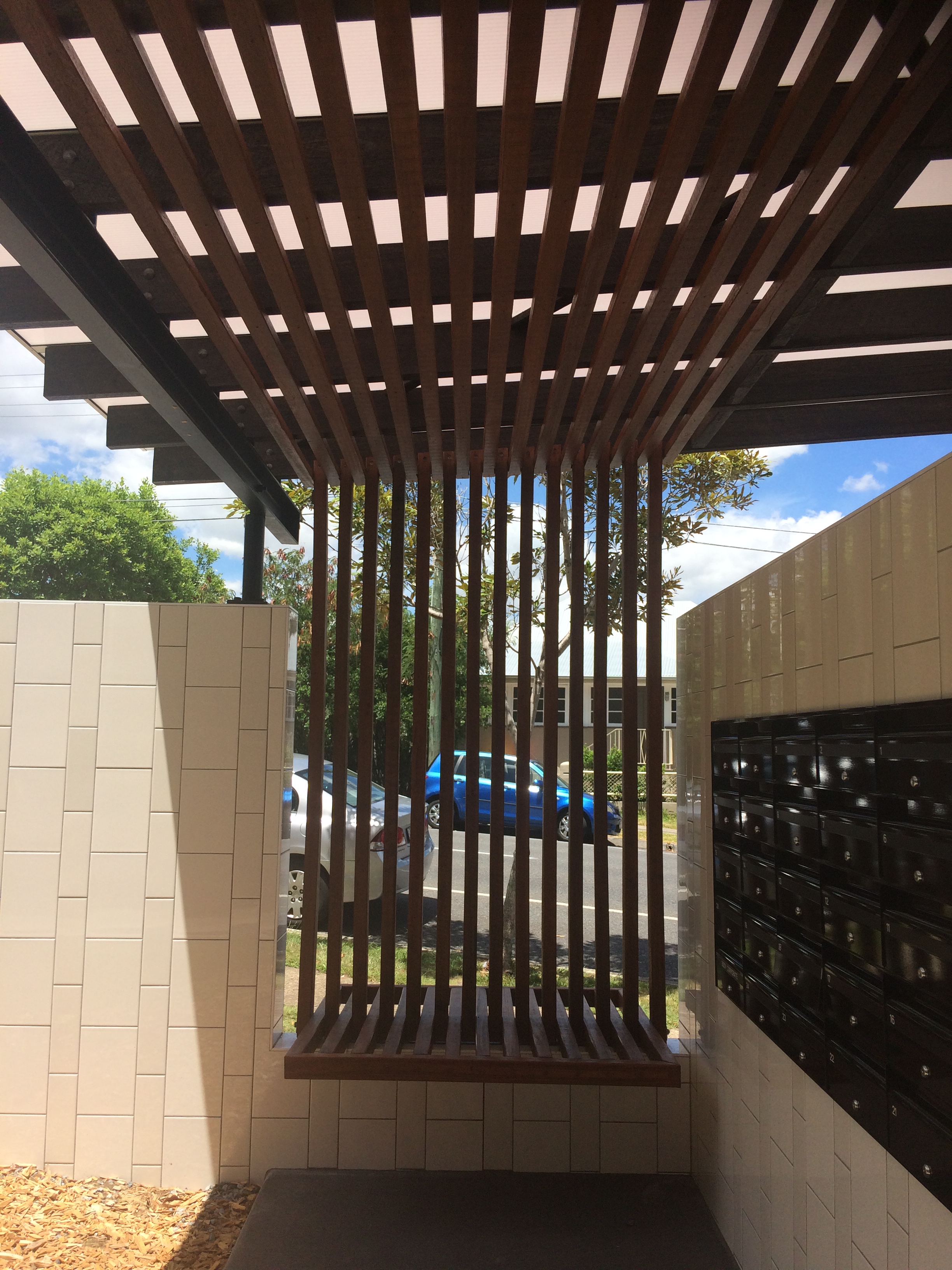
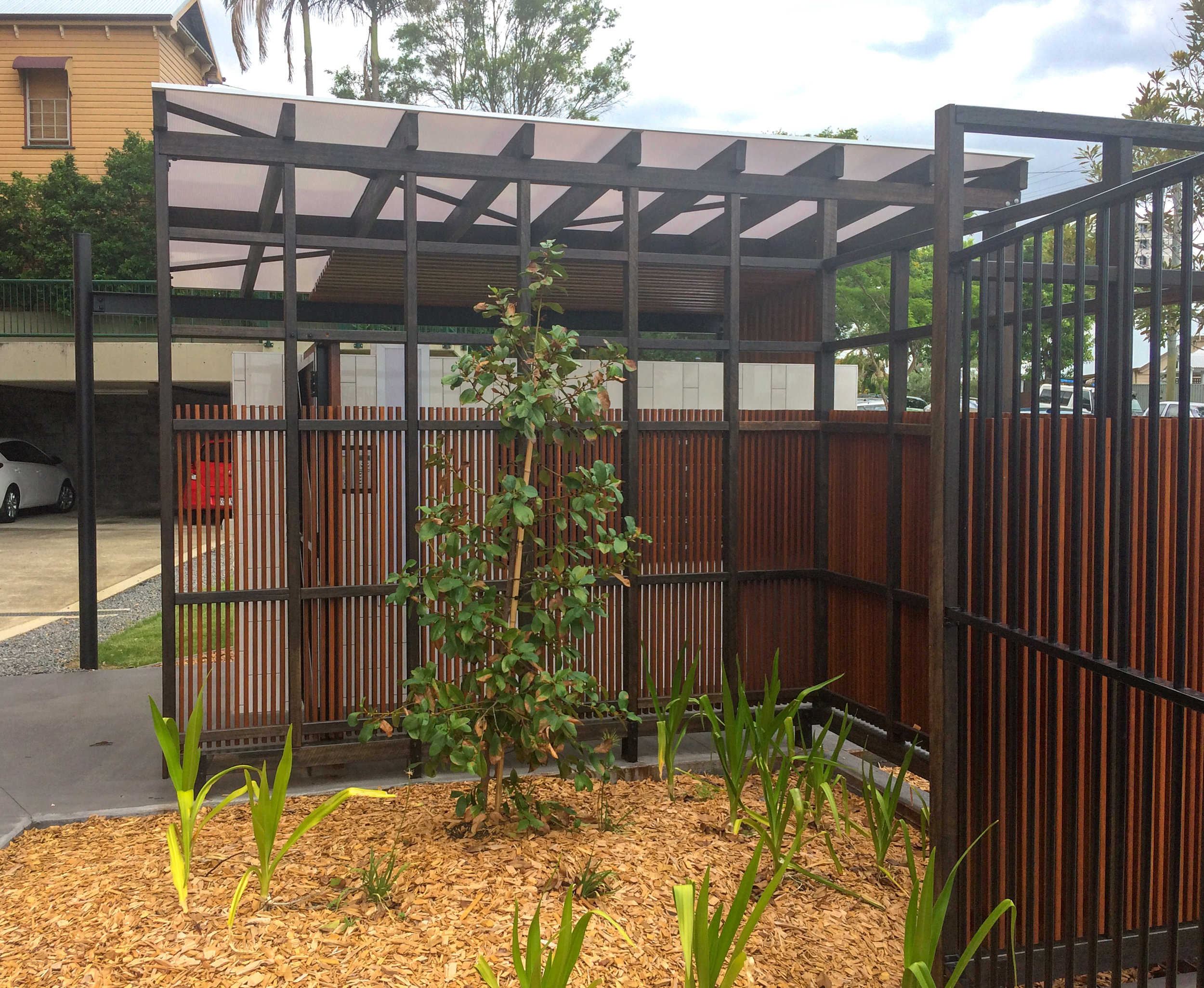
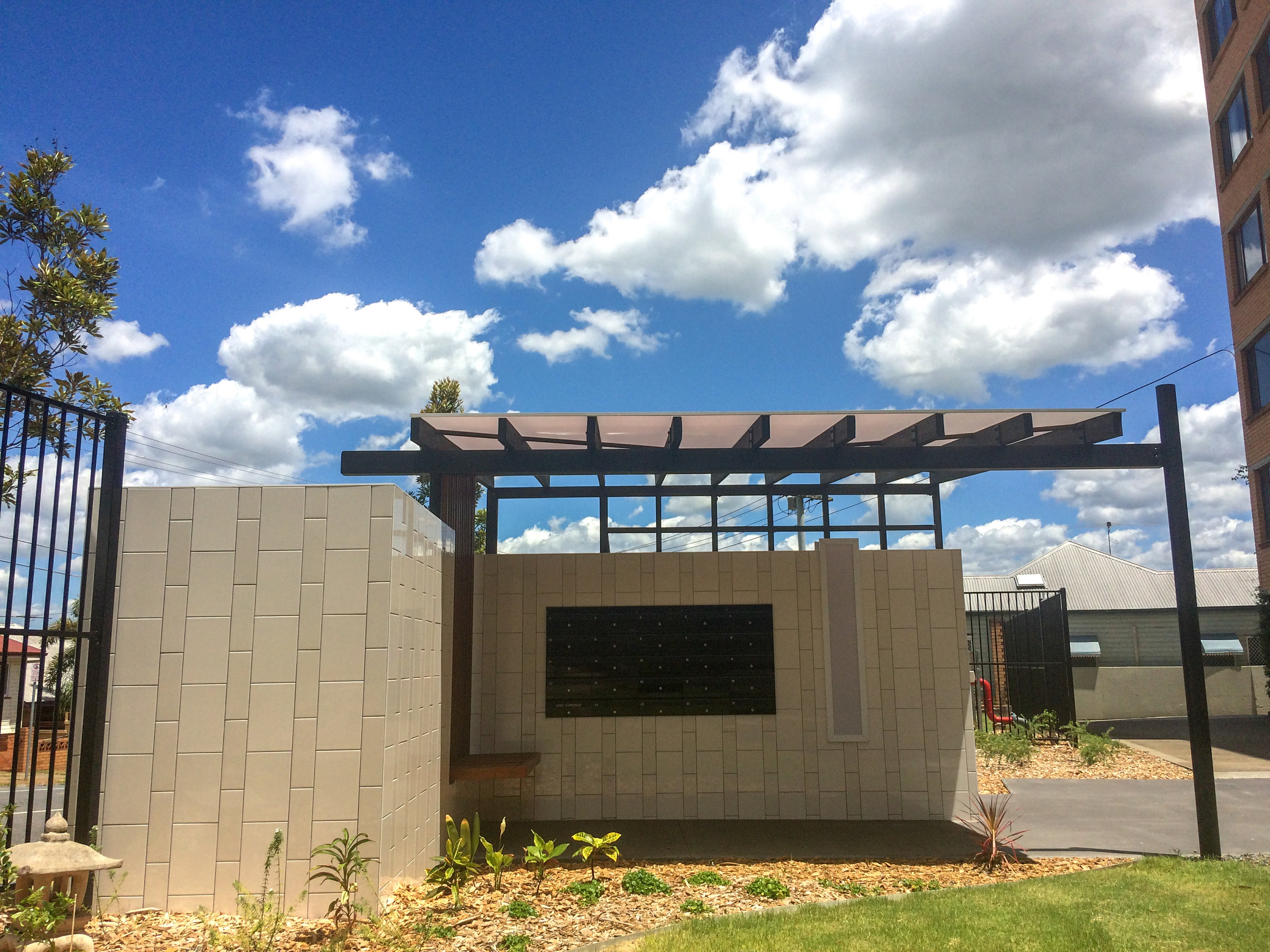
After the 2015 storms that ripped through Brisbane, Riverdene lost their front wall and security. Resonance d+a offered pro-bono design services to update the replacement with a new gatehouse that provides a functional covered entry with a modern interpretation of the existing and uninspiring 70's West End apartment building. The previous breezeblock wall and arched entry was set back from the street hard up against the driveway giving no secure amenity to the residents. The new gatehouse abuts the footpath and brings forward a simple (and affordable) fence line and hides it within the garden. When grown the new plants will hide the fence and create a soft transition between public and private space. The new gatehouse reflects the box aesthetic of the existing building and continues the textural finish on the walls with gloss white tiles to reflect the existing bricks. Detailed timber screening provides a warm and inviting juxtaposition to the gloss and an opaque roof lining provides shelter at the entry and letterboxes while flooding the space with light. To achieve a cost effective outcome the detail has gone into the gatehouse with the remaining fence line very simple pool fence and soft scape.

regency Street
regency Street
regency street
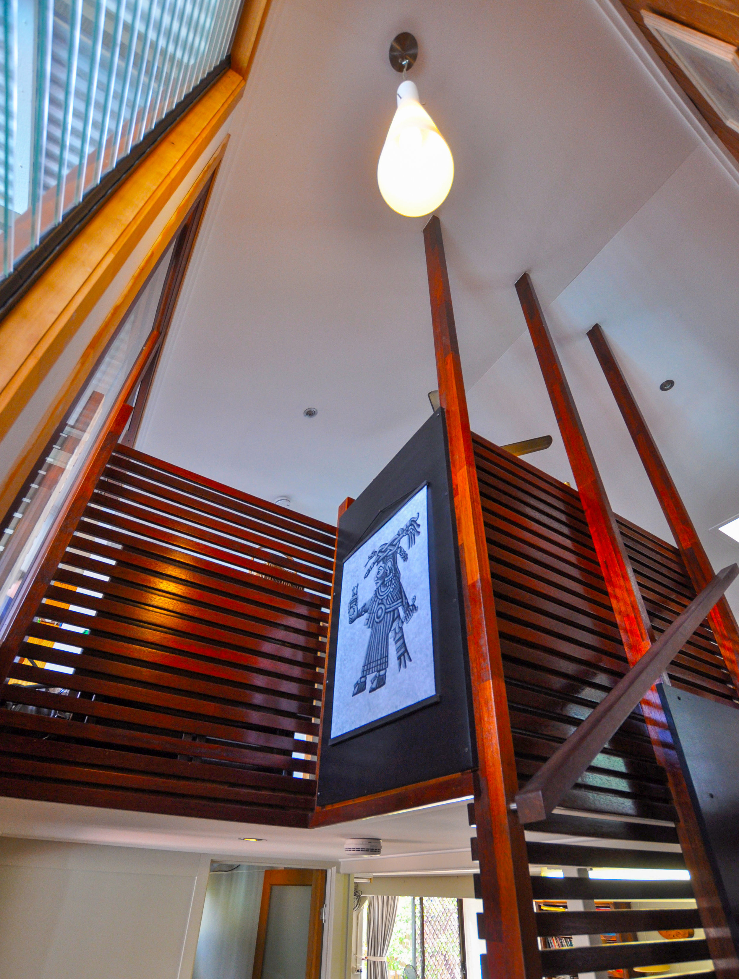
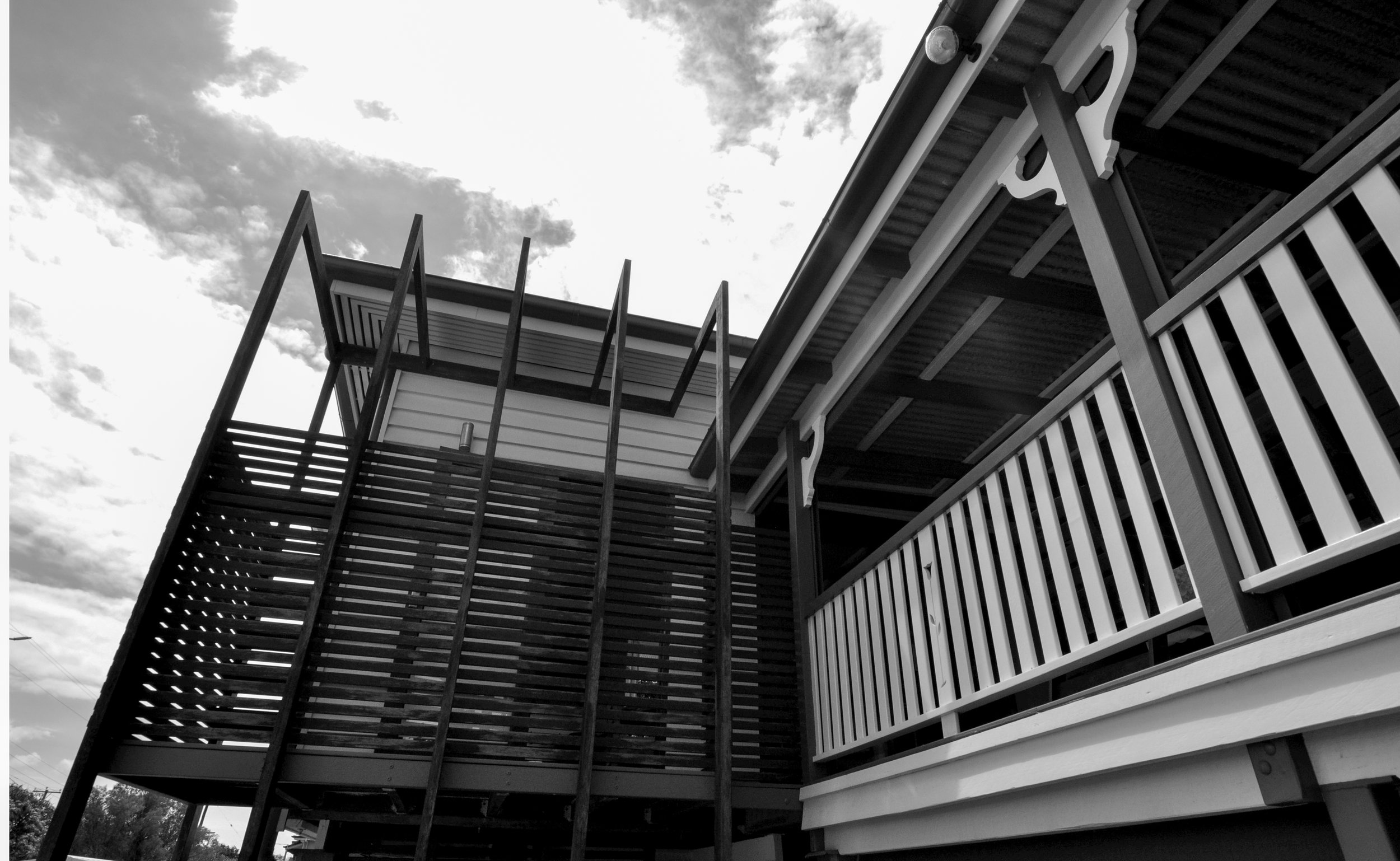
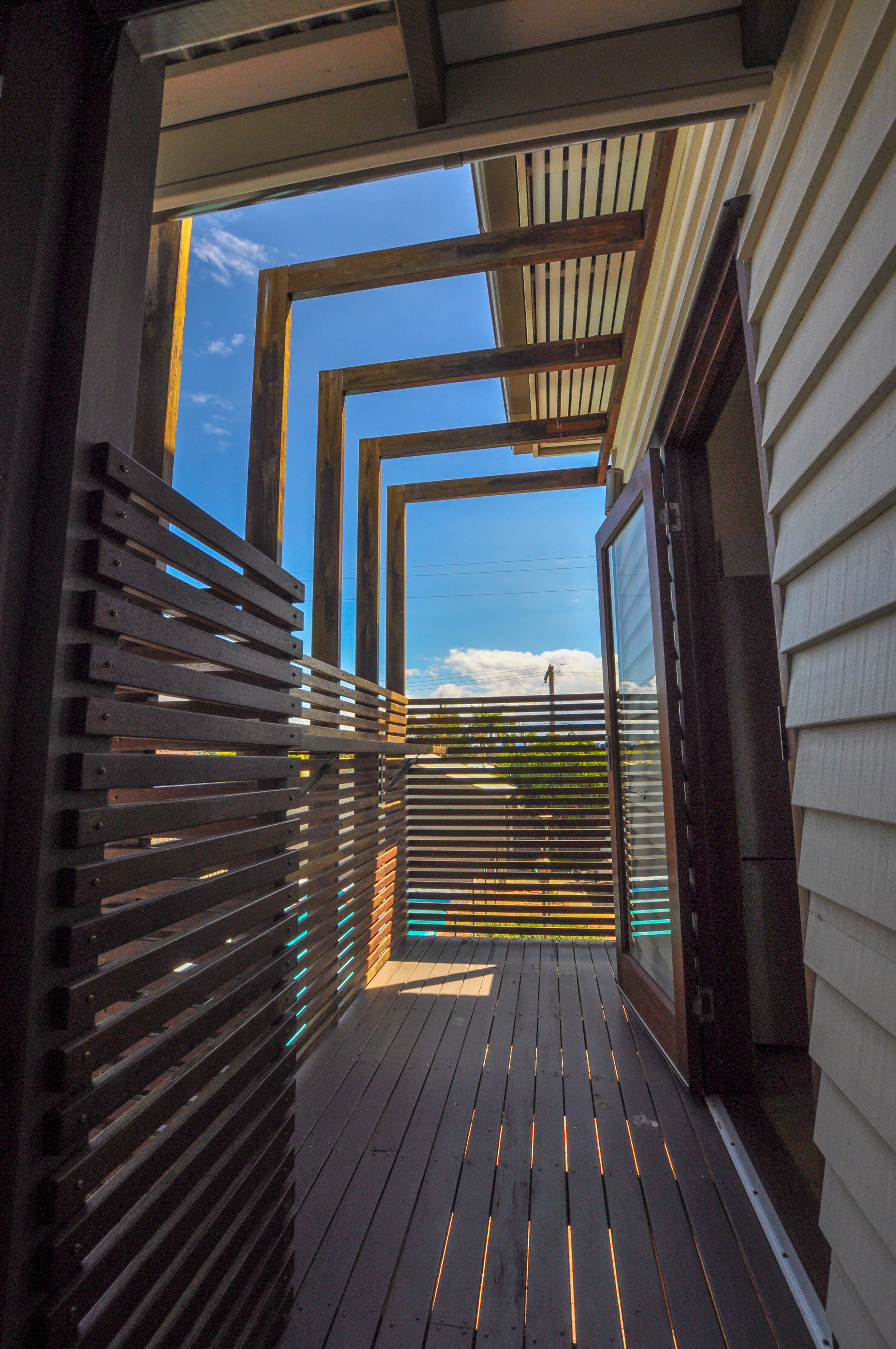
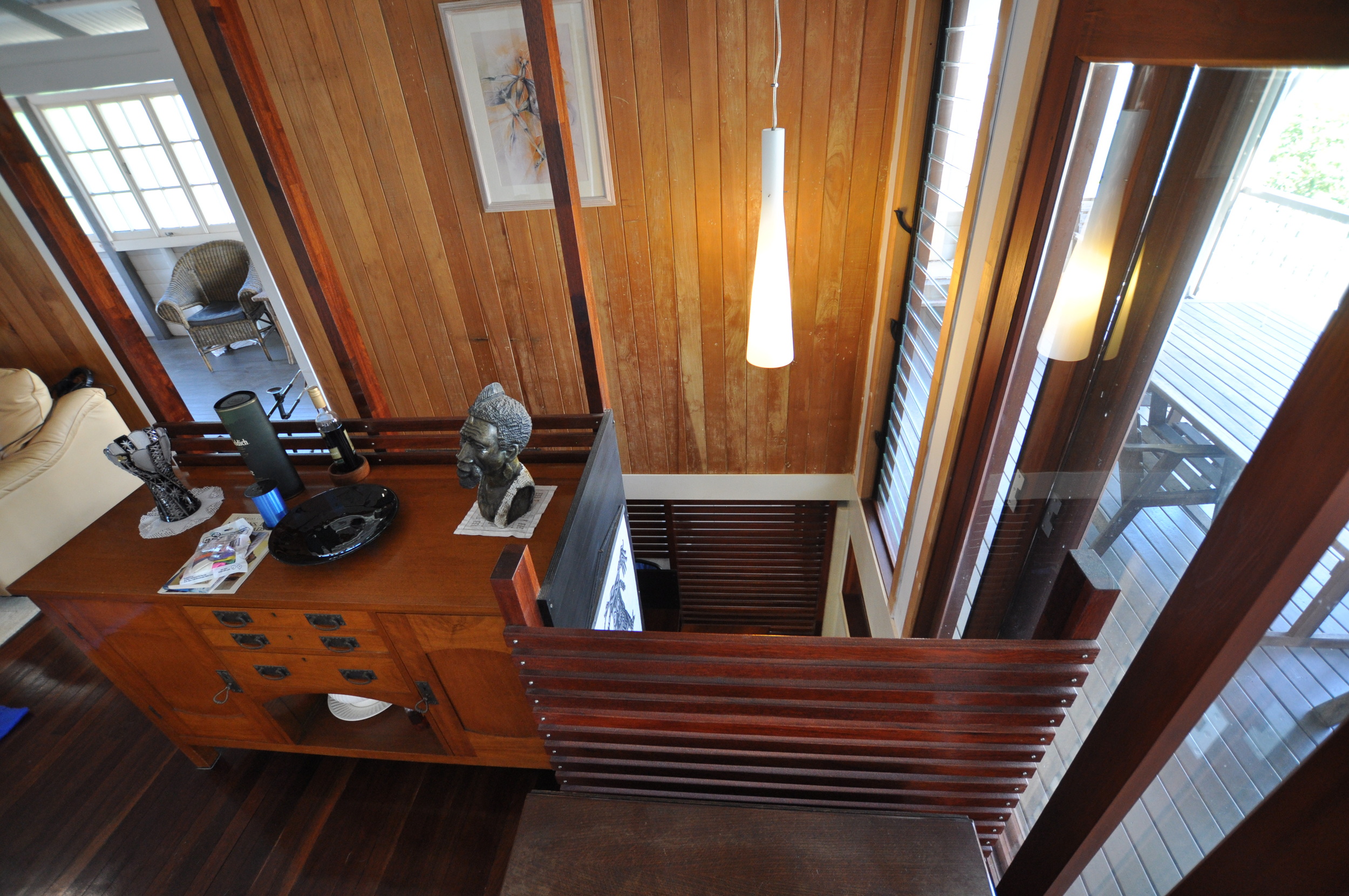
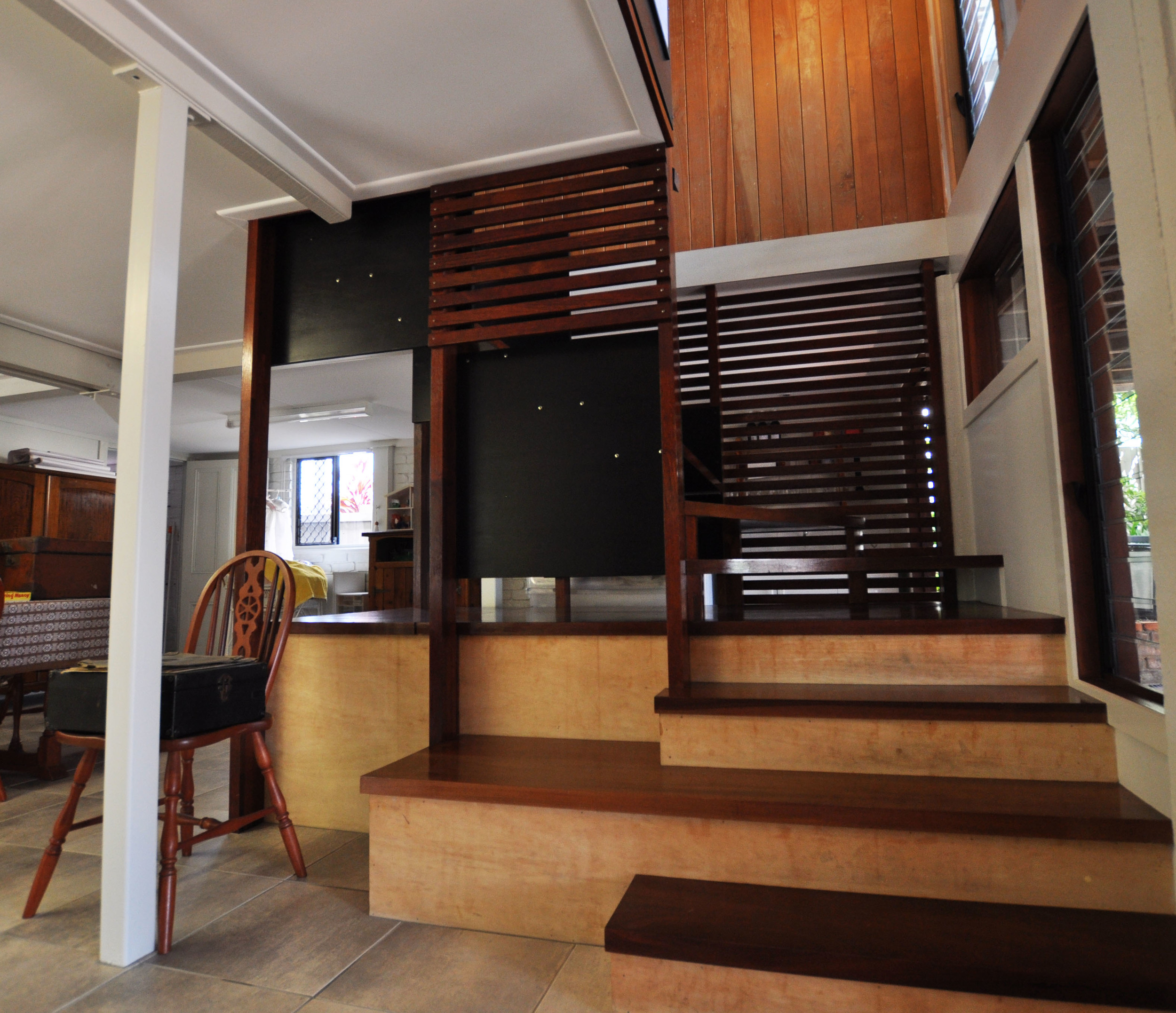
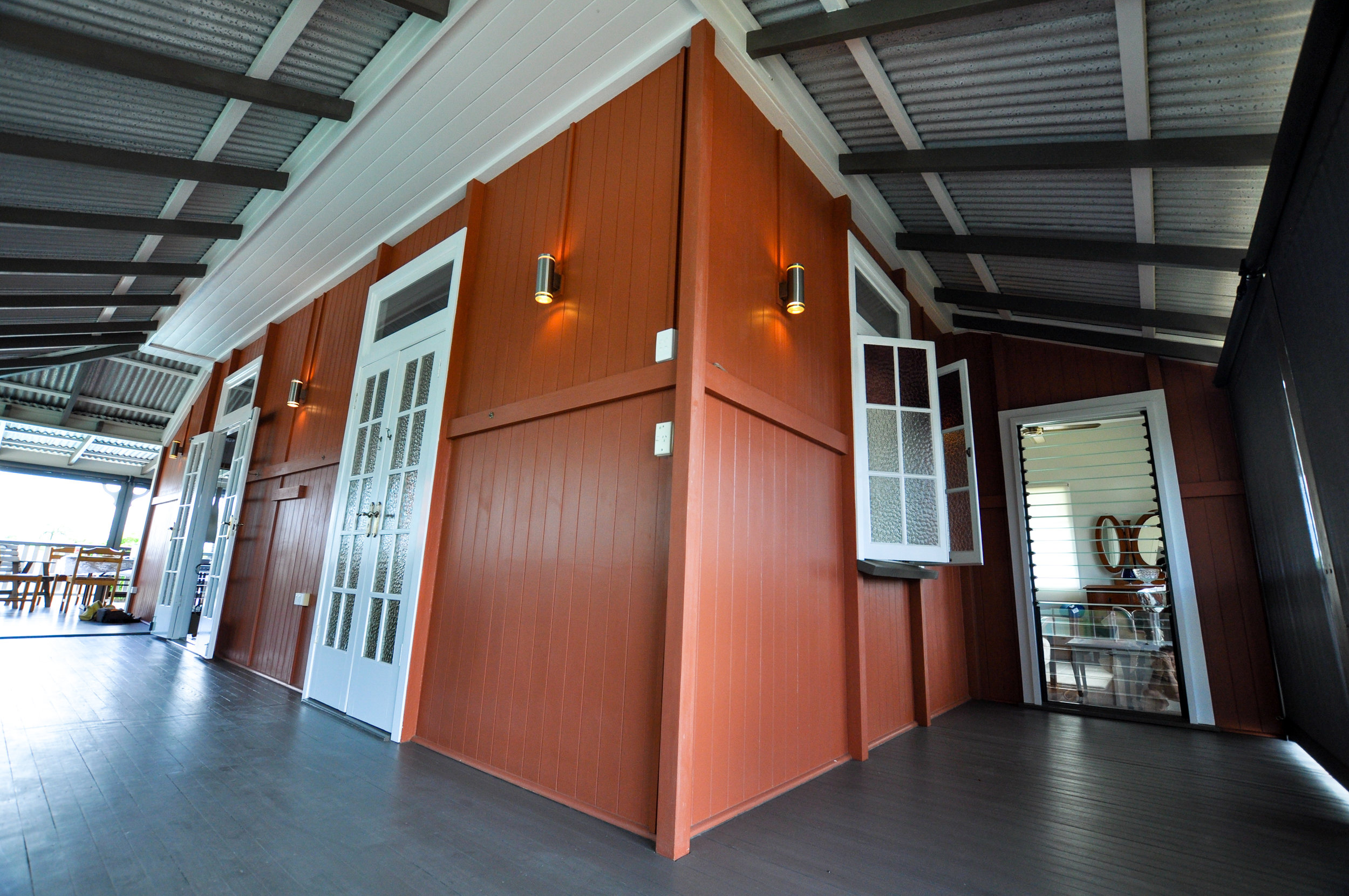
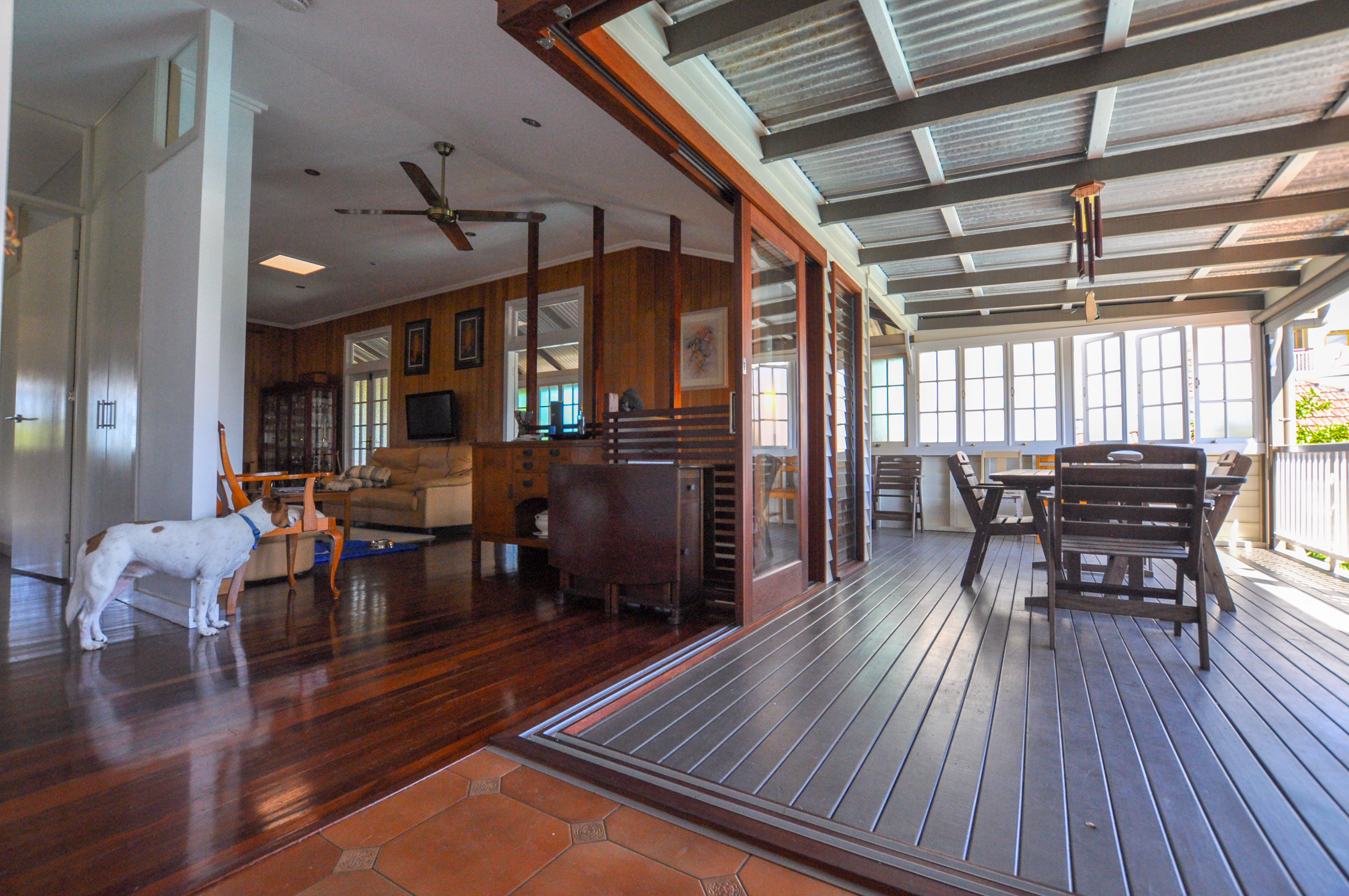
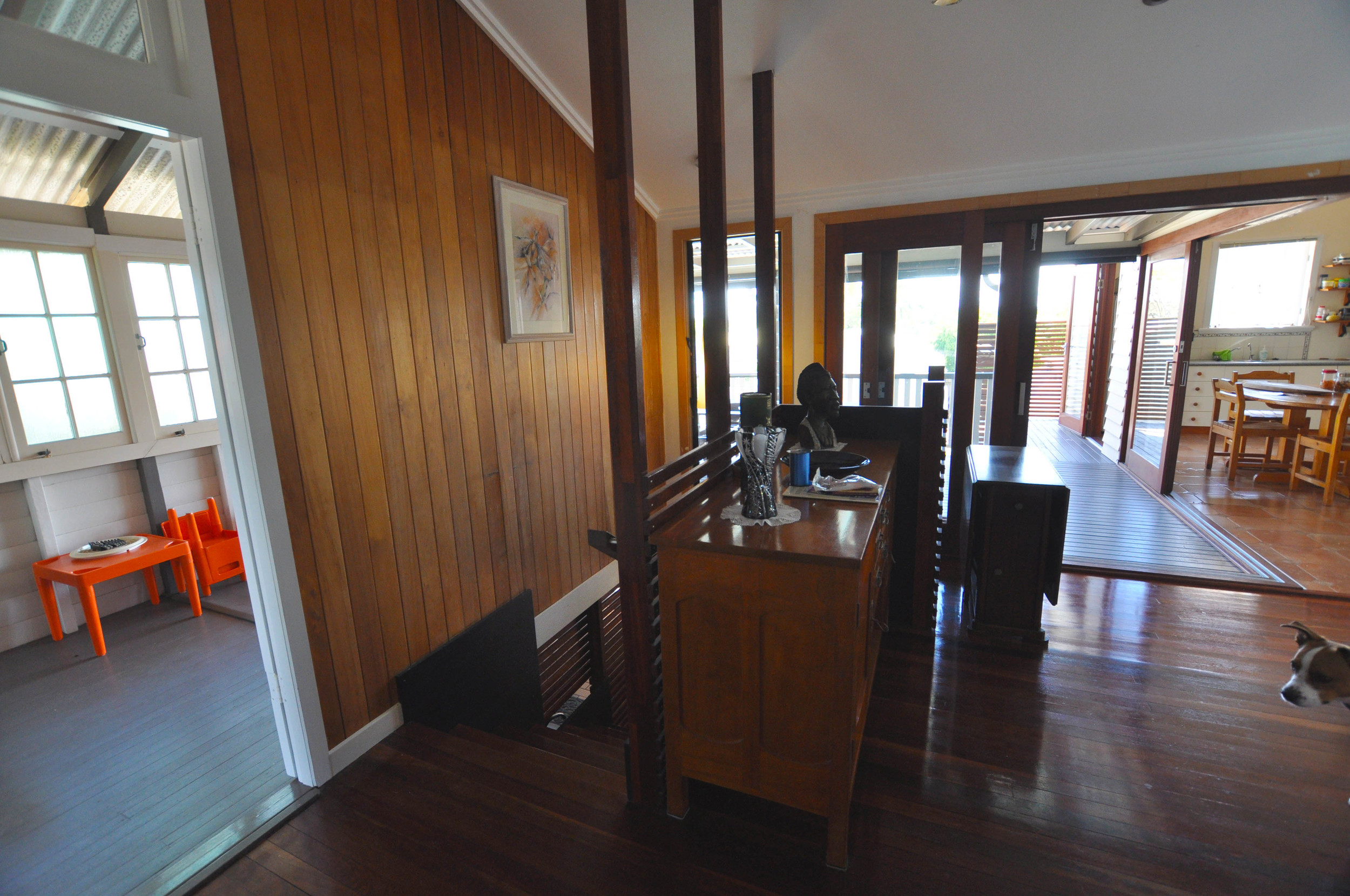
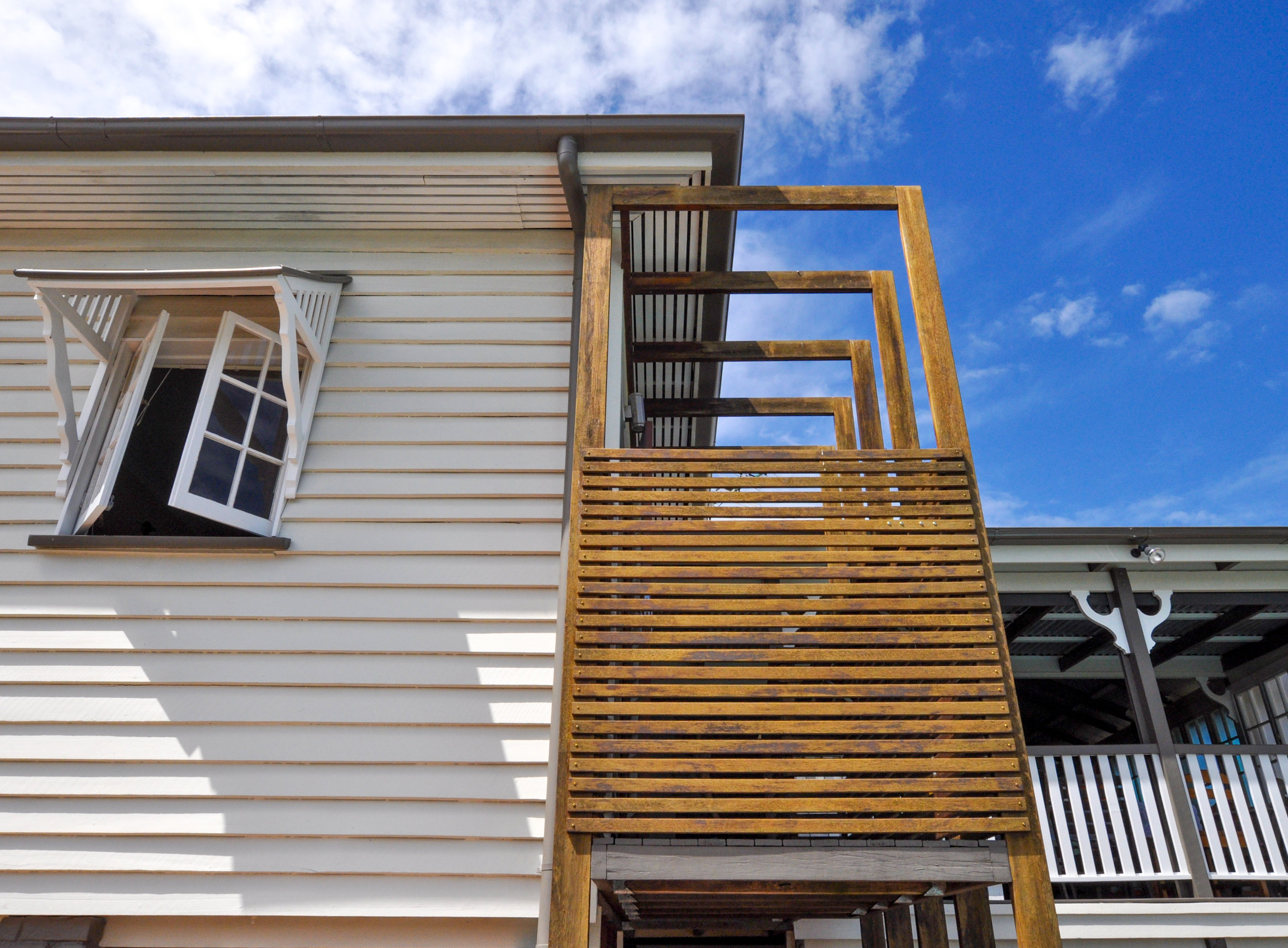
The primary purpose of this renovation of a queenslander in Brighton was to re-arrange the internal spaces. An old extension had placed the kitchen at the back of the house and completely detached it from the living area. 2 bedrooms were located between the living room and the wrap around deck, further contributing to the separation of living spaces and creating dark and insular bedrooms.
As a budget renovation the kitchen and bathrooms were kept as is. Internal walls were removed to re-locate the living space adjoining the decks and the existing kitchen. A new master suite was established at the front of the house claiming views of the bay with immediate connection to the bathroom. New corner opening sliding glass doors connect the internal and external living areas including a new internal staircase to the already enclosed ground level.

Lush Apartments
Lush Apartments
lush apartments - lutwyche
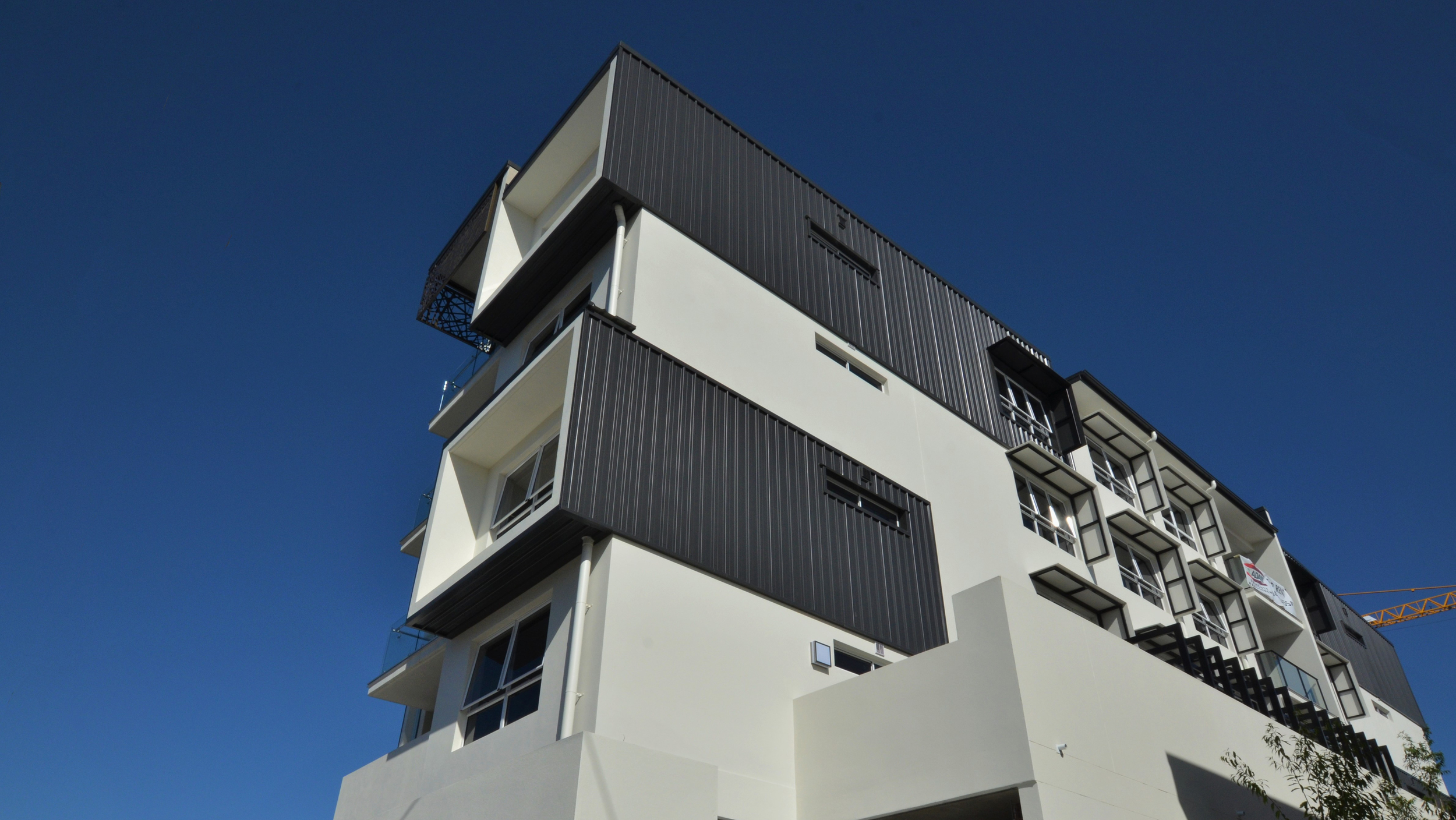
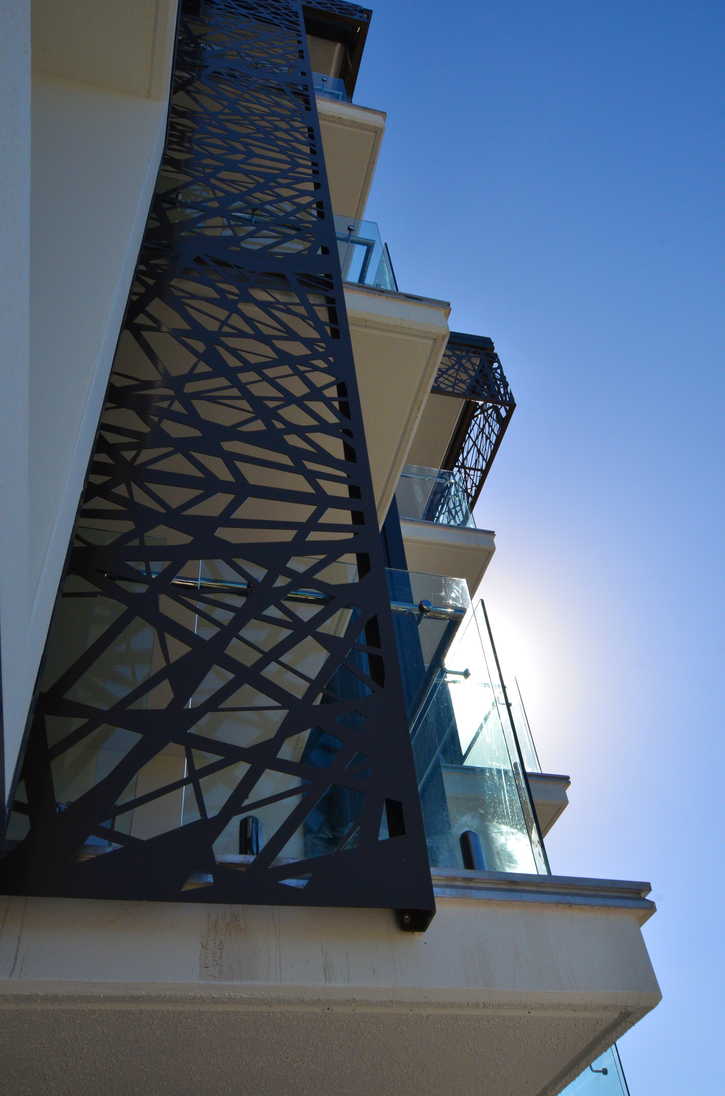
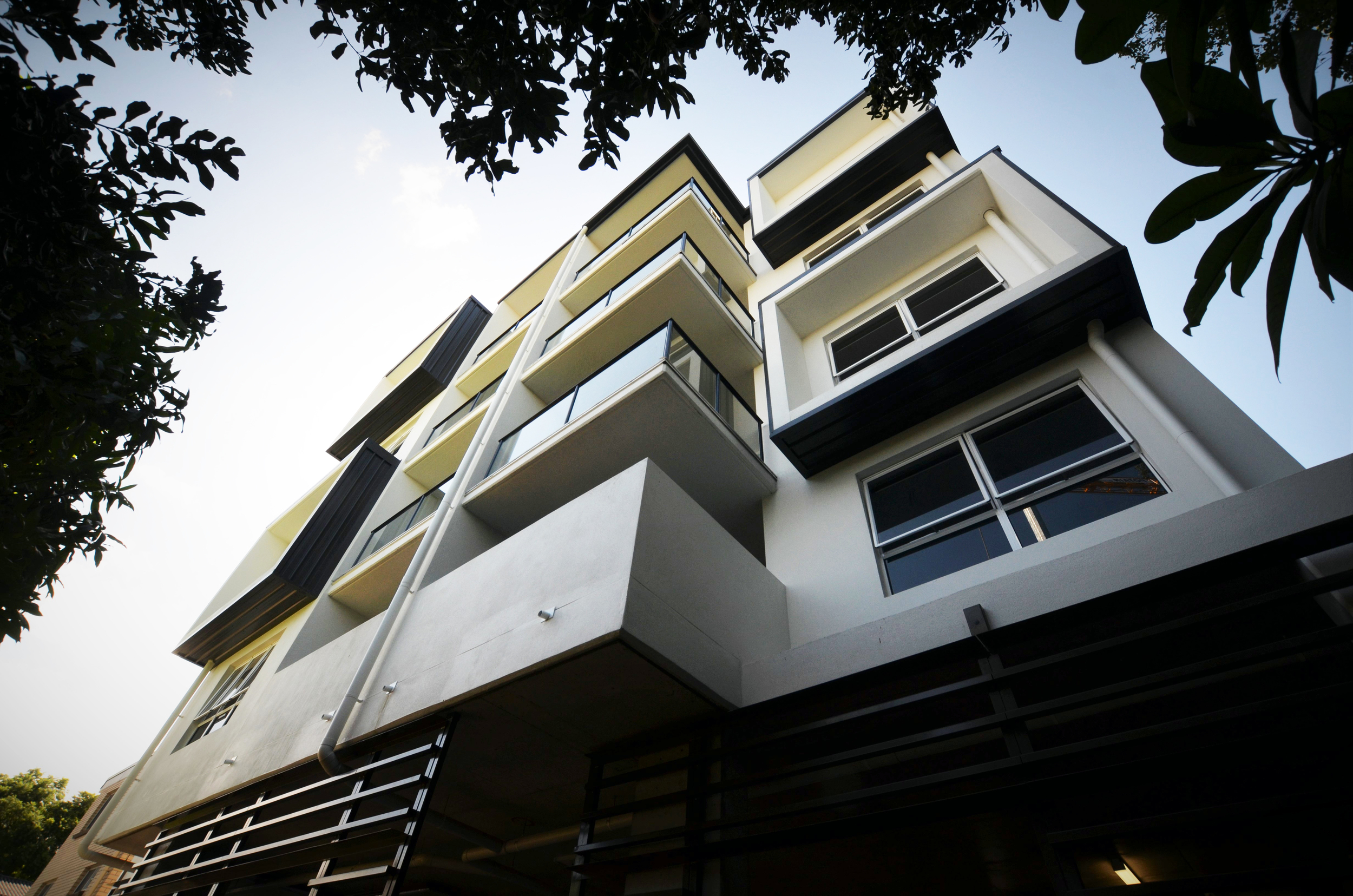
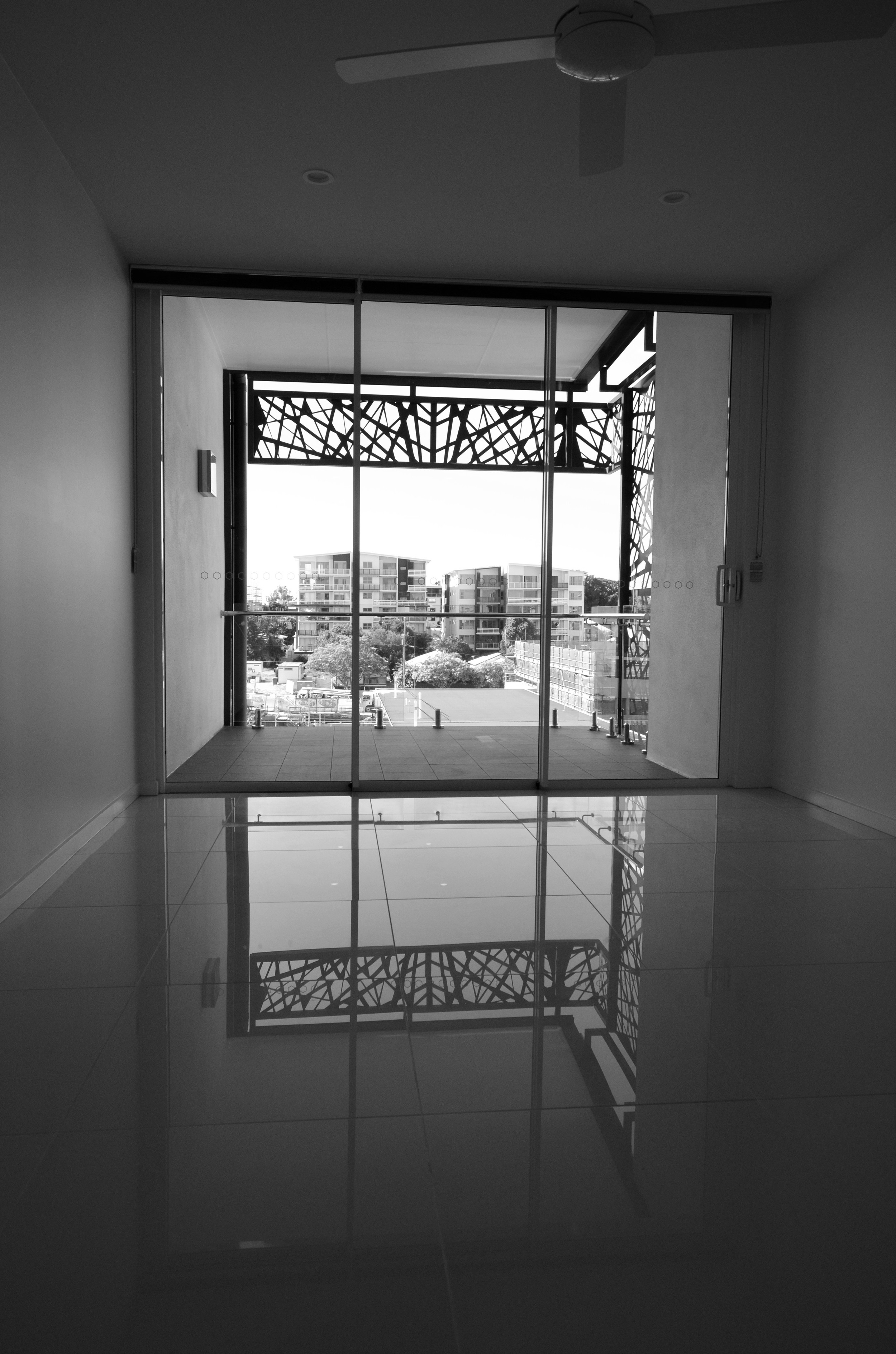
Resonance d+a was approached by Rimfire constructions to assist with the design component of their D&C contract for 24 apartments in the growing suburb of Lutwyche. With the original design completed by another architect and DA already received there was limited scope with this project. As with our approach to all D&C projects we worked very closely with the builder/client to establish preferred construction methodologies and efficient design resolution while maintaining DA requirements. The detailed design phase of the works rationalized the structure and resolved access issues to ensure compliance with NCC and relevant Standards. The success of this project lies in the detail resolution that enabled the original intent to be maintained while delivering a quality outcome to suite the contractors conditions.


middleton residence
middleton residence
middleton residence
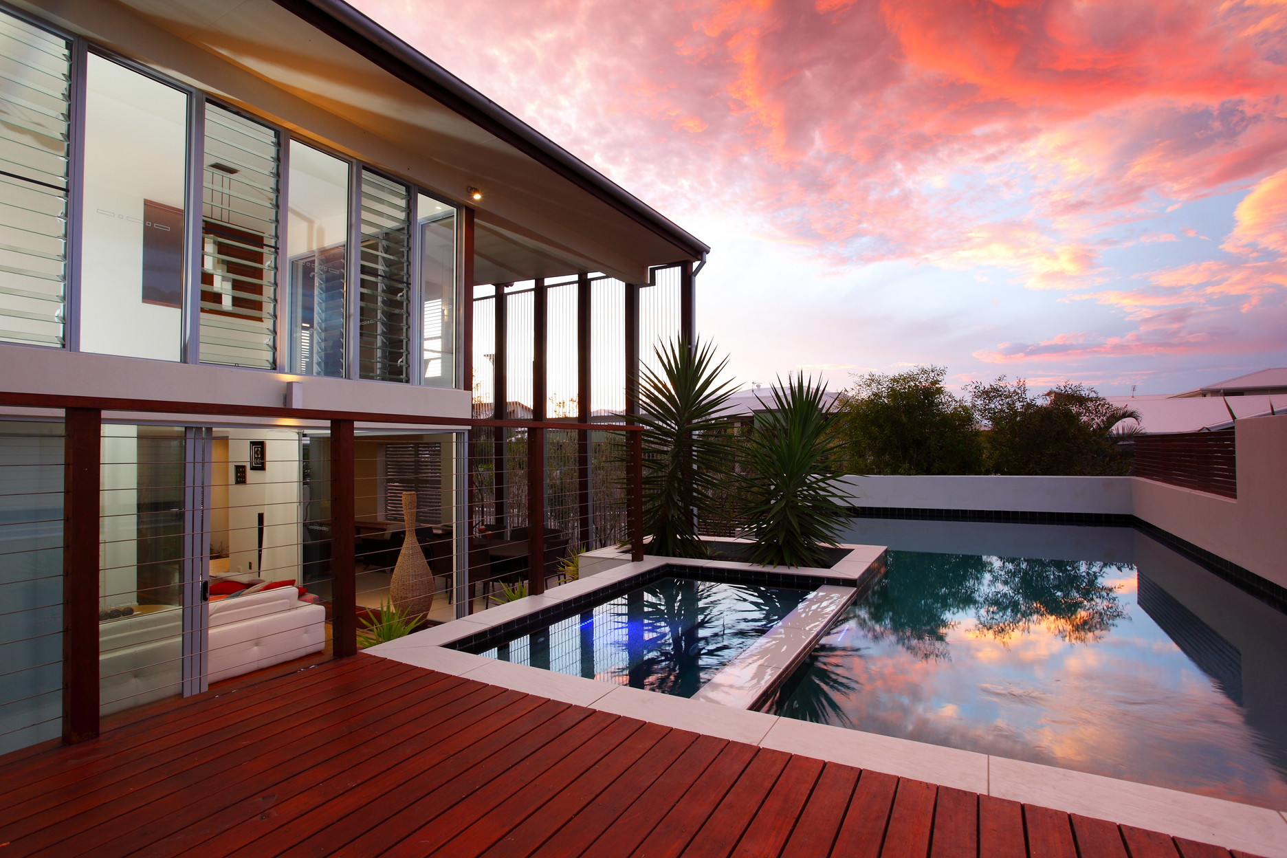
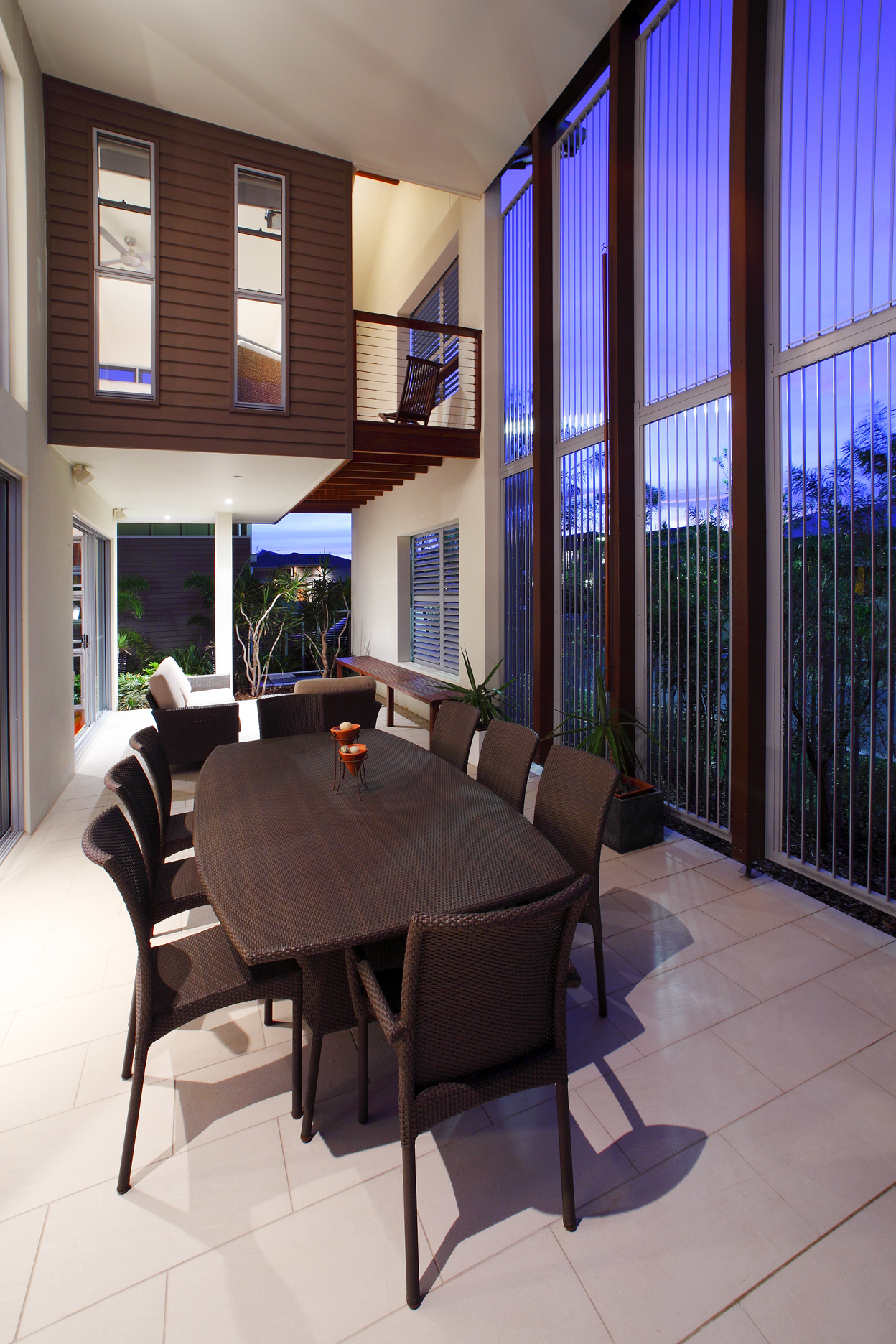
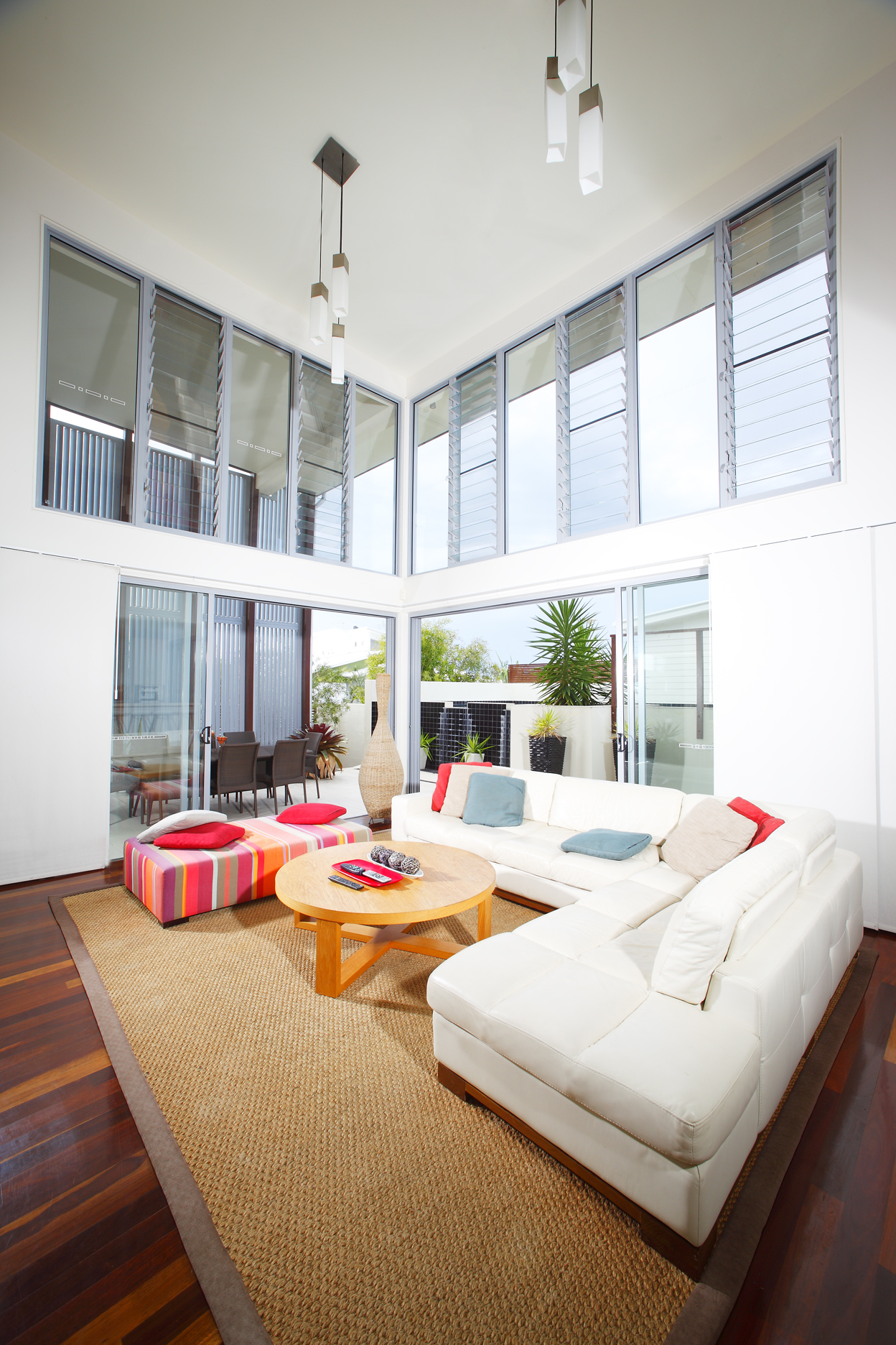
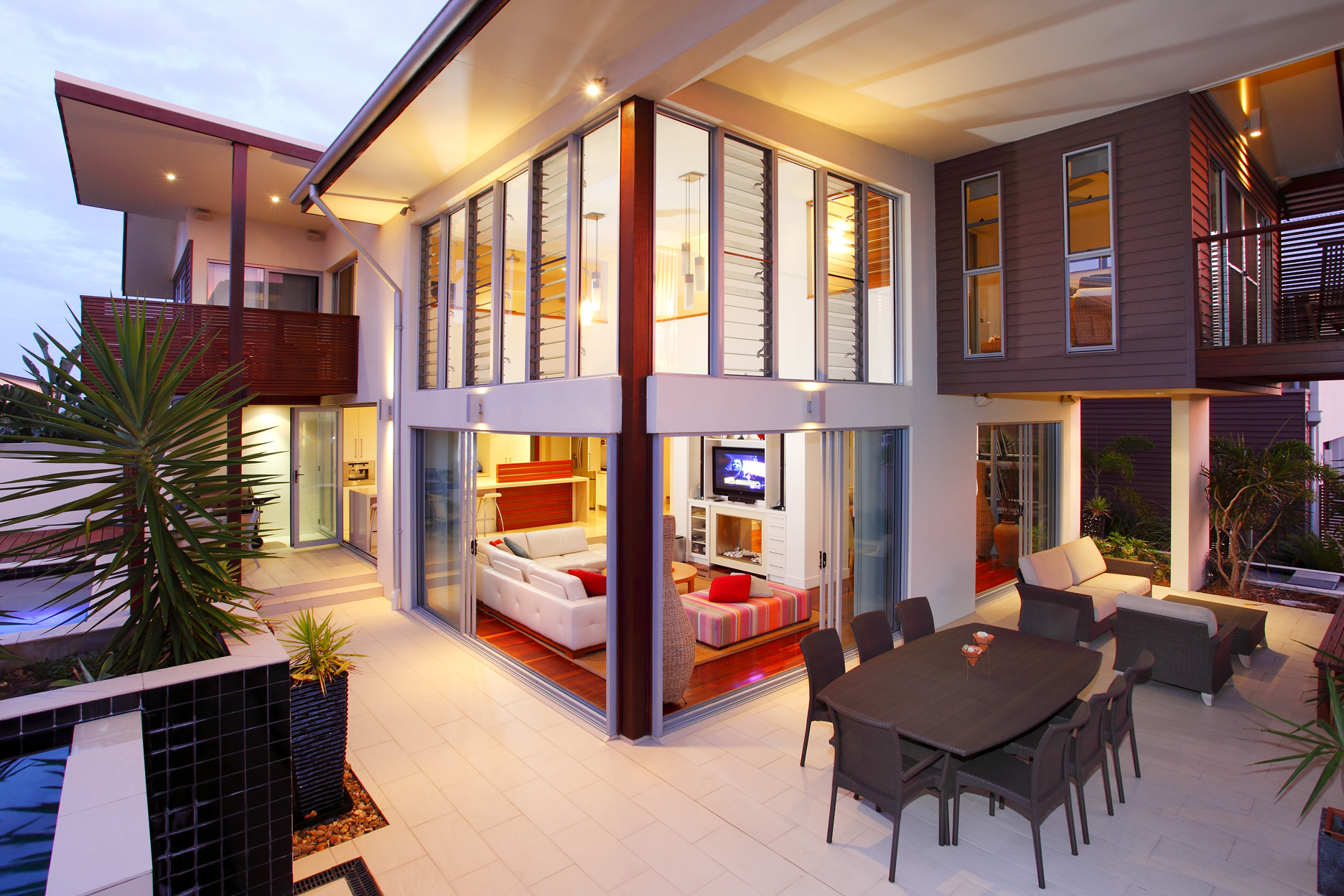
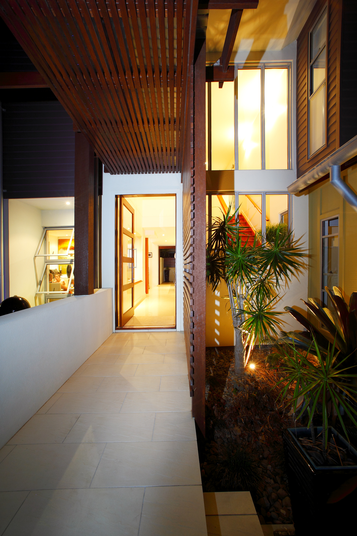
This was a budget house with a great brief. Our clients loved the beach and bought a block of land in the newly developing SALT, south of Kingscliff. With a focus on family, entertainment and growing kids the program needed an active heart with space for retreat.
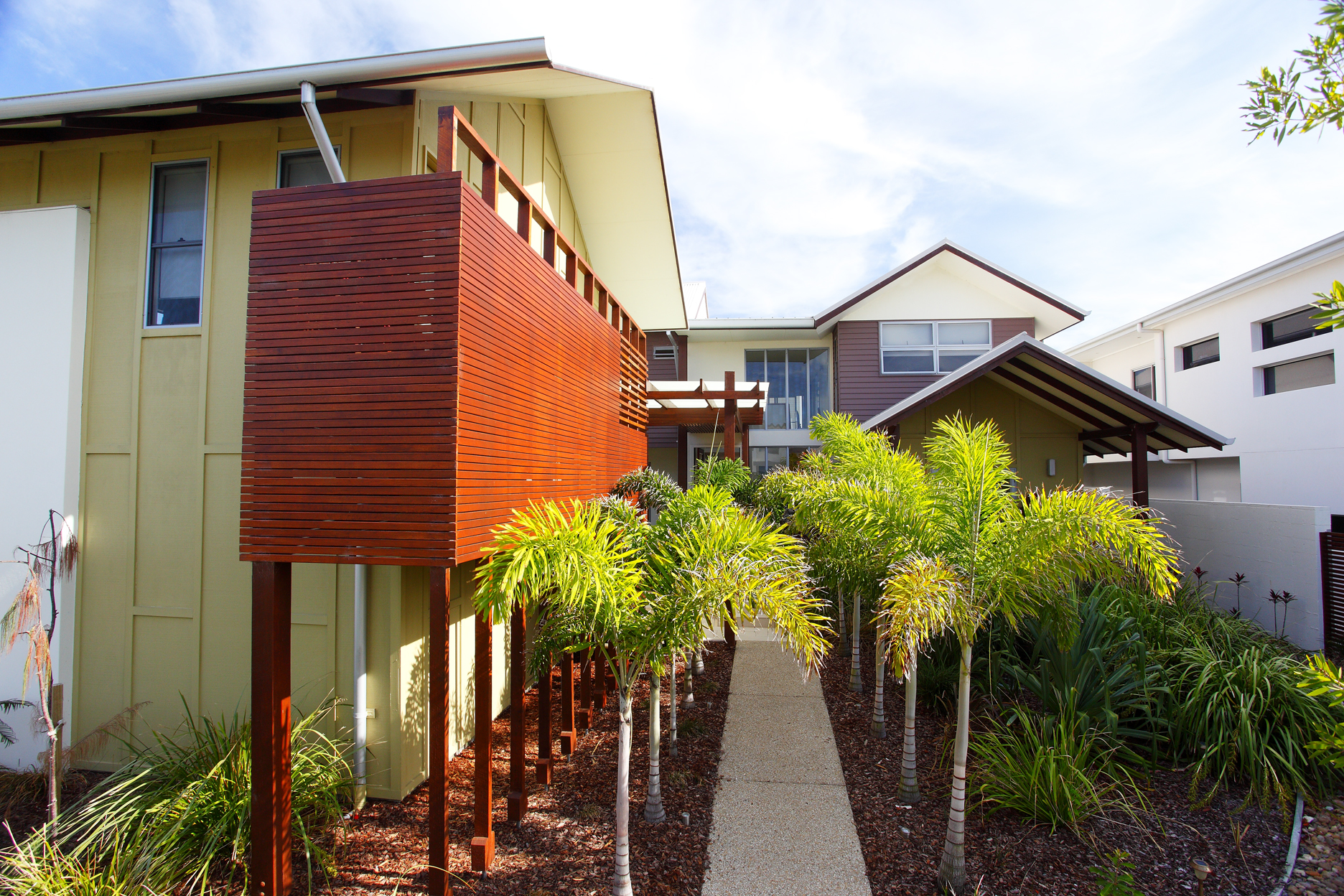
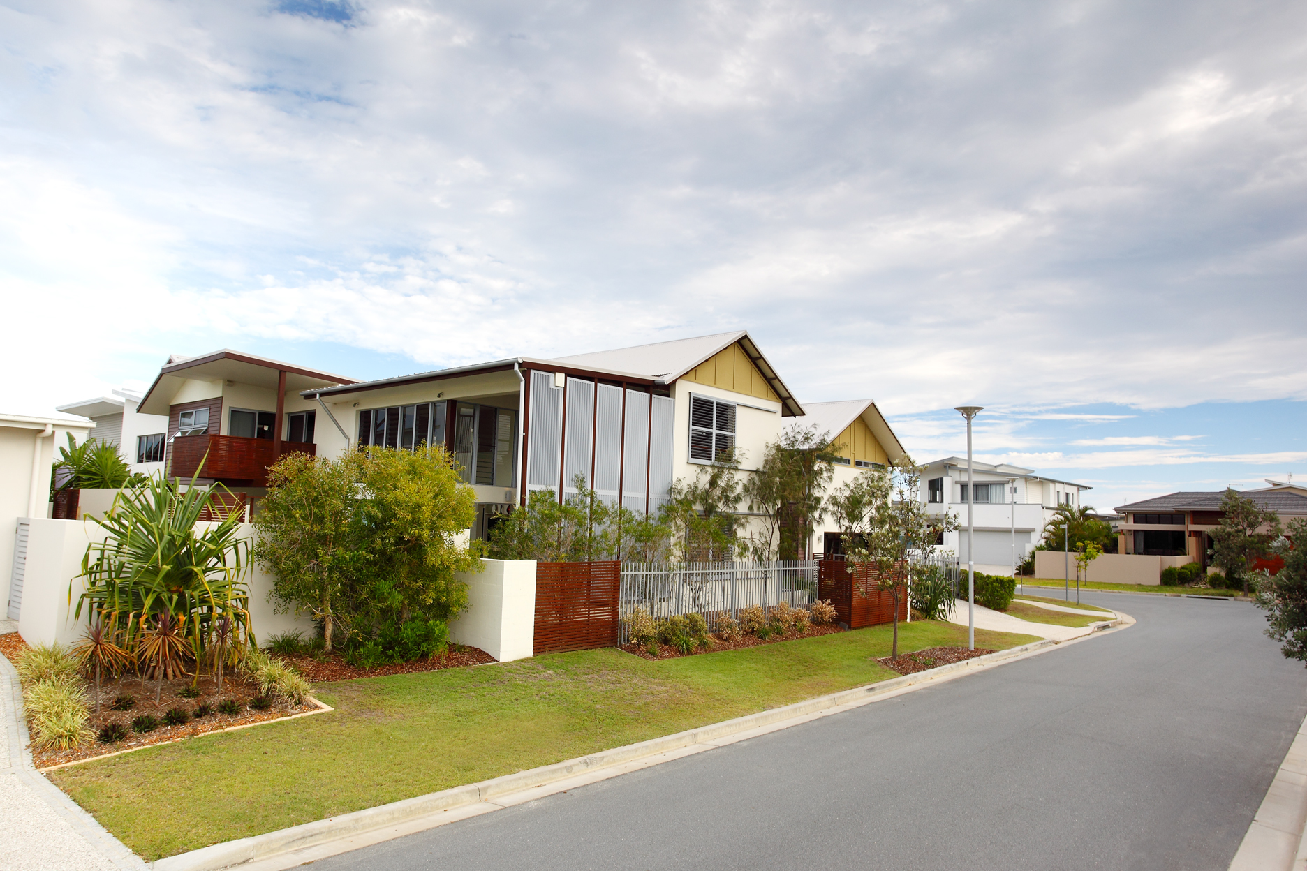
Splitting the functions into 2 buildings to allow for a diversifying family unit and setting the main house back on the block created a small oasis on entry and encourages an outdoor and private lifestyle in an otherwise dense neighbourhood. After entering through the lush garden the front door access opens deep into the centre of the house and the open kitchen / living areas which connects directly to the outdoor bbq. This 2 storey space faces north into the raised pool and opens on the other side onto a covered 2 storey porch overlooking the secondary street with large vertical operable louvres. Designed to maximise ventilation and an outdoor lifestyle it also allows the winter warmth to penetrate deep into the house for comfortable passive thermal control all year round.
Interested in pursuing a typical 'Australian barn' typology within an otherwise white rendered block neighbourhood this house is playful and active. The large operable louvres maintain an active facade that livens the street by providing an ever changing face.
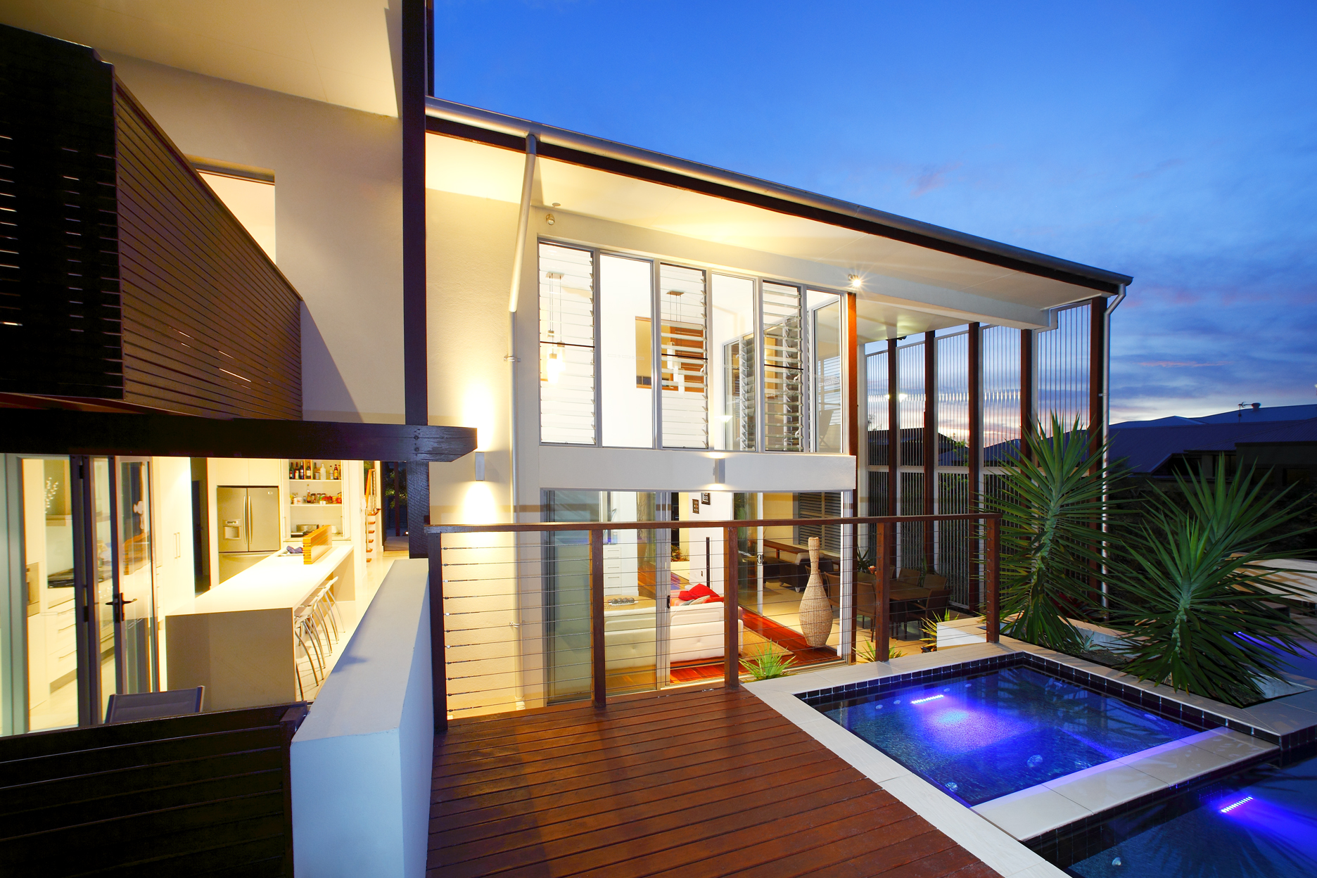
All images courtesy Lightwave International

concepts
concepts
concepts
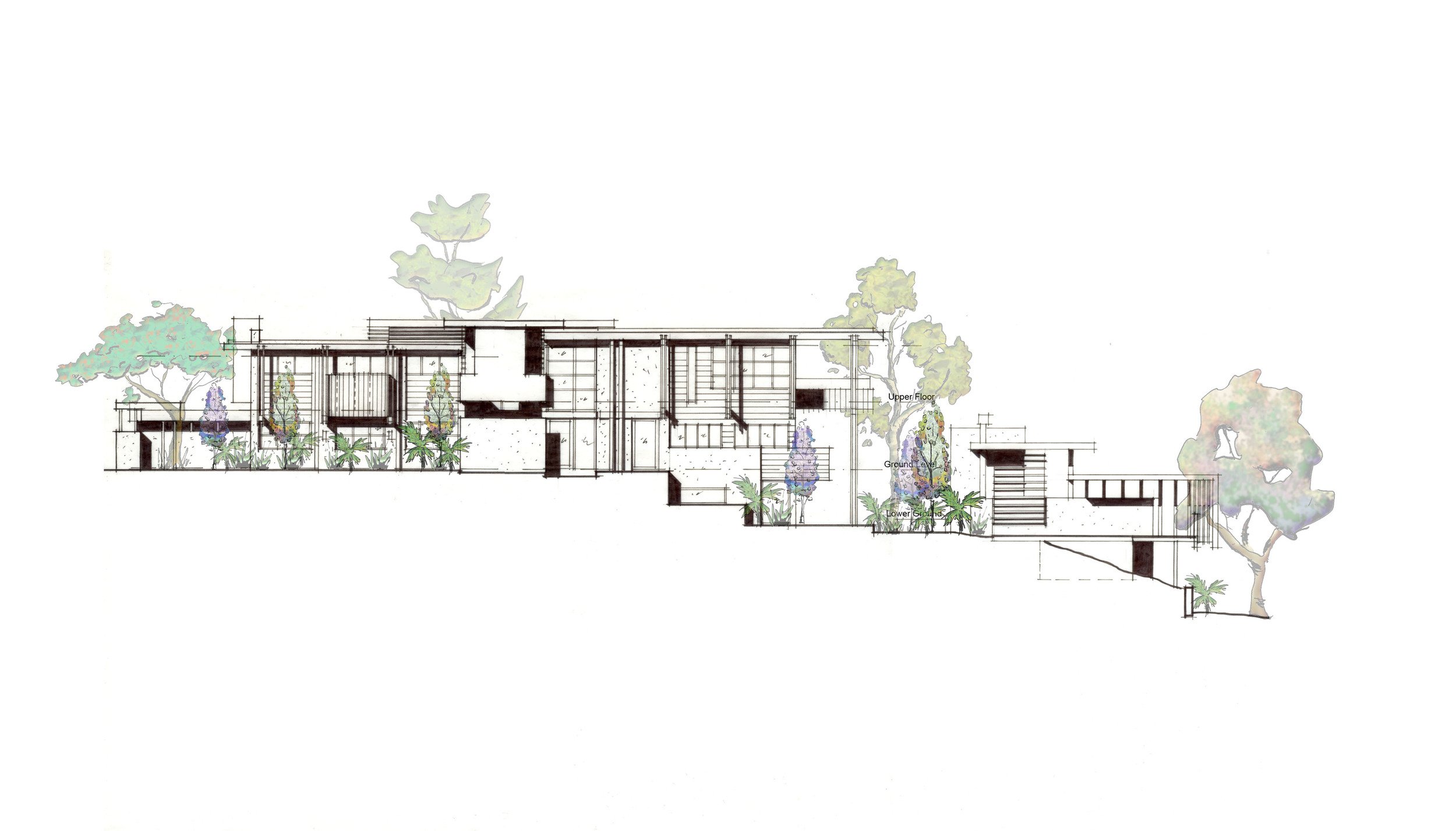
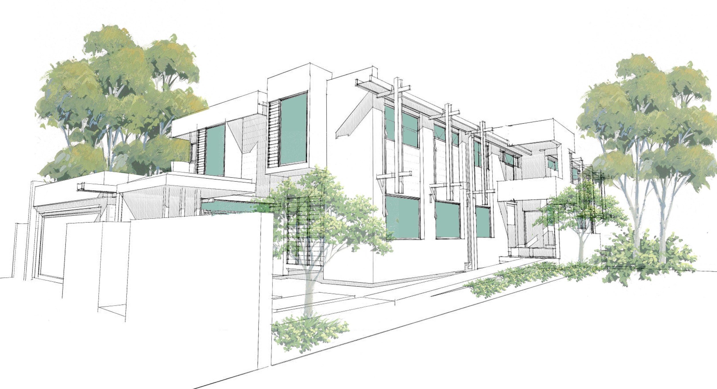
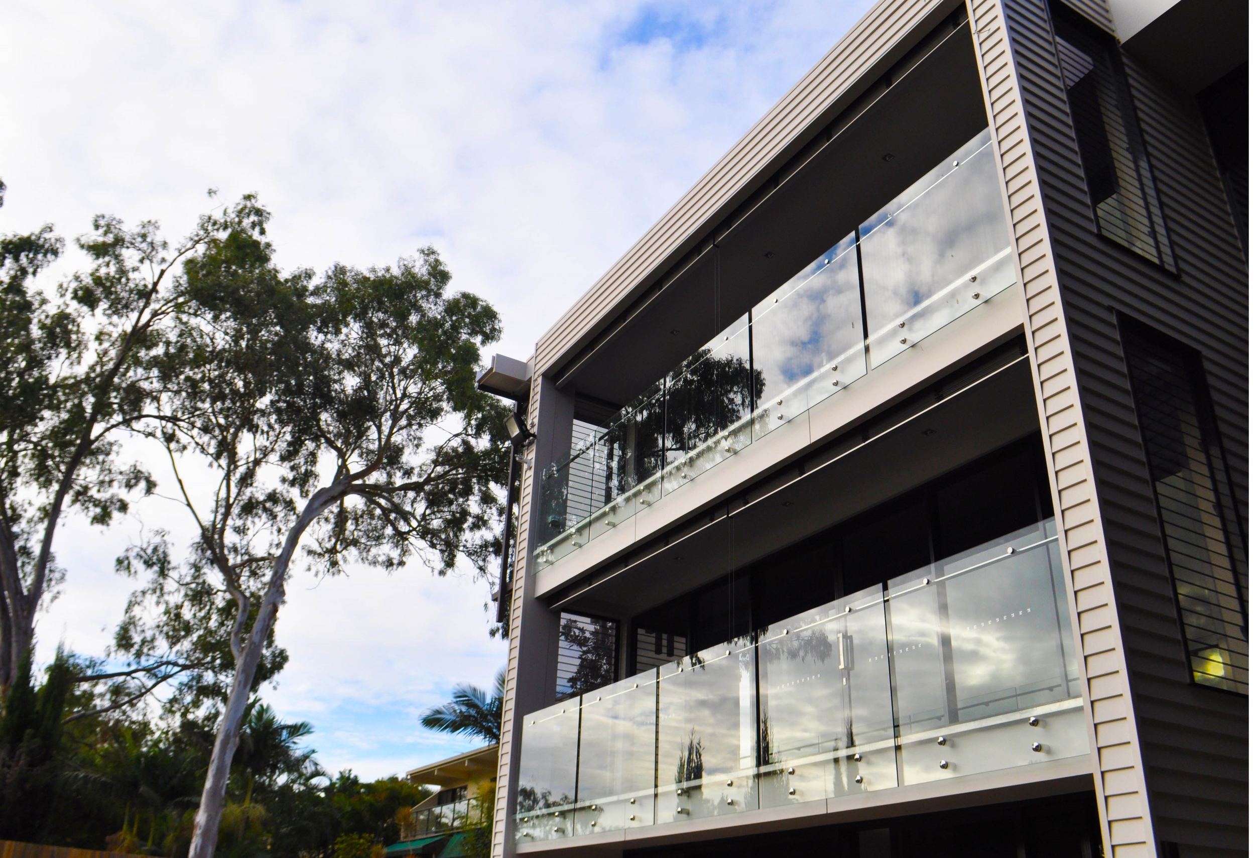
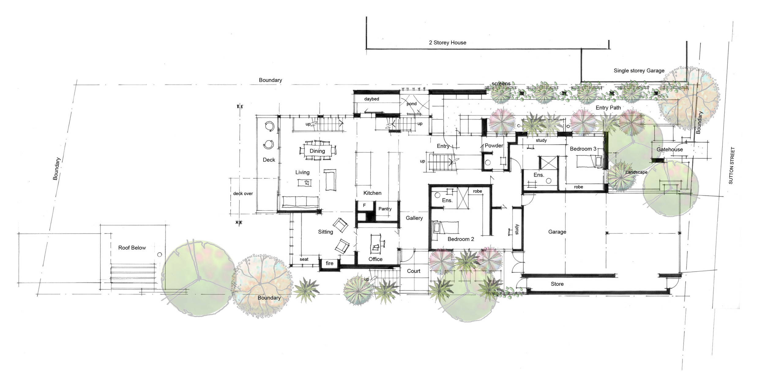
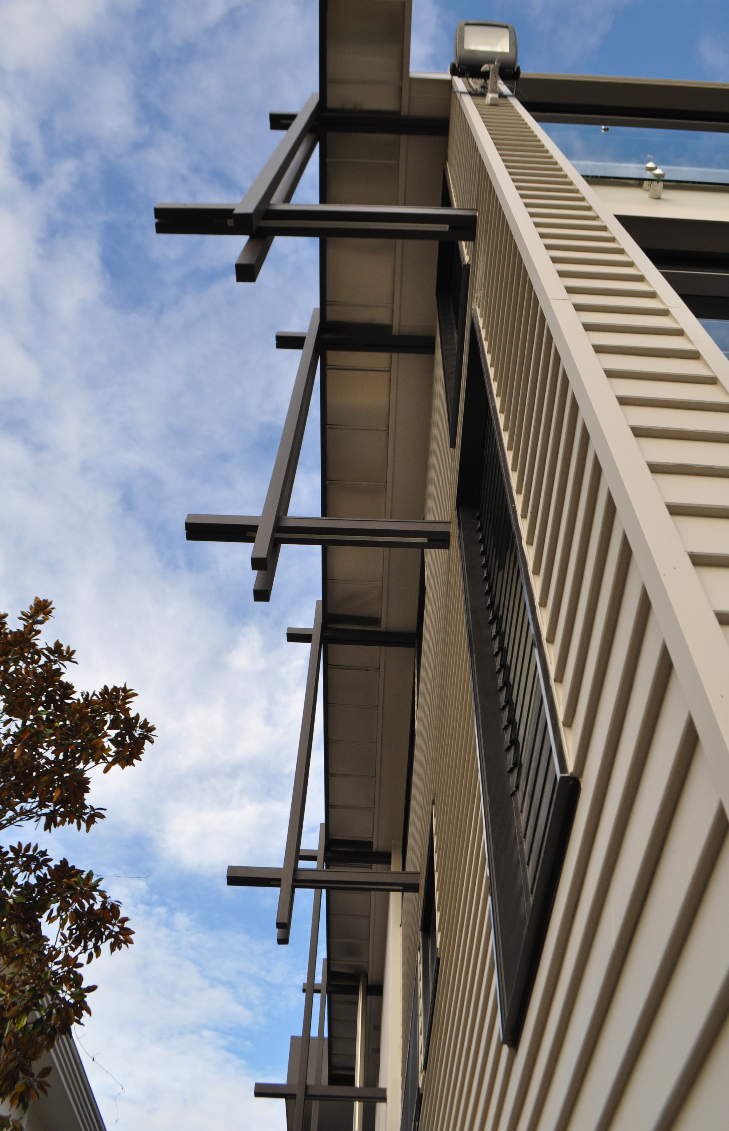
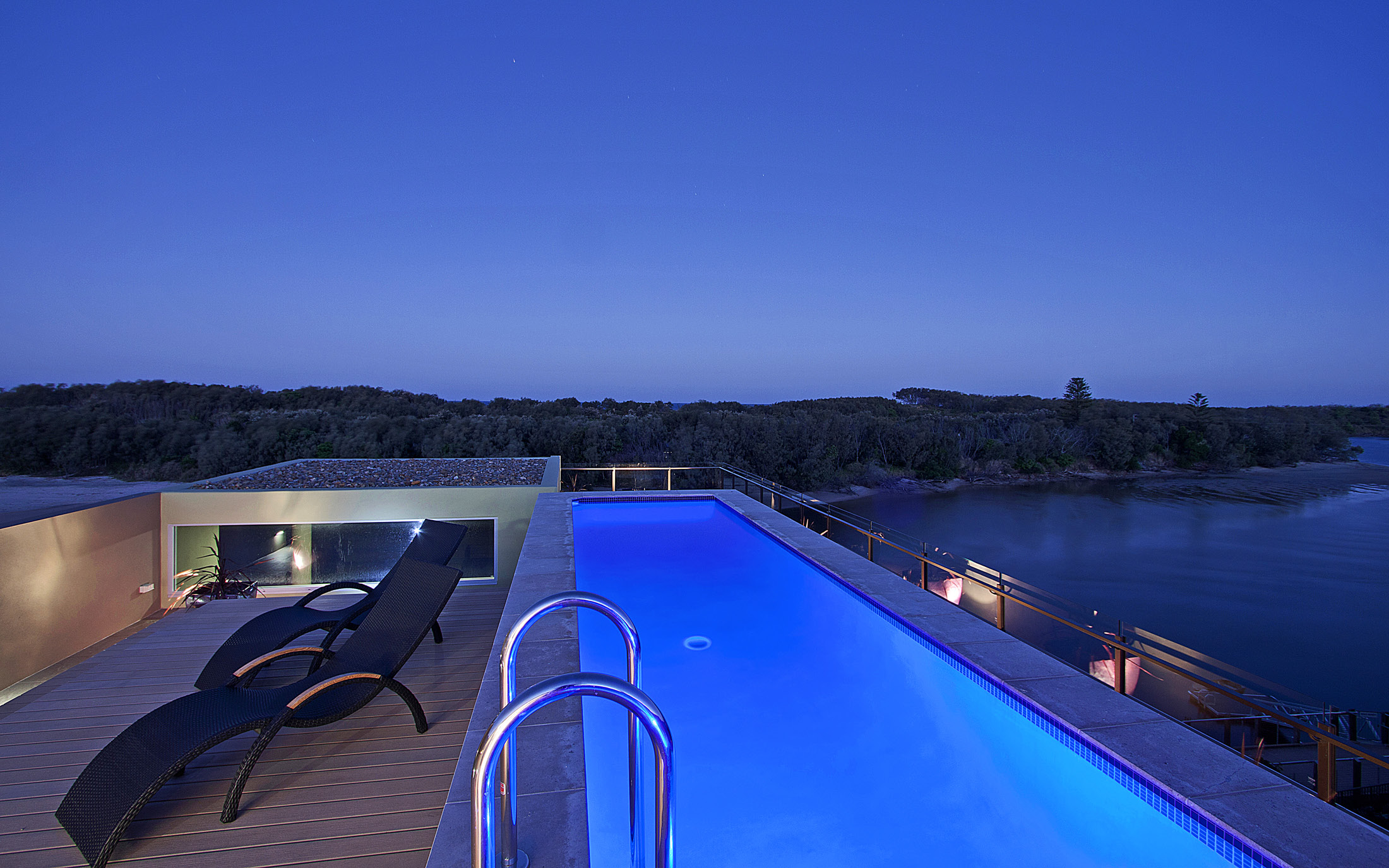
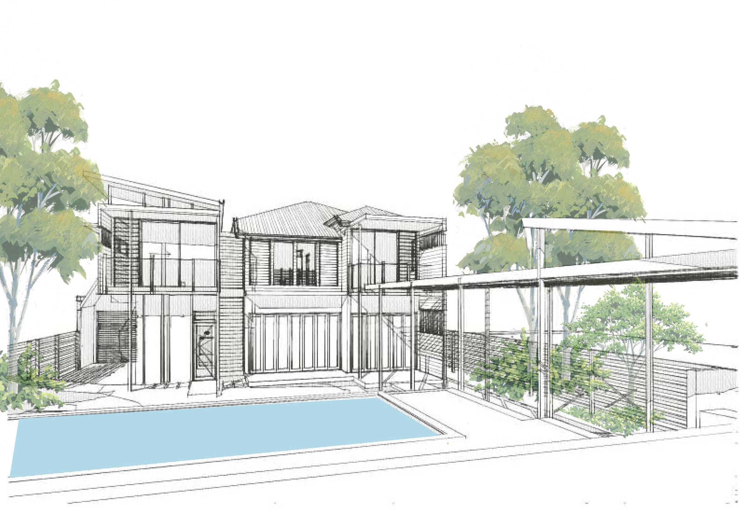
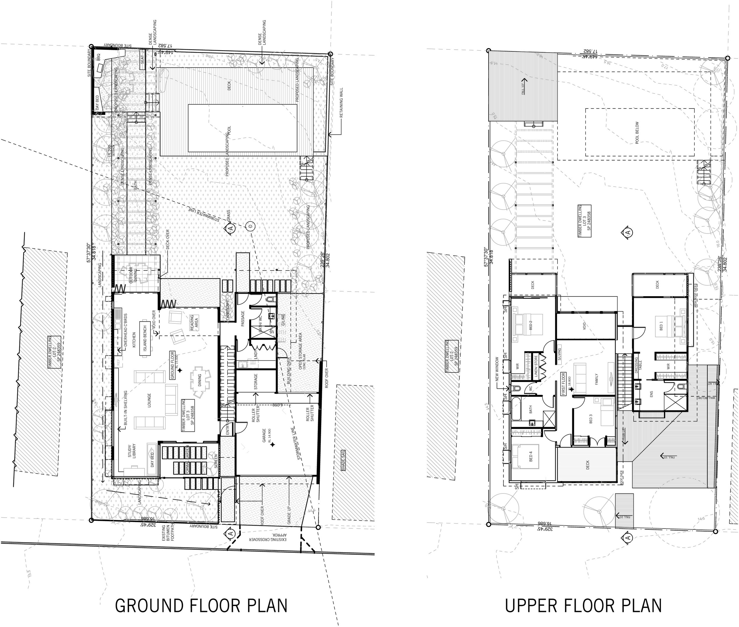
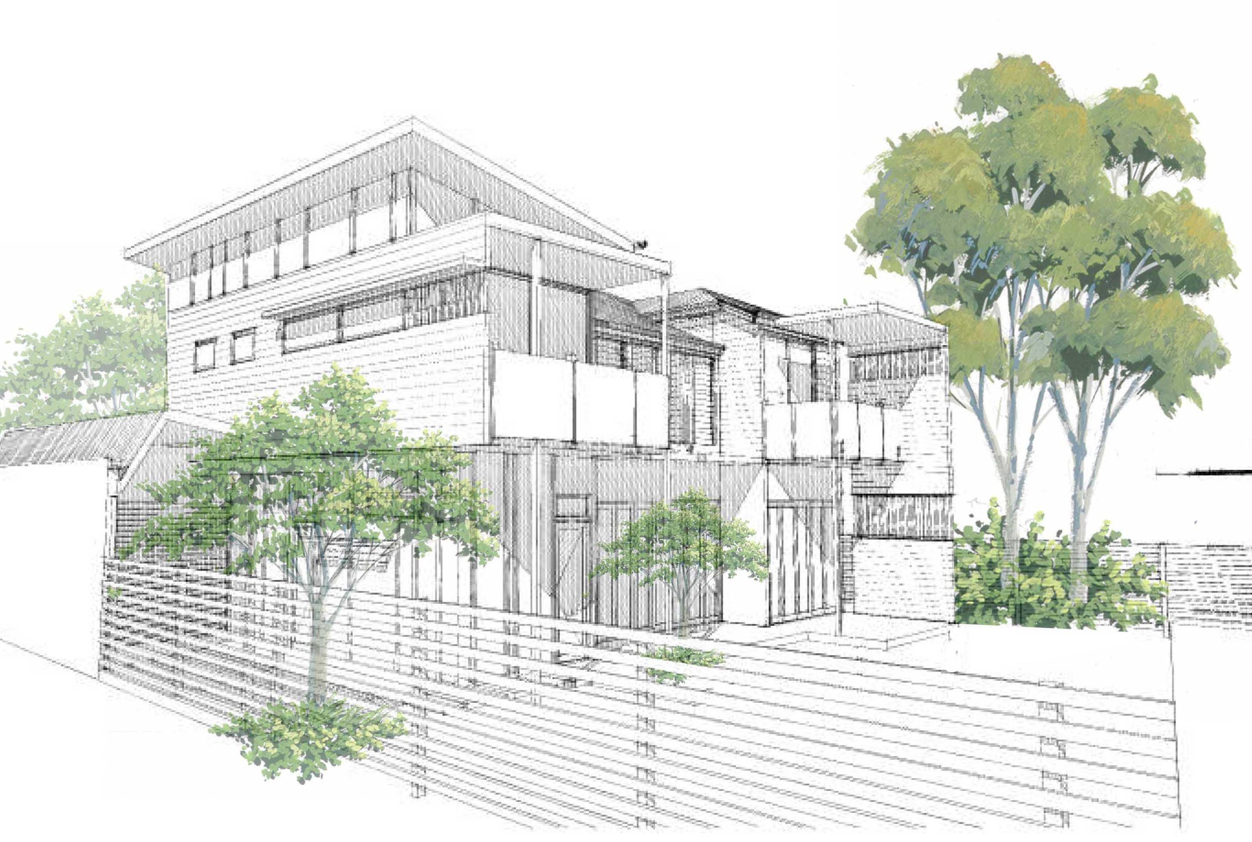
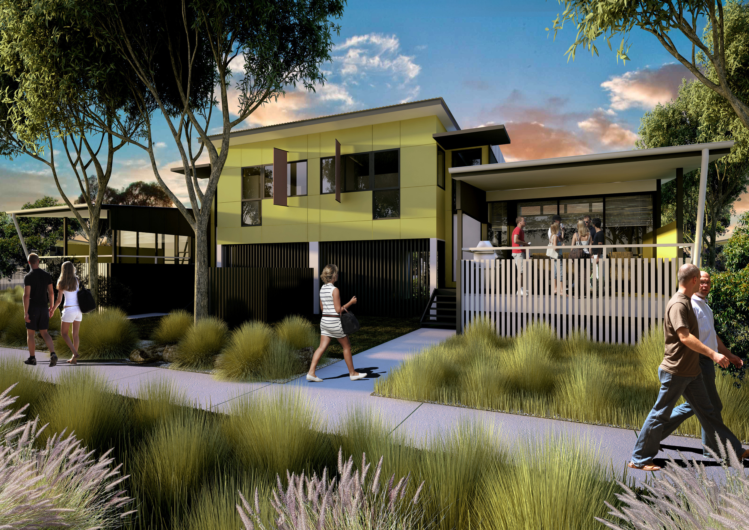
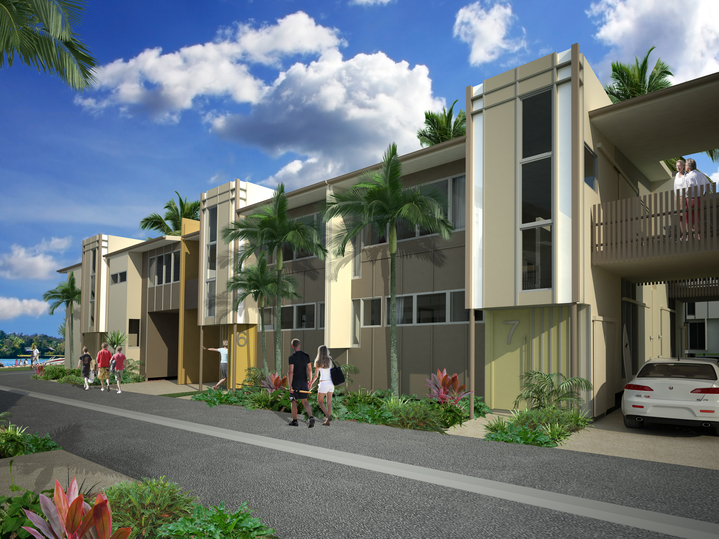
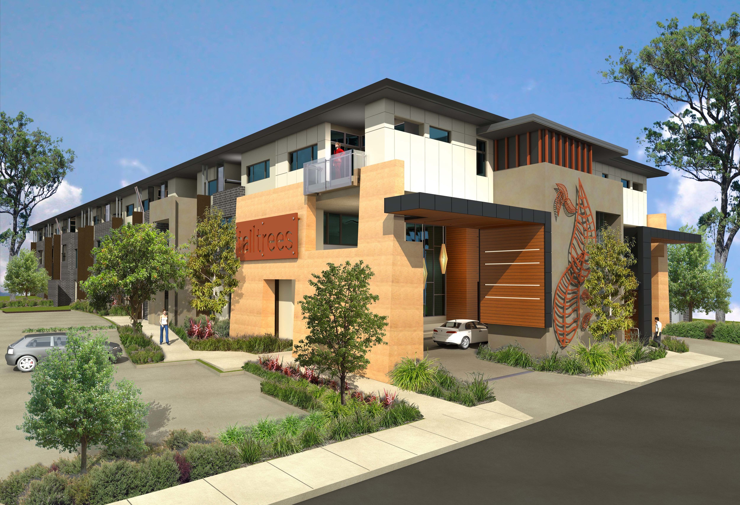
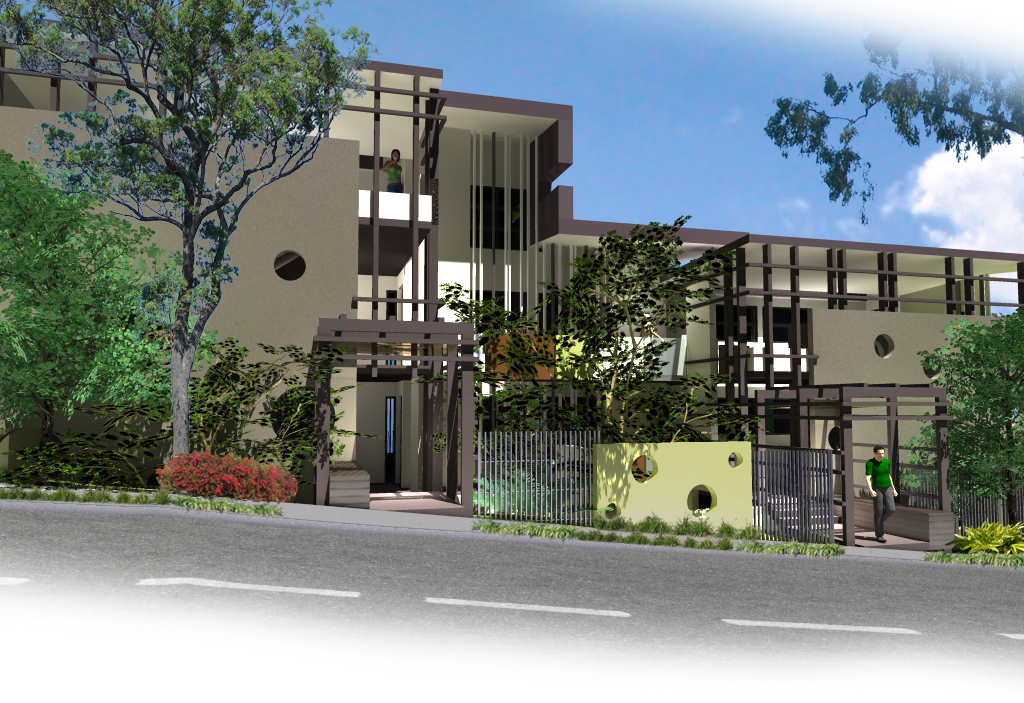
It is always a long journey from the initial concept to the final product, and unfortunately along the way a large number of projects are never realised. Below are images and sketches of a variety of residential and multi-residential projects on the drawing board, under construction or lost in the world of ideas.
detached dwellings and renovations
multi residential and mixed use
All images courtesy Lightwave International


