
on the board
the ideas
on the board
the ideas
on the board
The practice of architecture is one of longevity. The buildings themselves are usually intended to last a long time, but the process to get the buildings built is also a long and often complicated one. This page looks at works currently on the board and tracks the process of these projects.
The stages within the practice of architecture start well before construction. From the early briefing the original design is critical to ensure the success of the end product. How well does the concept suite the brief, the site, the budget, the aesthetic requirements and more are all vital for the next phases within the project. What happens with those concepts during the detail design, costings, and construction is an interesting journey that is often overlooked for the final glossy building image. This page aims to track the process to reveal the journey behind the building.
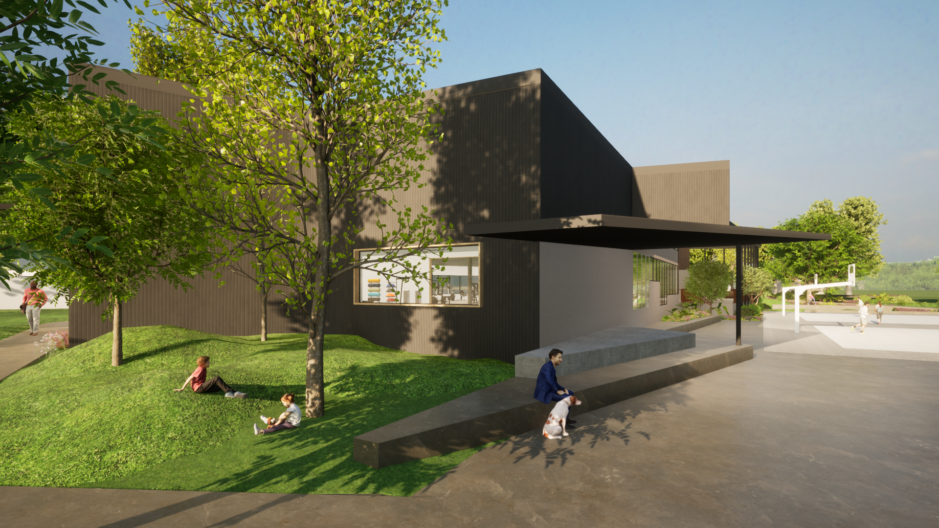
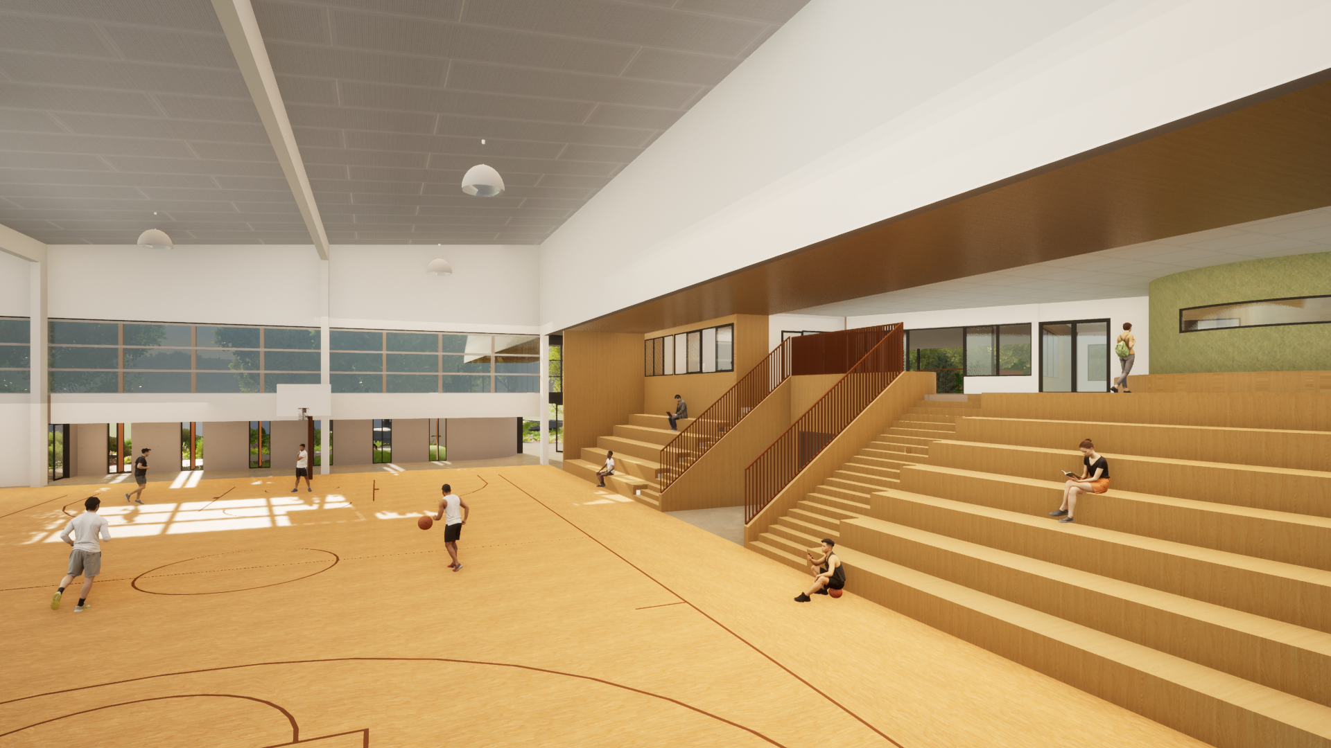
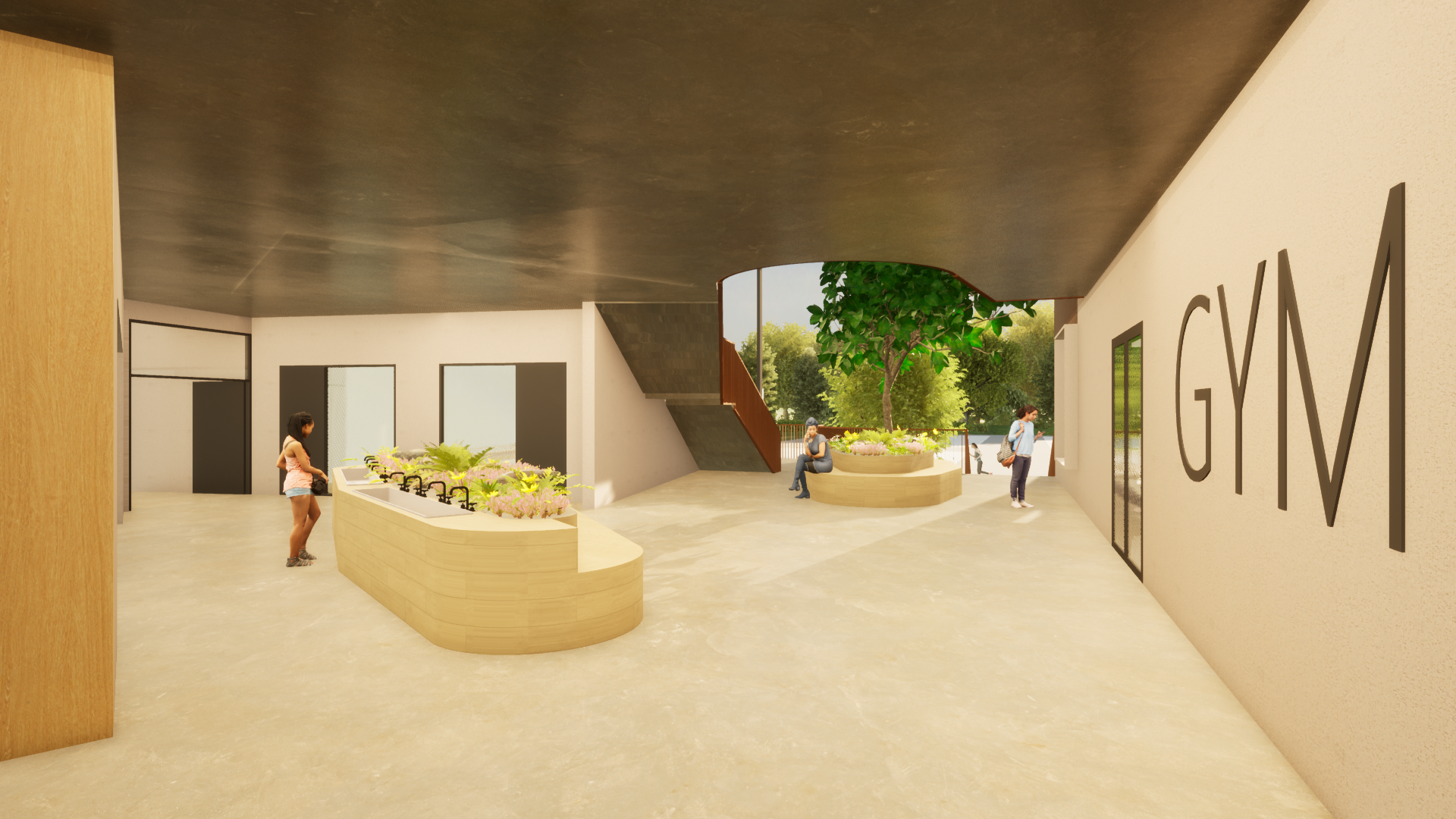
state high school, sports precinct
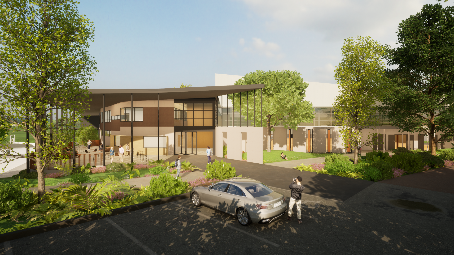
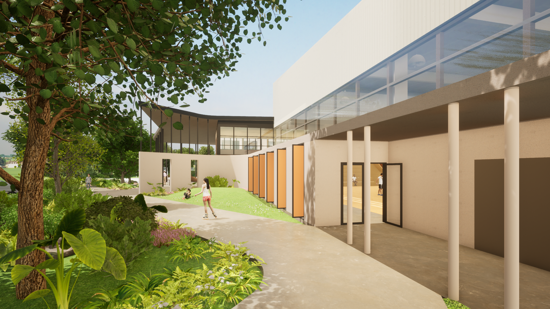
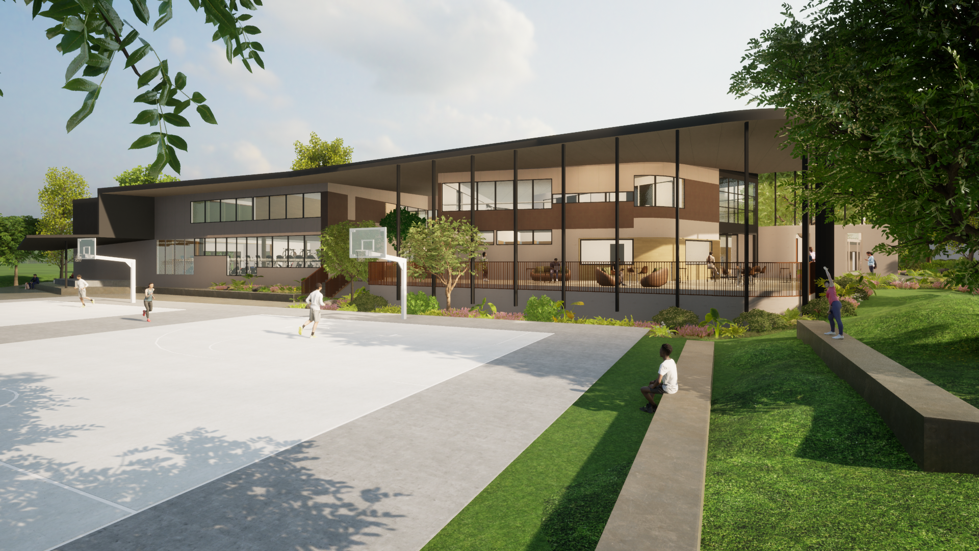
This new sports centre replaces an outdated multipurpose hall woth a competion grade facility inclduign, gym, aerobics, indoor training, bio lab, staff facilities and more. Adjoingi the existintg outdoor courts it alo provides public access and wet weather golf driving range.
miami state school
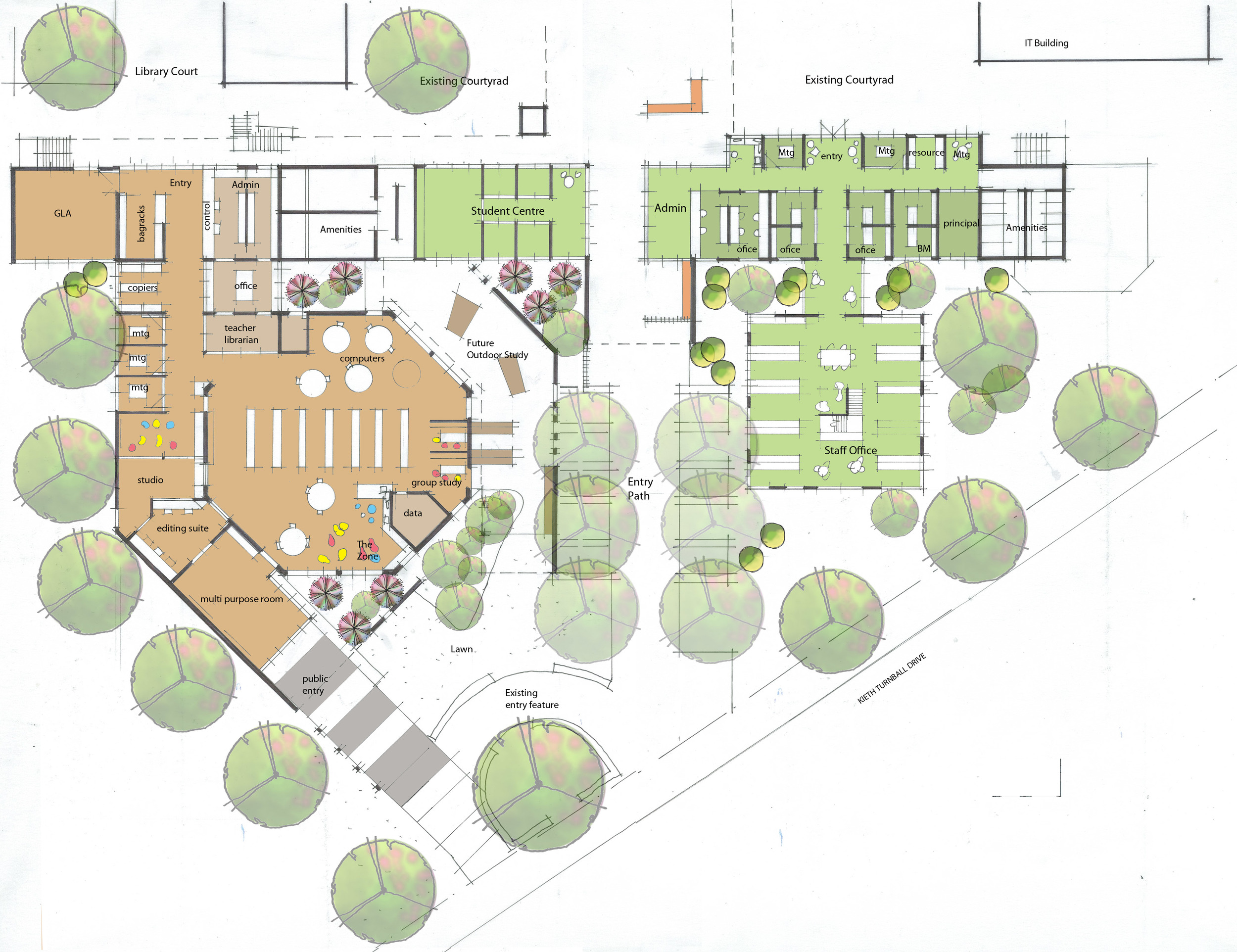
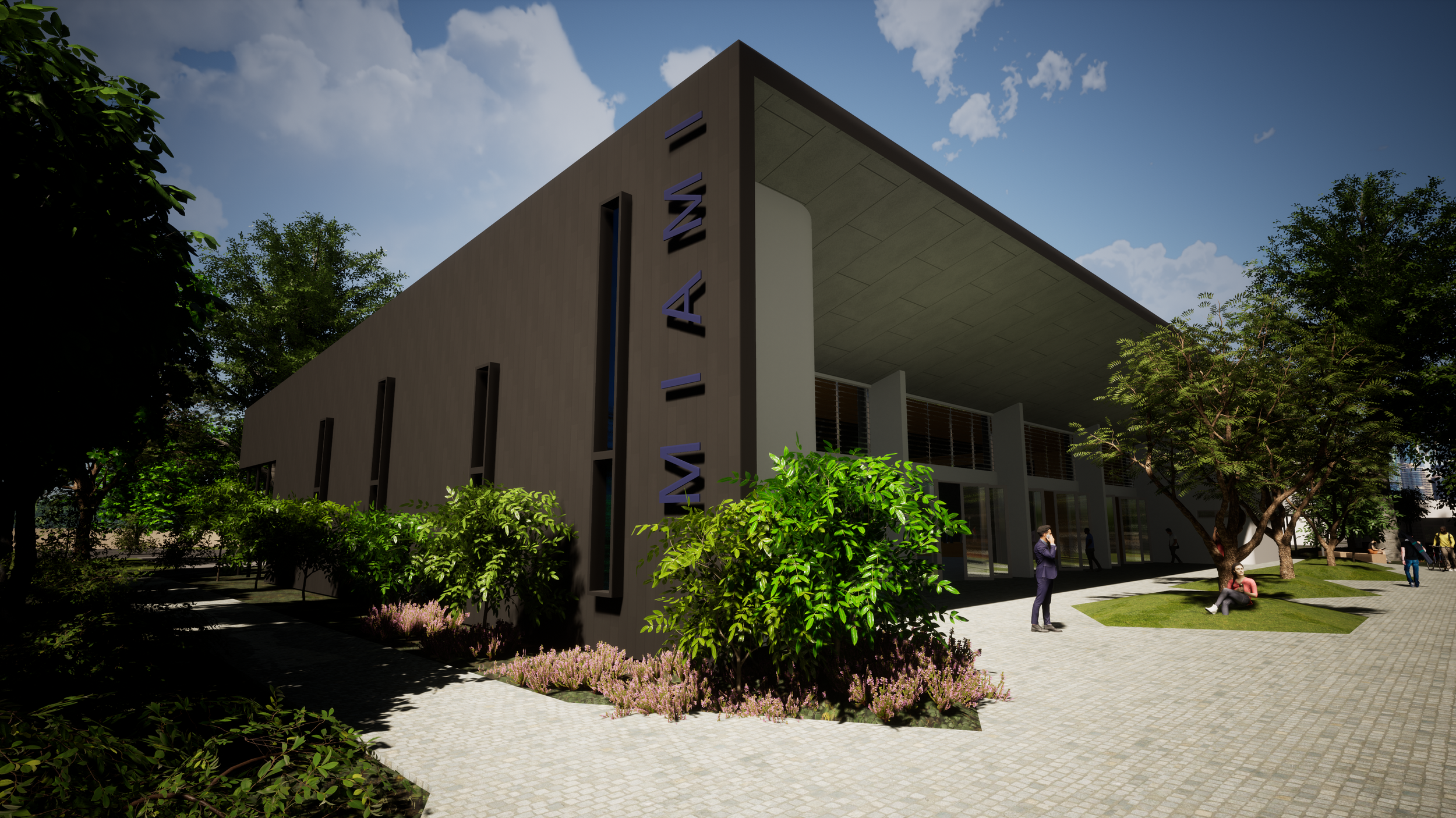
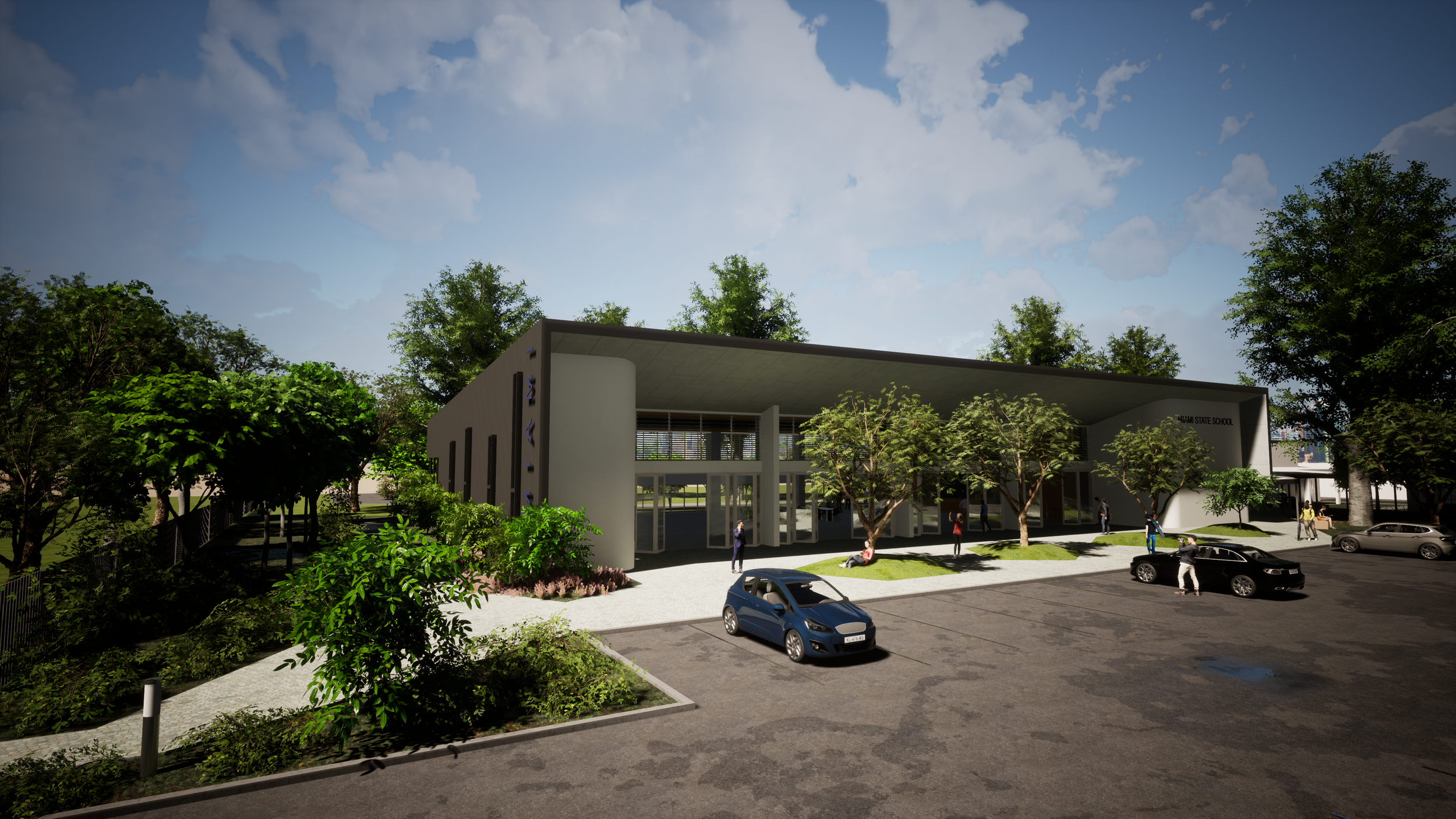
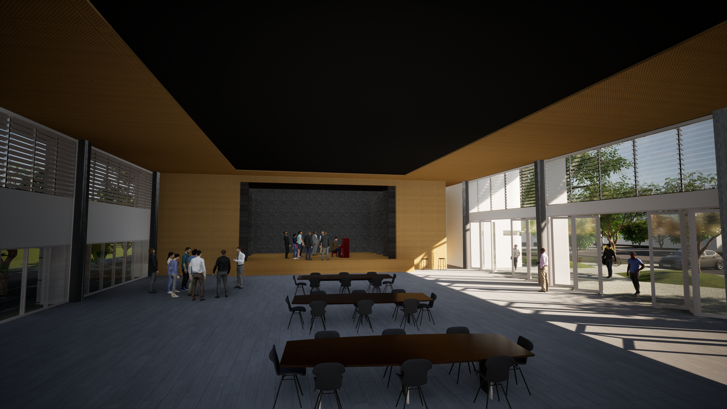
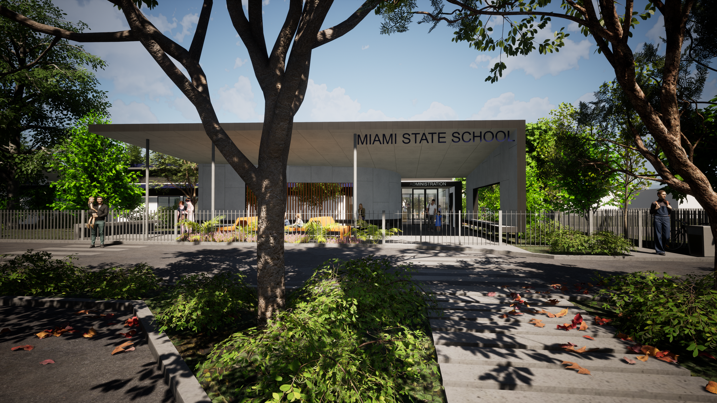
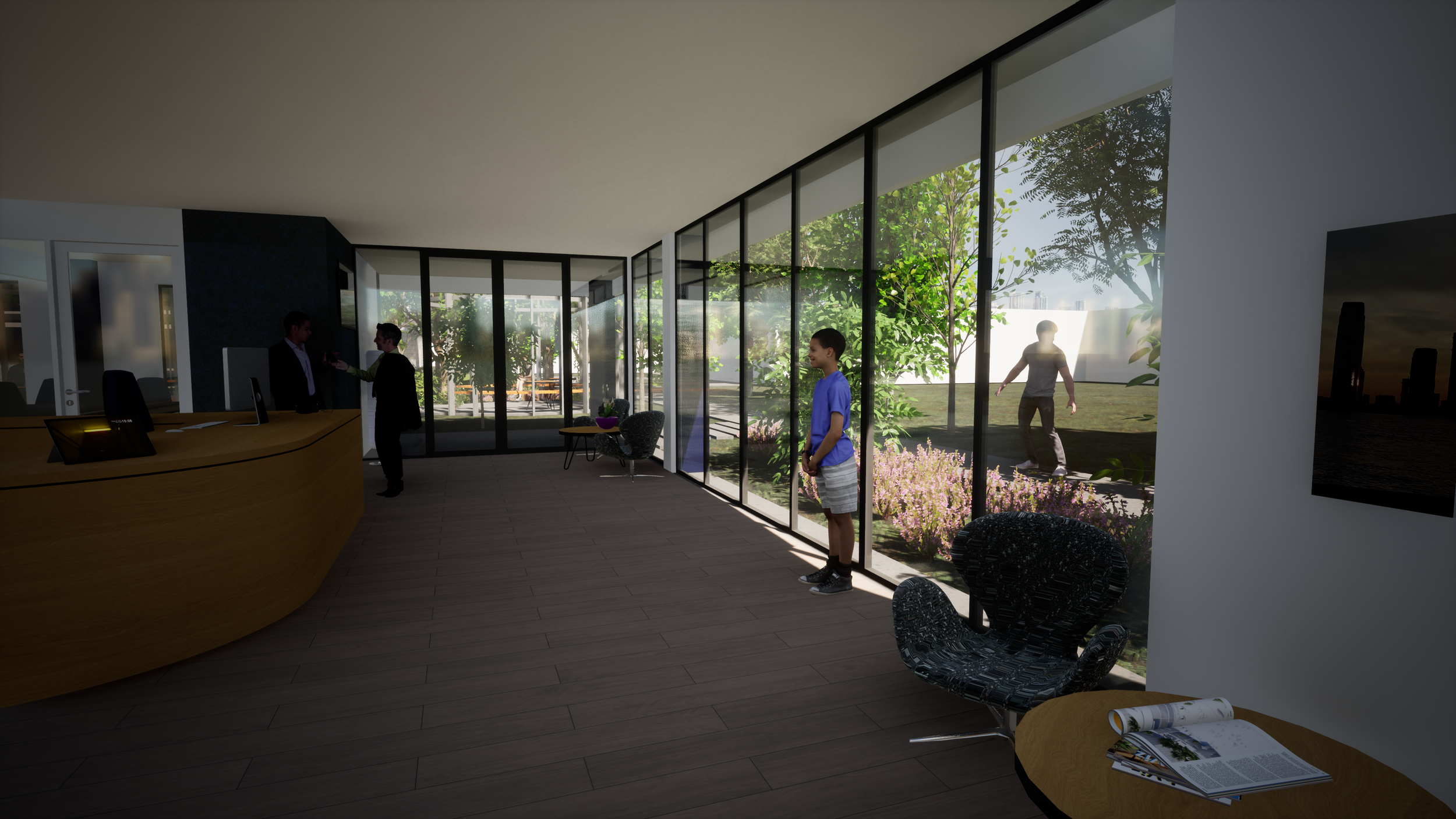
This extensive proposal looks at master planning the front of the school . The works utlise existing buildings to co-locate administration services with a new well defined entry. Student facilities are moved to a more centralised location also utlising existing buildings. A new performing arts hall flanks the neighbouring parklands as an extension to the existing smaller hall facility, now to be used as the green room, music rooms and OSCH.
the track
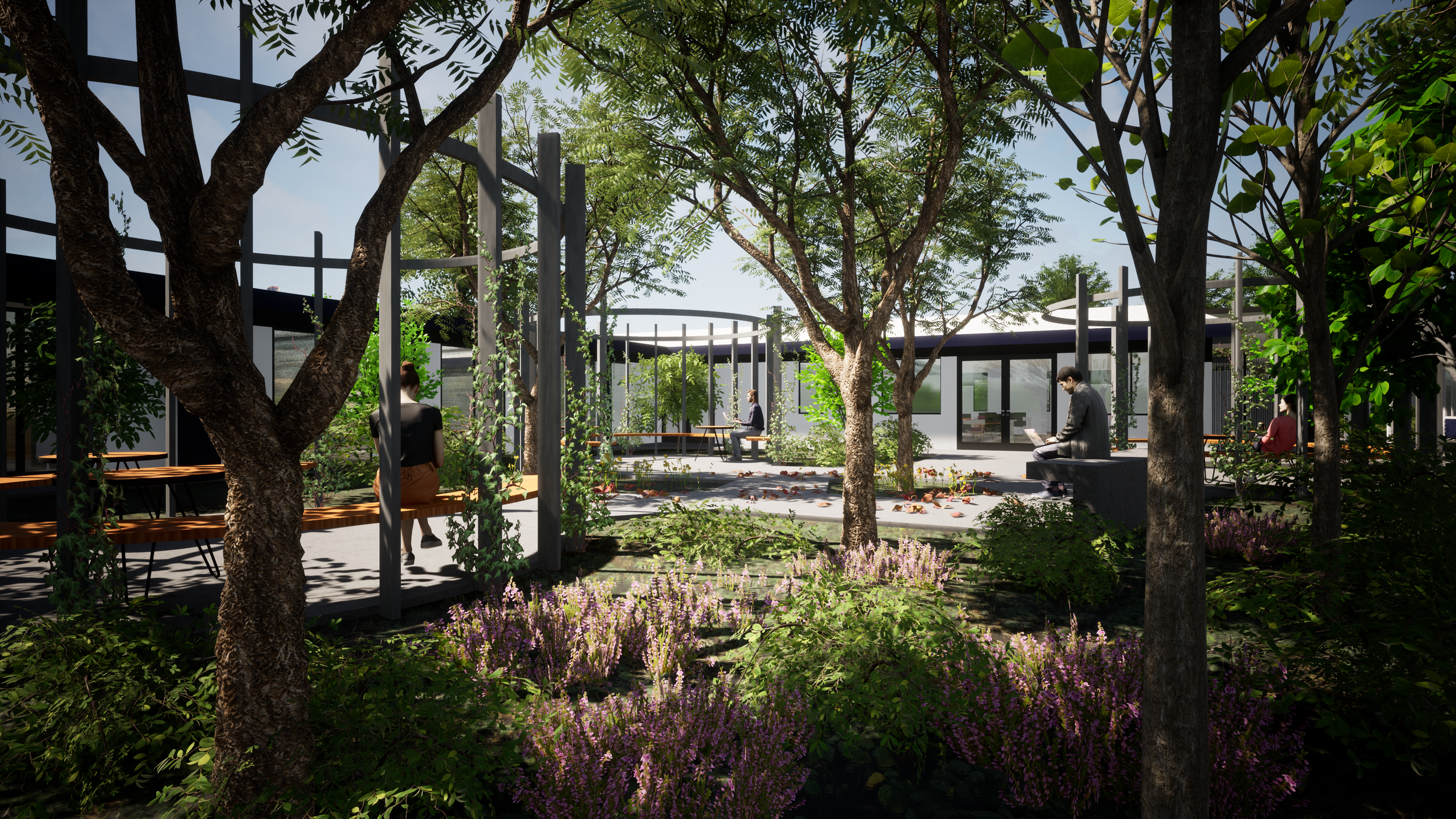
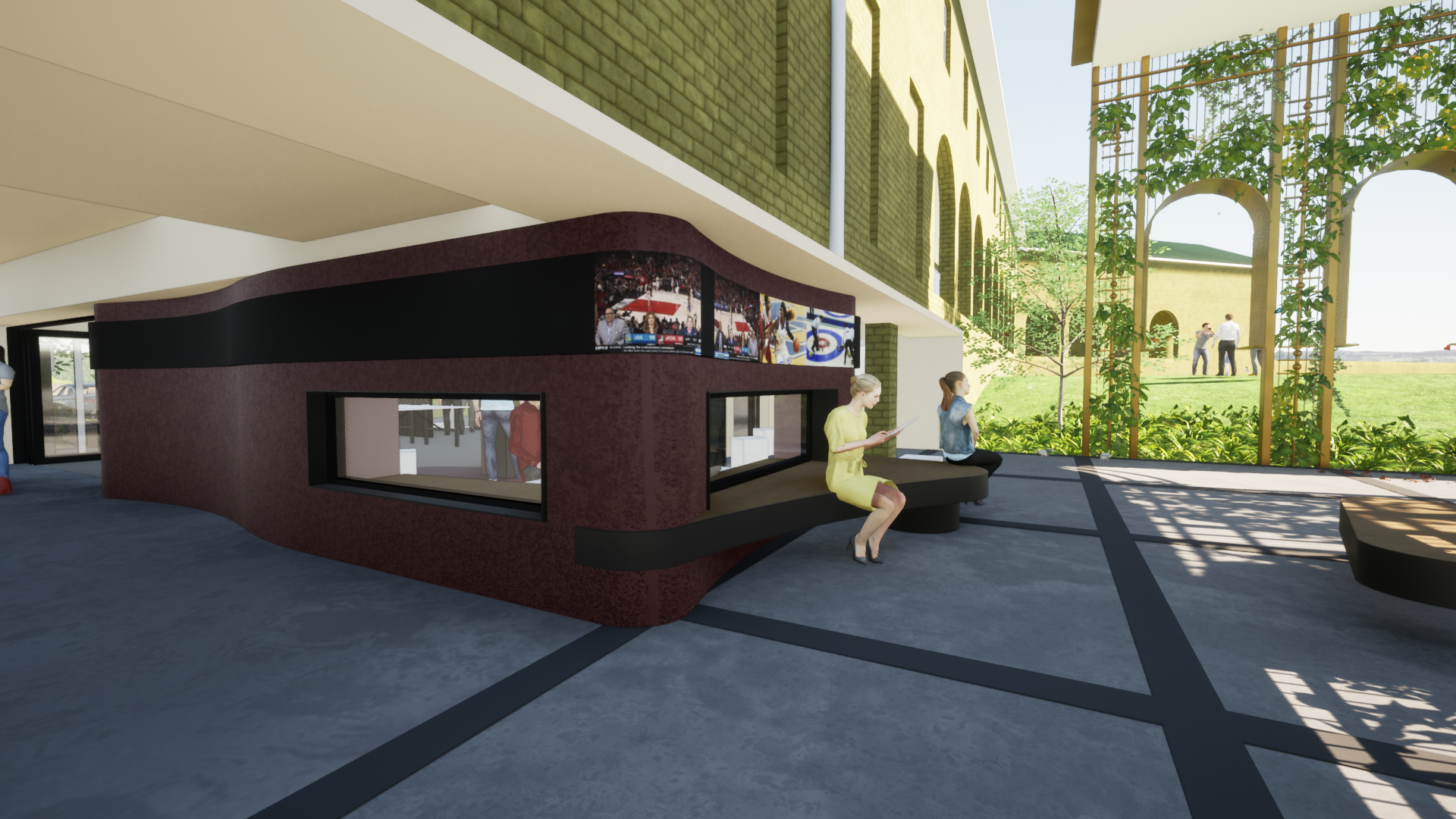
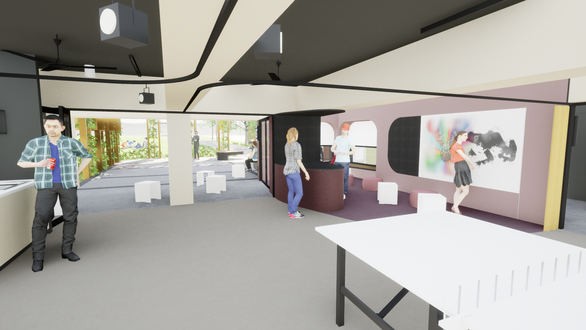
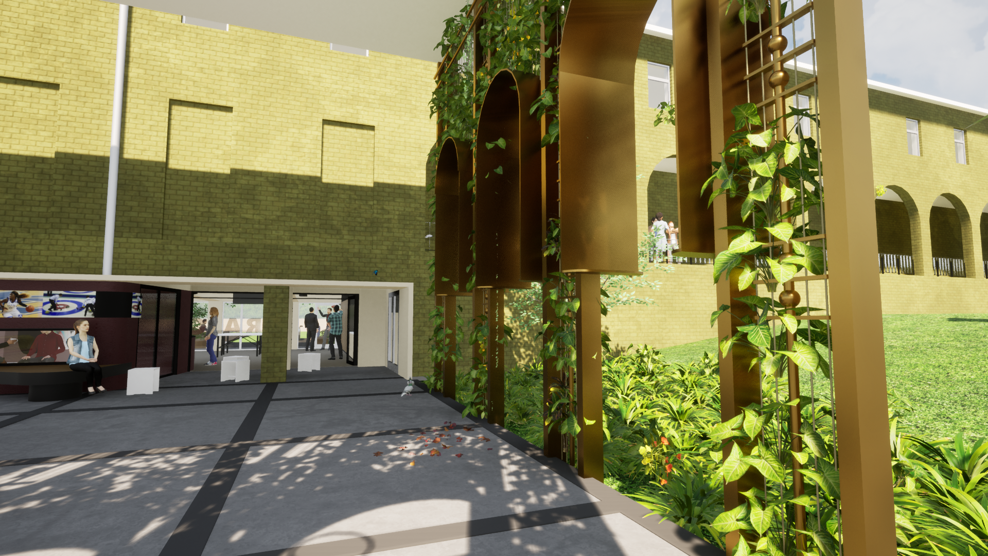
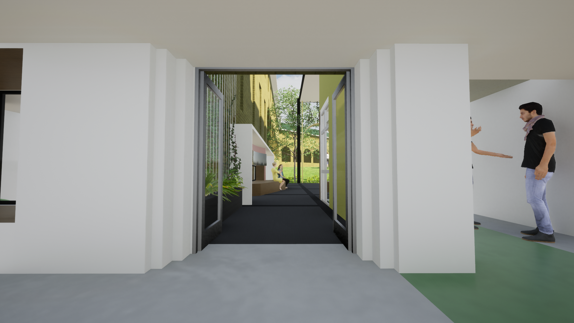
what is currently and undercroft, hidden bookstore and labyrinth of access routes is being turned into an active hub and a destination. A permeable and inviting node at the corssroads between courtyards and buildings. The track is to provide an interface between on campass and extra cirricular sporting clubs, a spirutual destination through yoga and meditiation, and general student hang out space.
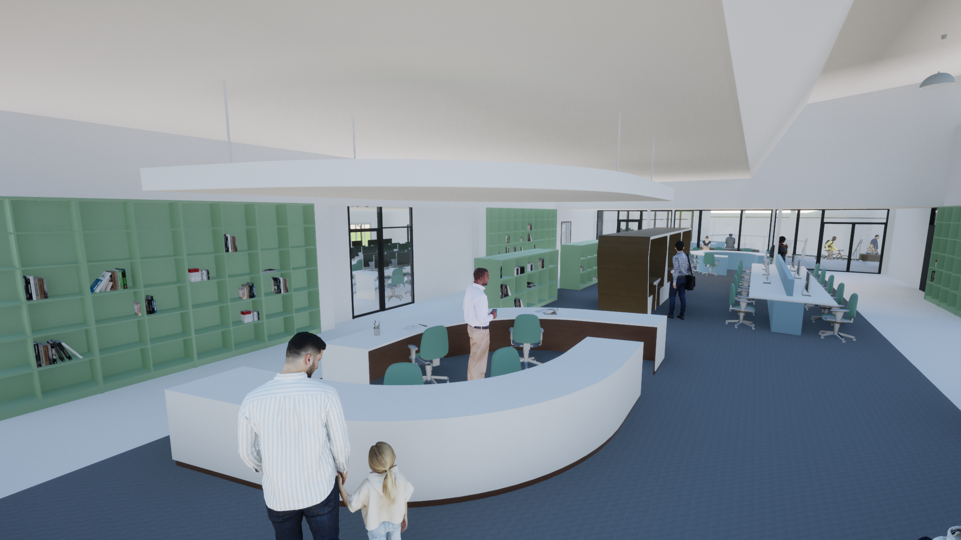
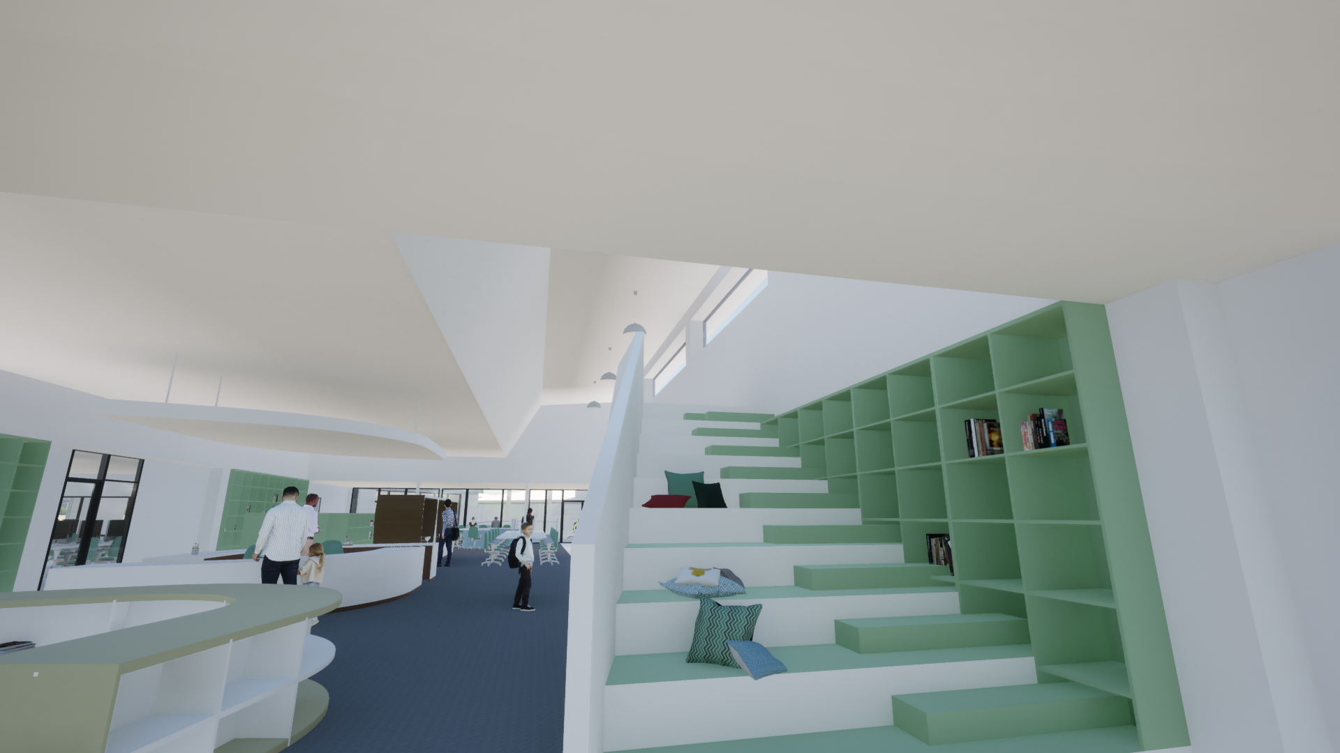
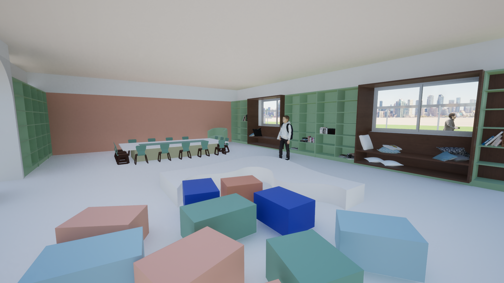
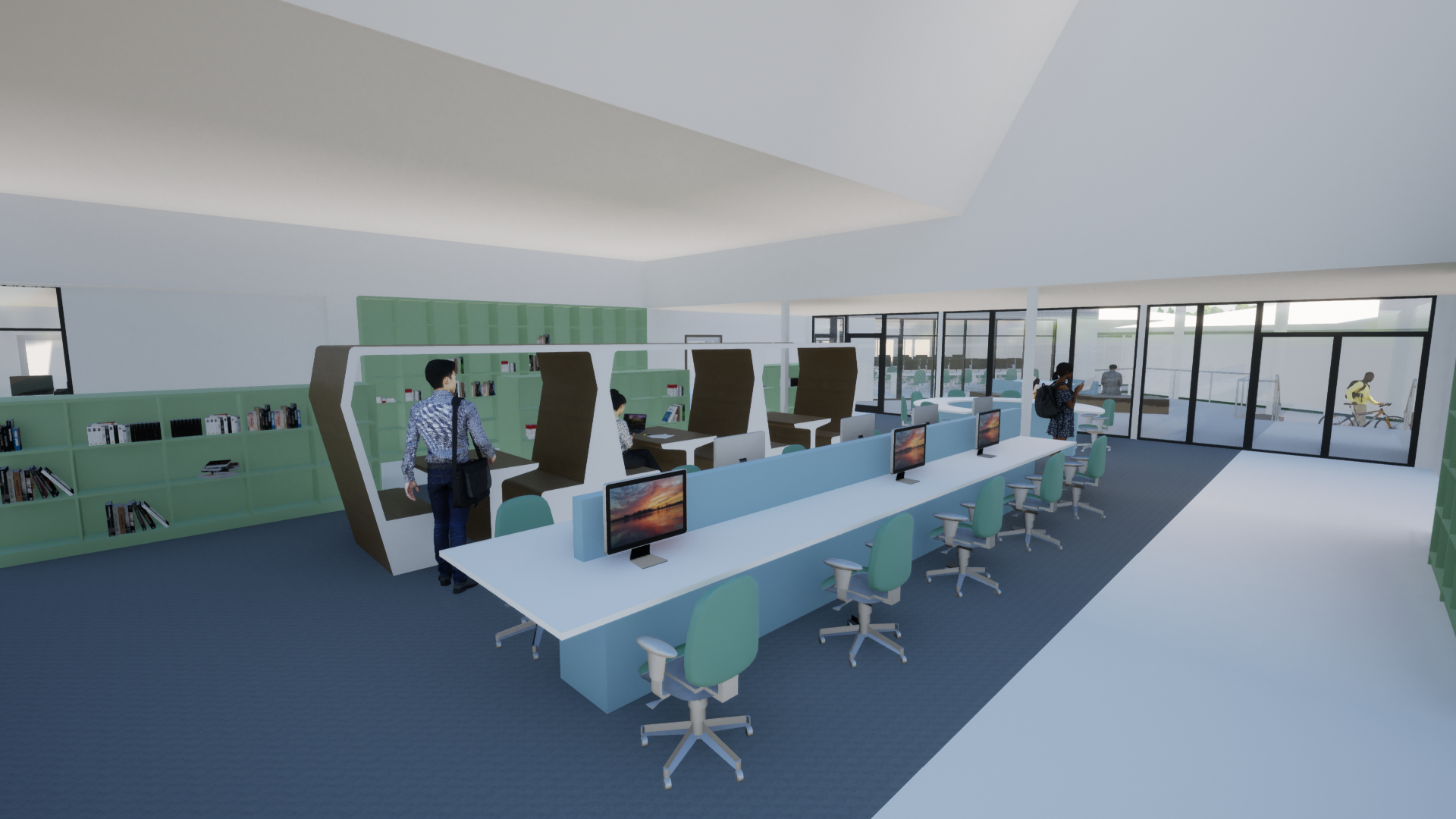
Upper Coomera SC Library Refurbishment
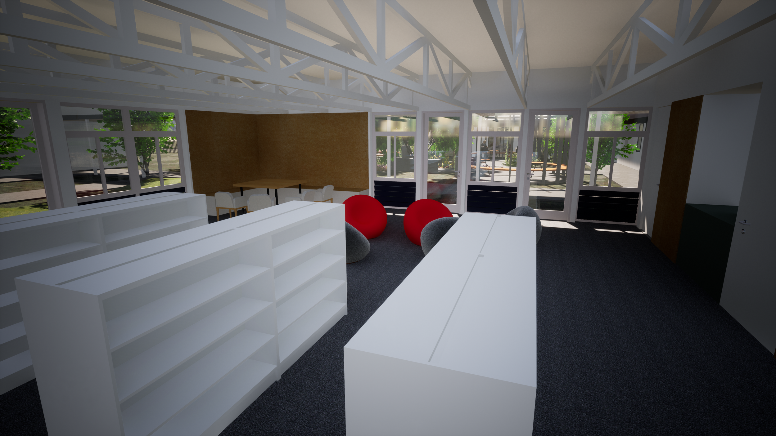
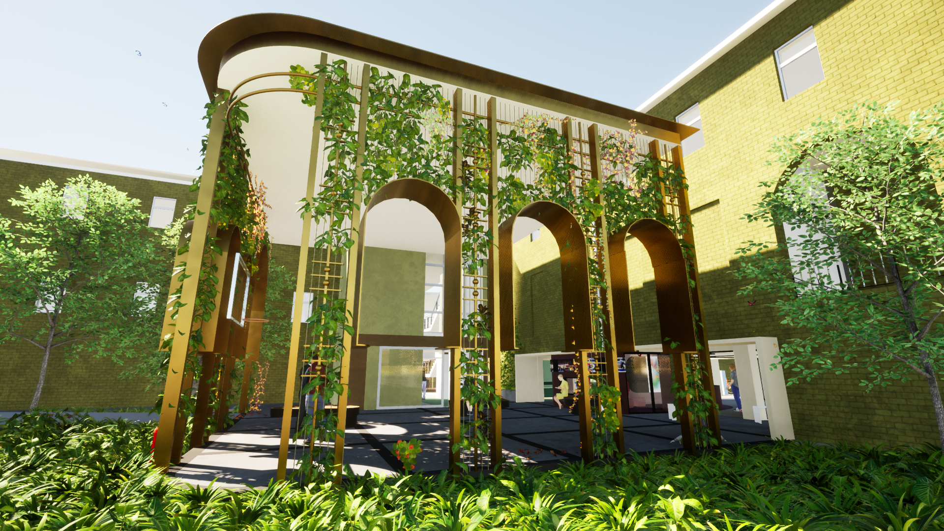
This concept for a complete refurbishment and extension to the existing Library aims to provide seperate entries for the juniour and senior schools while utilising the same checkout desk. The existing high ceiling provides a great opportunitiy to take extend vertically for a playfull layering of levels.
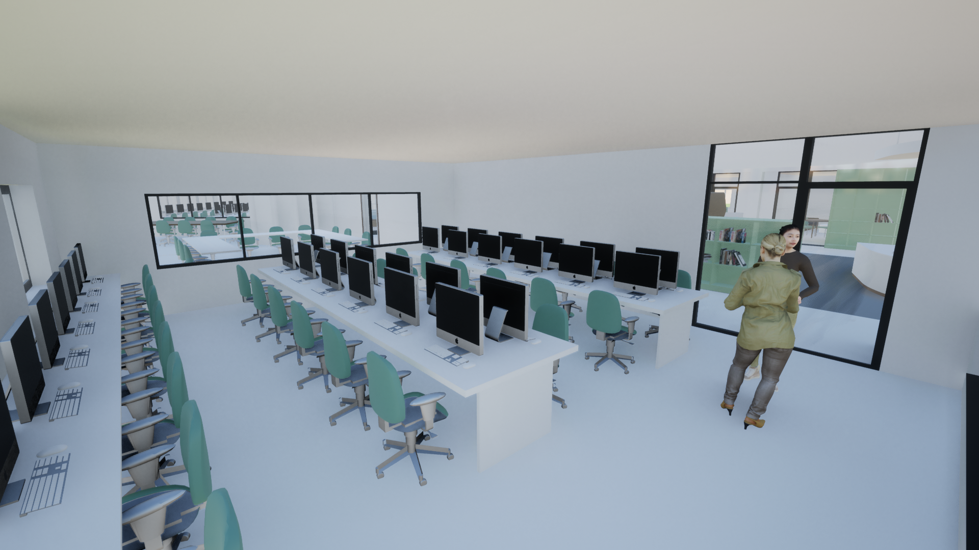
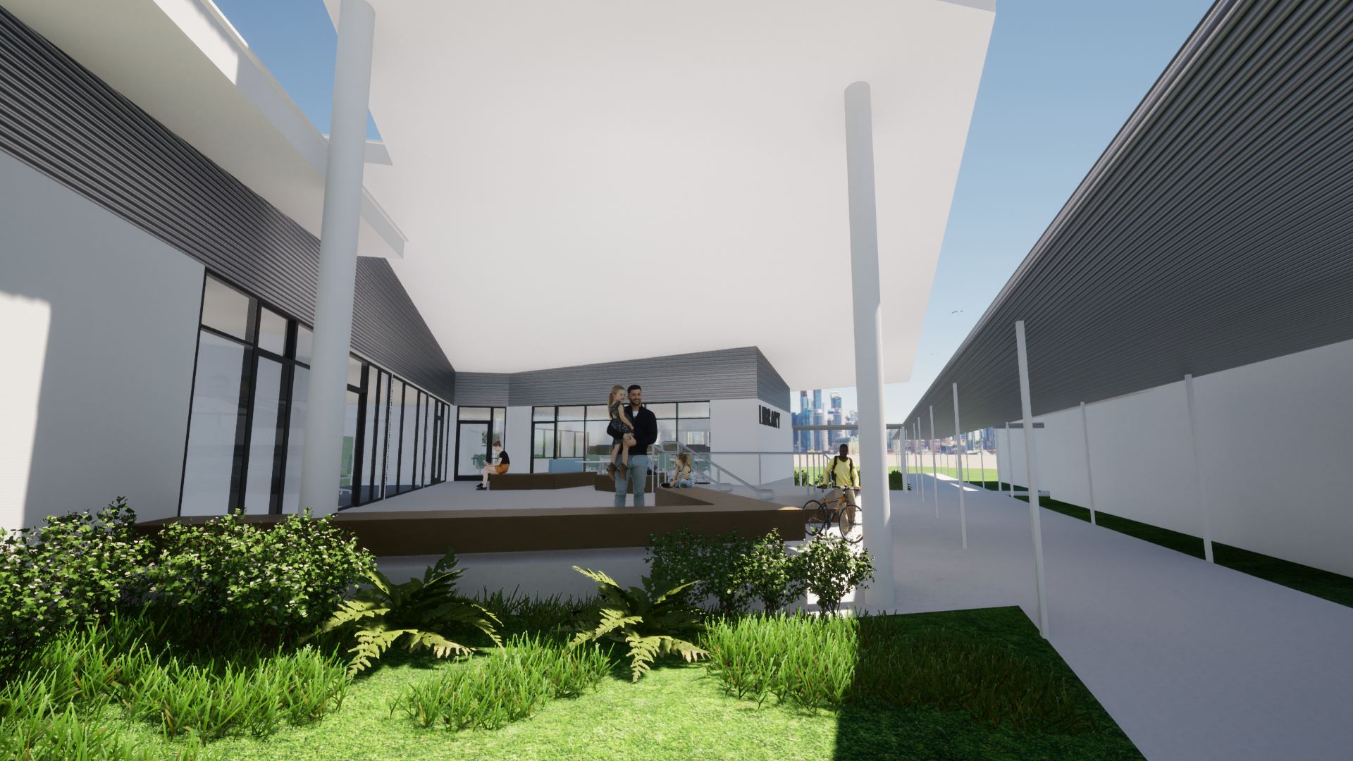
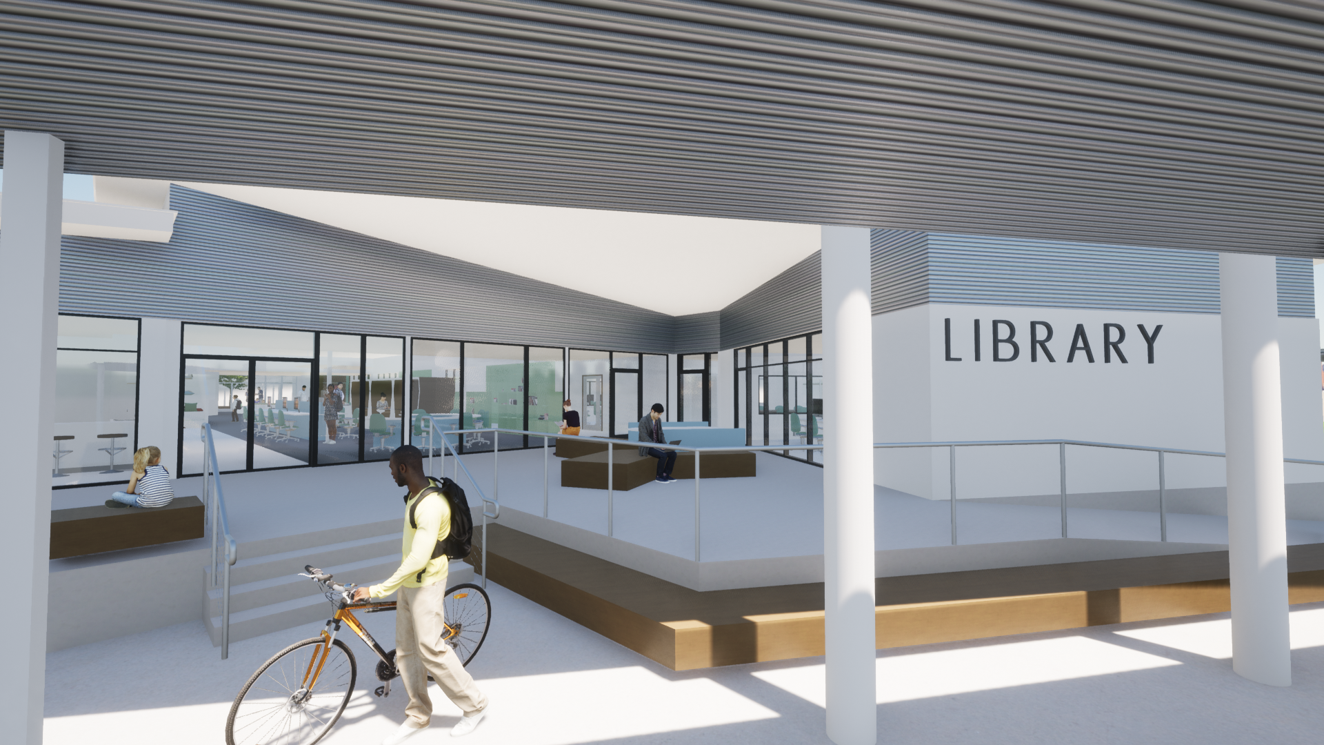
kingston SHS Administration Refrubishment
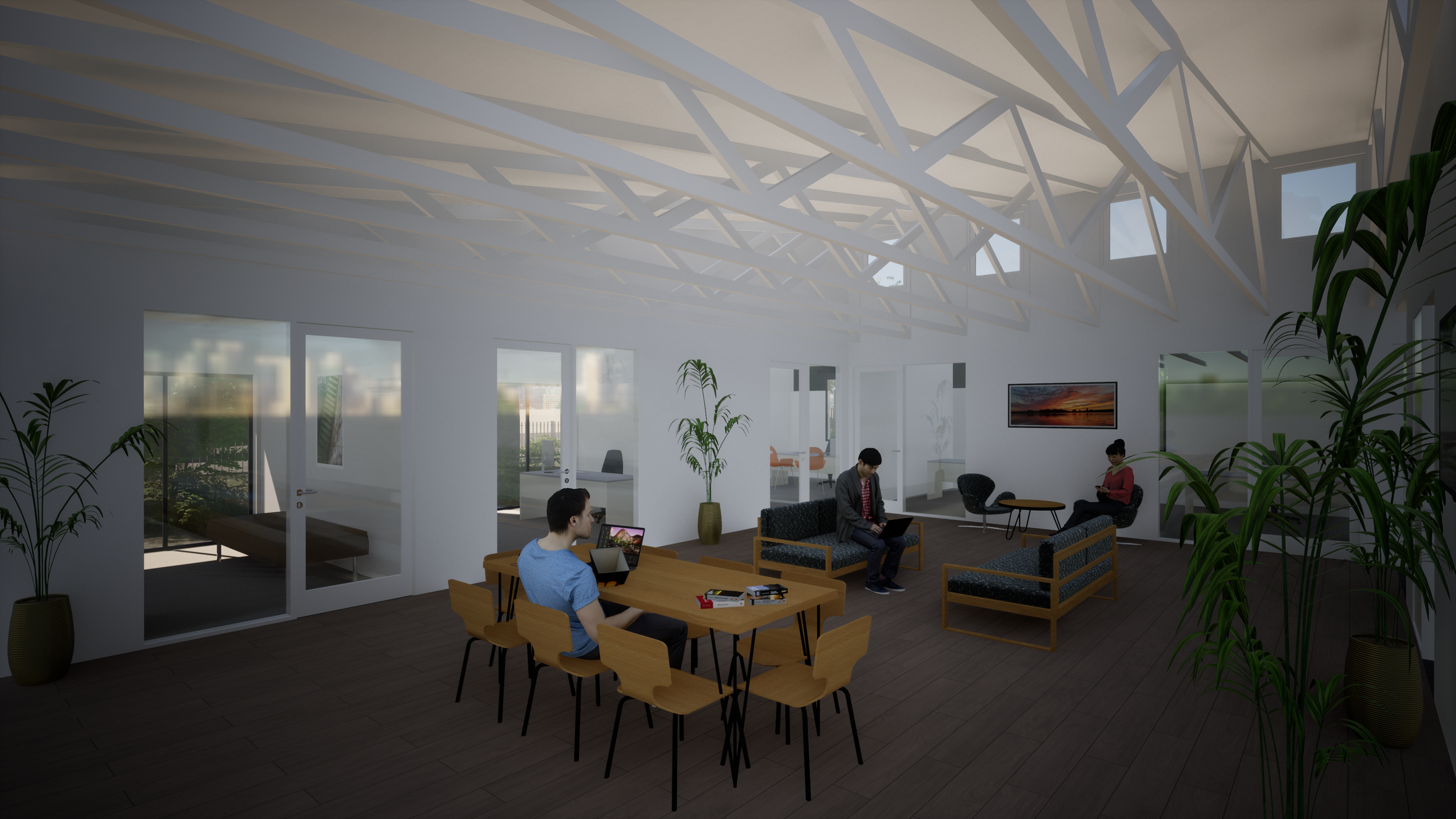
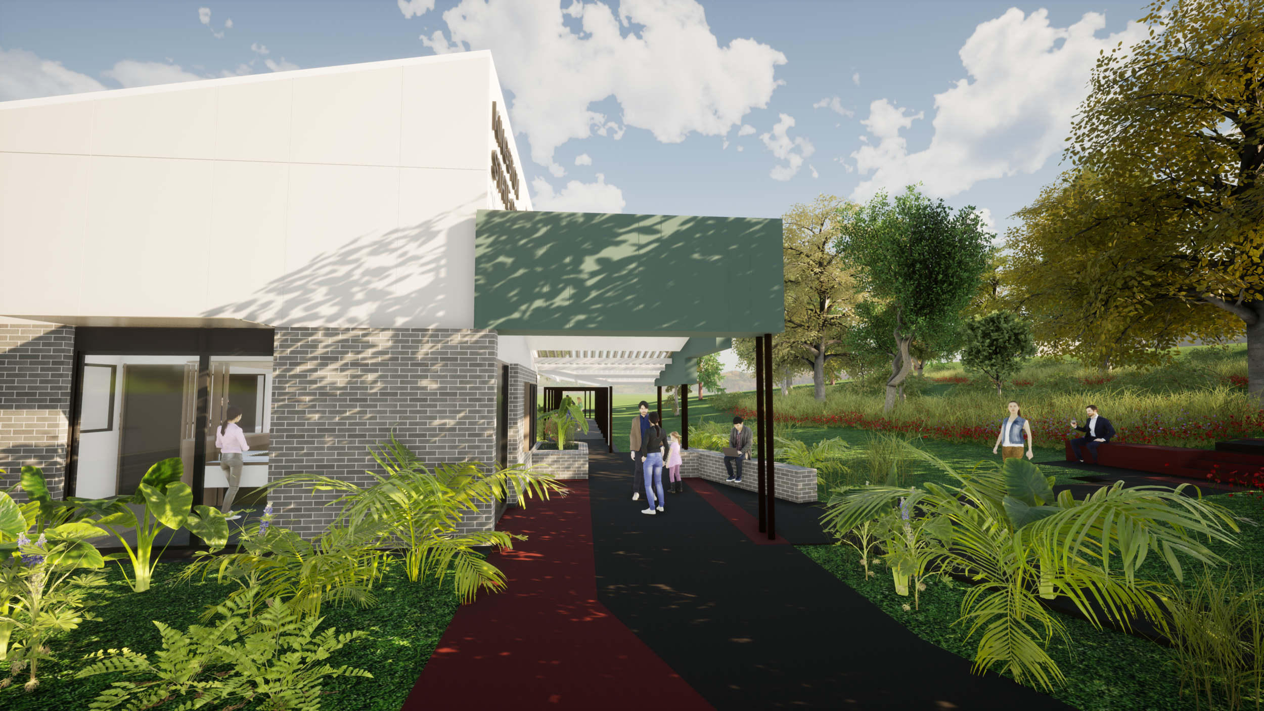
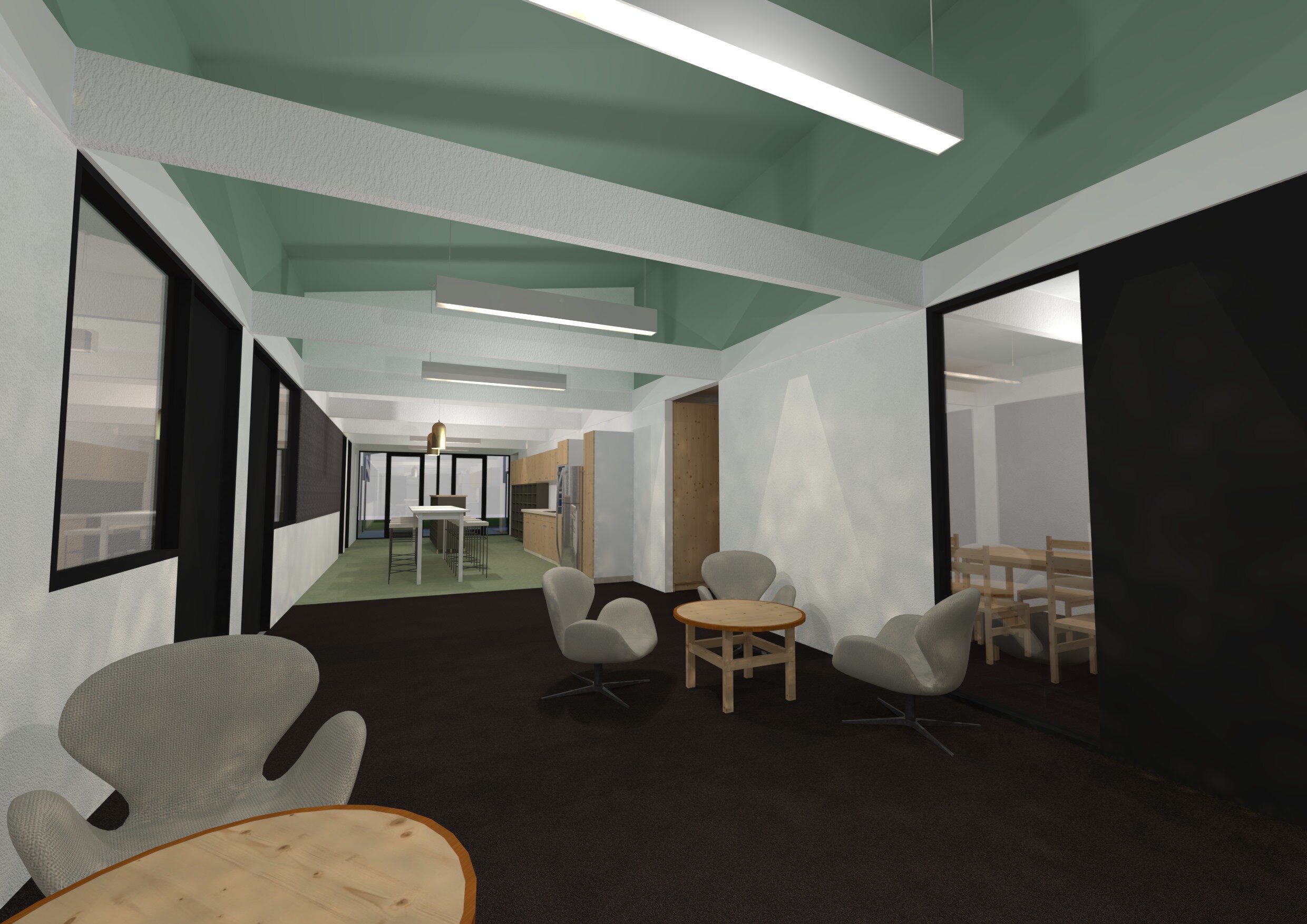
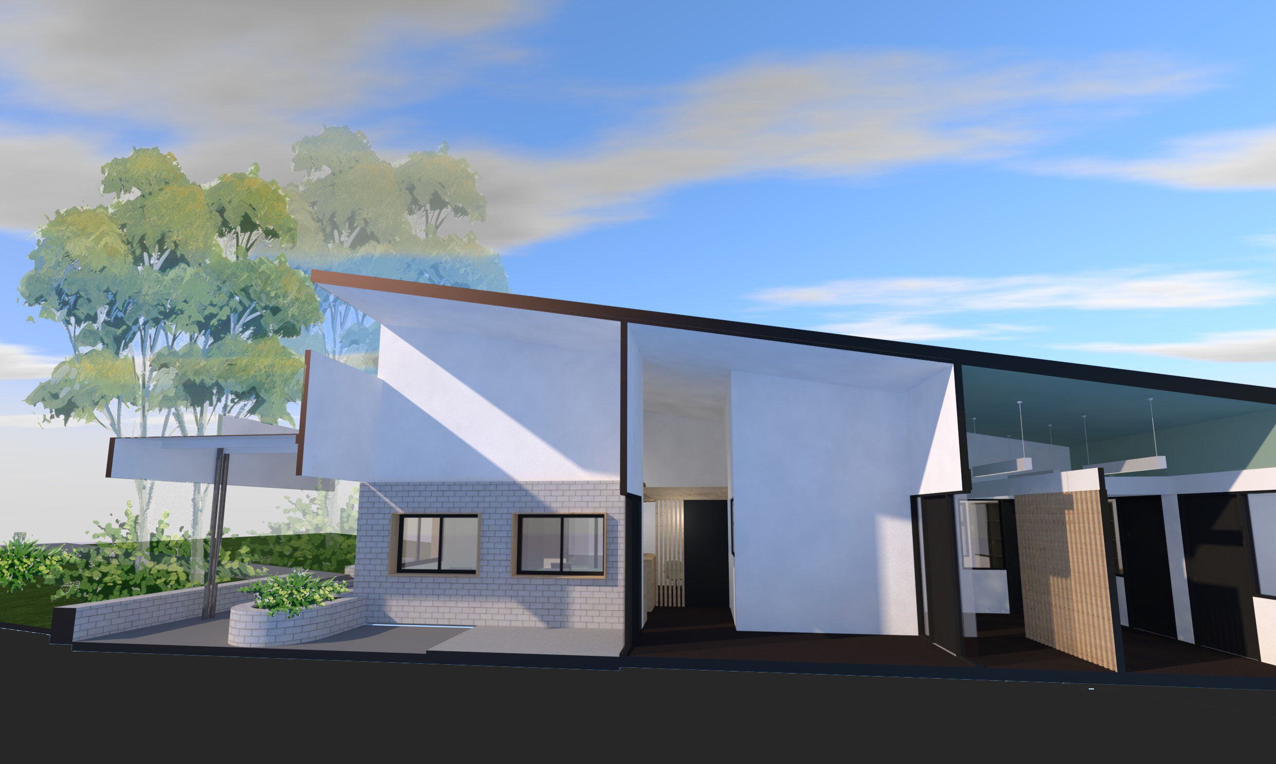
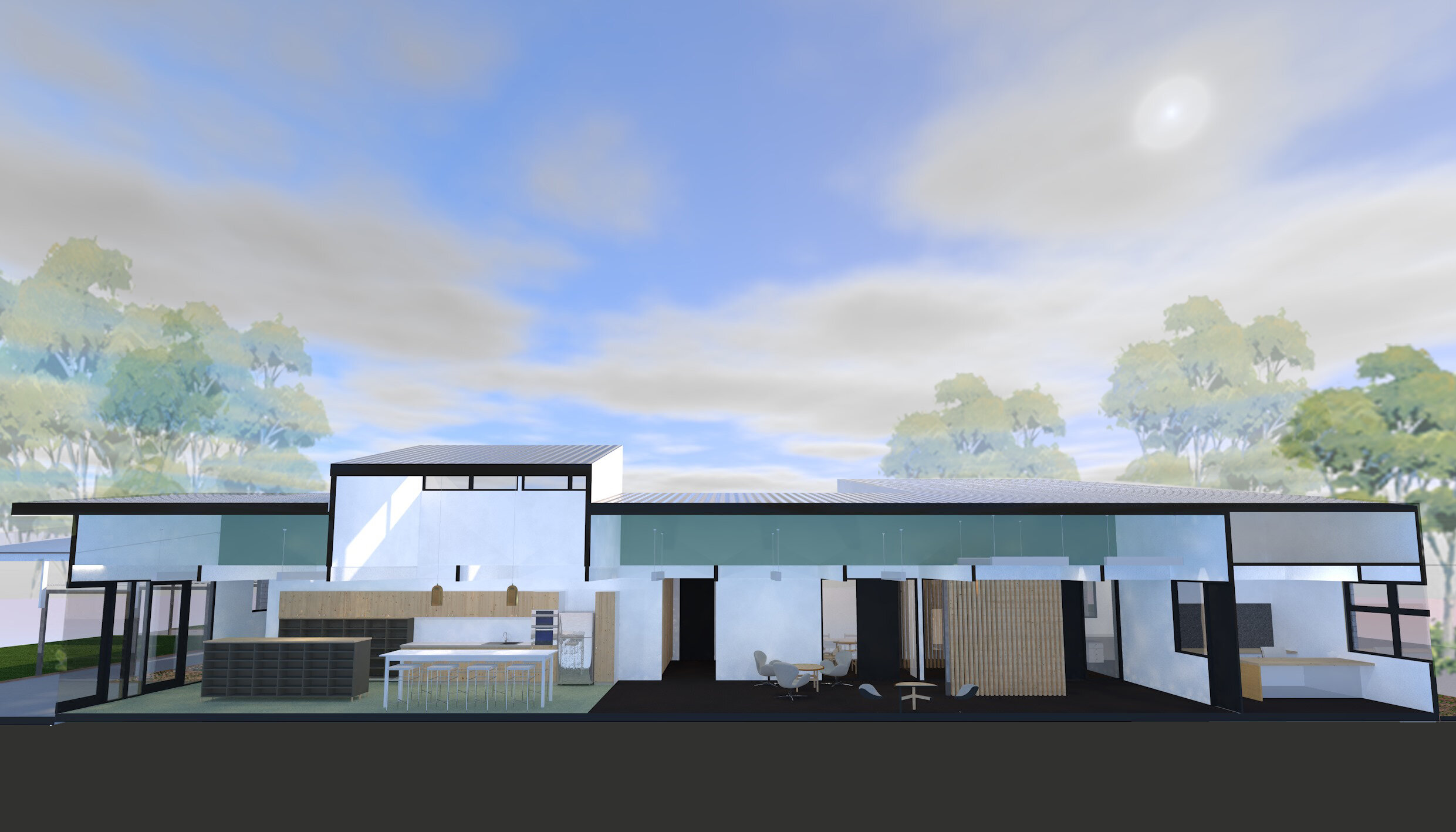
This extensive refurbishment re-uses the slab, columns and beams of an existing 70’s building and brings back a little mid centuray magic to this administration building. The existing deep floor plate flanked by covered walkways has required some clever use of high level windows, translucent roof sheeting and activate (common use) hallways space to maintain light and ventilation throughout all habitable spaces. Creating a clear marker deep into the site and enhancing the nicely treed aspect of the site.
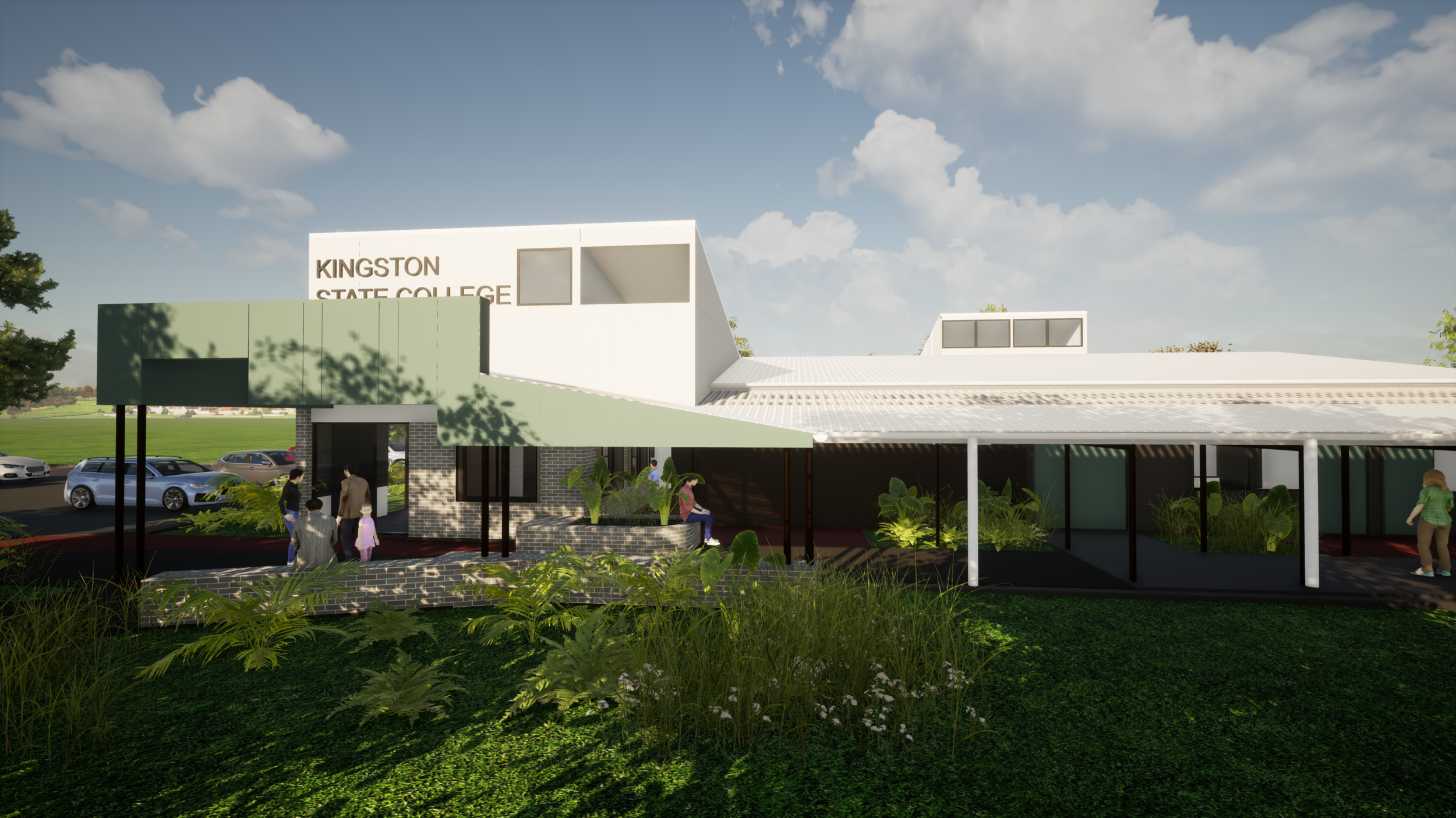
front of school upgrade
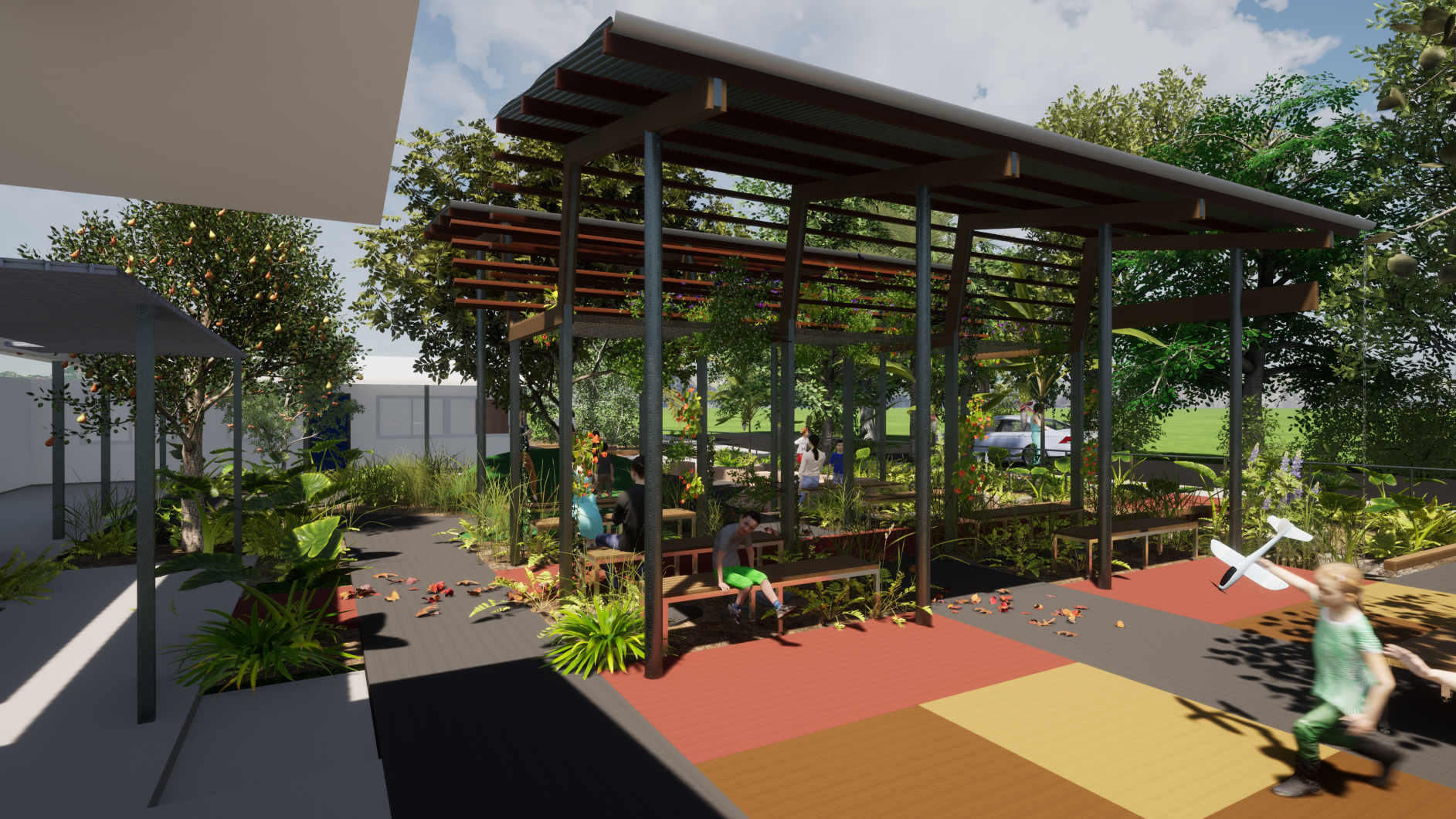
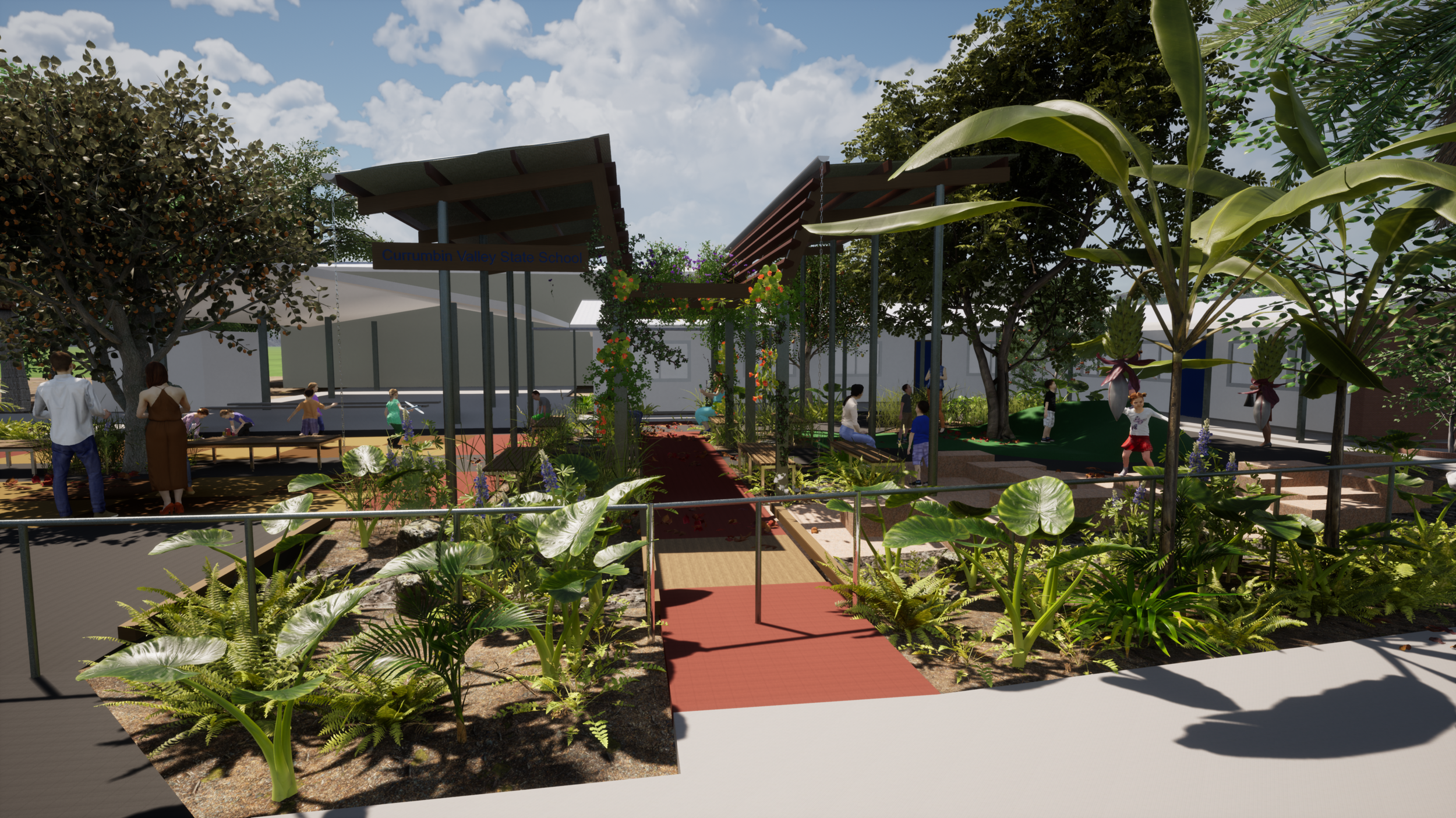
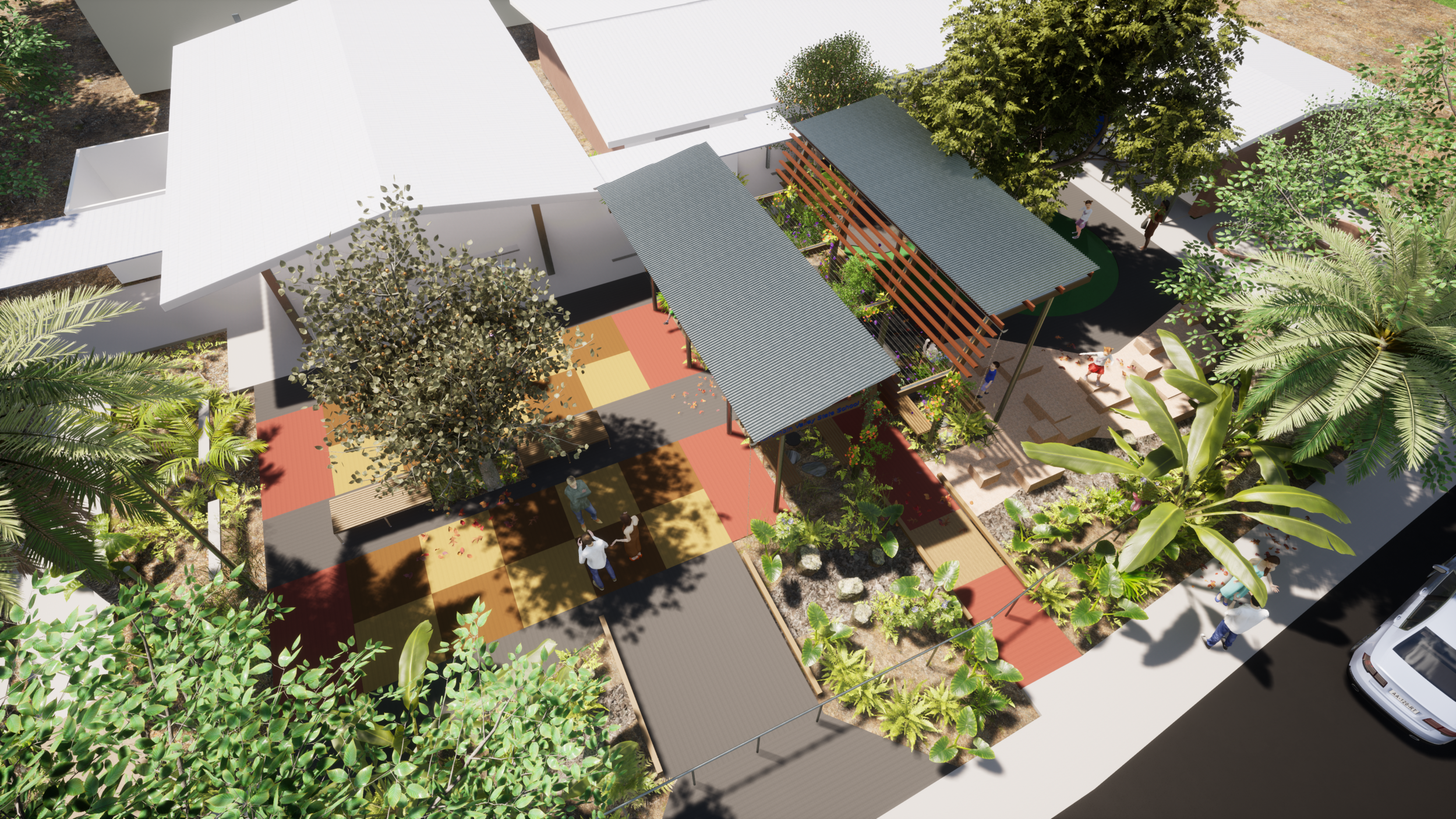
Sometimes a small project can make a big impact. What is currently a barren expanse of bitumen will soon become a multipurpose, lush and exciting entry zone for this little school. From the valley to the ally - the central roof provides much needed shade while also flanking 2 distinct spaces. An organic path with nature play and outdoor learning around a soft fall embankment and the 'town square' with handball sized concrete colour square.
Bushfire Recovery
The Qld fires of 2019 were devestating and close to home. We were lucky to avoid them but others within our communtiy were not. We have been privalaged to help our neighbours and friends rebuild their lives and look forward to seeing these homes teaming with life soon.
The Qld fires of 2019 were devestating and close to home. We were lucky to avoid them but others within our communtiy were not. We have been privalaged to help our neighbours and friends rebuild their lives and look forward to seeing these homes teaming with life soon.

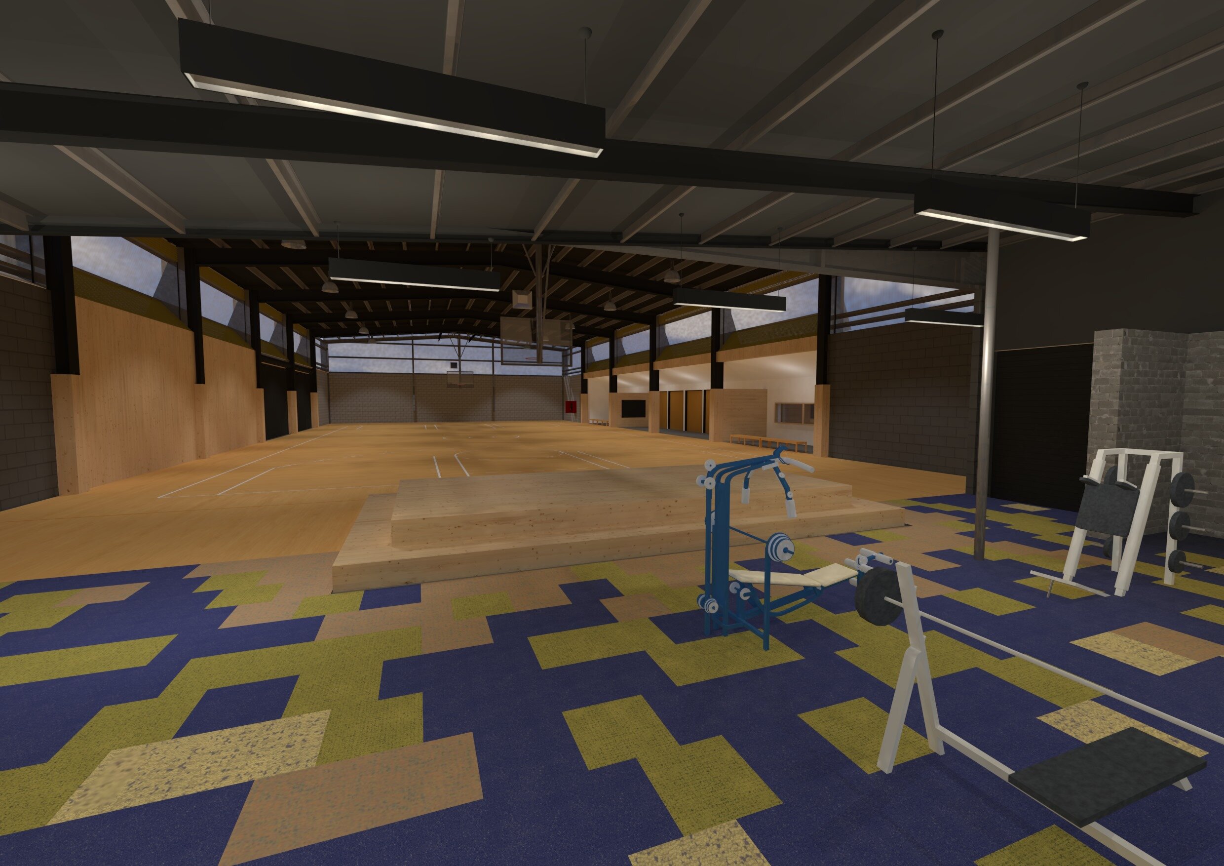
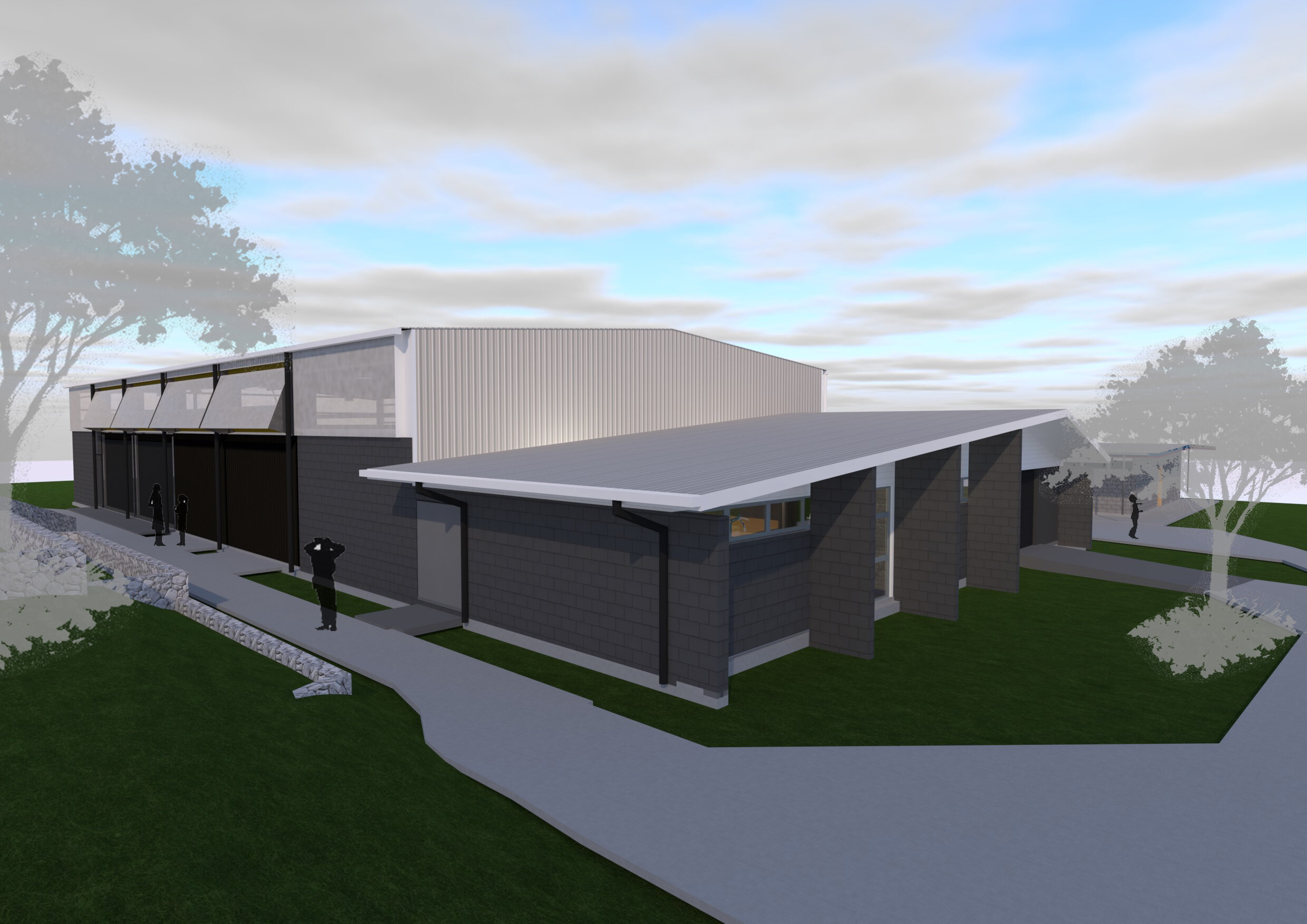
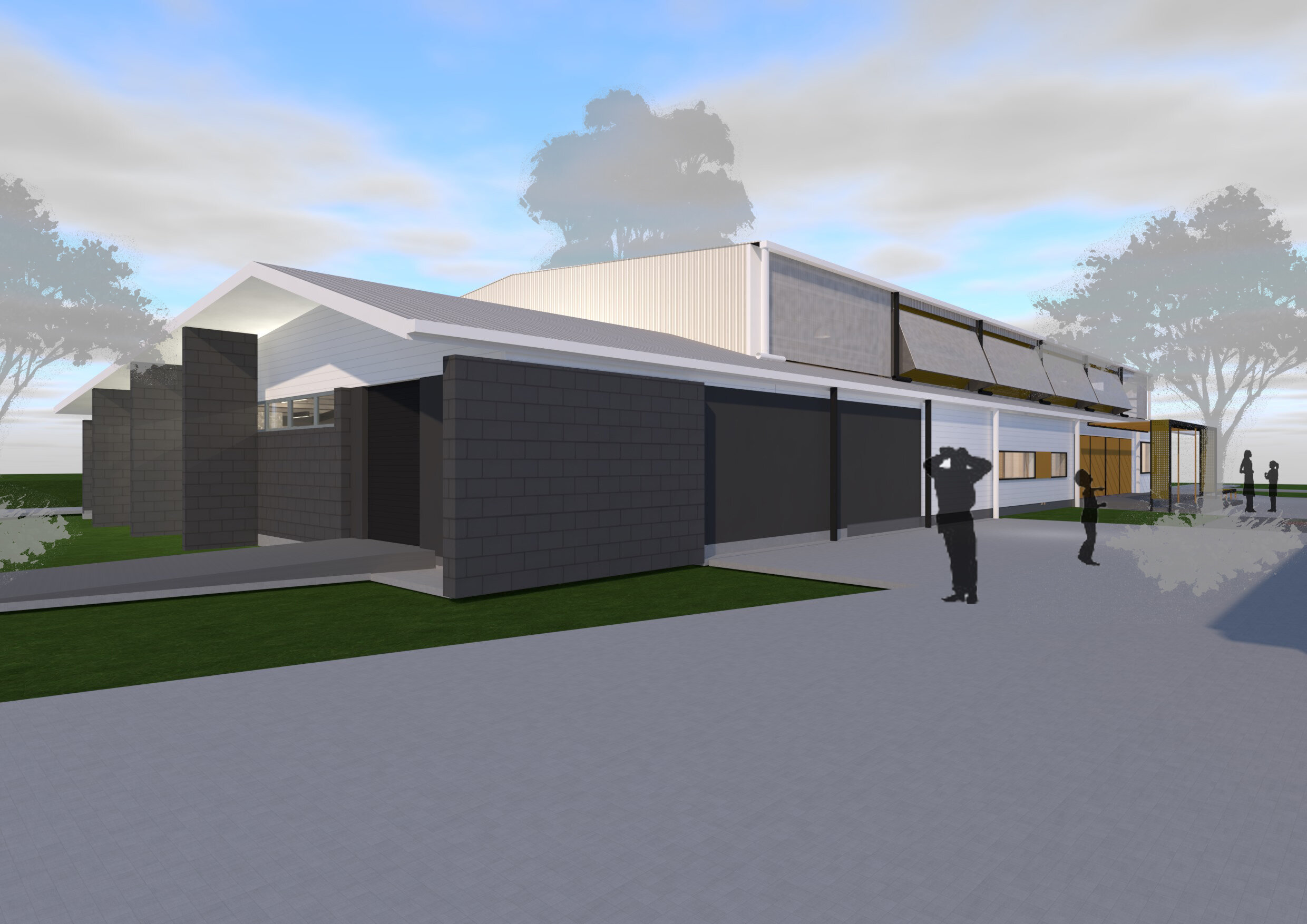
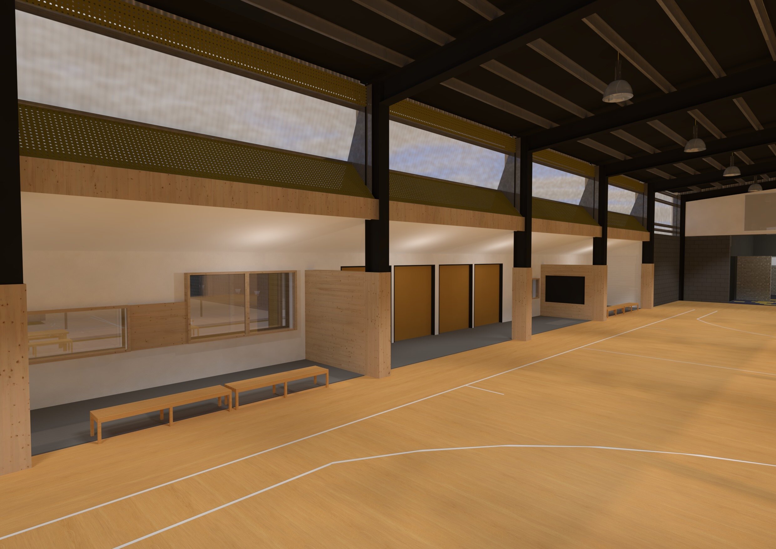
Shailer Park SHS - Multipurpose Hall refurbishment
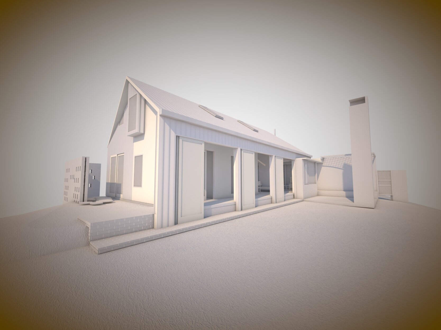
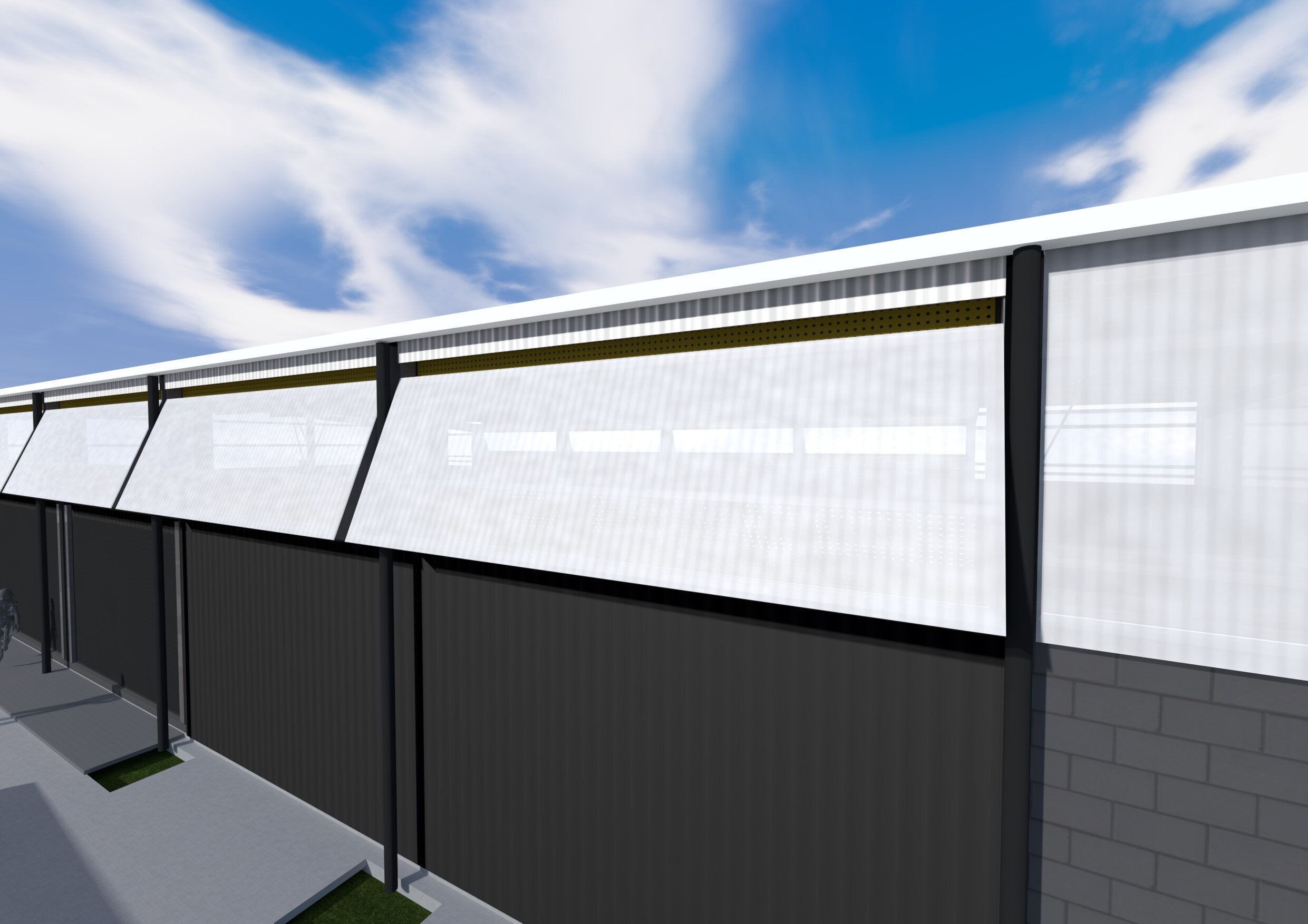
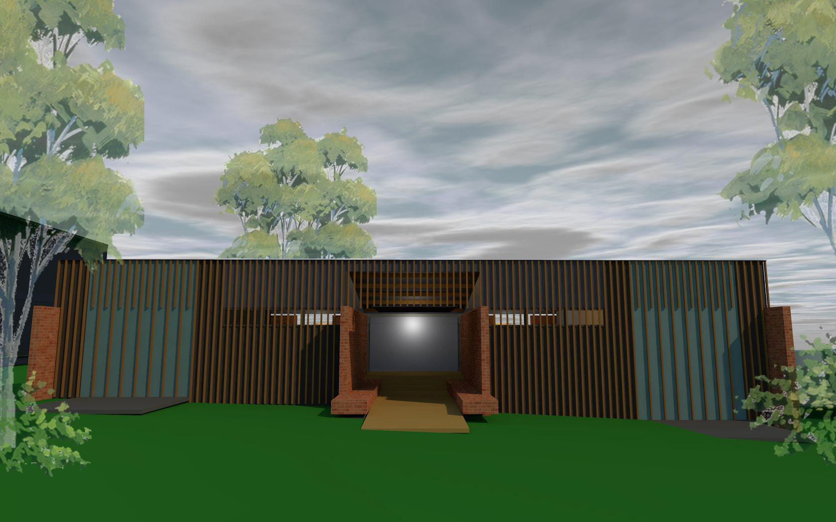
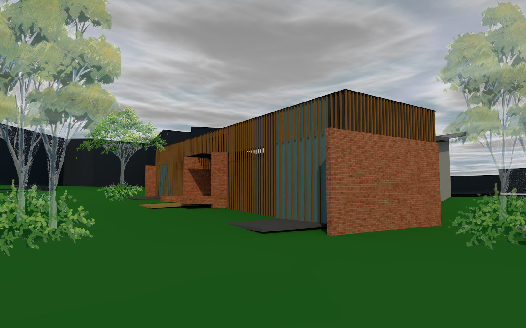
Once a covered outdoor court this building is to be utilised by the adjoining sports complex in the evenings with an A grade sprung timber floor and for training and assemblies during the day. Bing stripped back to the protal frame and block walls the refurbishment will incorporate high level translucent sheeting with a custom design venting system to provide light and air movement from a high level and provide hard wearing lower walls. New storage, gym and small platform with AV connection provides additional facilites to enhance the functionality of the new space. The adjoining amentieis will be upgraded to provide team rooms and showers.
Logan Village SS
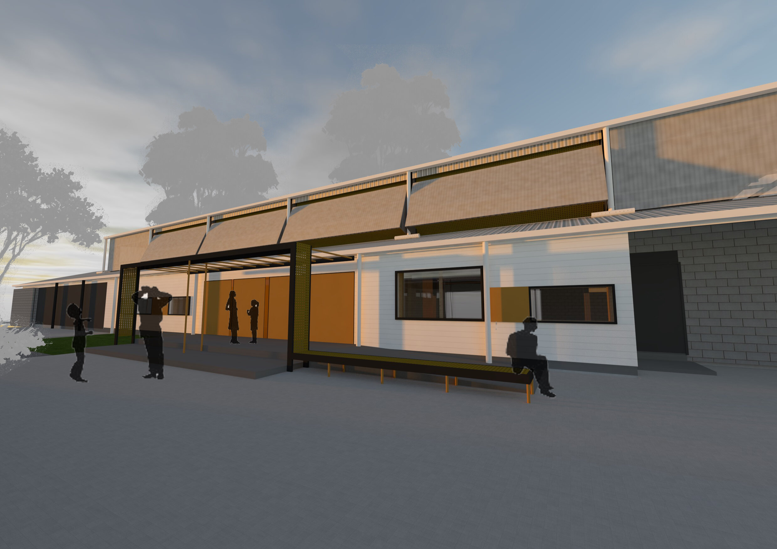
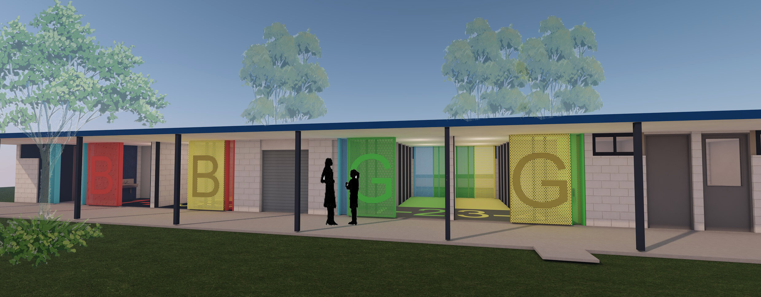
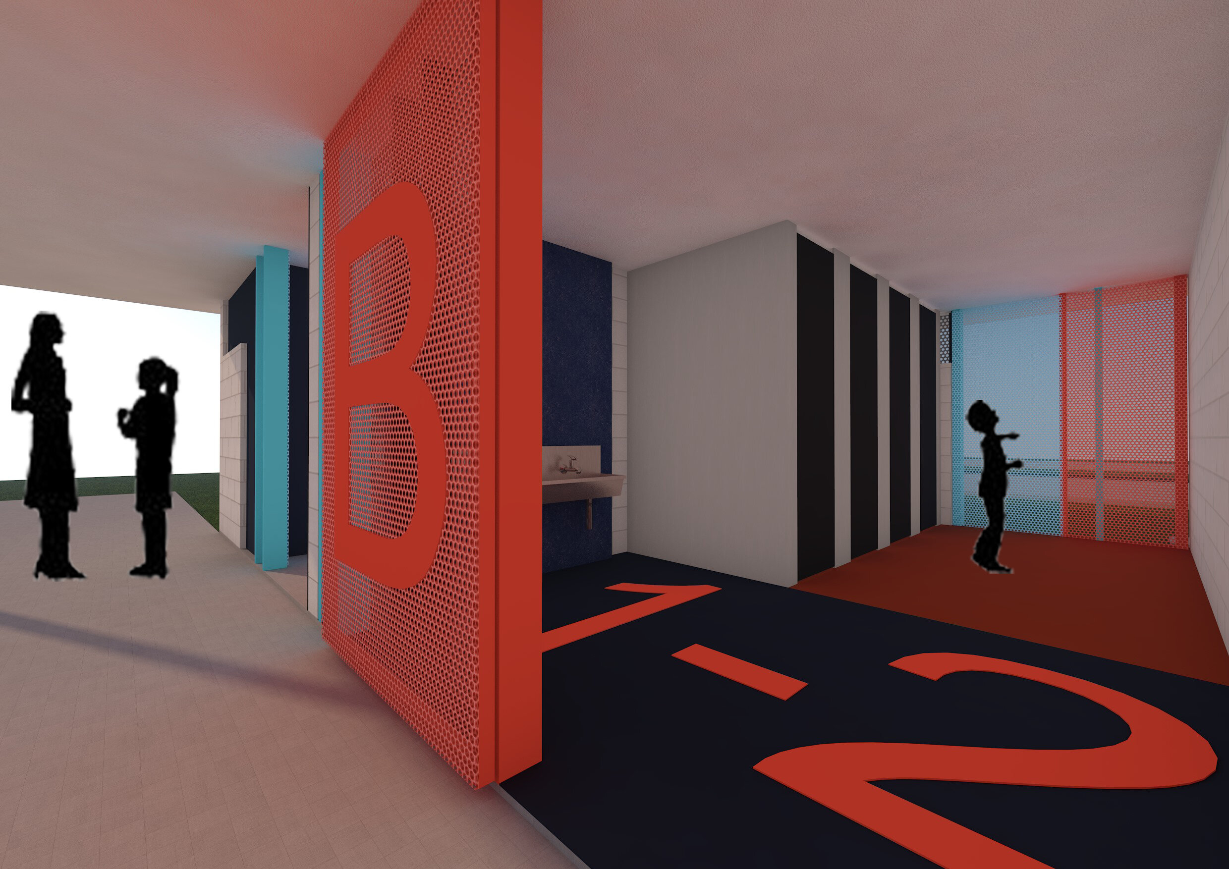
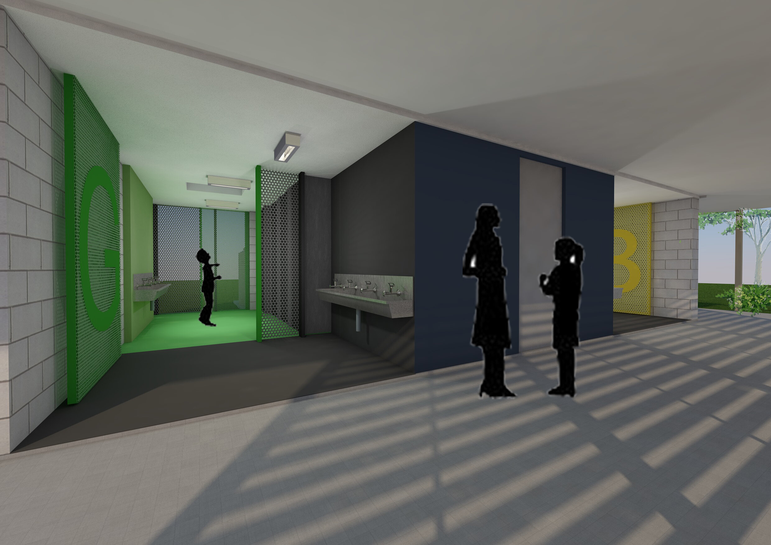
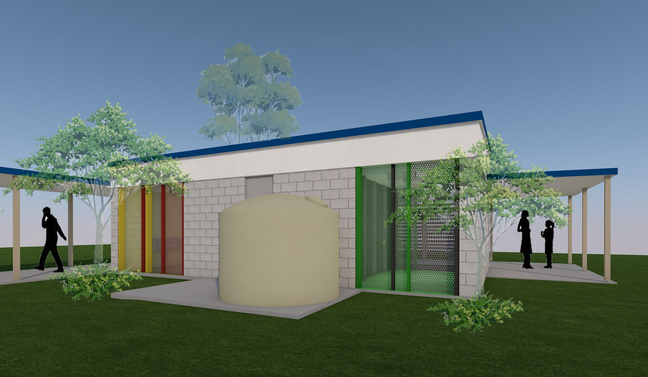
Having quality amenity facilities in schools is extremely important for childrens mental and physical health. This project involves upgrading 2 amenities blocks from the old style dark and hidden spaces to open and airy. Providing passive supervision removes bullying opportunities and allows the spaces to vent. Privacy is provided in the cubicles which allows the rest of the space to open up. Removing existing blockwalls on the 2 long sides opens the building up to cross ventilation while colourful screens incorporating signage provide some fun. Hand wash facilites are provided in the front zone with cubicle behind, all circulation space is visible.
eagleby SS
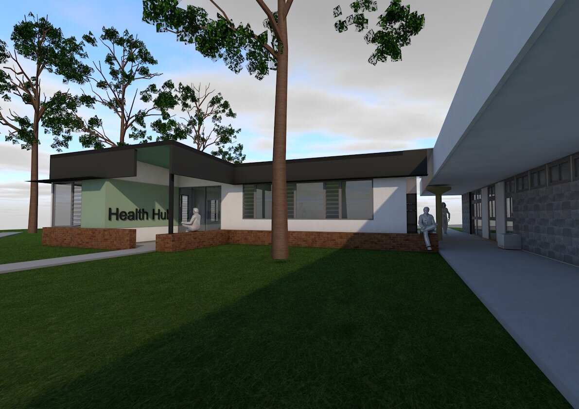
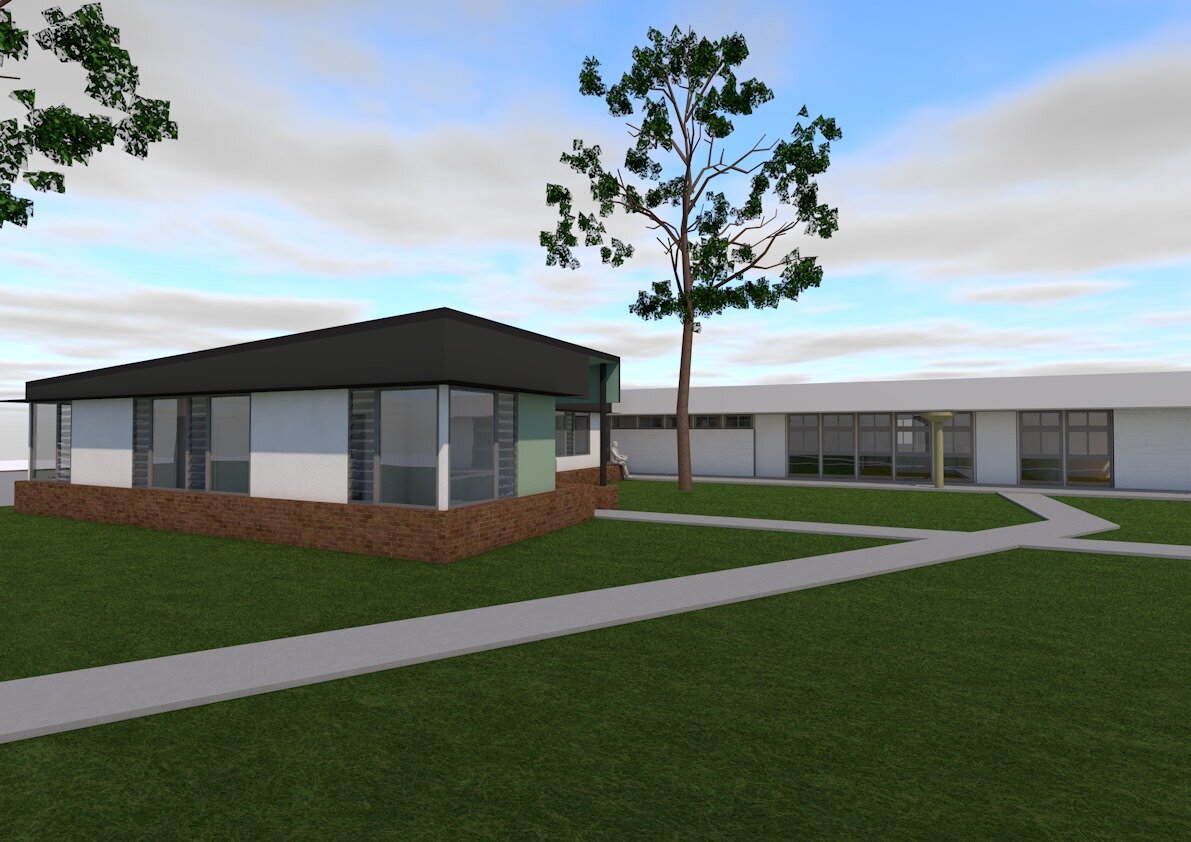
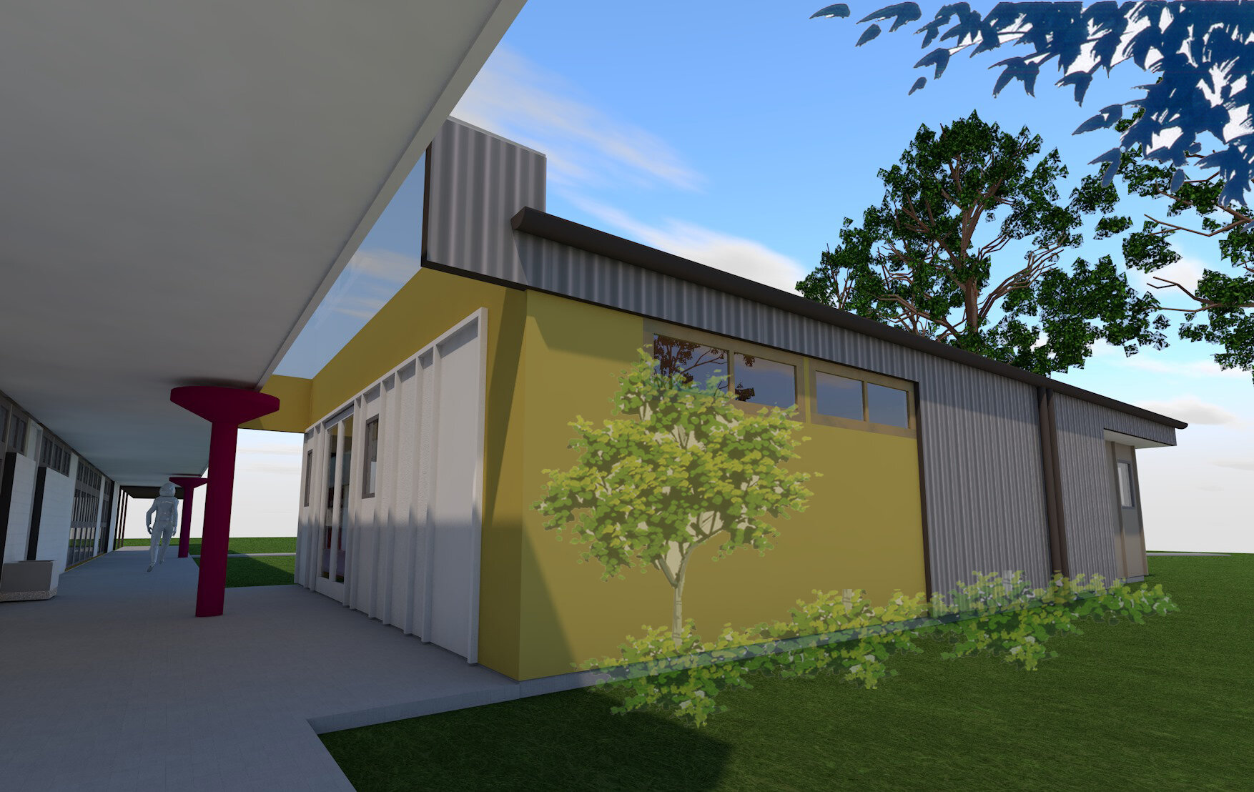
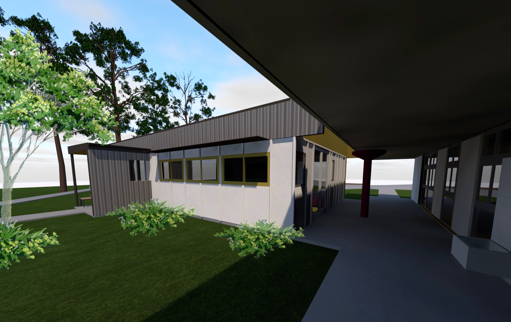
This extension and refurbishment of an existing Administration building finds us working with the very familiar DET 70’s concrete block building. This project involves a new health hub and resources room. The proposed ‘extension’ is for a new building adjoining the existing walkway to provide a seperation of spaces while allowing easy access from the main thoroughfare without the need to enter the admin building. New amenities and file rooms in the new building free up space in the existing to allow for new offices. The new built form takes ques from the existing, with similar volumes and large fascia elements but with lightweight walls and modern materials. The 2 forms lightly touch with gold translucent skylight keeping the transition light and colourfull.
panorama place
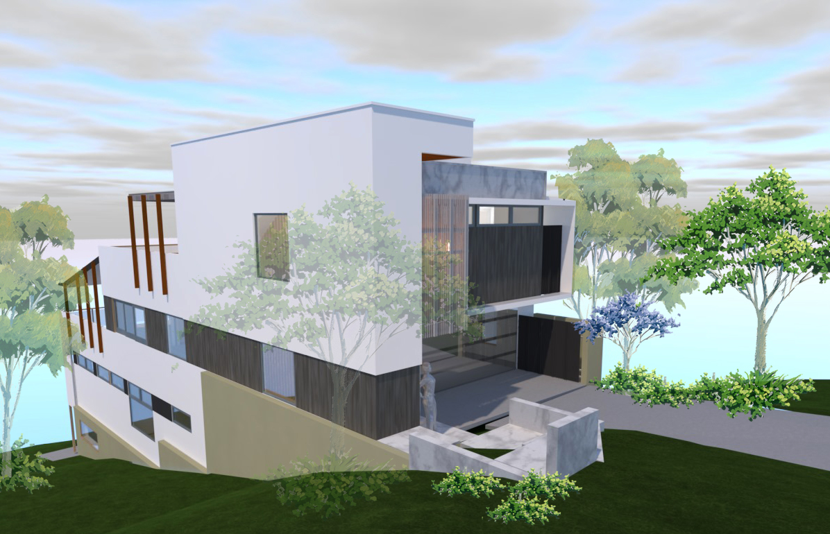
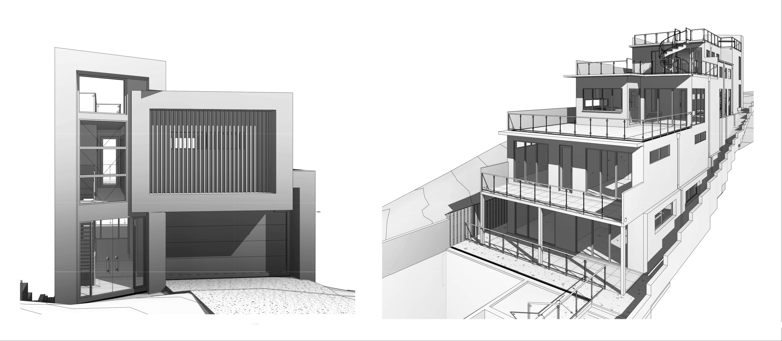
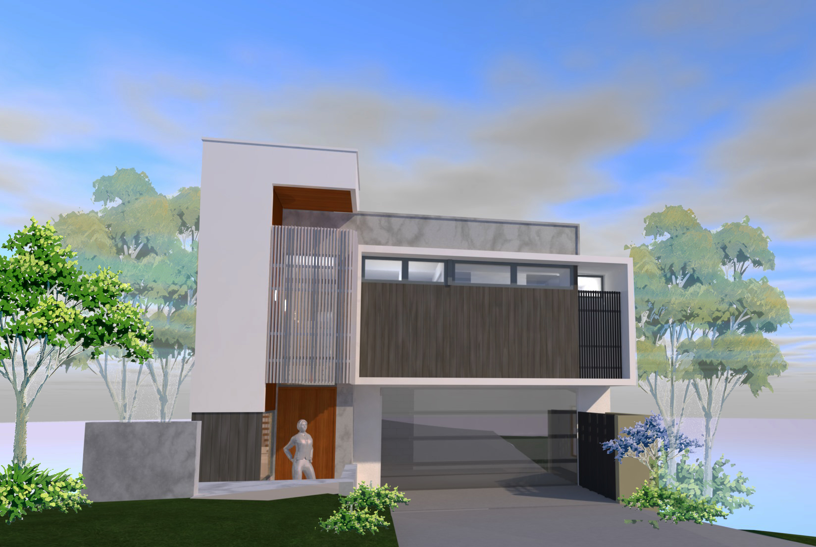
Our client came to us when they were already on site, slabs poured, some block walls erected and costs already spent fixing mistakes from un co-ordinated documents. Furthermore they just were not happy with the design as it stood and asked if we could fix it. The DA had some strict conditions and with site works already started we had significant constraints to work within. With some internal re-arrangements, adding some roofs and rationalising the fenestrations we simplified the structure produced a more refined and elegant facade still keeping in the ultra modern aesthetic the client was looking for.
ACU - Yarning Circle
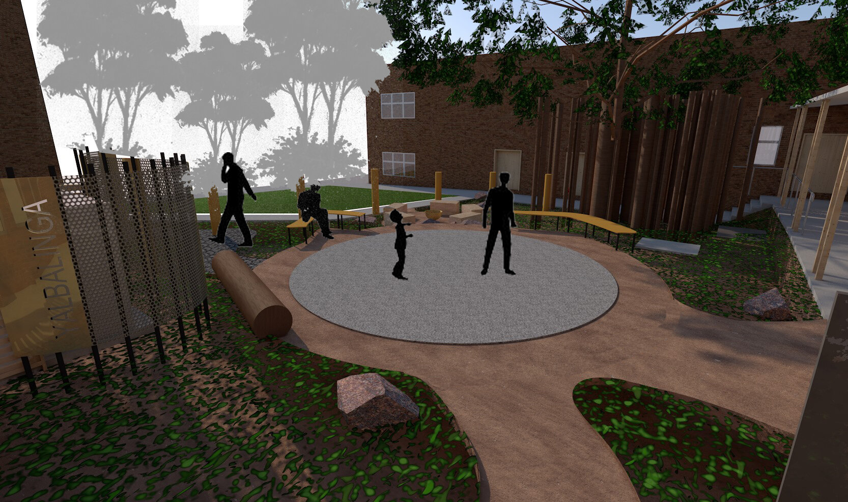
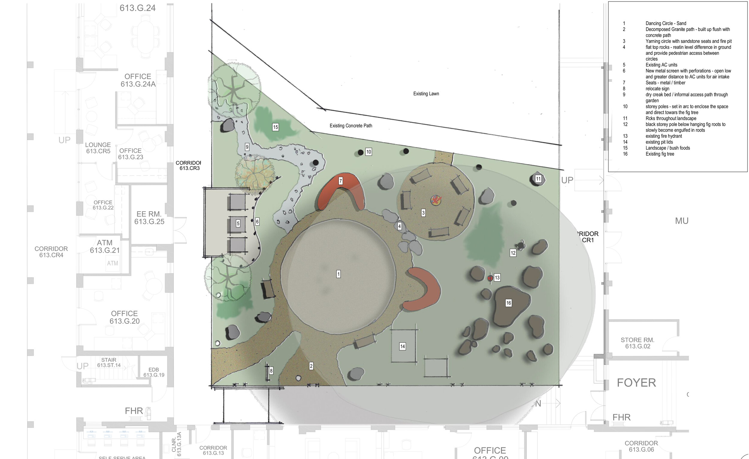
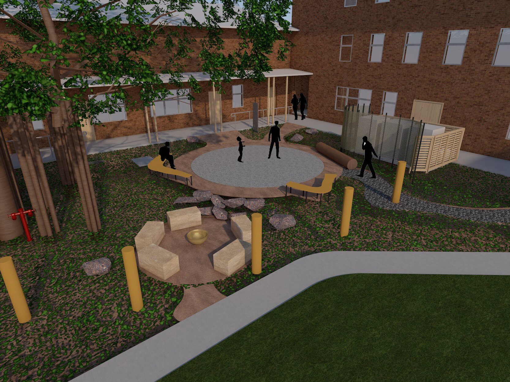
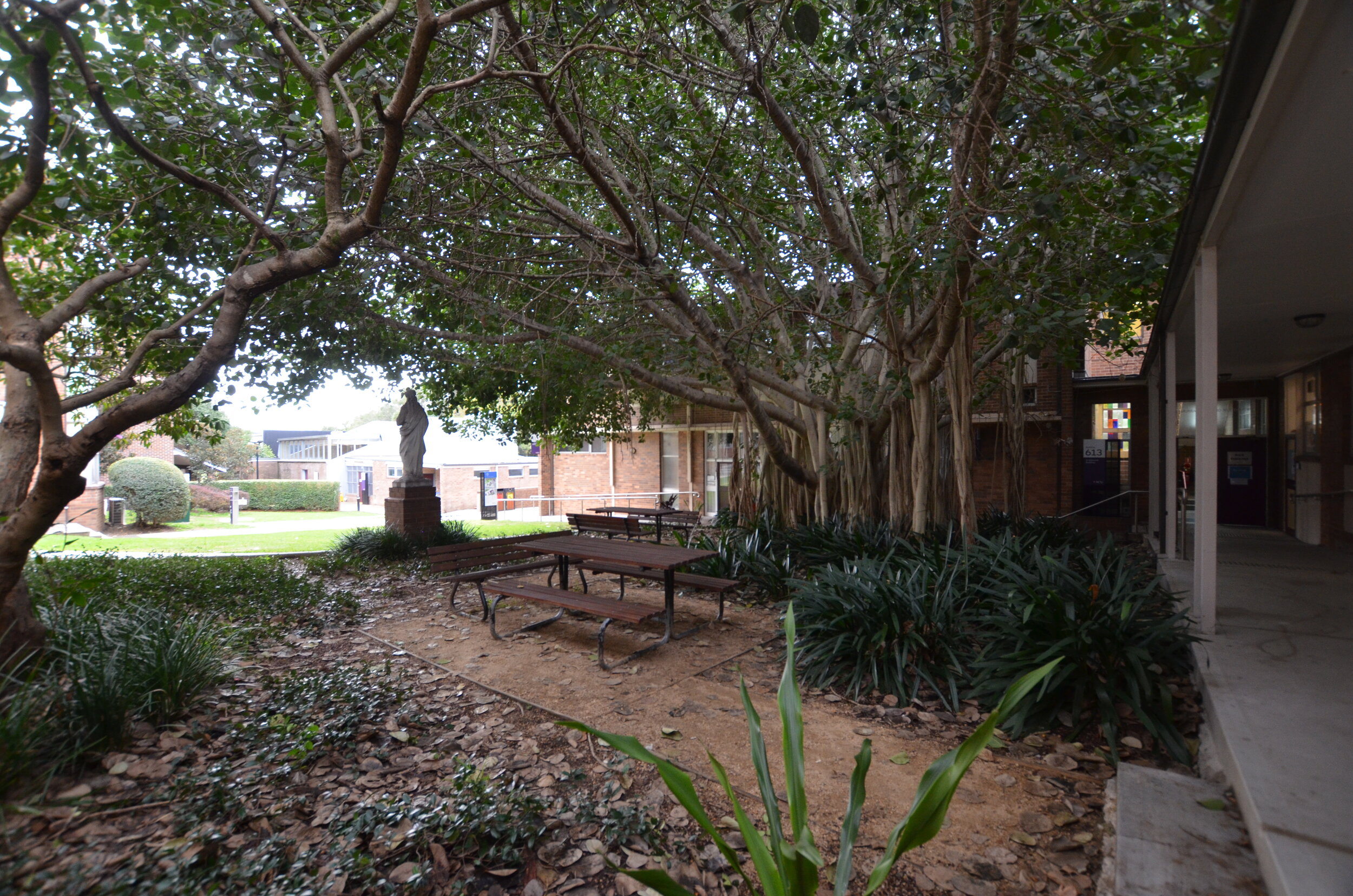
We are very excited to be working on a yarning circle for Yalbalinga at ACU’s Strathfield Campus. Set within a courtyard in this beautiful brick campus and covered by an enormous white fig tree the site forms the centrepiece of the building cluster. The dual purpose yarning circle and dancing circle has been split into 2 to allow for large performances and more intimate story telling. A permanent fire place marks the centre line view from the entry diagonally through the space.
Hope Island Houses
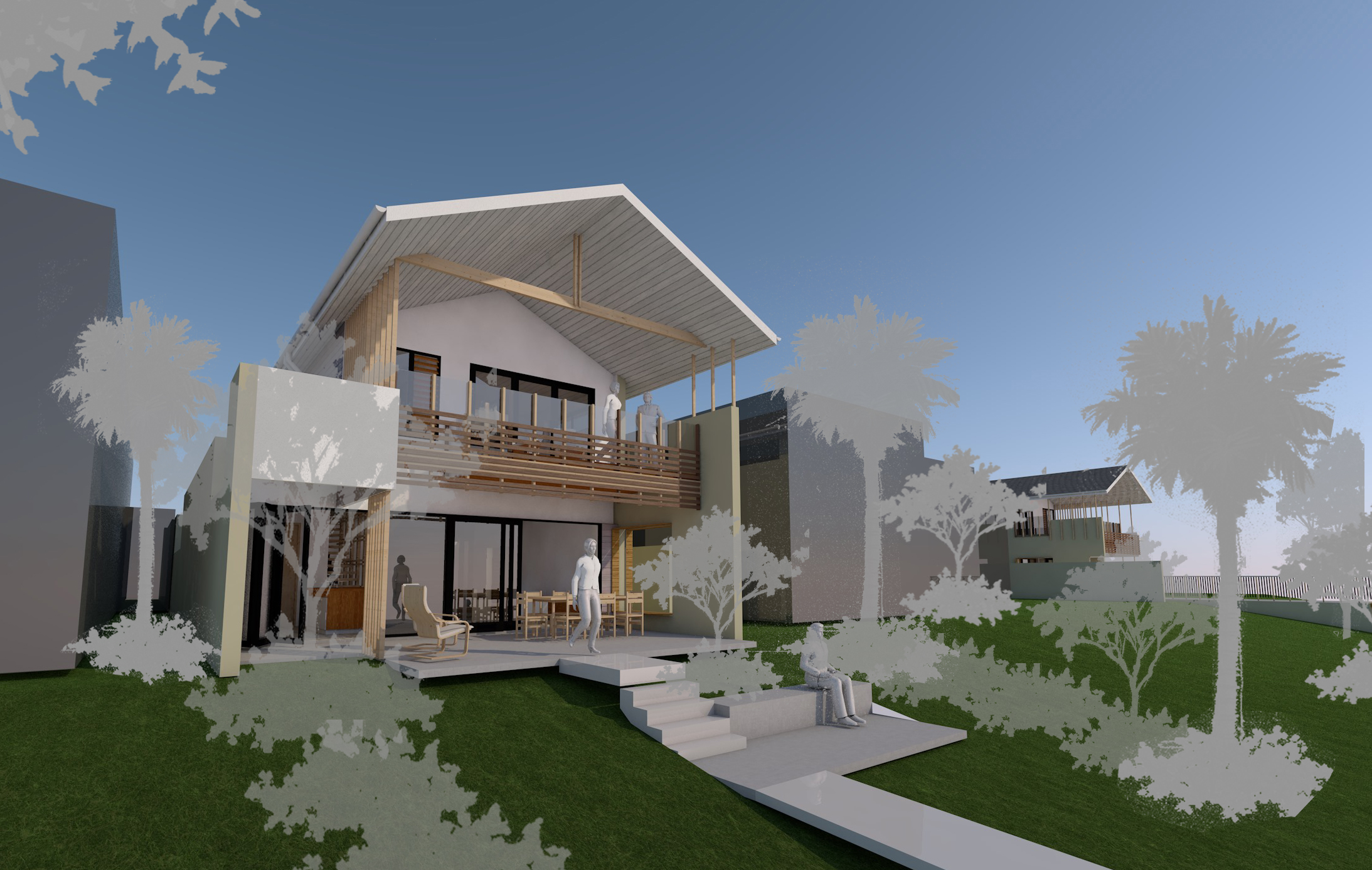
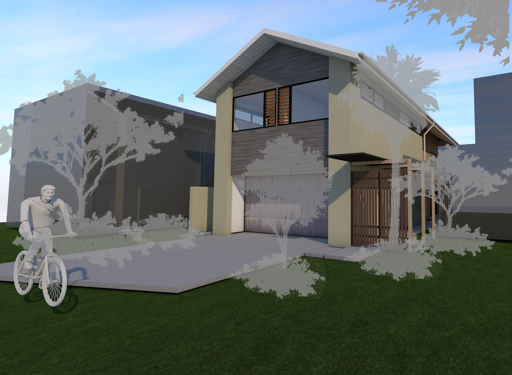
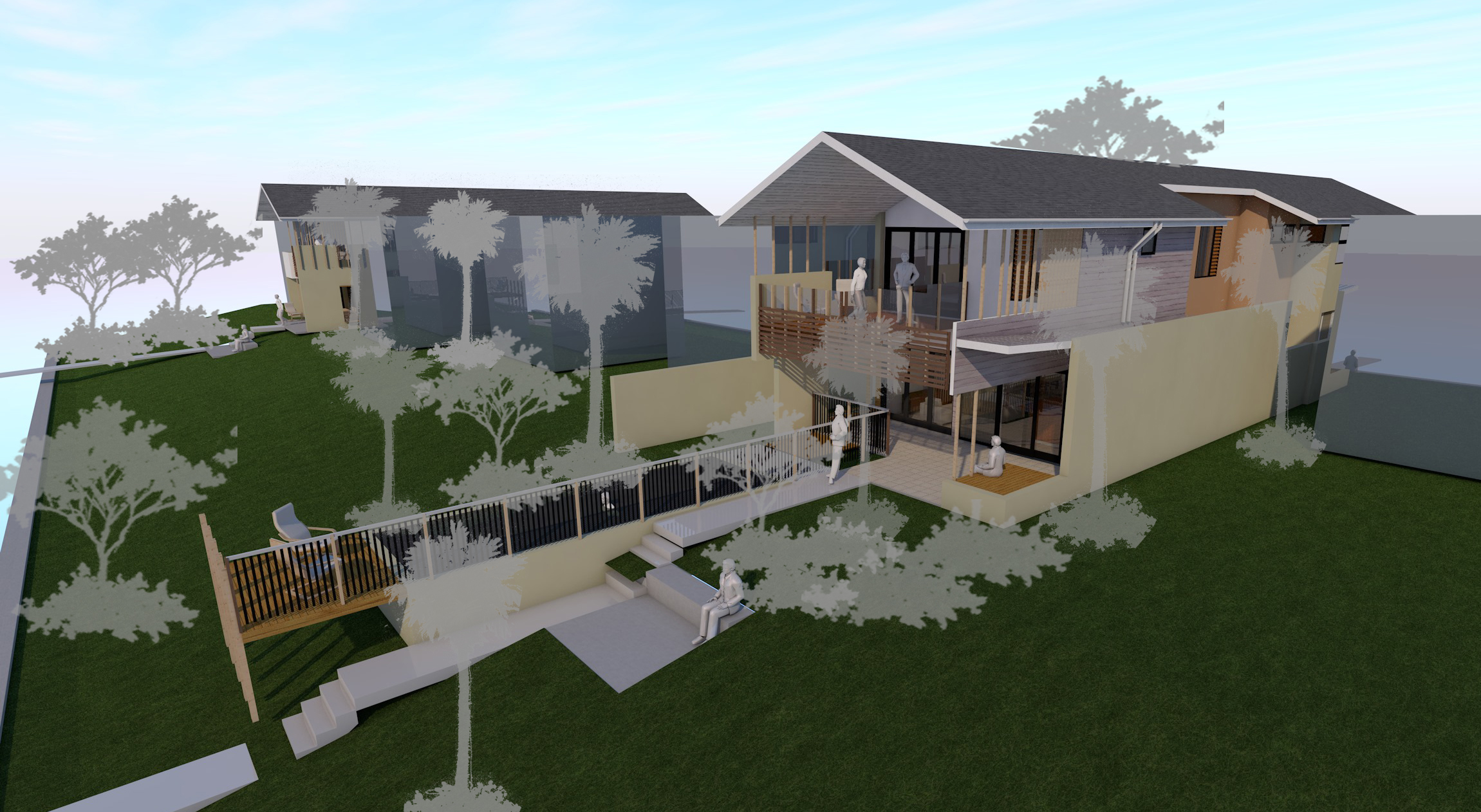
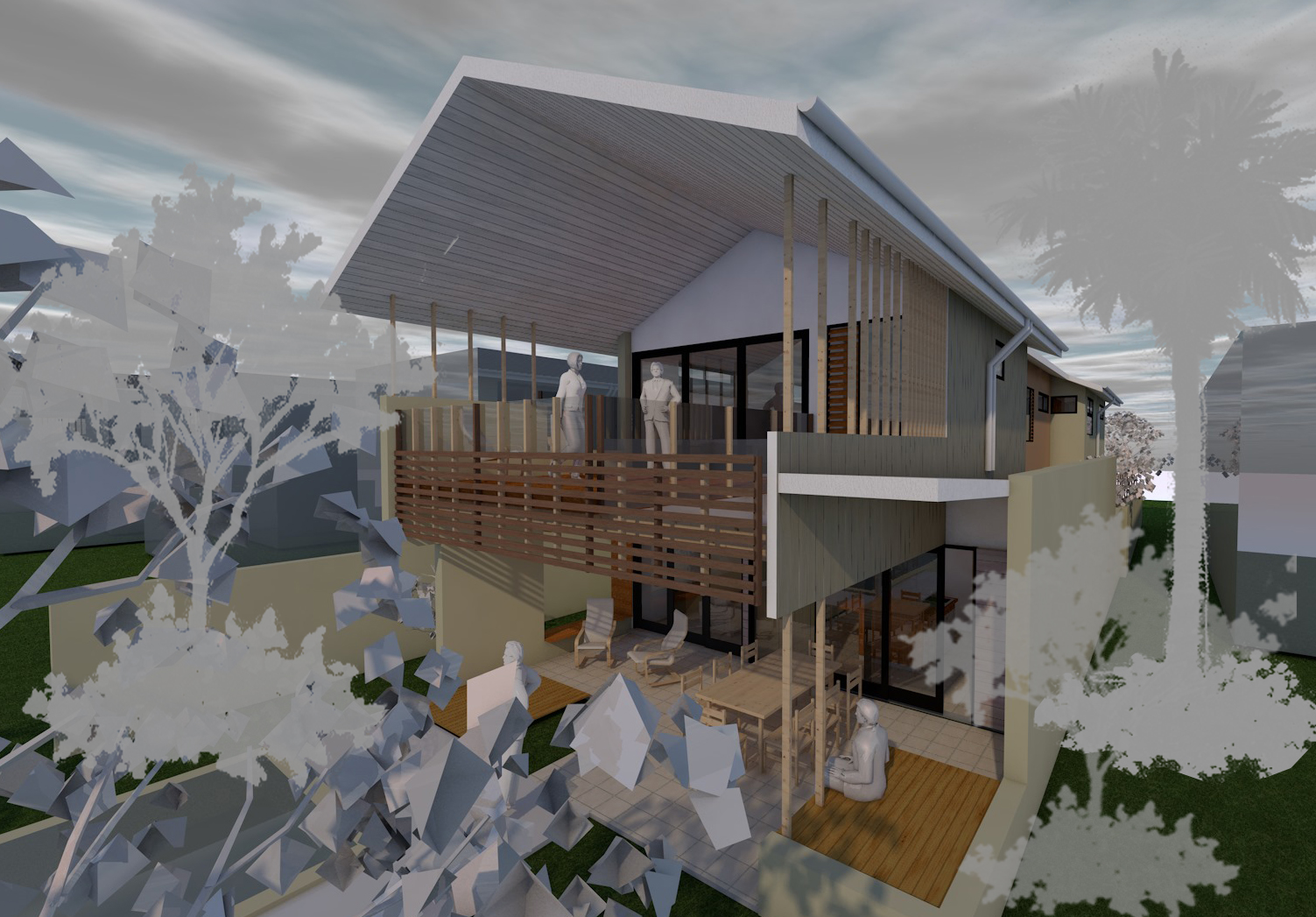
Working within the strict confines of the Hope Island design guidelines these 2 houses are to be built at the same time with the same contractor. They include a similar aesthetic and detail resolution to keep an efficiency in the contraction, but have slight planning and elevational variations to suite specific program requirements and provide individual identity.
In both cases the houses are stretched apart to create an entry courtyard that brings light and ventilation to the long narrow lots. Entry is through a screened door alongside the house and into the courtyard. This saves on internal circulation and maintains a sub tropical environment. Internally the functions are split from this entry zone, public zones opening onto the canal downstairs while upstairs the master room is separated from secondary rooms.
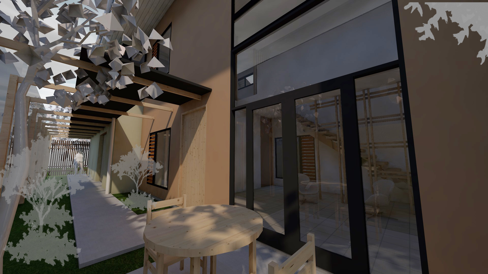
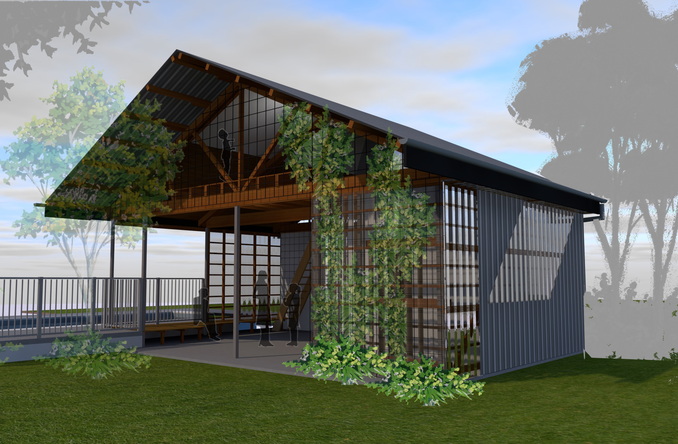
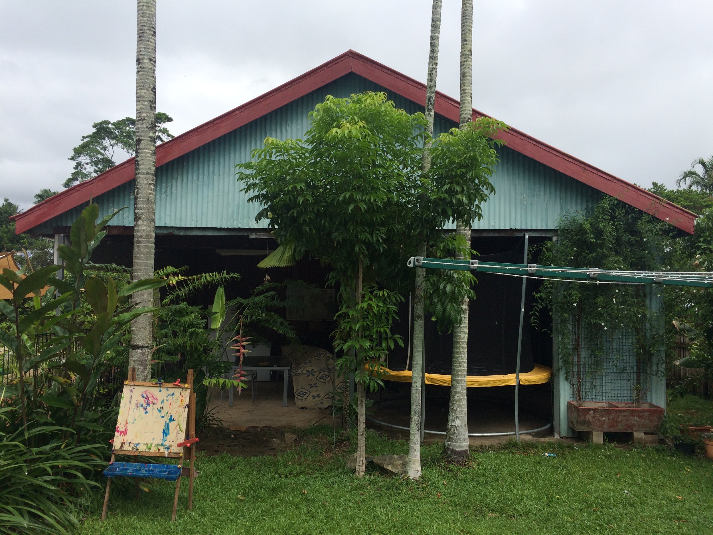
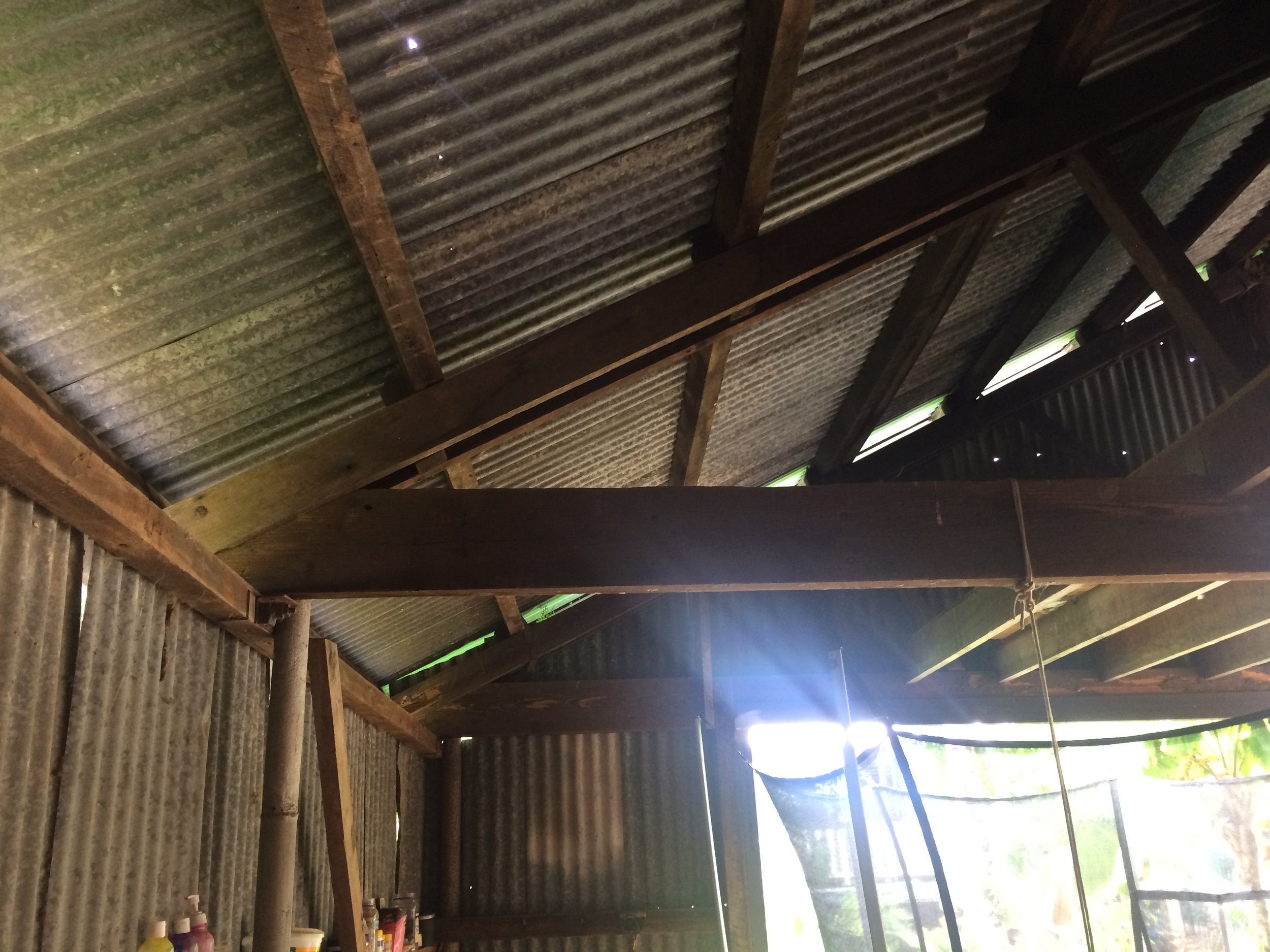
Stratford Shed
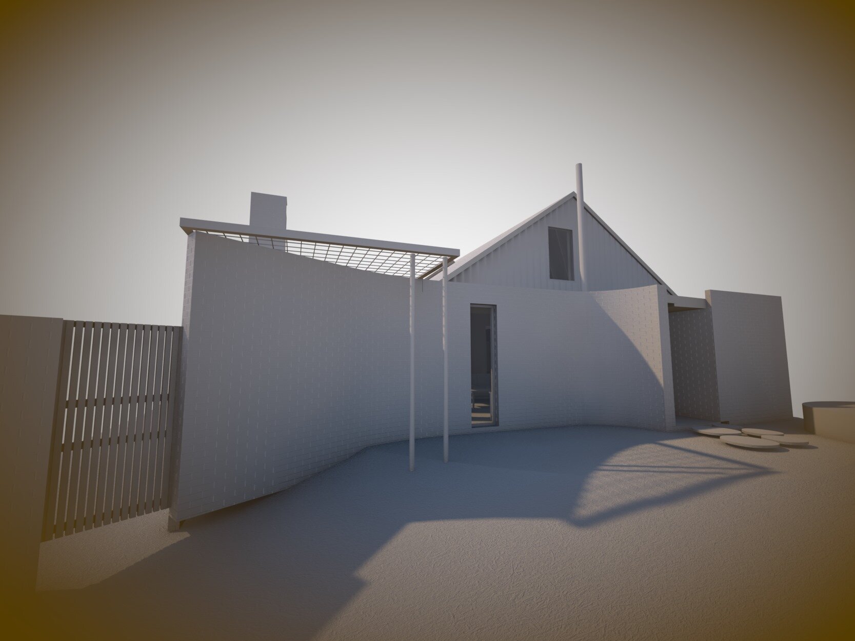
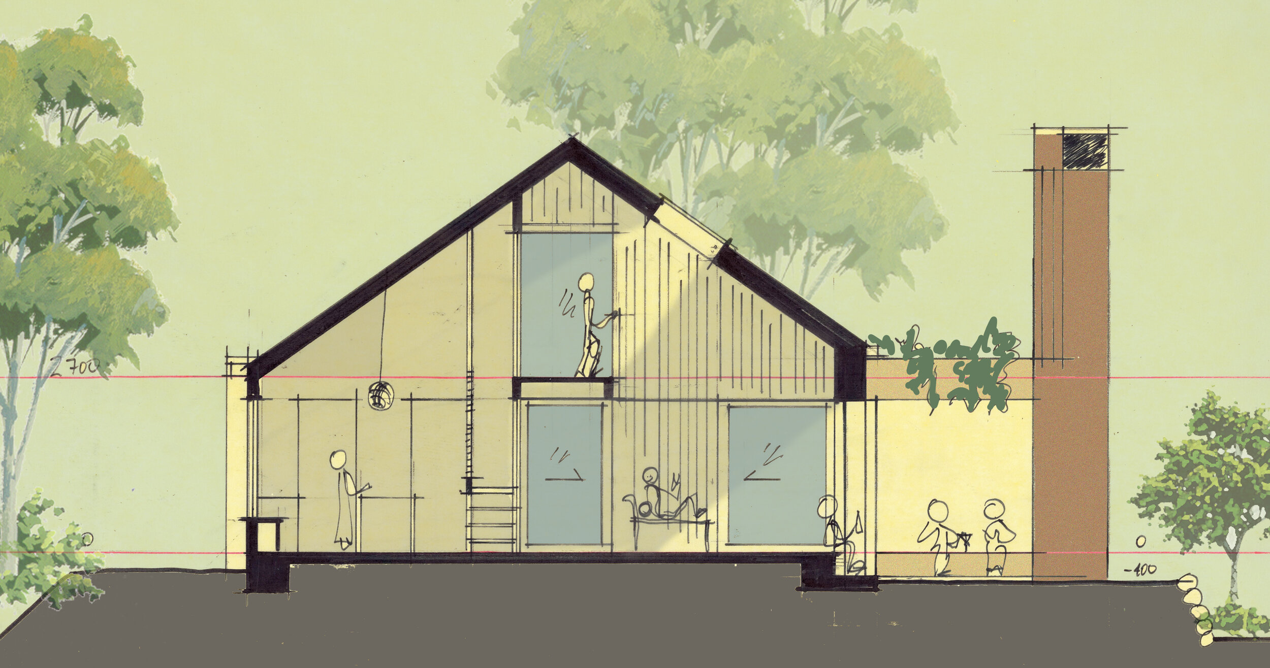
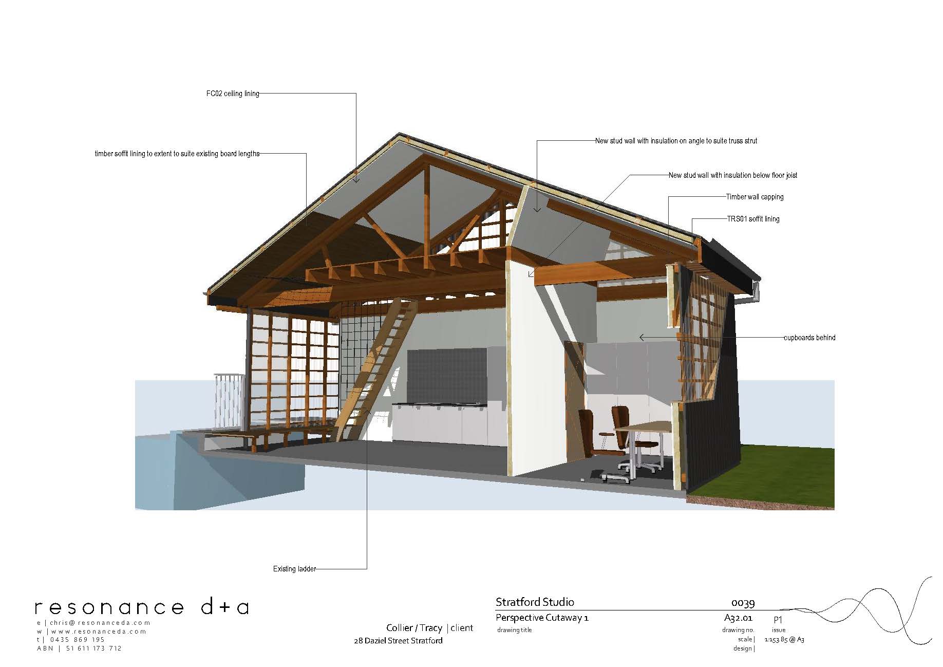
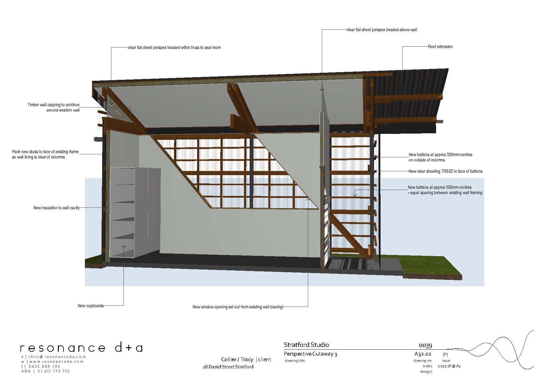
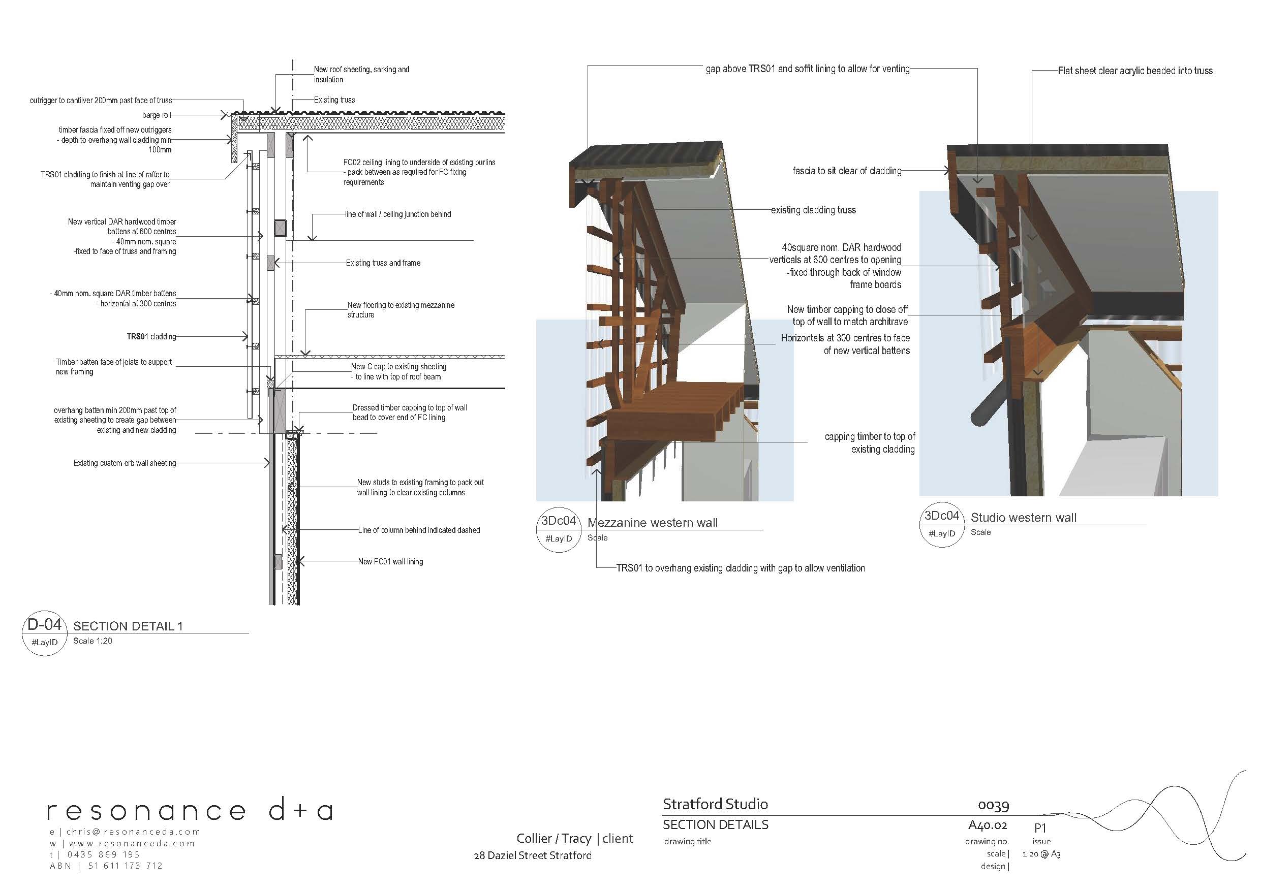
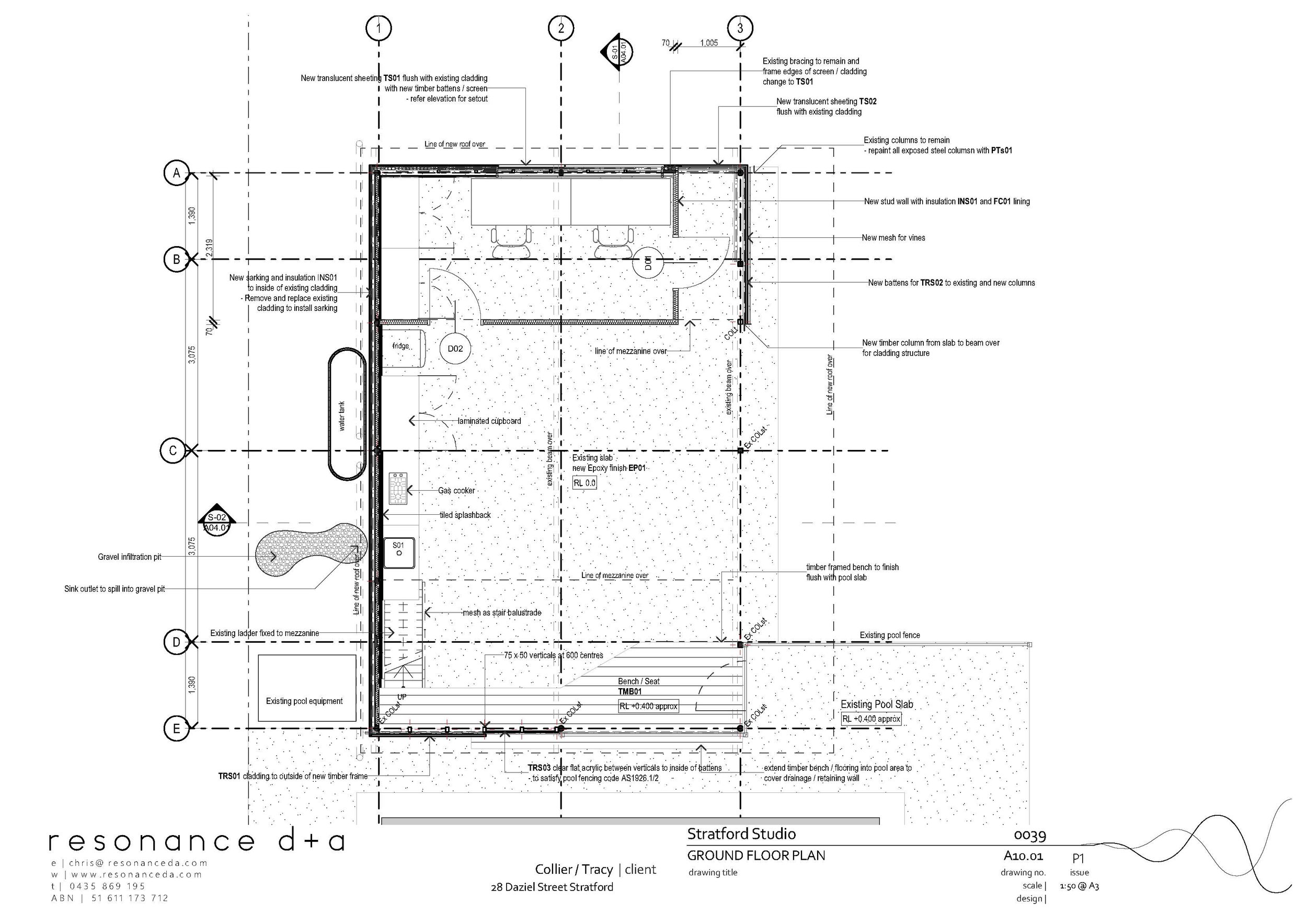
Backyard sanctuary. This existing hardwood shed provides fantastic space to expand the outdoor lifestyle required when living in Cairns. It does however need some love to optimise the functionality for this small family. Apart from a general tidy up the program requires an office space, storage and kitchenette, better weather protection and ventilation. New roof lining will include an extra long overhang and re-located truss bracing, allowing the mezzanine to be used as a kids hideaway. Only partially hidden behind vines to shade and clean the air and allow passive surveillance from the house. New opaque sheeting in the existing custom orb walls will allow natural filtered light and open the upper level to enhance cross flow ventilation.
Hamilton Residence
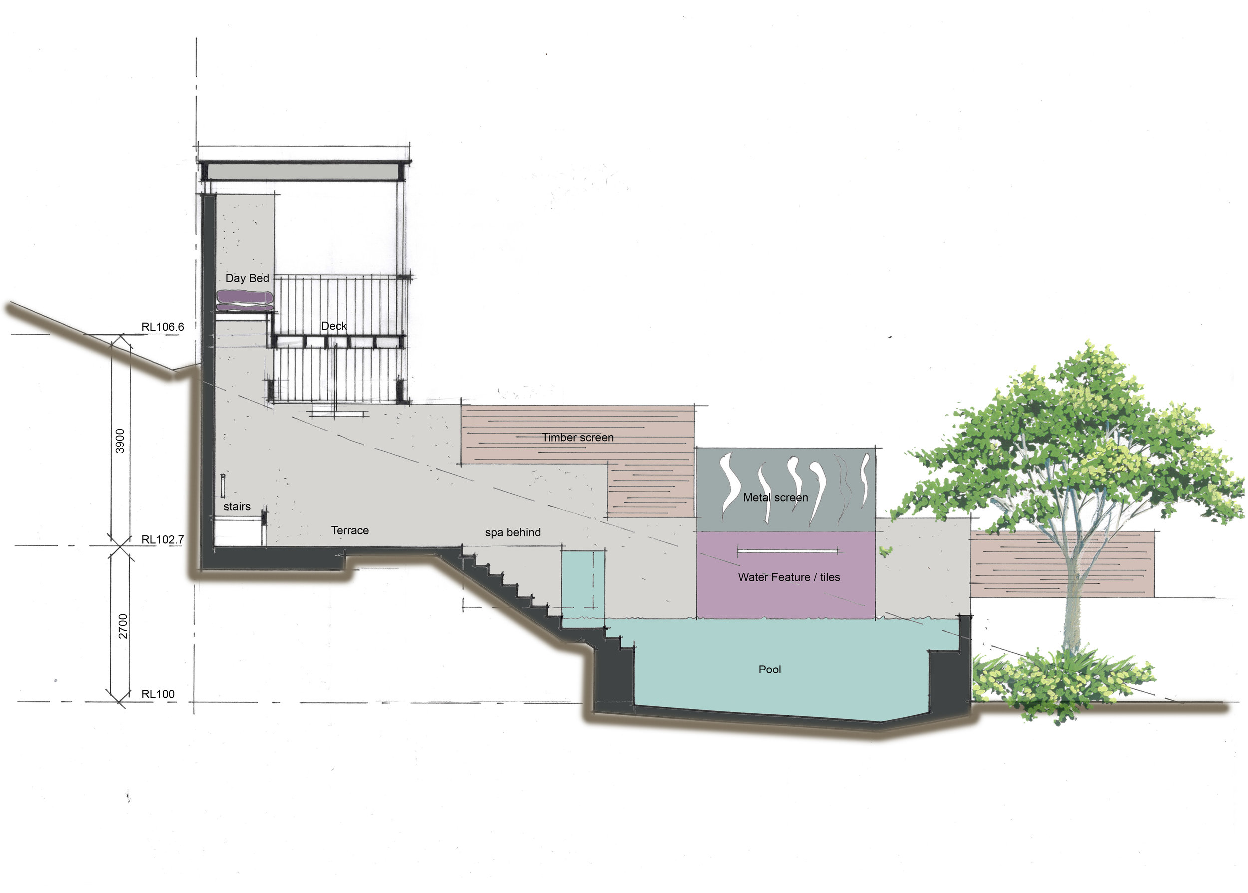
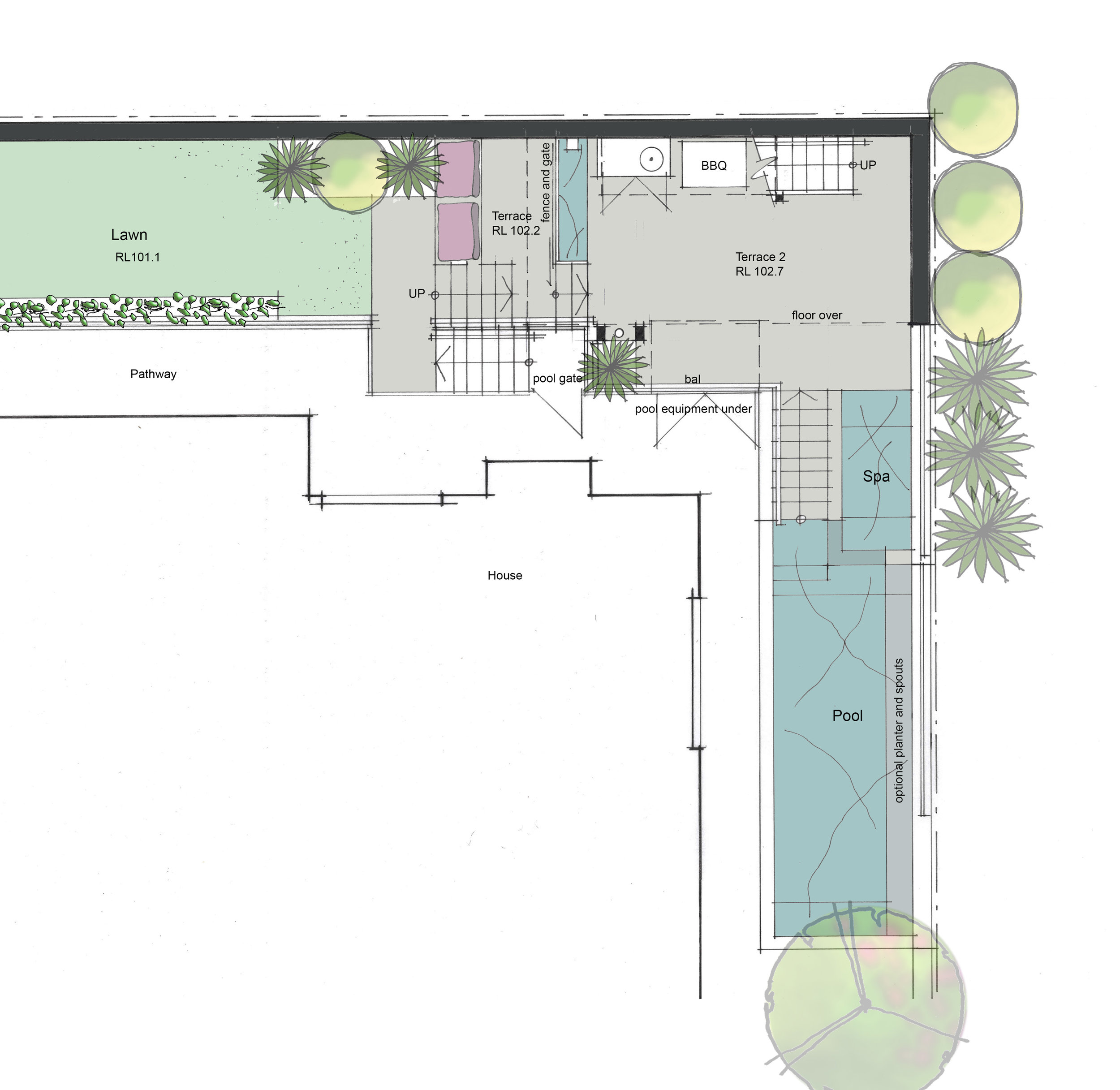
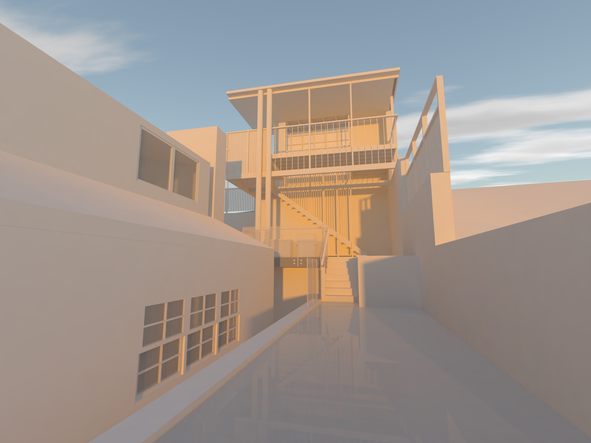
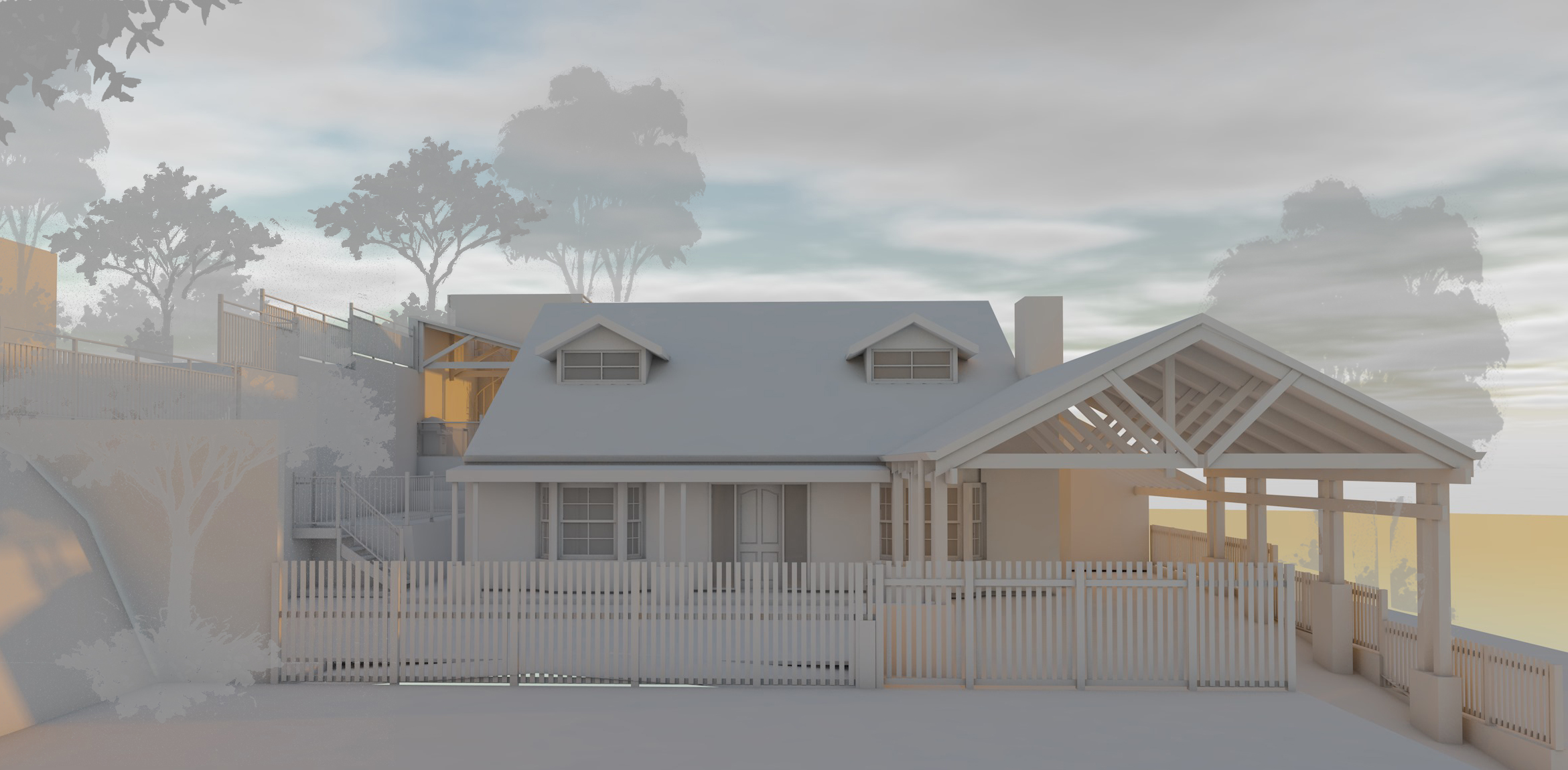
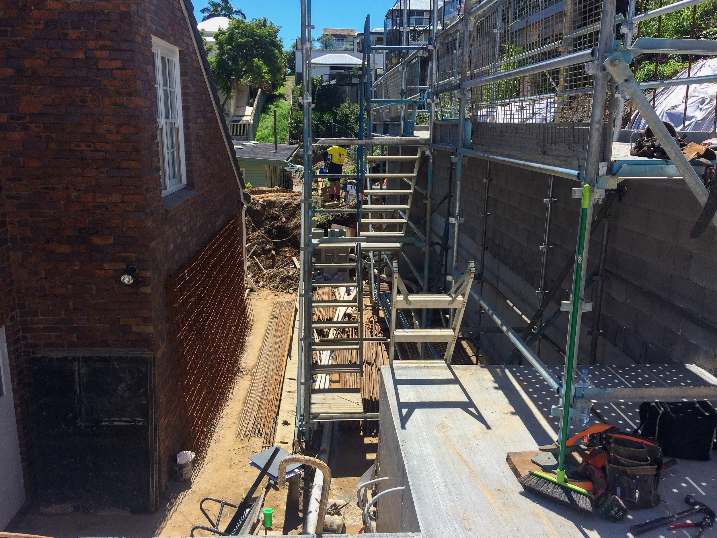
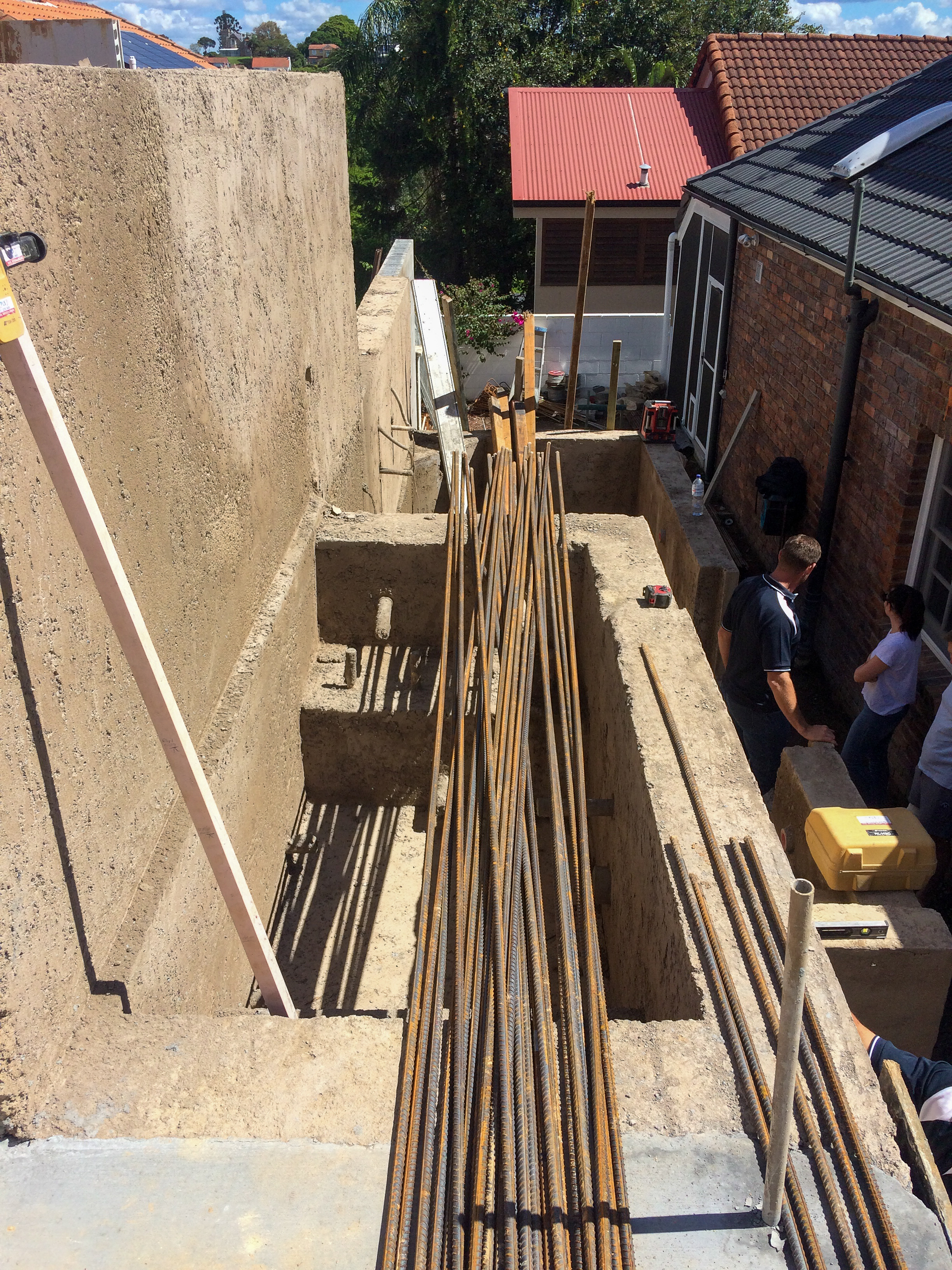
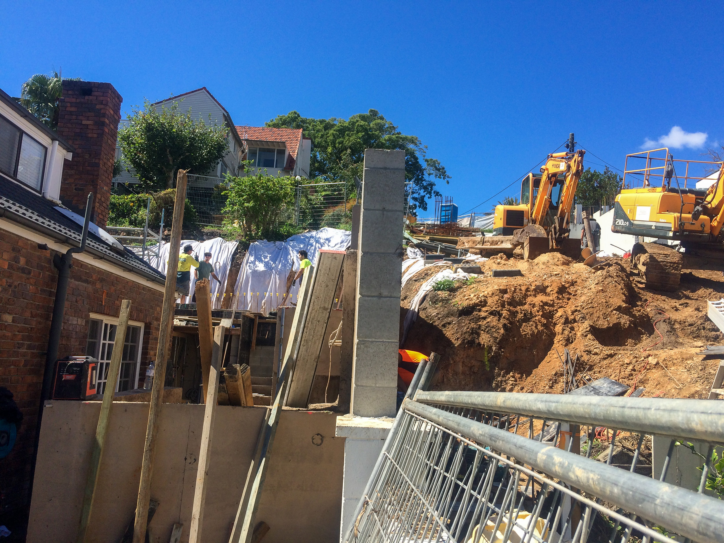
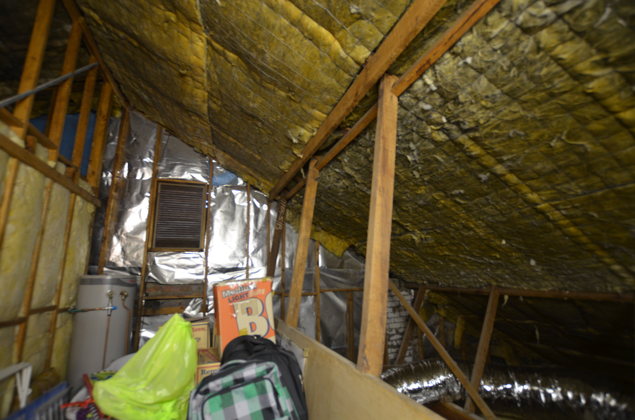
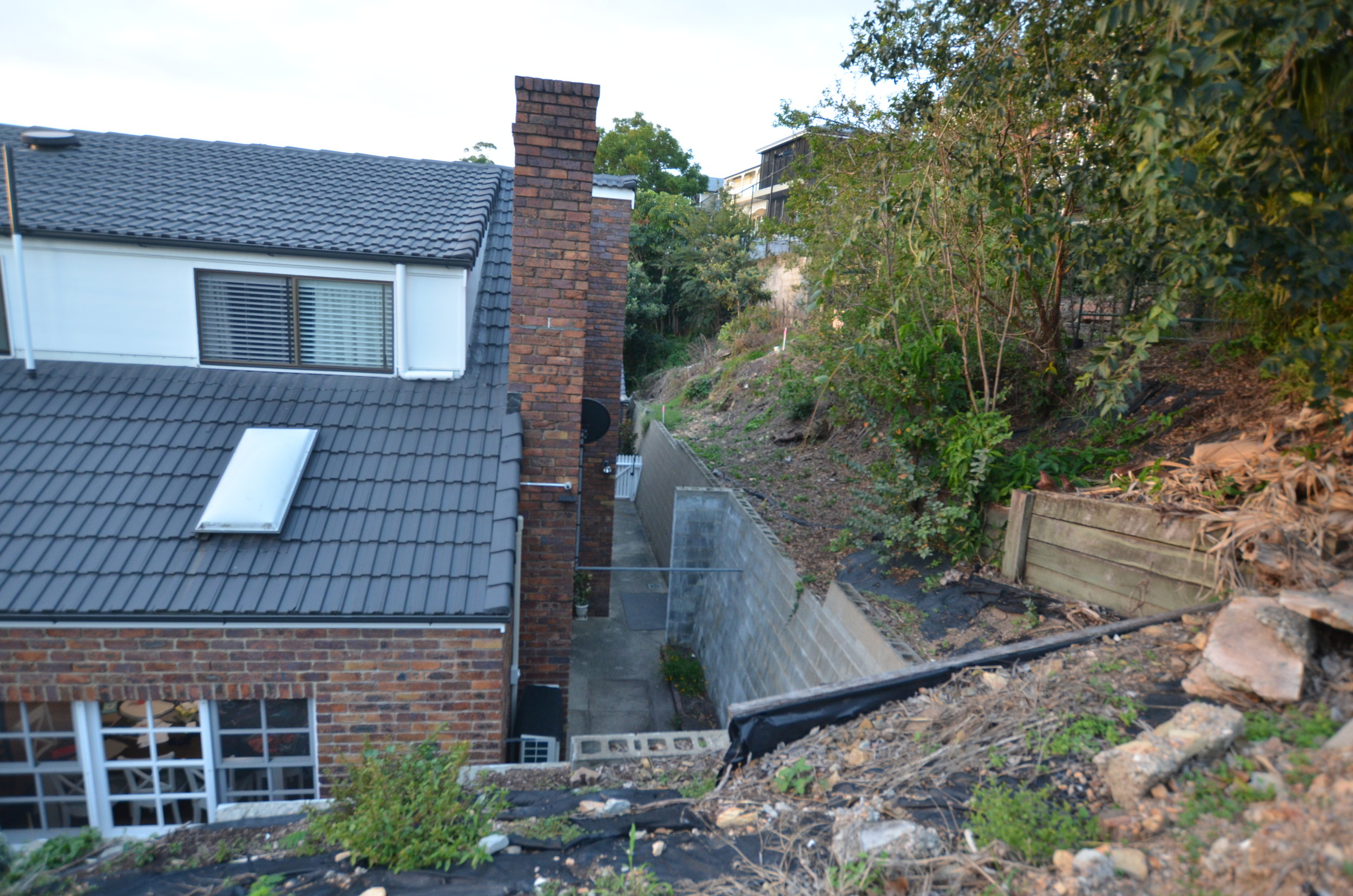
This project might be small but it is extremely complex. The very tight site includes a 3-4m strip around 2 sides of an existing house with a 5m fall. Set on the Hill in Hamilton the house is surrounded by other dwellings with limited outlook and an unusable ‘yard’. The new works are to reclaim the cliff face and include a new pool, pool house, as much soft play as possible and a new viewing deck to capture city views. To accommodate the the new vertical shift from house level to viewing deck the new works involve a series of terraced levels to provide an easy transition between spaces. From the house level through to grass play zone, to pool house then up to viewing deck. The pool itself is above ground to act as it’s own pool fence with a glass wall facing the dining room window.
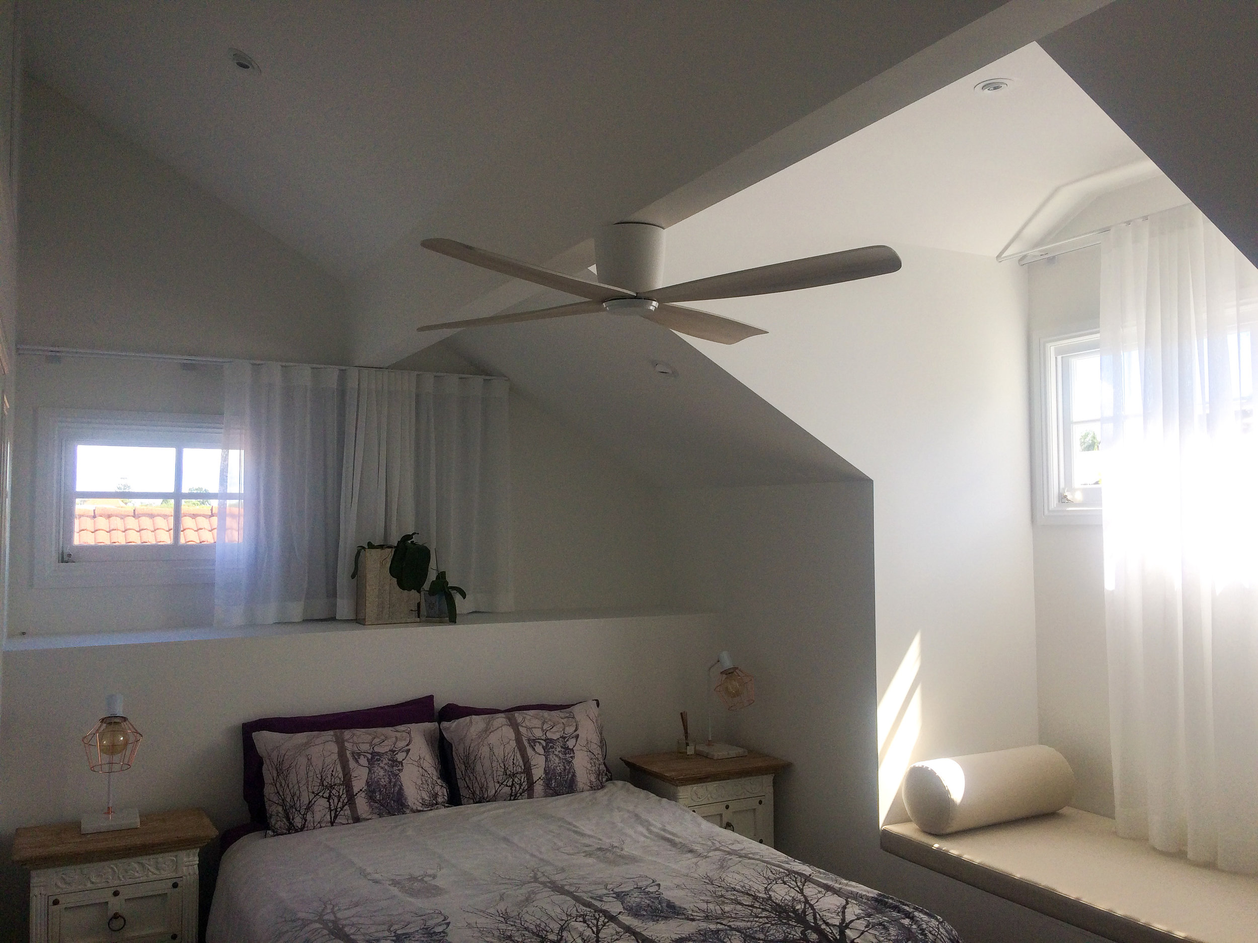
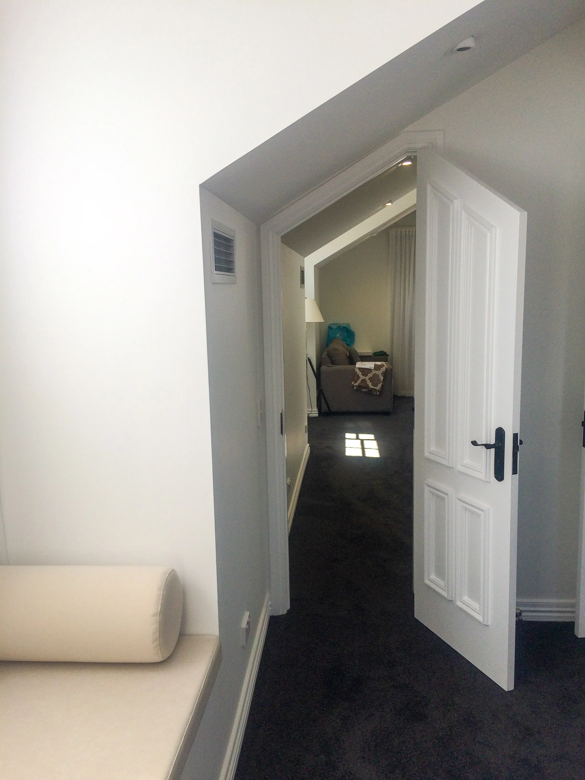
Additional works to the house include turning an attic space into a bedroom and office, along with a new double carport and opening up the front yard for more play area.
petersen residence
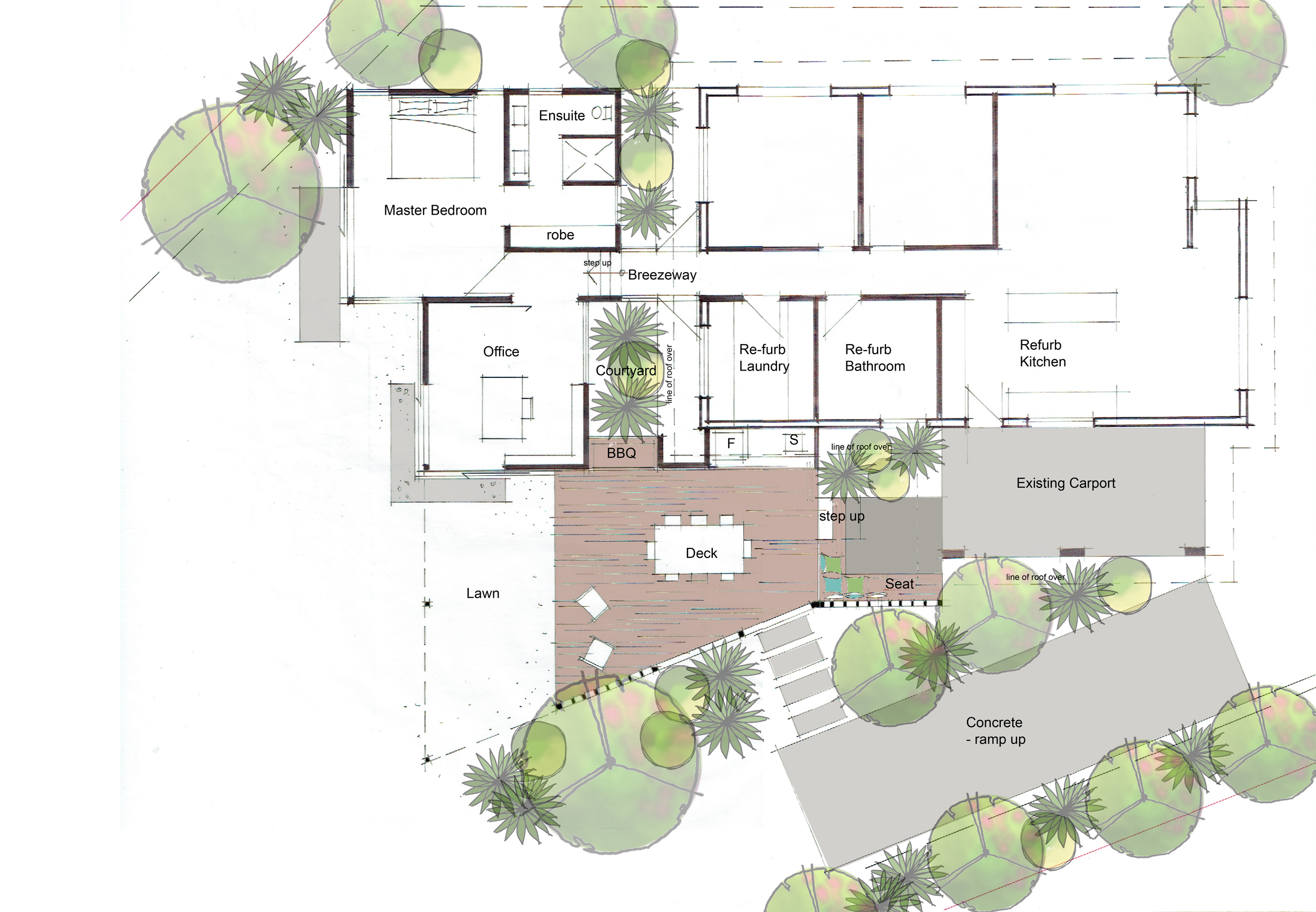
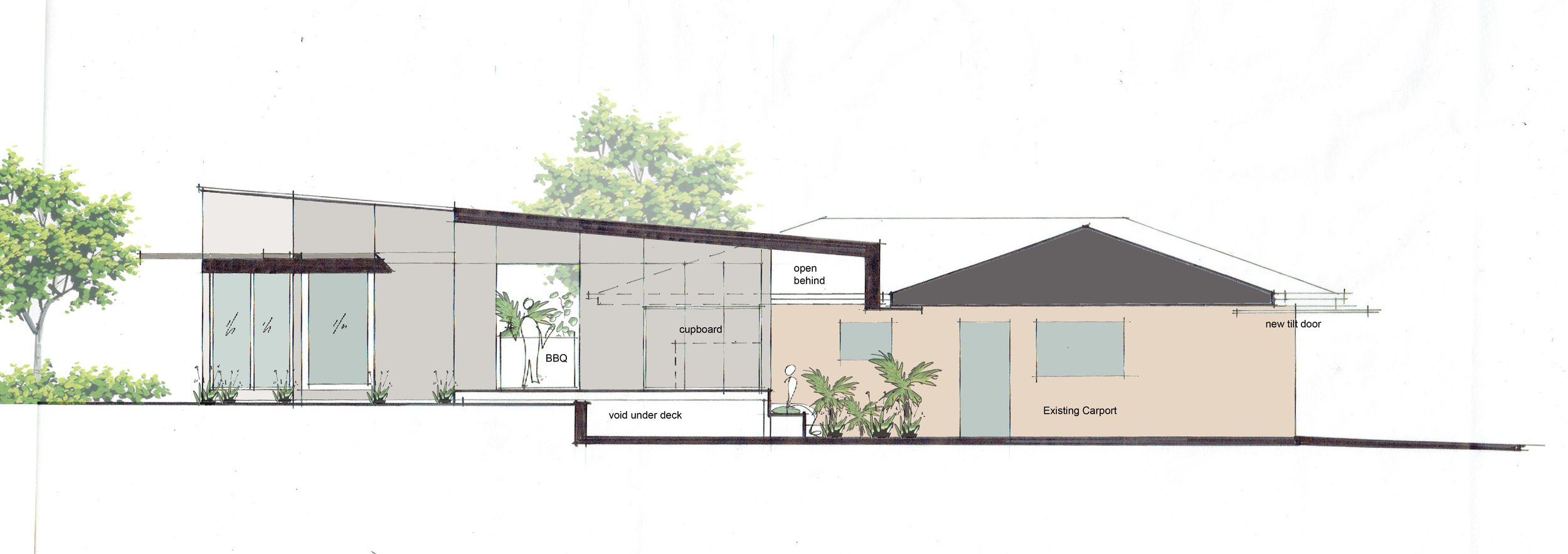
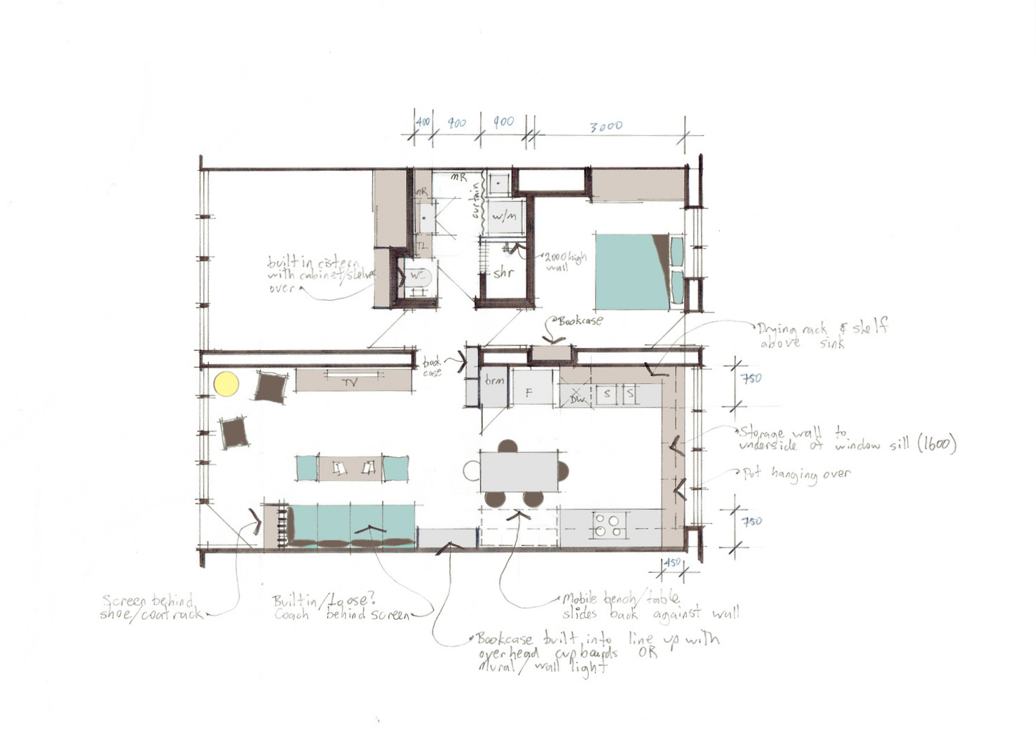
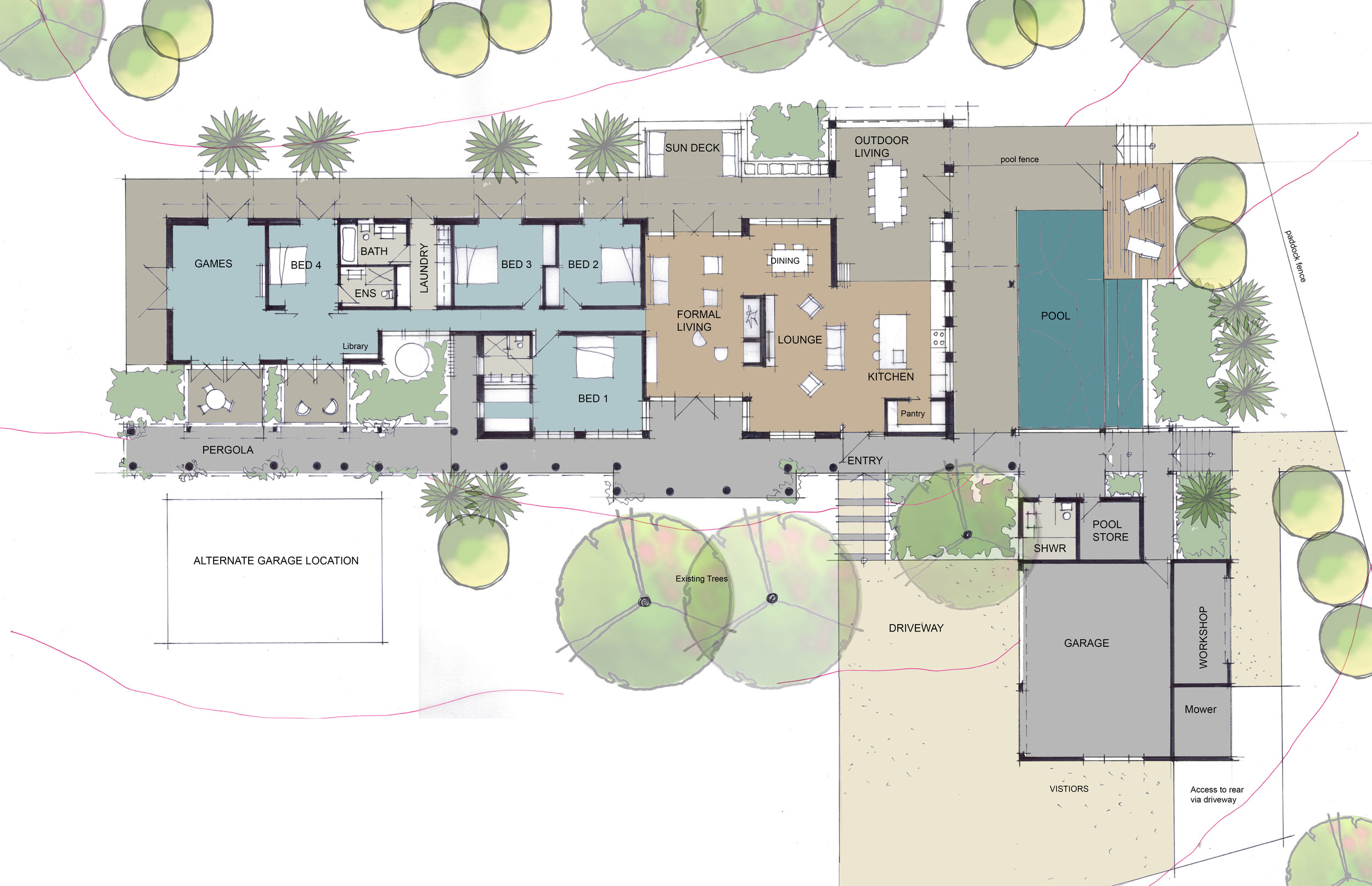
This small extension project involves updating a 60's style bungalow to make it better suite the new owners needs. Some internal renovations to expand the living and kitchen into what is currently the garage space while adding new large outdoor living zone. Some wet area renovations and a new 3 car garage complete the project. The client wanted to maintain the existing aesthetic of the 60's character so the new works tie into the bungalow utilising similar detailing and finishes.This is an owner builder project so documentation and site roles are limited.
beechmont residence
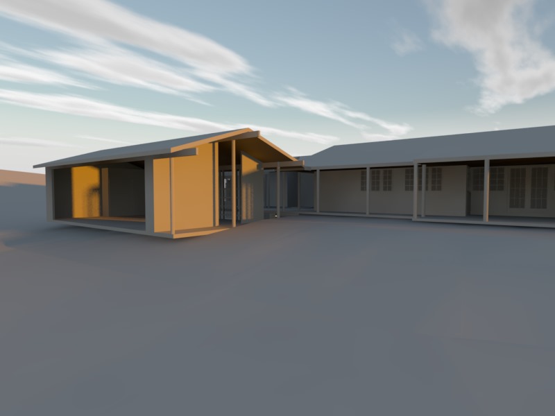
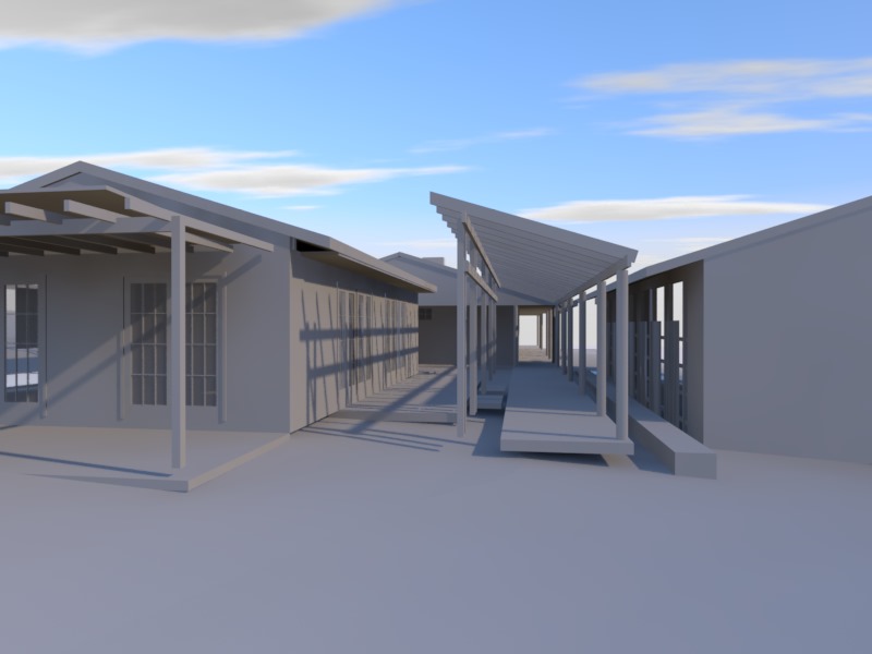
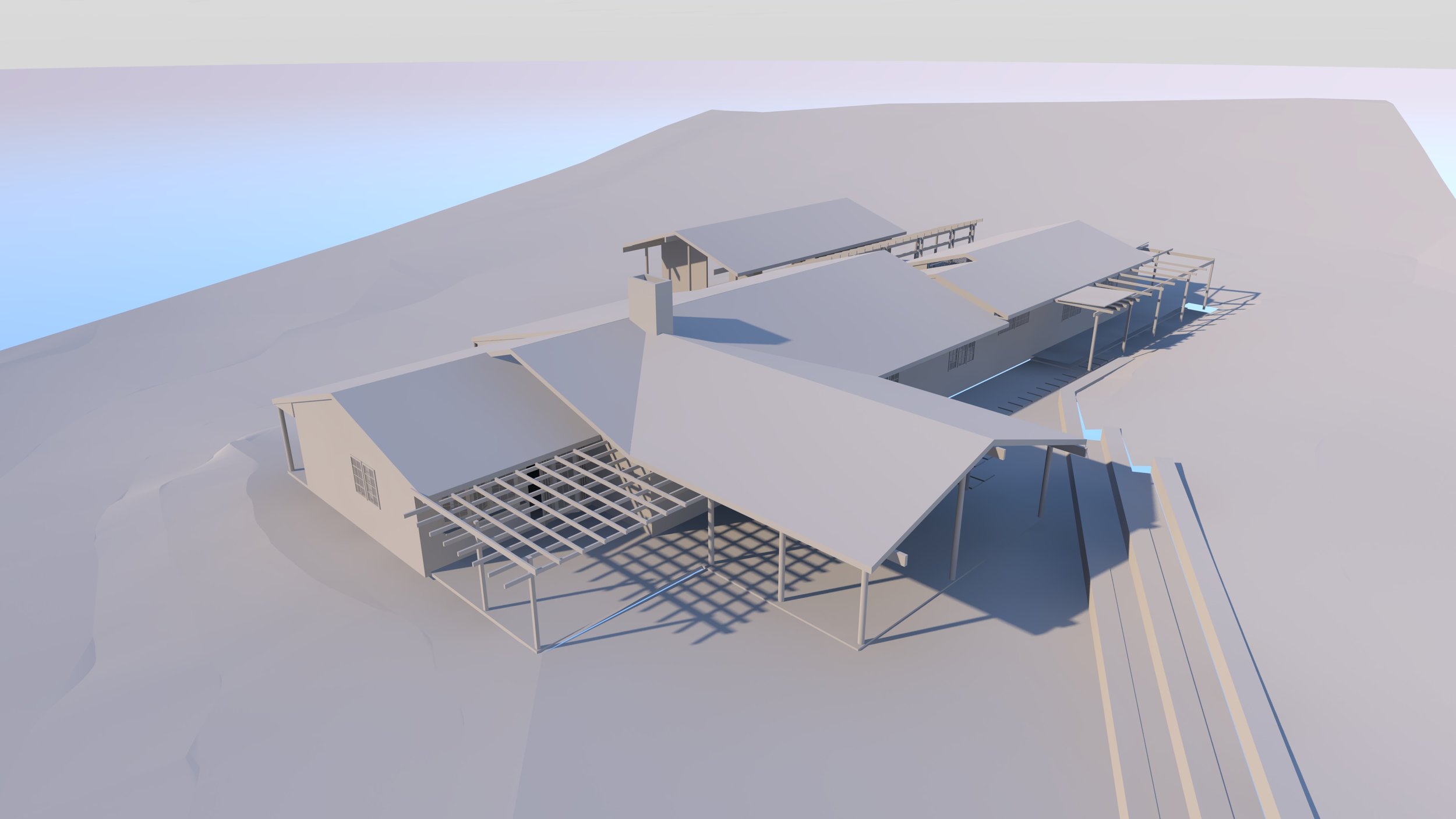
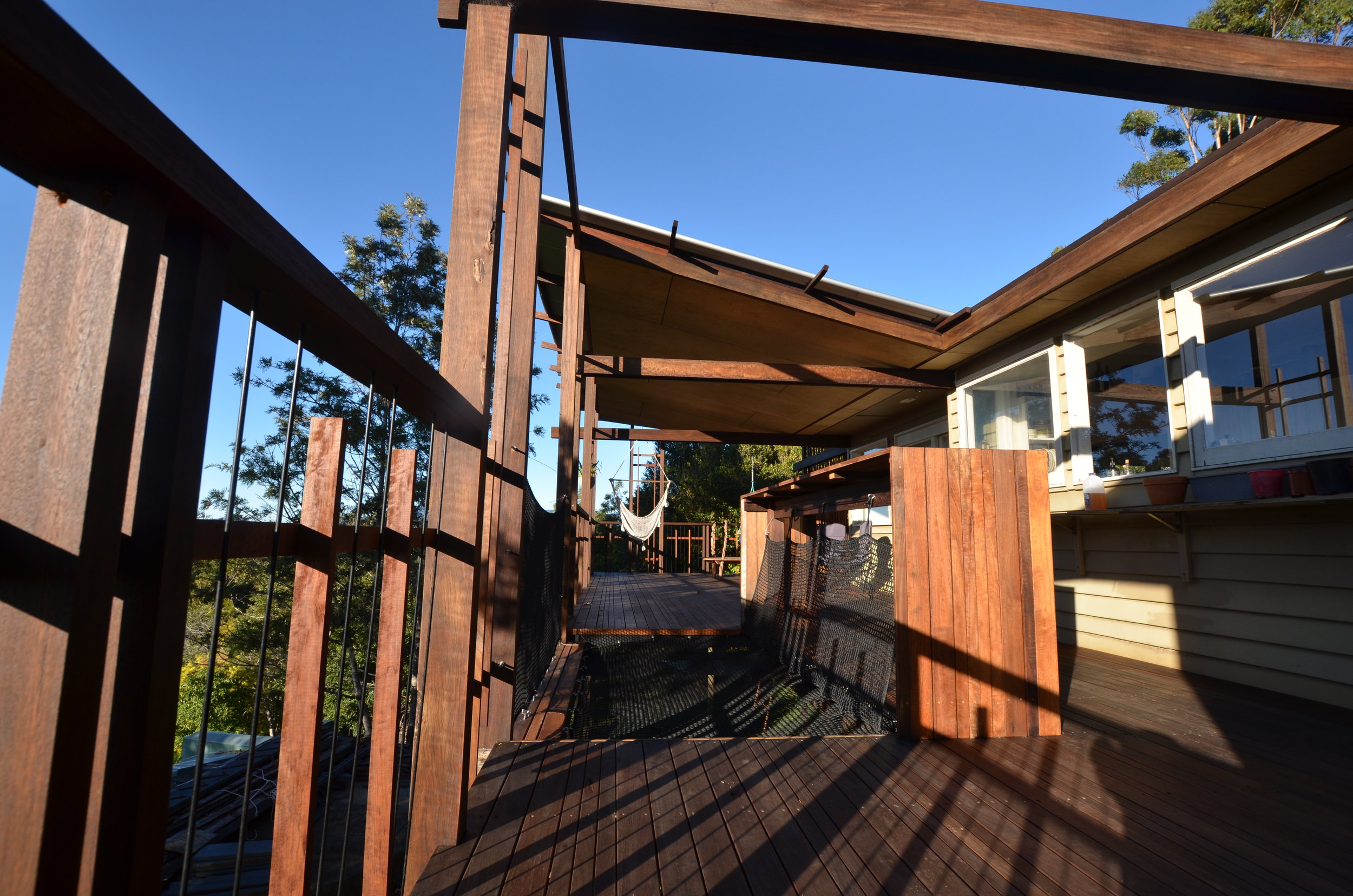
Our own house in the gold coast hinterlands is an ongoing project that will explore design ideas and techniques over many years. After recently moving into a somewhat neglected 1920's weatherboard house on almost 3 acres we aim to slowly transform it into our oasis. This will be a long process with most of the work exploratory and hopefully self constructed.
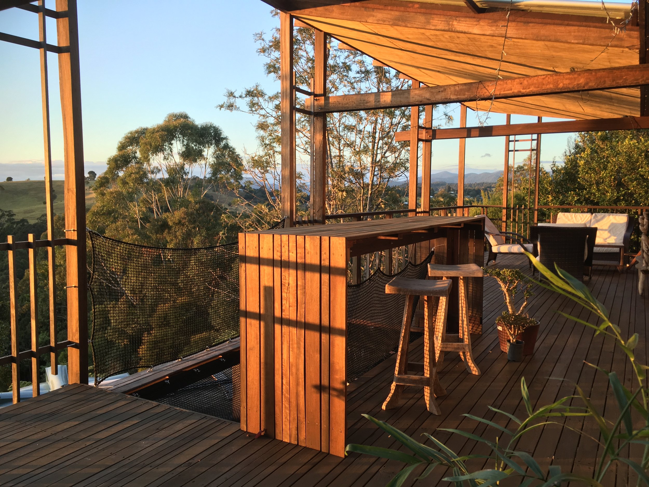
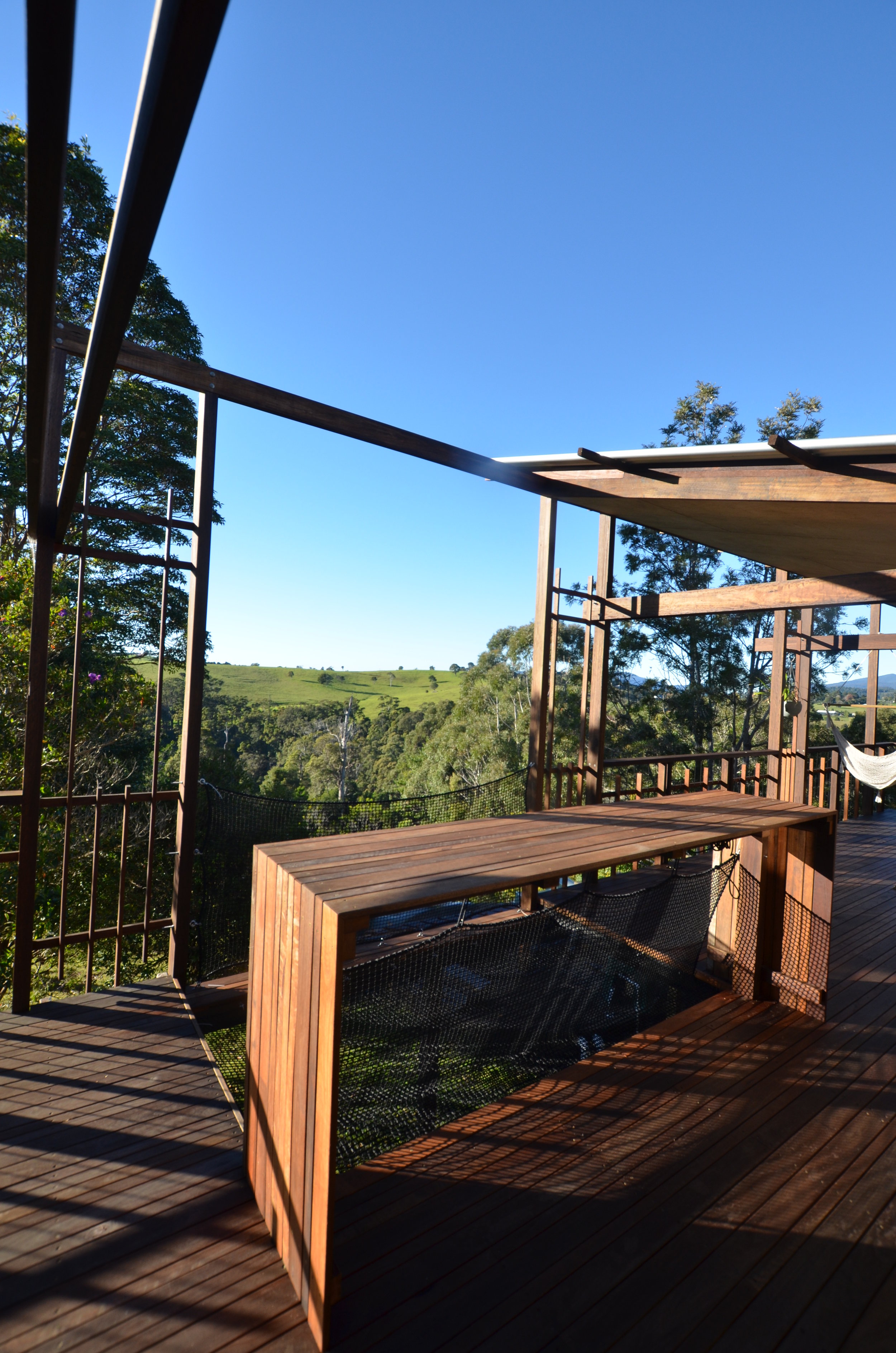
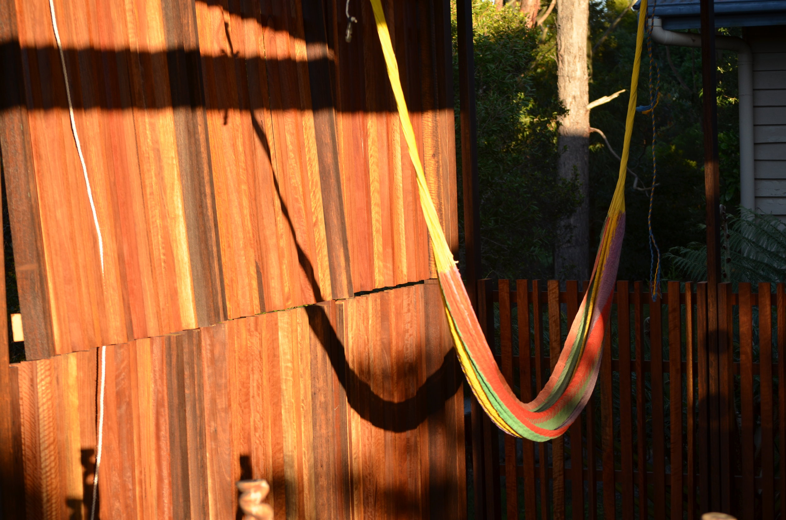
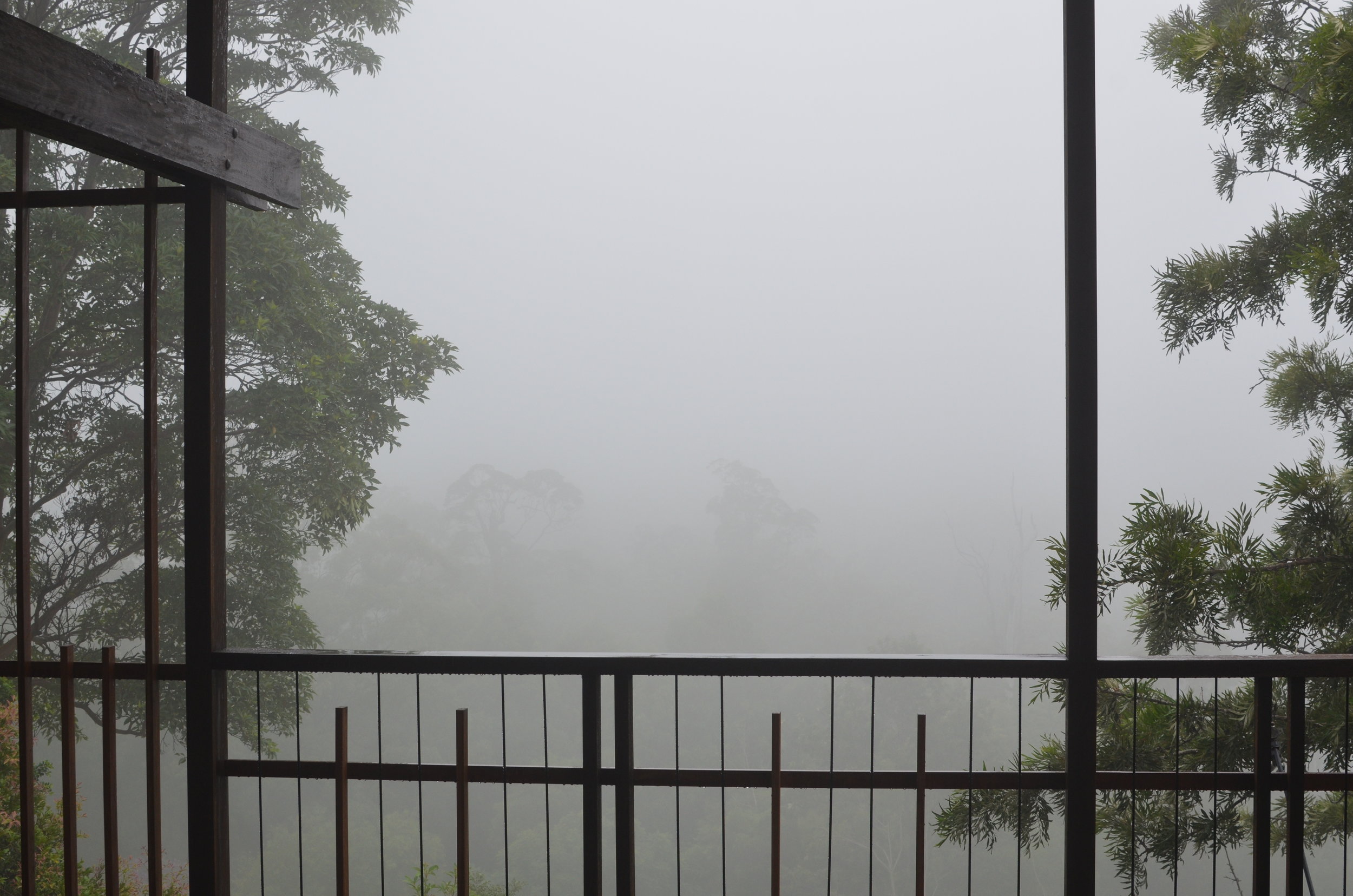
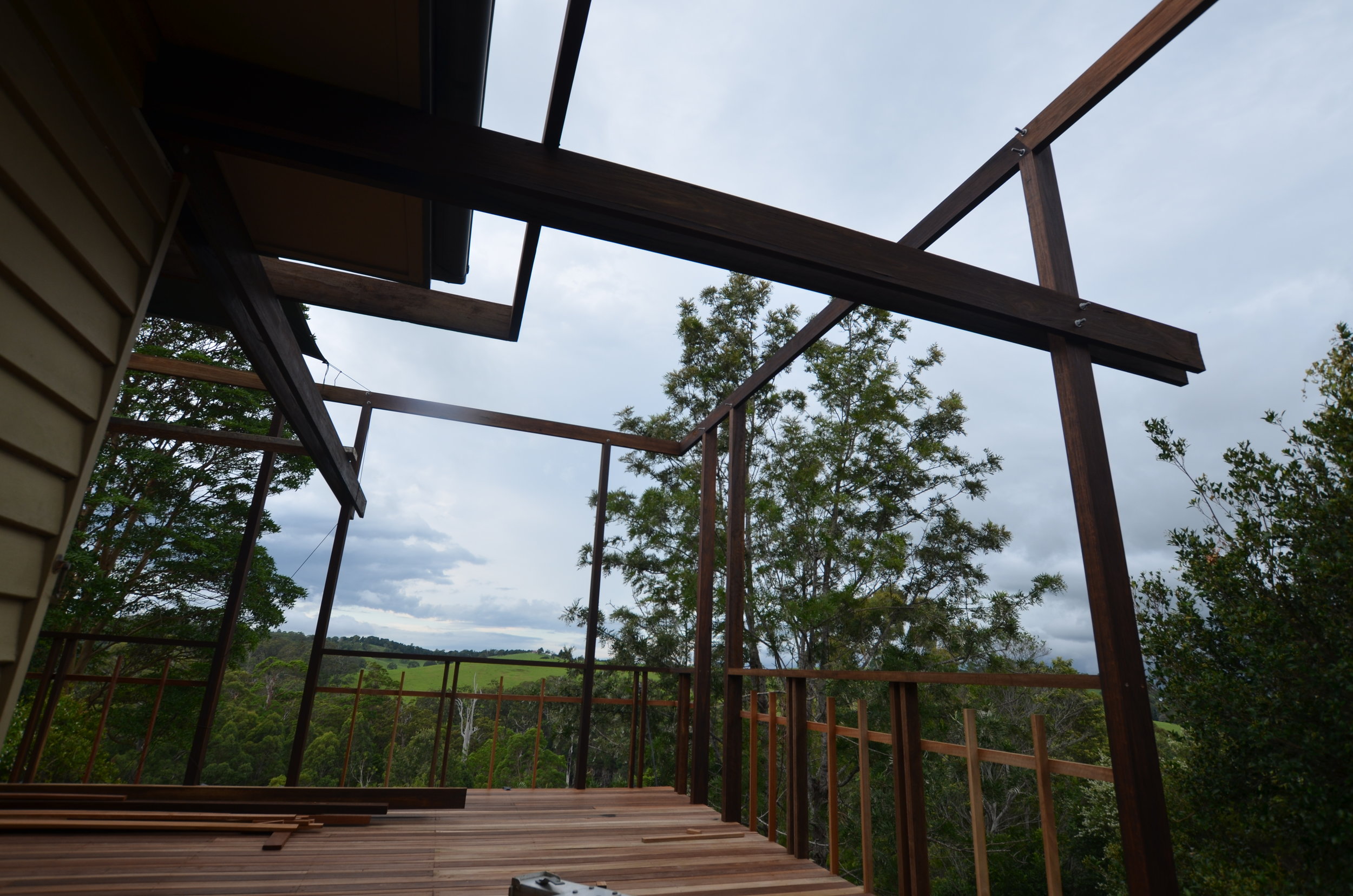
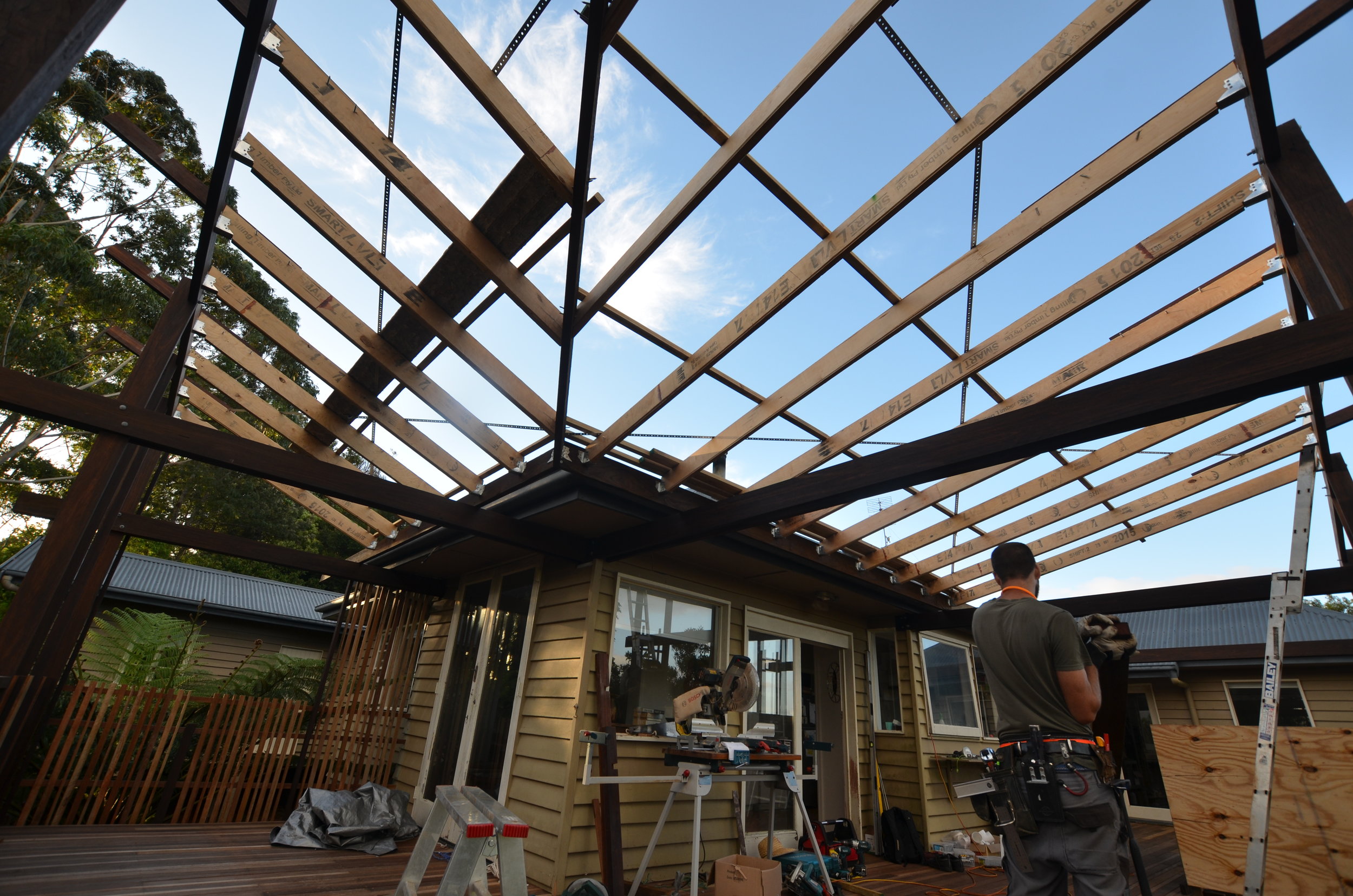
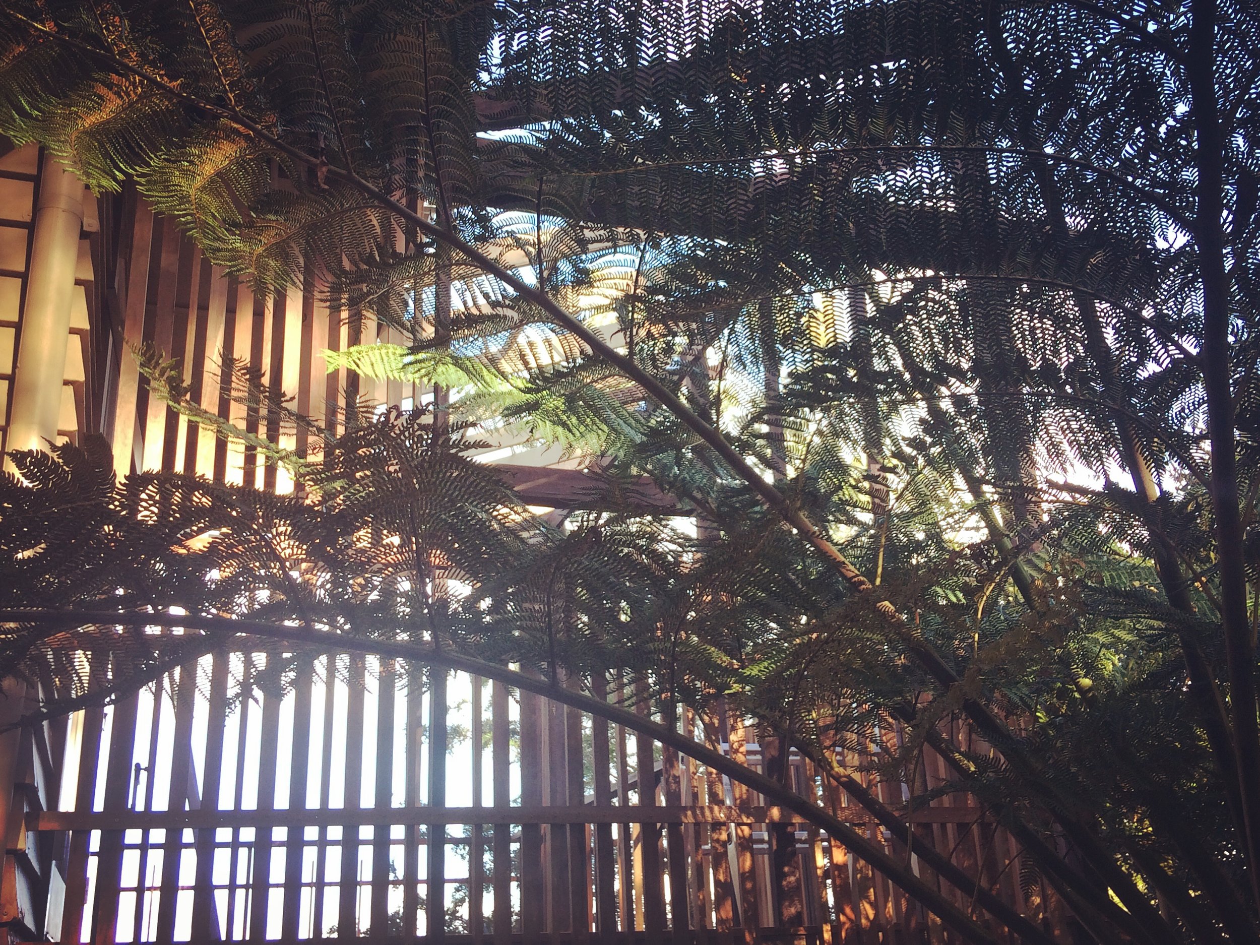
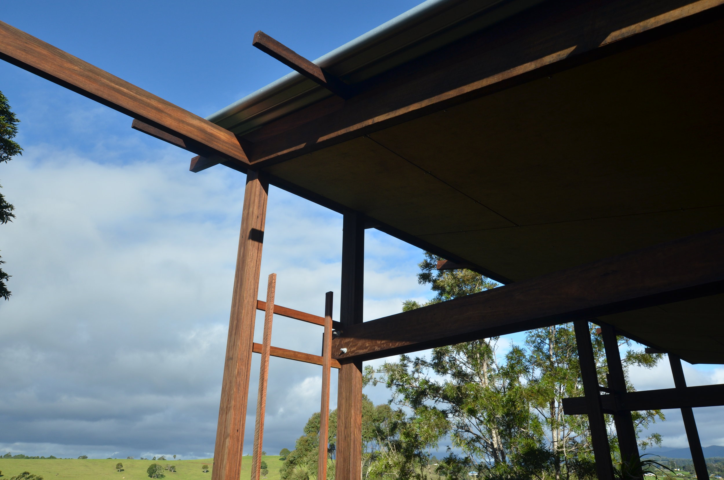
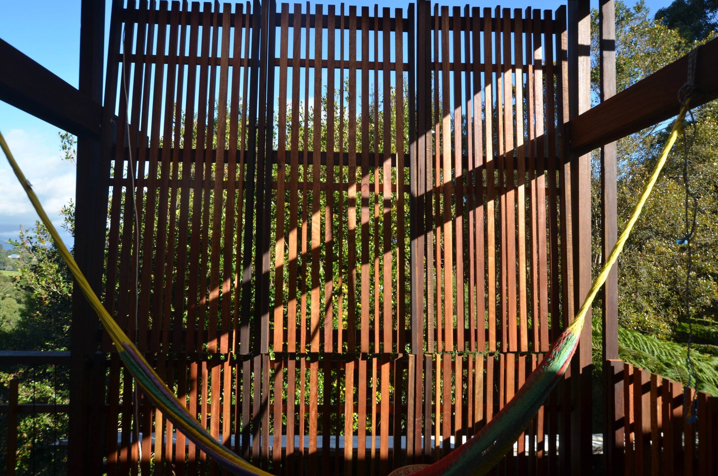
The first urgent project was the deck. There was an existing deck that was rotten with holes in the floor and large sections of the balustrade missing. With a 2 year old in the house this was a priority to fix and needed to be completed without experiencing the local changing climatic conditions. With the deck on the south and eastern side of the house we needed to roof most of it for protection but keep the north section open to allow the winter sun to penetrate. We removed everything to reveal the floor framing (which was kept), removed the central columns to allow cars through underneath and built up from there. New spotted gum decking, open balustrade and roof sloping away from the house to maximise the views framed off secondary beams to avoid roof penetrations and provide soft strip uplighting .
The infloor hammock is an idea to provide a bit of fun and provide a relaxing space to take advantage of the northern sun and the incredible view. Finding someone to make it however was a challenge. In the end we had a sail maker rope the net to size and installed this ourselves through SS eyebolts fixed through the decking joists.

d residence
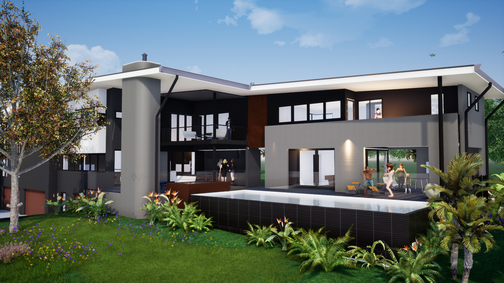
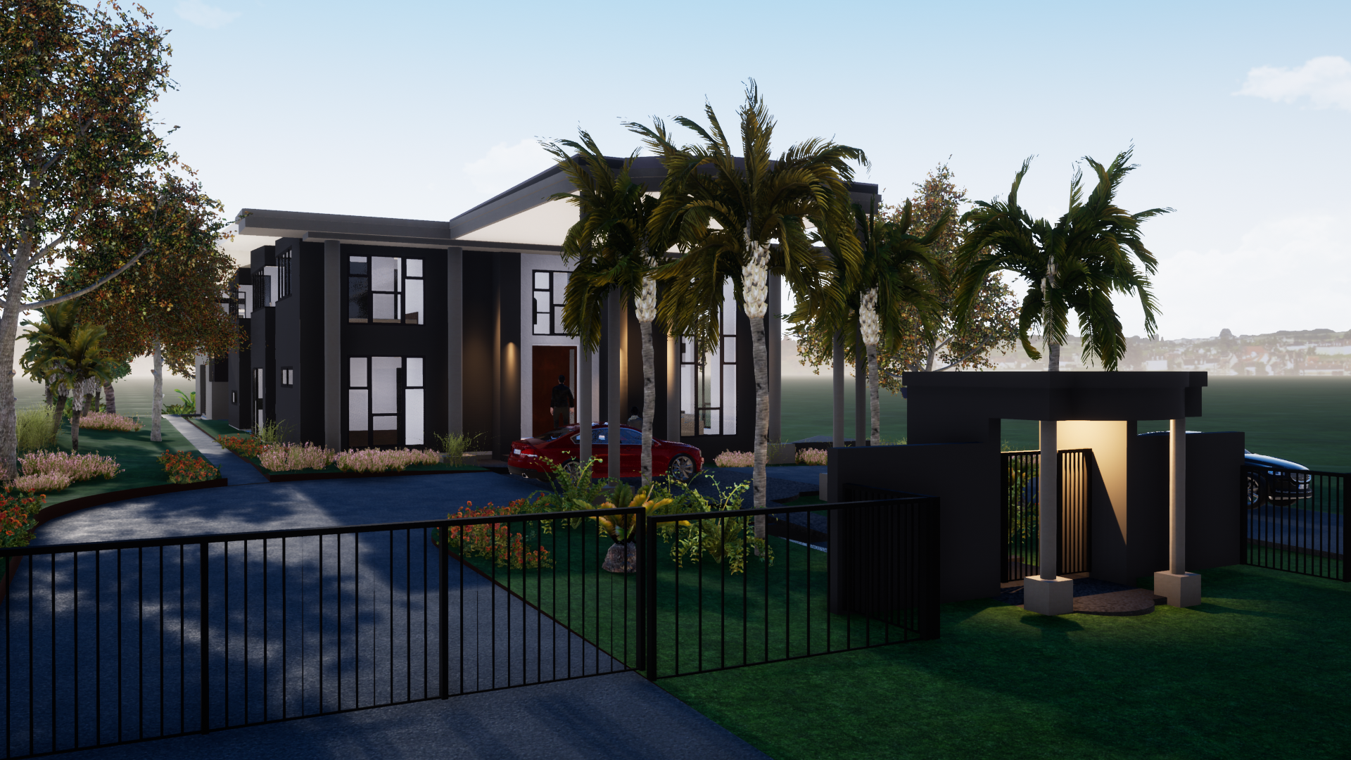
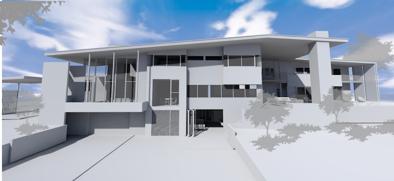
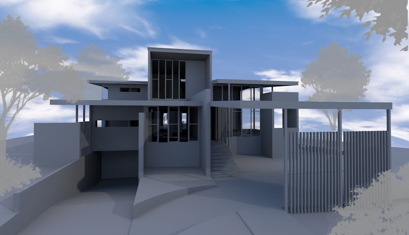
Set on an acre in the Western suburbs of Brisbane this is the house the client has been dreaming of building for years. With a large family intending to stay around for a while to come this house needs to provide a lot of space for a large number of people. While combining traditional formality and modern aesthetics this house is meant to provide a hotel feel with some homely warmth. Watch this space as the early concepts develop into a finished product.
northgate townhouses
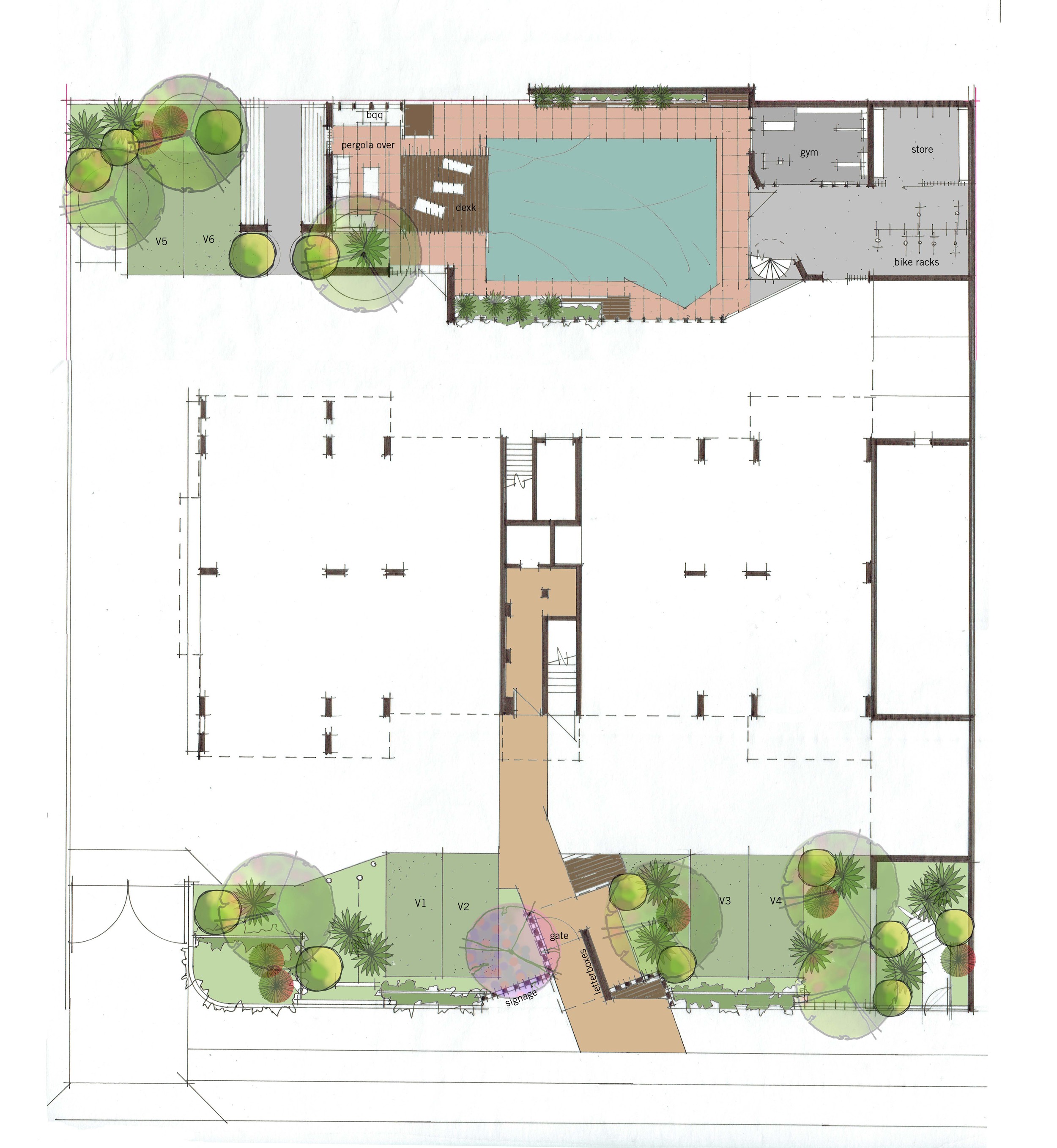
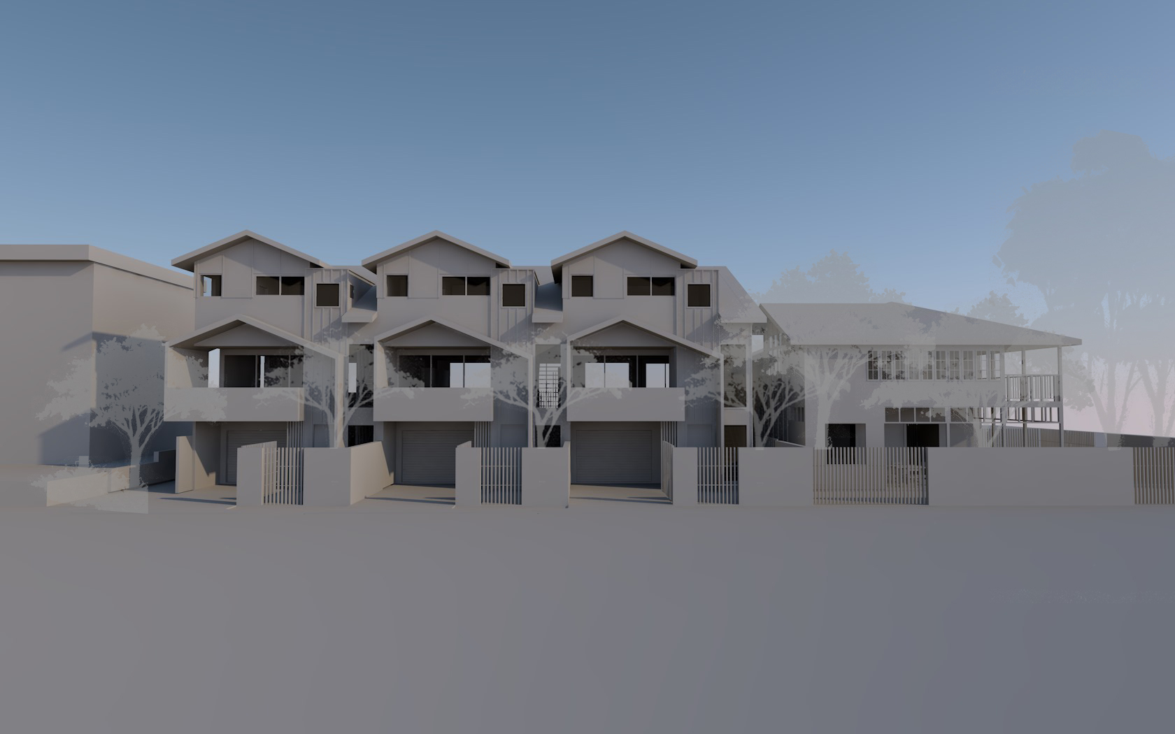
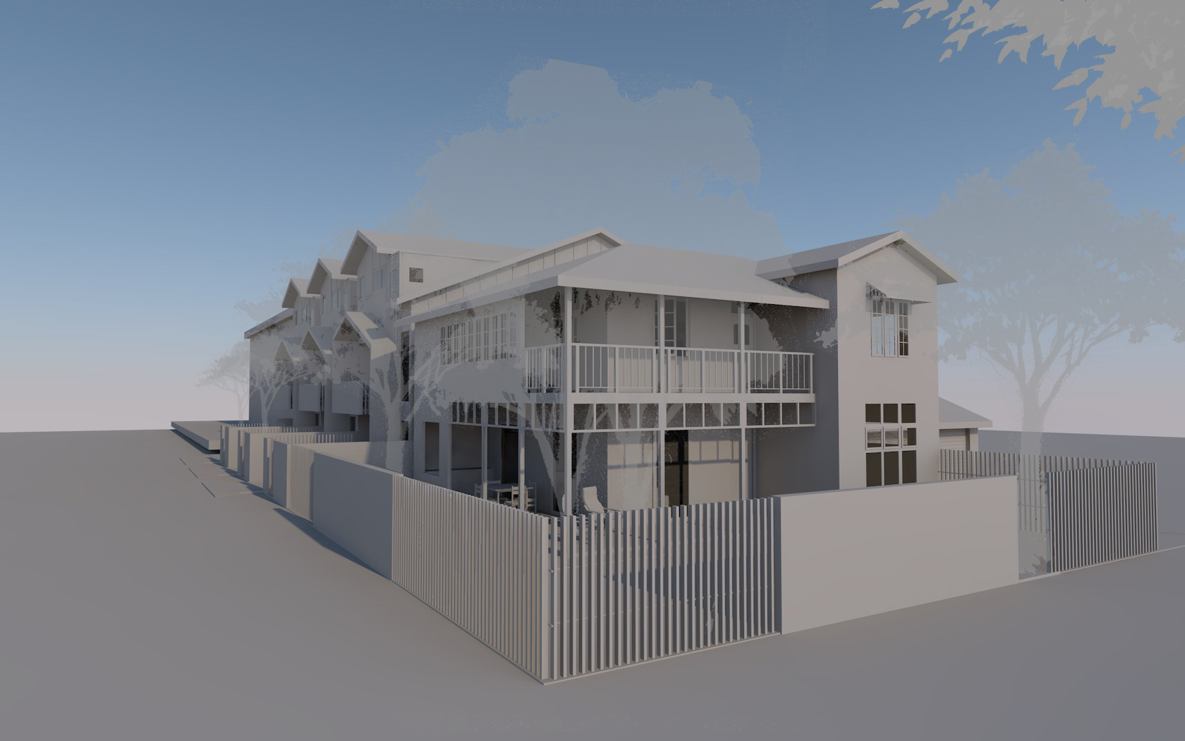
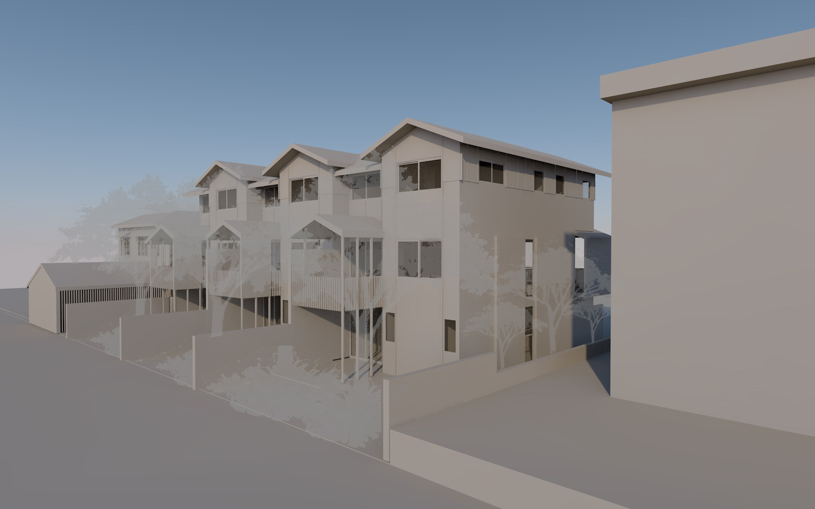
Set within councils heritage control areas this subdivision required the new townhouses to reference existing aesthetics of the neighbourhood. While trying not to replicate traditional details this design takes on elements to tie into the existing house, such as roof pitches, eyes on the street and general massing, all with a slightly modern feeling. As a developer driven project this design seeks to maximise yield while maintaining quality of space, including privacy, open plan living with covered outdoor areas on the north and back to the street. Each townhouse includes 3 bedrooms with Multi function room on ground floor directly accessing the north facing courtyards. The garage is set back to allow secondary car park and the existing house built in underneath to maximise functionality while opening onto the yard.
ACU - australian catholic university
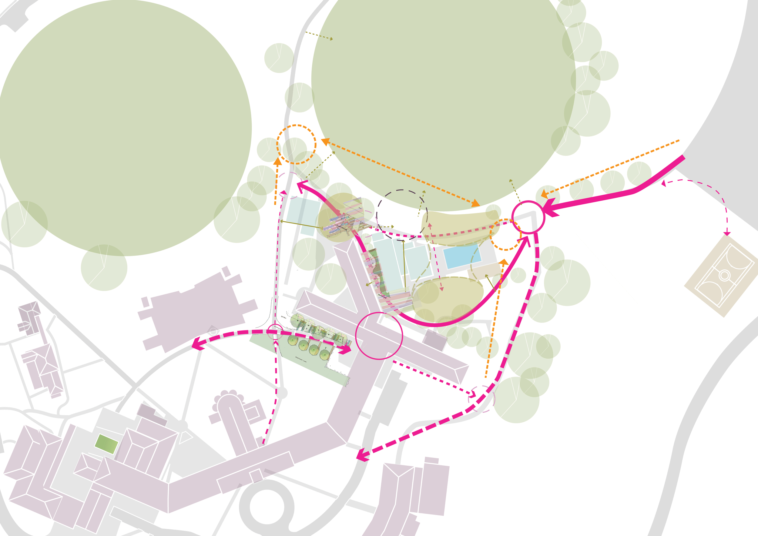
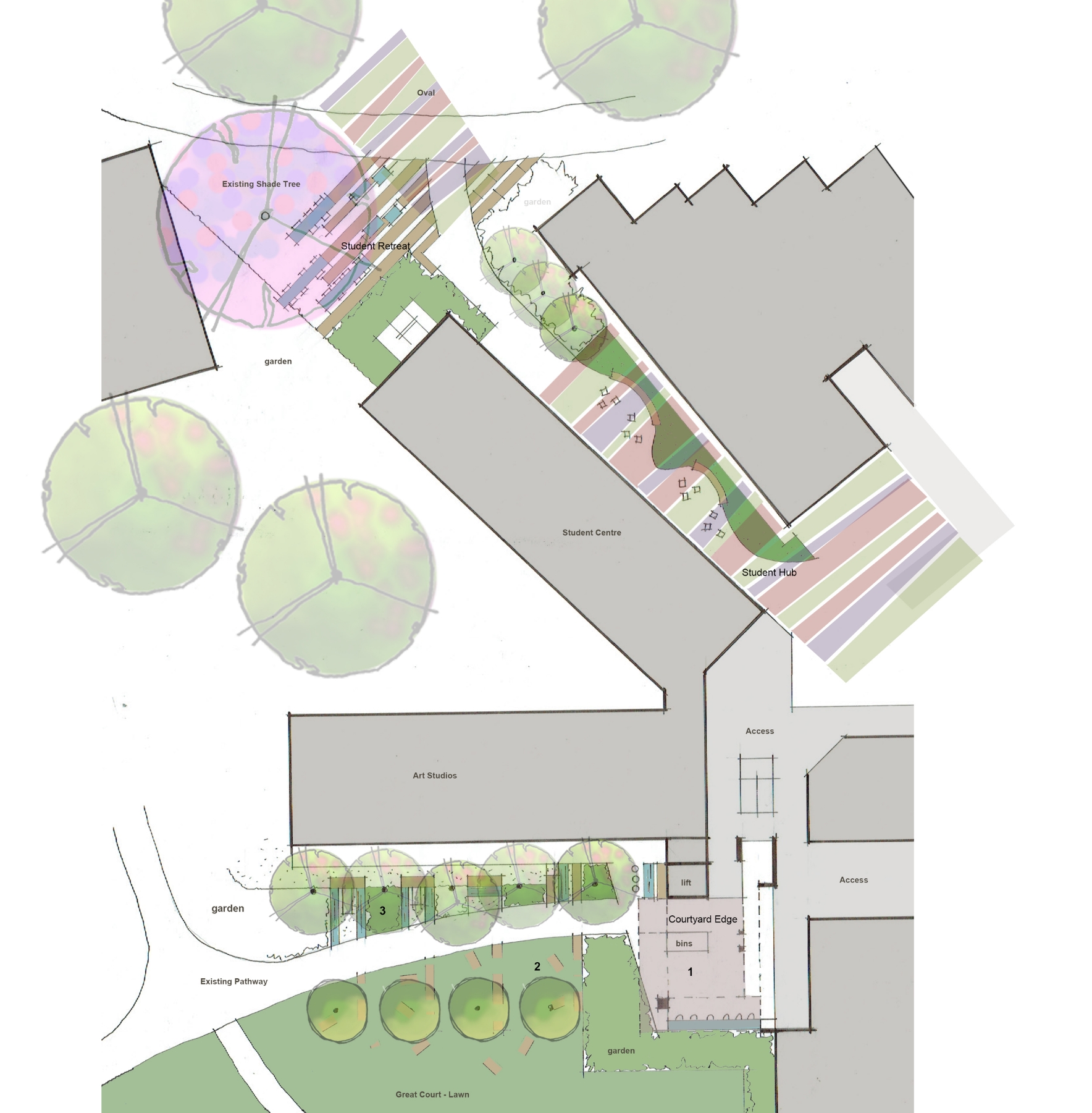
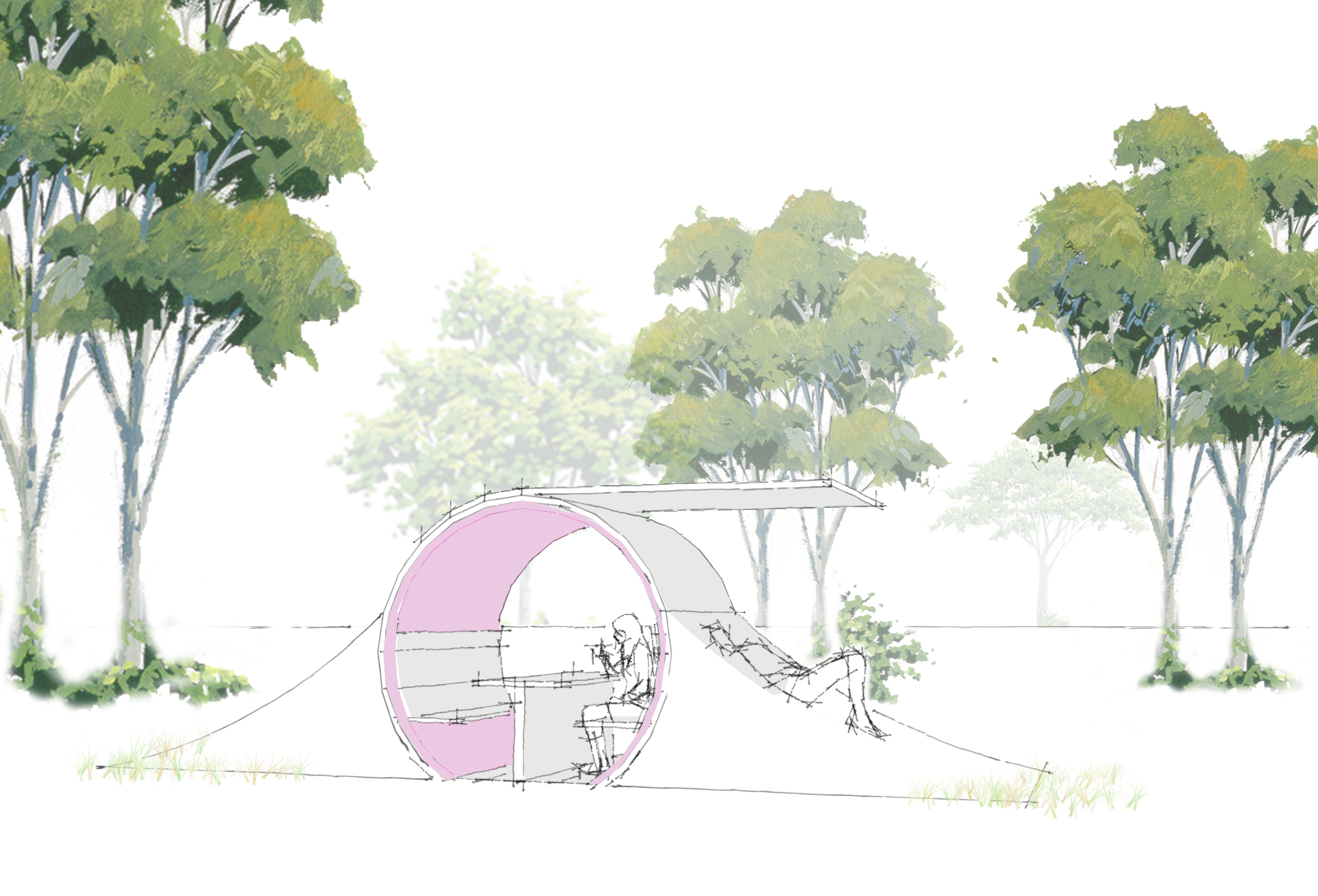
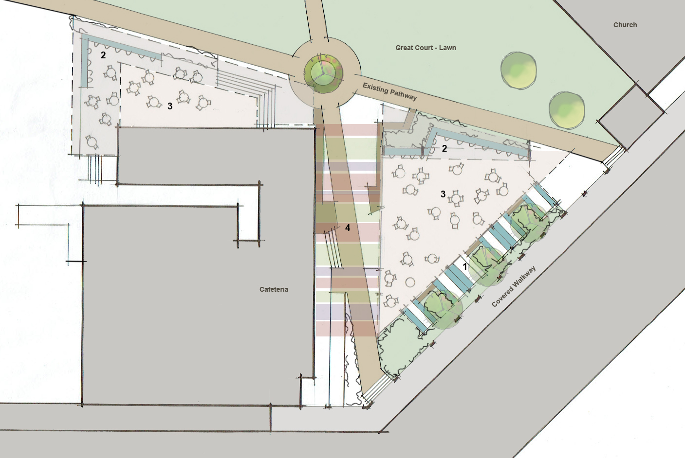
We are very pleased to have been working with ACU at the Brisbane (MaCauley at Banyo) Campus on a number of interconnecting projects. ACU recognises that a successful modern university campus is as much about the common space activation as it is the teaching space. Providing healthy, active environments that encourage student engagement and interaction is key to enhancing the education experience and retaining student numbers. The relatively new campus has fantastic academic facilities but has under utilised its extensive grounds and incidental gathering and co-curricular spaces. Identifying potential Hubs, Active Edges and Retreat spaces throughout the campus Resonance d+a is working through design concepts to enhance these areas with the provision of shade, seating and services. As part of the activation works we are also decentralising the coffee and food distribution. The inclusion of a coffee outlet within one of the shade structures outside the lecture halls will assist in re-vitalising the north facing courtyard and will provide charging and wifi capabilities in the building surrounds.
All of these works are now complete and available for viewing in the education section. Below are some of the works that did not proceed.
aquinas college- stage 5
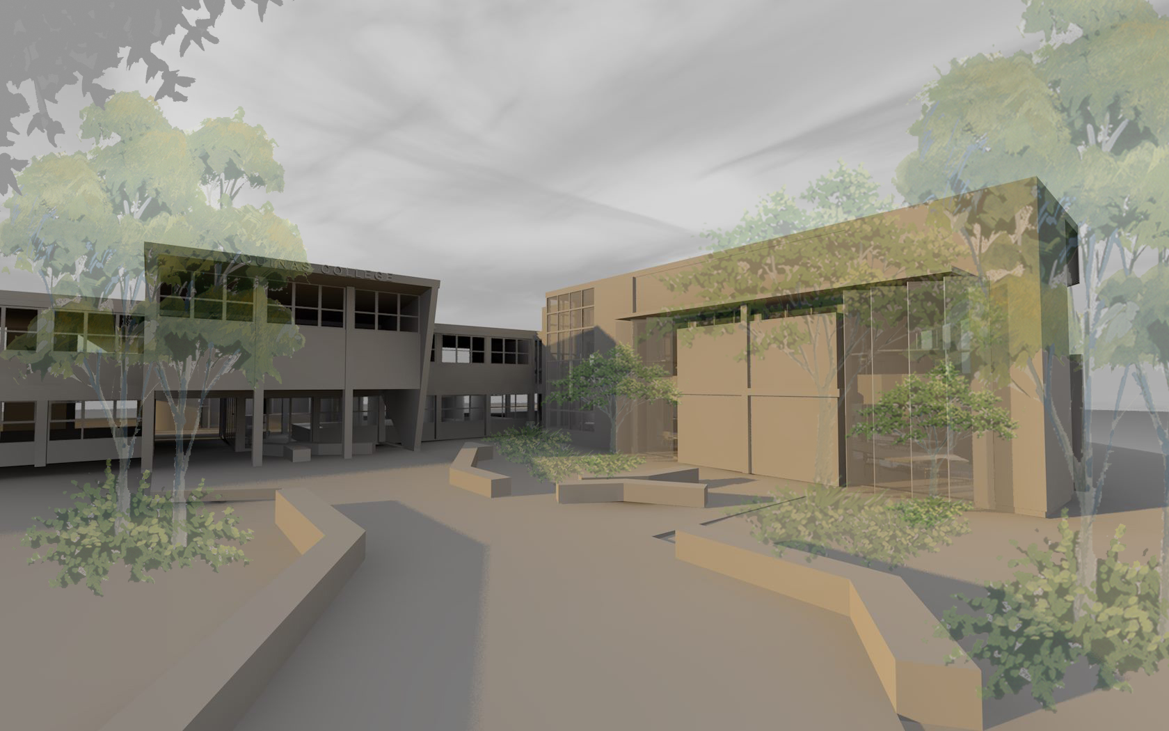
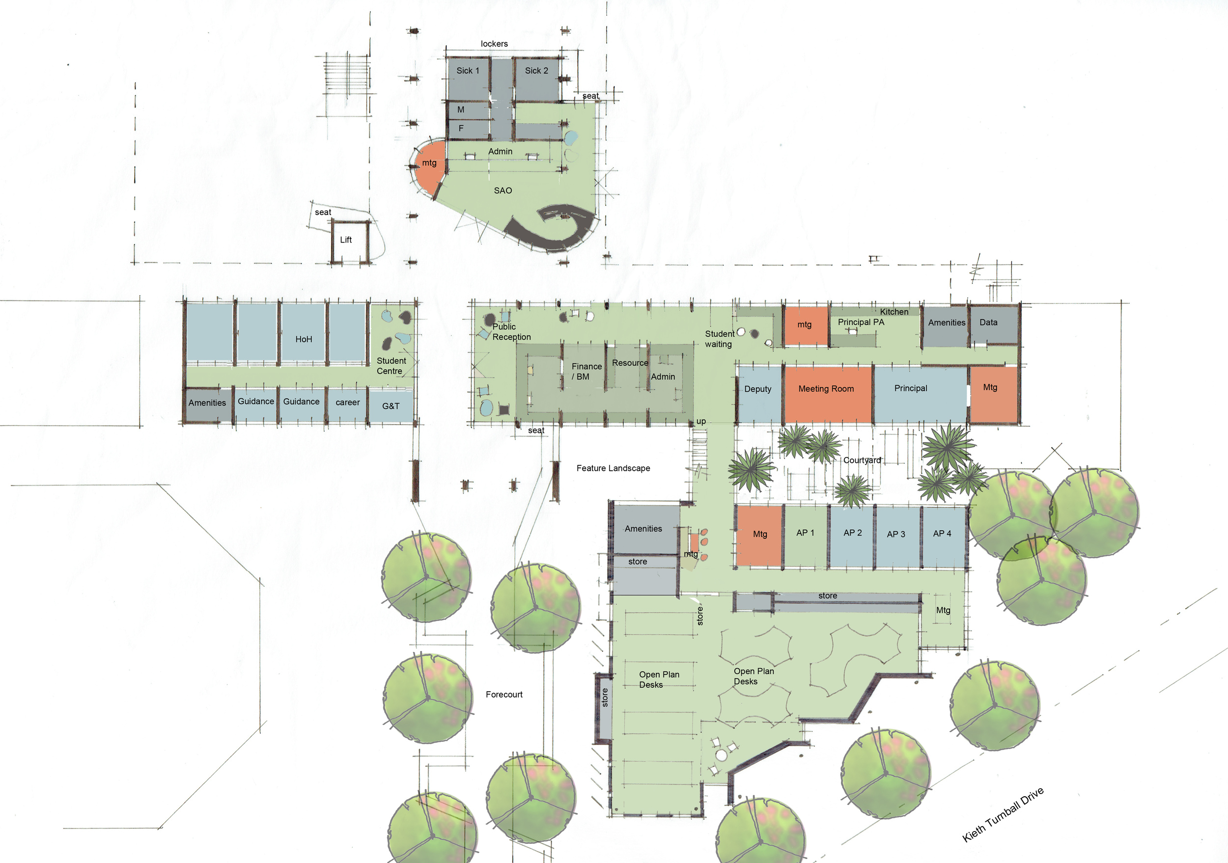
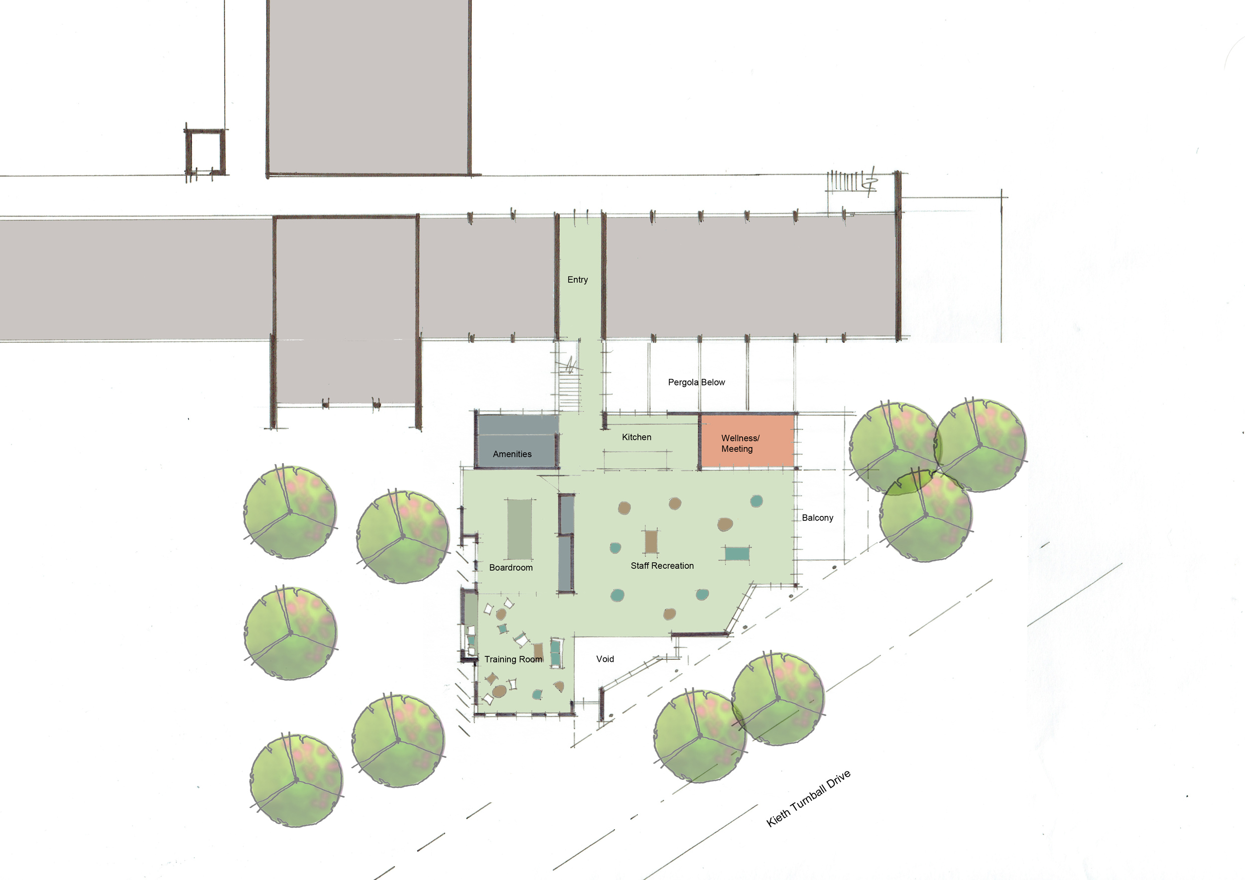
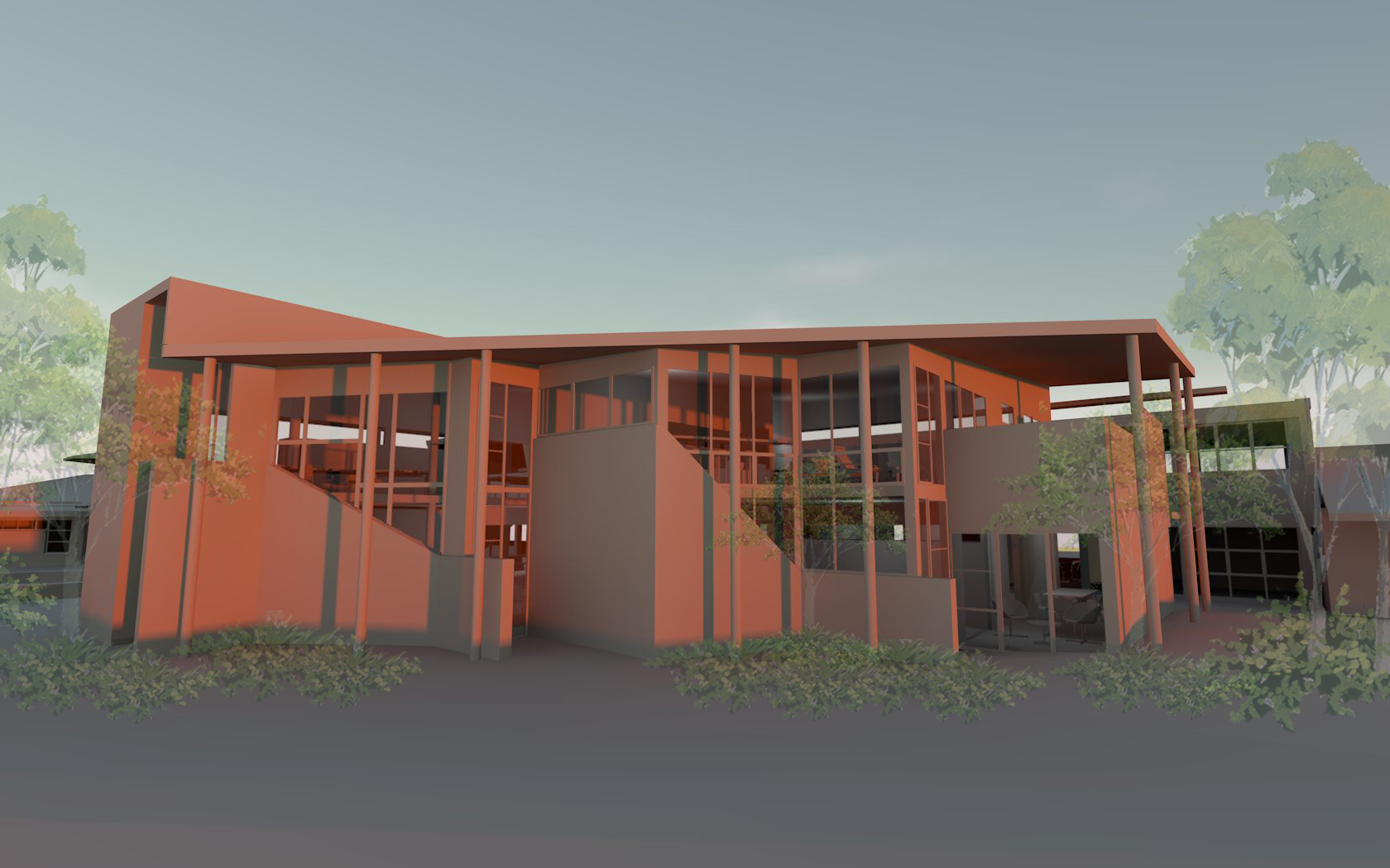
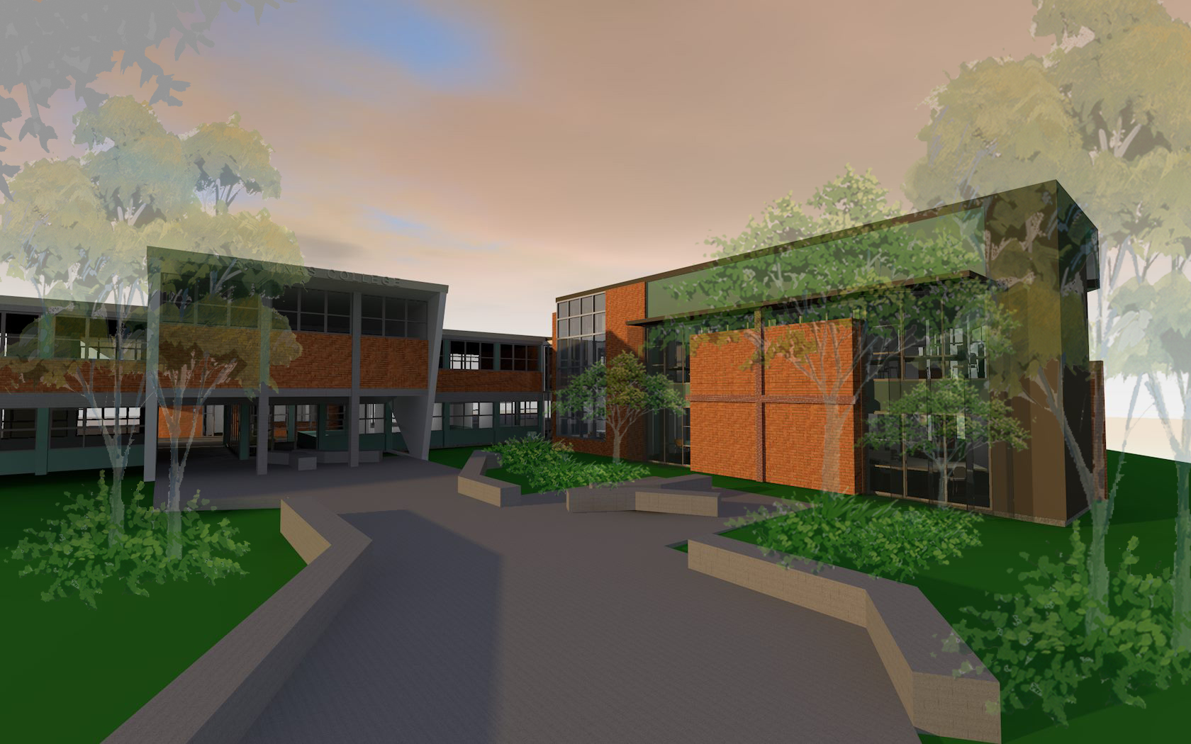
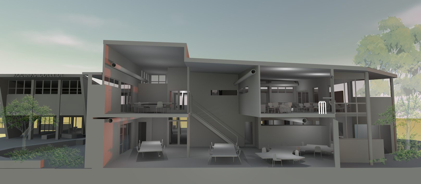
Following the successful completion of Stage 2-4 Resonance d+a has been continuing to work with Aquinas College on developing the next phase of the master plan. Stage 5 includes a new and revamped administration building and resource centre that aims to re-invigorate the original 60's building while providing a contemporary interpretation for the new works and a new face for the college. The concept design proposes to demolish the small 70 and 80's single storey 'add ons' and open up the original 60's entry. A new 2 storey building at the front of the site provides a street frontage and lightly links into the existing building while framing the entry promenade.
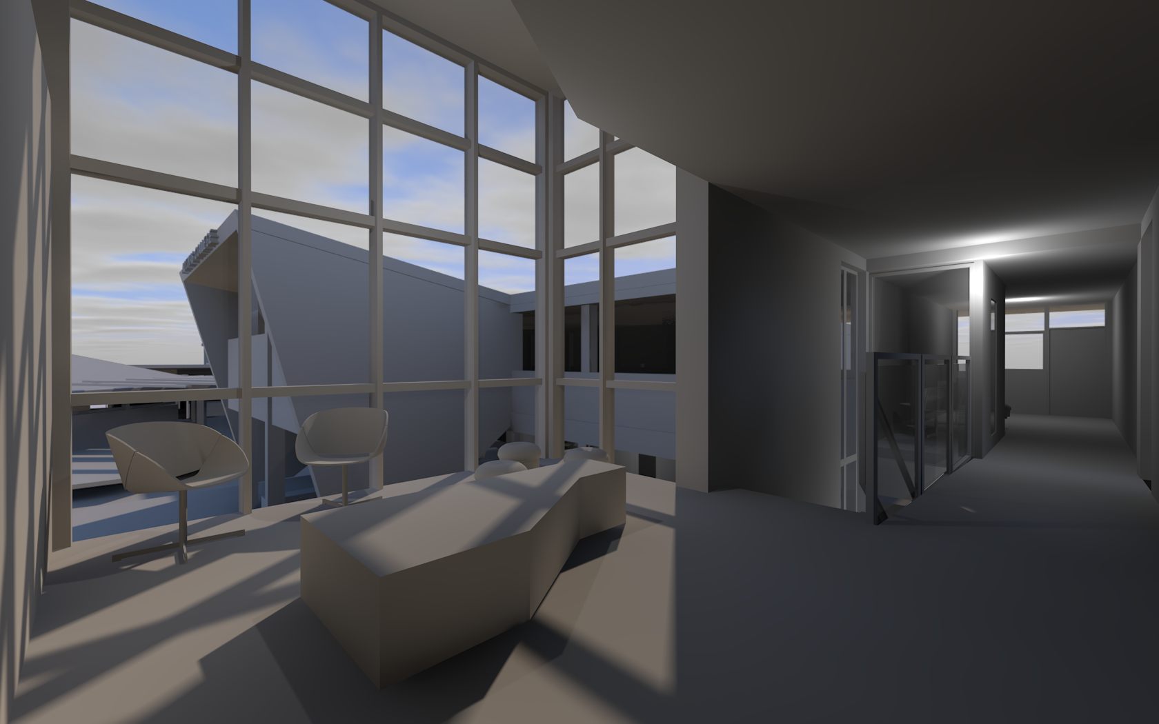
Problematically the new layout brings the public reception closer to the heart of the school with a twin faced reception (one side for public and the other for students) to create a clear delineation of space while providing efficiency of space. The management team is housed in offices facing each other across a private courtyard that forms the link between the old and new buildings. Open plan staff offices are further removed to provide separation from the students for retreat, with the staff rec room on the second storey with views to the gold coast and incidental viewing over the street frontage for surveillance purposes.
early concepts
