



education
education
education
education
education
It is vitally important to understand that schools are not just buildings but social environments. As architects we must be aware of the relationship between learning spaces and social spaces and use this to enhance the education experience. By creating external and social spaces that carry through elements from the general learning spaces we create a relationship that assists with greater recall when switching between.

Currumbin SS OSCH
Currumbin SS OSCH
currumbin SS OSCH
The Currumbin OSCH (outside school hours care) is an extension to an existing multi-purpose hall. The new building has been partly attached and partly removed to create a large breezeway space between the existing and new that allows both space to breathe. Direct access from the covered space to the hall utilises the existing amenities and kitchen for the new OSCH allowing the budget for the new works to be concentrated on additional and complimentary facilities.
The new space in essense is a simple large space to house the after school care program. The space opens to the north with large windows and sliding walls that connect to the existing playground. Within the space a series of smaller insertions create intimate spaces for retreat and rejuvenation.


Kington SC
Kington SC
kingston sc - administration refurbishment
This extensive refurbishment re-uses the slab, columns and beams of an existing 70’s building and brings back a little mid centuray magic to this administration building. The existing deep floor plate flanked by covered walkways has required some clever use of high level windows, translucent roof sheeting and activate (common use) hallways space to maintain light and ventilation throughout all habitable spaces. Creating a clear marker deep into the site and enhancing the nicely treed aspect of the site


Shailer Park SHS
Shailer Park SHS
Shailer Park SHS - Multipurpose Hall refurbishment
Once a covered outdoor court this building is to be utilised by the adjoining sports complex in the evenings with an A grade sprung timber floor and for training and assemblies during the day. Bing stripped back to the protal frame and block walls the refurbishment will incorporate high level translucent sheeting with a custom design venting system to provide light and air movement from a high level and provide hard wearing lower walls. New storage, gym and small platform with AV connection provides additional facilites to enhance the functionality of the new space. The adjoining amentieis will be upgraded to provide team rooms and showers



Southport SS
Southport SS
southport ss - prep courtyard
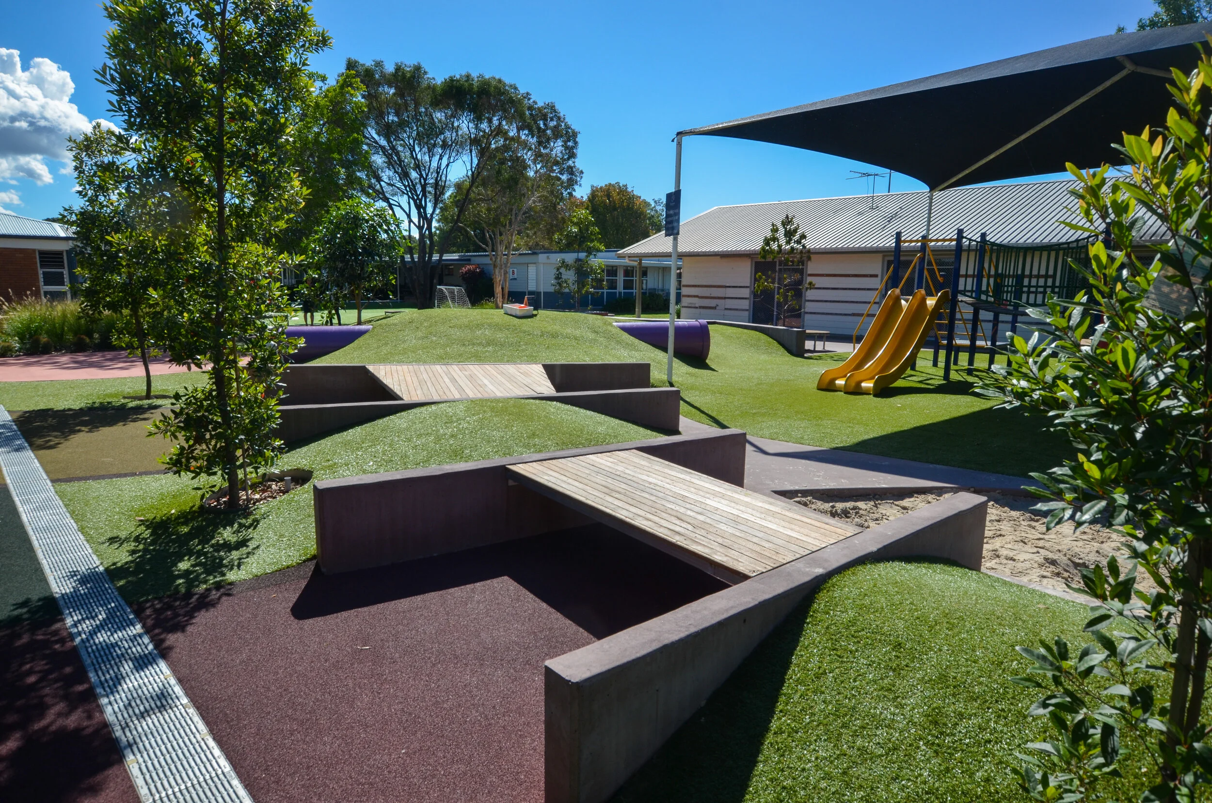
With a huge very large prep cohort Southport SS wanted to provide an engaging and multi-functional outdoor learning and play space. The existing courtyard consisted of some play equipment, trees and some grass. With the new works we utilised the existing trees to proivide immediate shade and worked around the existing play equipment. A new path meadndering around the trees with some well shaded seats inhabit the pathways.
A mini soccer field and embankment sits alongside a chequerboard coloured concrete handball court flanked by climbing rocks and softscape. Across the path a more organic approach encourages imaginative play with grass embankments, tunnels, sandpit, waterplay and bridges. Small hardstands with off form coloured concrete seats and blades provide outdoor learning and play spaces that resemble small stages. The timber bridges provide seats and play space witht he new rubber flooring extending into the existing covered space to provide a soft seating lunch space.
A new covered space provides a bookend to one corner, defining the end of the space while provoiding an accesible route to the modular at one end. New terracing off the deck provides a quick access between the internal space courtyard with art sink, outdoor whiteboard and seating.




ACU
ACU
ACU - australian catholic university
We are very pleased to have an ongoing relationship with ACU at the Brisbane (MaCauley at Banyo) Campus. ACU recognises that a successful modern university campus is as much about the common space activation as it is the teaching space. Providing healthy, active environments that encourage student engagement and interaction is key to enhancing the education experience and retaining student numbers. The relatively new campus has fantastic academic facilities but has under utilised its extensive grounds and incidental gathering and co-curricular spaces. Working closely with key ACU stakeholders Resonance d+a recently completed a number of interconnecting projects to provide additional amenity within strategic locations throughout the campus.
ACU Weemala Outdoor Learning
Once again we are very pleased to have been invited by ACU to provide the design for this exciting little project. The Weemala outdoor learning area is a dedicated space for the indigenous support centre at ACU. This project utilises an existing slab and shade sail structure and updates to a new solid roof reflecting a bird, (inspired by the local tribe animal the Black Duck). The existing concrete has applied finishes that introduce song lines from the Weemala artwork and brings clearly identifiable Aboriginal and Torres Straight Islander imagery to the space. The space is intended to be a comforting and secure space that provides for teaching, meeting, functions and general relaxation. The works extend into the landscape and include aspects form the artwork reflecting the land, forest, river and reef.
We have designed custom made mobile and modular furniture from perforated aluminium and timber that provides the opportunity for a variety of functions, including screened private tuturial / meeting spaces or more open social engagement. Built in seats and central bar are complimented by mobile tables and chairs and even outdoor beanbags within the wi-fi range extend the habitable zone well and truly into the landscape.


ACU - building 207.1 refurbishment
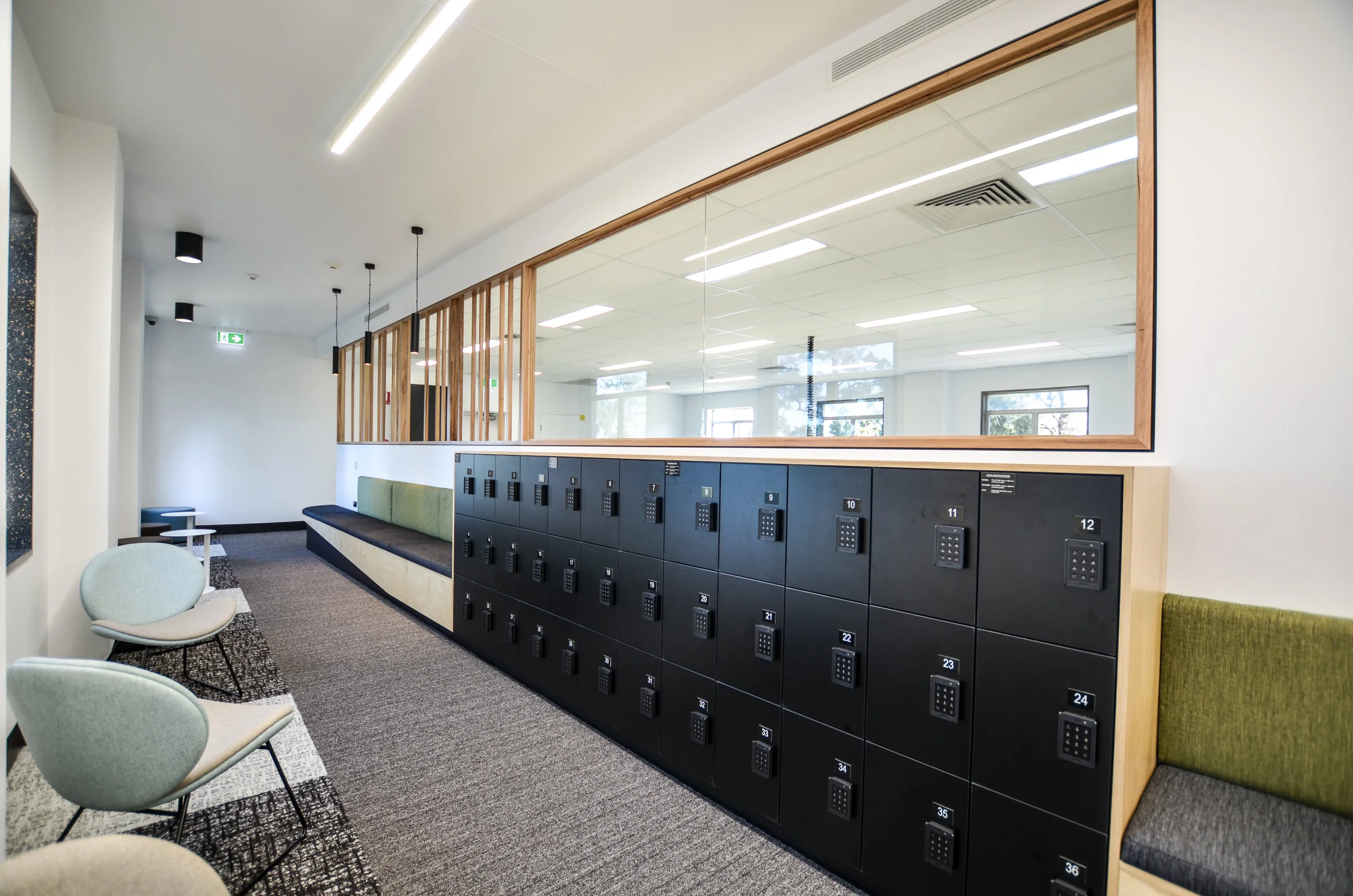
As part of their major works to co-locate the school of nursing, the second floor wing of building 207 was been freed up for alternative uses. This involved a complete gut and refurbishment of 400m sq on a long, middle floor north facing section of the main campus building. The new works constitute additional sessional staff facilities including 35 desks, breakout spaces, 3 new teaching rooms and 2 new meeting rooms. The project opens up the existing wing with an extra wide hallway incorporating built in seats and benches with GPO and USB outlets to encourage students to inhabit the movement spaces. This space hugs the northern wall with existing windows (complete with terrazzo windows jams) and links through glass doors to the sessional breakout zone. The hallway has a subtle angle that widens at the start to accommodate larger numbers of people and narrows towards the private sessional office space. This act also makes the corridor feel less like a hallway and allows greater habitability. the inclusion of seats and benches with mobile soft stools further enhance the relaxed and usable space.
Entries to the teaching spaces are highlighted by door recesses with large common space whiteboards and a feature squiggle light. The meeting rooms are accessible to the wider campus and include writable glass walls and much needed tele conferencing facilities. The built in plywood furniture and colourful soft furnishings provide a warmth to the breakout zones with a timber and glass screen that buffers this zone to the working space while still allowing borrowed northern light into the office space.




oval activation works
As part of ACU's health science precinct and their aim to engage with the community and encourage an active student lifestyle the lower oval was upgraded to a class A playing surface with new habitable viewing spaces around the edge. These works included a significant amount of in ground services and stormwater re-direction, collection for irrigation, new competition grade oval lighting for night time events and a covered terrace seating area adjoining the health science block. While these new works were intended to provide destinations in an otherwise under utilised zone of the campus they also provide a direct connection to the internal teaching space and have been designed for multiple uses. From the inclusion of power charging and wifi connection, terraced seating for viewing of the oval through to flat spaces for teaching purposes and a direct connection between O Block and the oval itself the new works promote a crossover between the active and passive spaces and revitalize a neglected area of the campus.


the junction - coffee hub
The junction coffee hub is strategically positioned outside I block and the lecture halls to provide a decentralized catering option for the campus. Designed to hug the edge of the forecourt and tree line the coffee hub provides much needed shade and caffeine at the entry to one of the busier Blocks on campus. The junction is set against the heritage listed Administration building and aims to provide a counterpoint while subtly referencing the patterns within the existing building through the tiling layouts and cutouts in the folded metal seats. The blackboard walls of the cafe fold down when not is use to allow an open covered space complete with power and wi-fi. When the cafe is open it addresses the main access path and provides an active and shaded edge to the building forecourt.


i block fitout
Resonance d+a was commissioned to re-invigorate the common space and hallways of I Block. The existing concrete floors and Beige rendered block walls were dull and noisy. Part of the works was to soften the space and provide some acoustic absorption and resting spaces between classes. Through the introduction of seating, pinboards and magnetic whiteboards throughout and a few splashes of colour the new space allows itself to be manipulated by the users for the users.


robina CPAC
robina CPAC
robina CPAC
AIA State & Gold Coast Regional Award for Public Architecture - Commendation
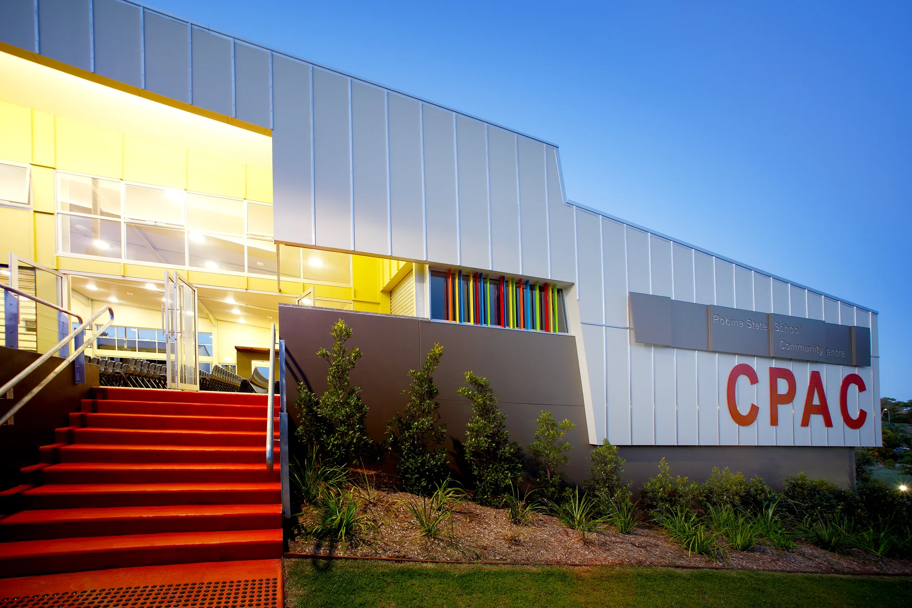
Robina Community Performing Arts Centre acts as an interface between the school and public. Afforded a secondary street frontage the centre provides direct public access to engage with the community and after hours access independent of the school operations. A north facing courtyard provides hard and soft surface play and recreation space that connects directly into the secure school network. The link network continues through the centre to the on site secure drop off zone.
Located on a hill the design of the centre takes advantage of the slope to enhance the functionality and comfort. The stage includes a full height operable shutter to open up the back to a grassed amphitheatre. The eastern louvred wall overlooks the oval and collects all the cooling breezes to scoop through the main hall. Large bi-fold doors open to the northern forecourt to provide a seamless transition between the internal and external space.
Receiving both peer recognition and client praise the Robina CPAC is indicative of how good design can achieve great results on an extremely modest budget.


all images courtesy Lightwave International

New Page
New Page
upper coomera junior courtyard
The existing junior courtyard was a dirt embankment in desperate need of some love. Approached to upgrade the space with durable and low maintenance finishes Resonance d+a designed a multipurpose facility with several separate components linked by similar finishes. Dimple flush and raised coloured concrete paths and plinths, combined with sandstone blocks, artificial turf, garden pathways and softscape the new works provide soft and hard spaces underneath a future shade tree canopy. An ampitheatre of red concrete paths and turf embankments overlook a low timber stage flanked by white oak trees. Random sandstone stepping blocks create seats and fun play space while long concrete plinths provide seating and platforms for play and performances.


New Page
New Page
Kimberly Park SS
This was a 2 part project involving the upgrade of an existing 70’s block classroom building and new external learning and play space . The new courtyard is located in the centre of the school and aims to provide a starting point to transform the entire campus with active circulation and new colours schemes. Suffering significant erosion this rabbit run was a dust bowl between buildings with no student amenity. The new works aims to stabilise the ground, formalise the access route and provide multipurpose zones that service students during lunch and as outdoor learning areas. The creation of terraces, retaining seats and landscaped embankments utilises the hill to our advantage and turns an uninhabitable space into an extension of the adjoining classrooms.
As part of the works the existing classroom building was refitted to provide large openings to provide direct and inviting access between the internal and new external covered outdoor learning spaces. The new covered space was detached from the existing with a long golden skylight to provide a bright transition zone over the terrace seating and bring light into the central zone. Internally the space was split into 2 large classrooms with operable walls separating a shared multi purpose zone and staff office with operable walls to open entire building to cater for flexible contemporary pedagogy. The existing exposed trusses were painted dark with new low set ceilings along the ends to highlight the teaching zones while maintaining some volume through the classrooms.


New Page
New Page
Musgrave Hill SS
As part of the SIE program this project involved the refurbishment of 4 classrooms and a multipurpose space in an old 2 storey timber timber building. The high ceilings were relined with acoustic plasterboard and full width bank of windows replaced to provide a good seal and control over the internal environment. A simple theme was developed and repeated through each room to maintain unity with some minor colour adjustments to give each space its own identity. New teaching walls include sliding whiteboards with ample storage behind and smart projectors over. Full walls of colour full pinboards match the carpet colours and provides ample pin-able zones for student works.


Boonah SS
boonah SS
Boonah SS
boonah SS
Boonah SS
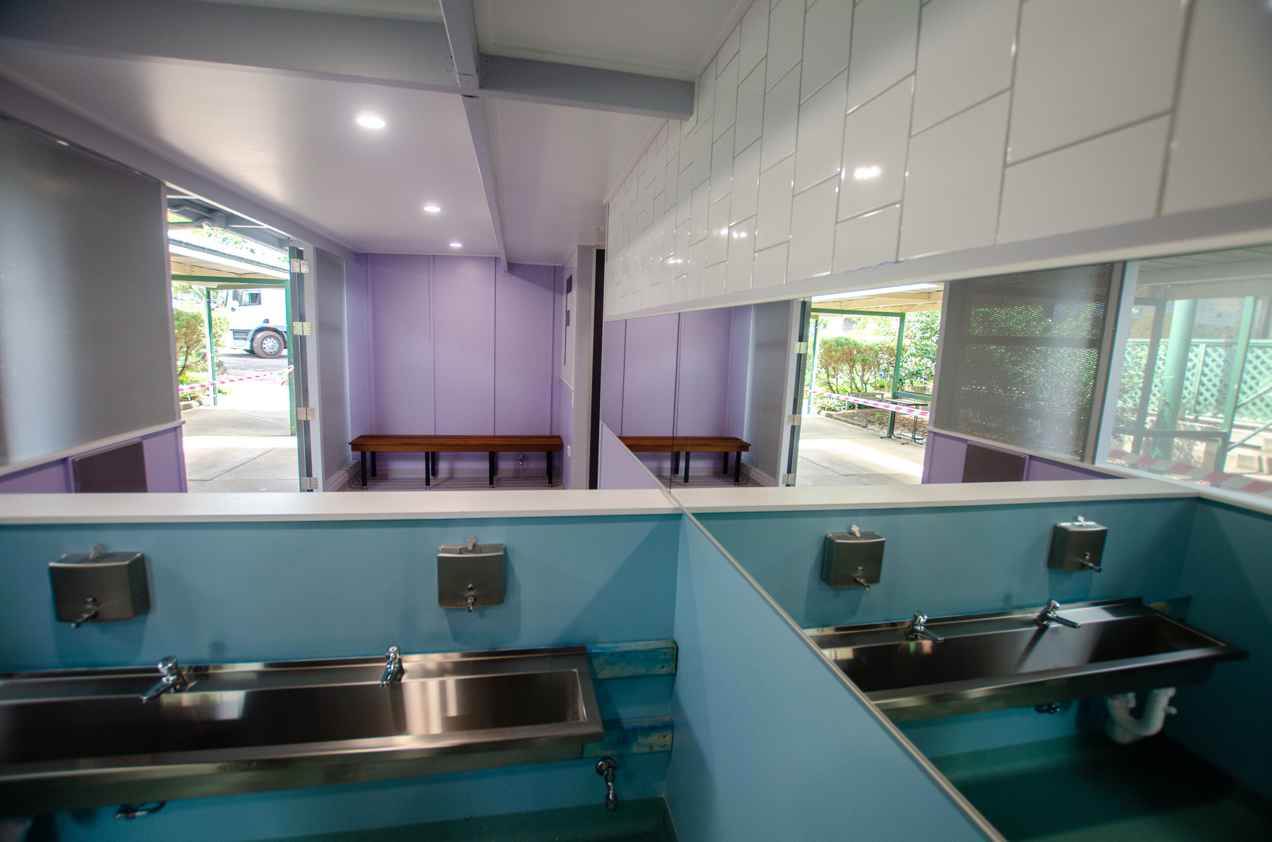
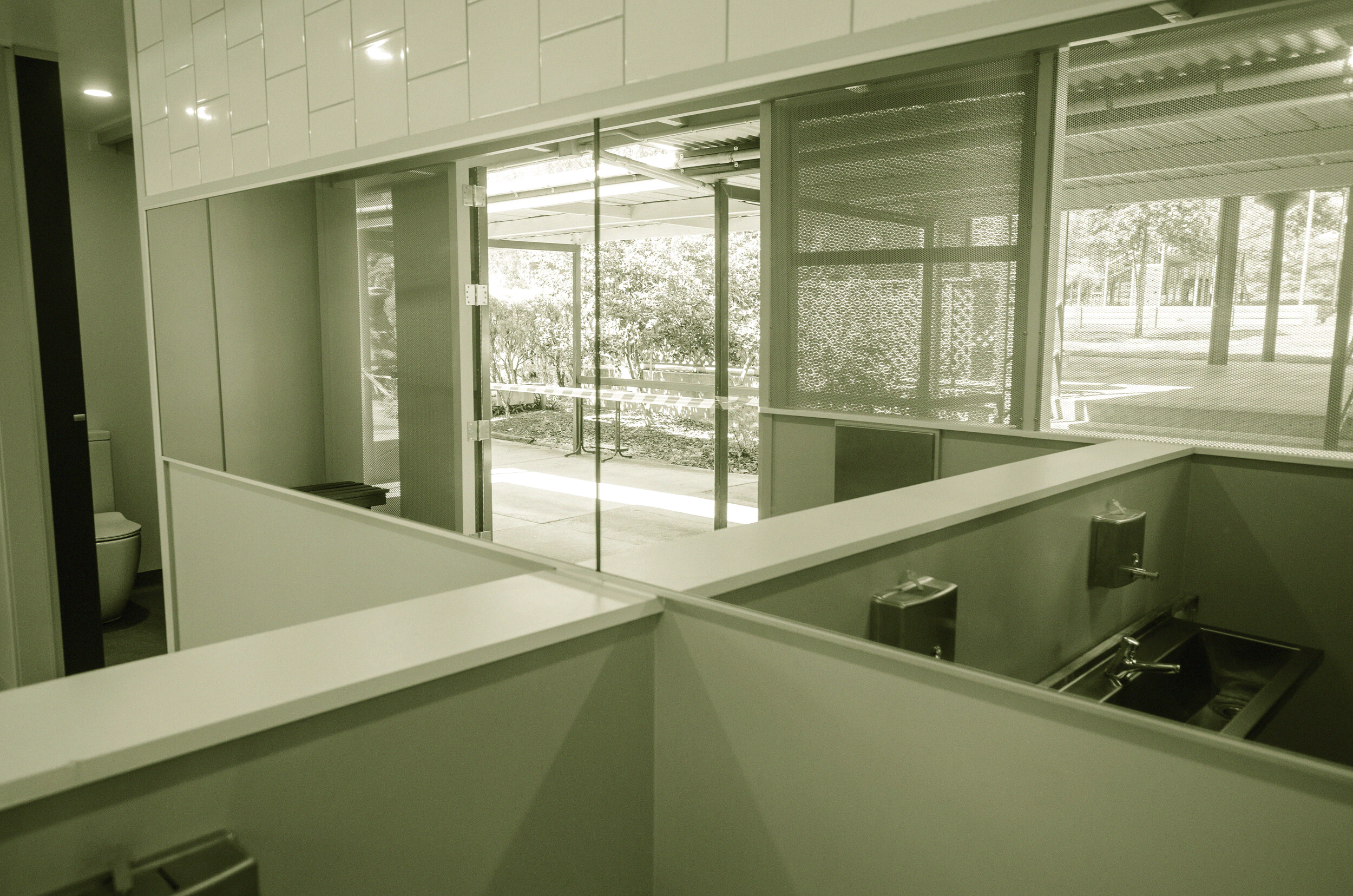
We have been completing a number of state school amenities upgrades this year of varying sizes and types. The base build on this project included a pattern of timber posts throughout the building. While removing some for more efficient use of space we have maintained the perimeter mullions but replaced the cladding with a permeable screen. Opening up the back with similar screening allows for greater ventilation and light and provides passive supervision from both sides. Internally the space is split into 2 zones. The first is the open transition between the walkway and hand wash area with a recessed zone for the cubicles - still visible but set behind the tiled wall to provide a more homely finish.

Currumbin SS Courtyard #1
Currumbin SS Courtyard #1
currumbin SS courtyard #1
After completing the junior courtyard upgrades for Currumbin SS the school approached us to develop a master plan for the rest of the school ‘between the building’ zones. The proposal starts with a formal arrangement of spaces and clear direction from the street into the school zone, taking a main route away from the admin zone and past the hall into the first courtyard space. This frees up admin resources and opens the school spaces up out of hours for out of school programs. Progressing through the site the formal zones break apart to more informal play and recreation while maintaining connecting elements, such as seats and retaining details to integrate the whole.


New Page
New Page
rochedale SS
- Amenities upgrade
This project involved the refurbishment of the central amenities facilities, uniform shop, cleaners and groundskeepers rooms. The existing facilities was split into many spaces that were dark, damp and smelly. The new works co-located the students toilets to the main access route and moved the staff amenities and groundskeepers store to the secondary side of the building. The front walls were removed to provide a colourful layered screening element that allows for natural ventilation, light and passive surveillance. Non gender specific colours remove the ‘toilet block’ feeling and tie into feature school colours with neutral background partitions and floors to hide the dirt. The unisex a staff facilities include end of trip shower, basin and mirror.
Thanks to Aligned management for the quality work and the use of the photos


New Page
New Page
springwood road SS
- Amenities Blocks refurbishment
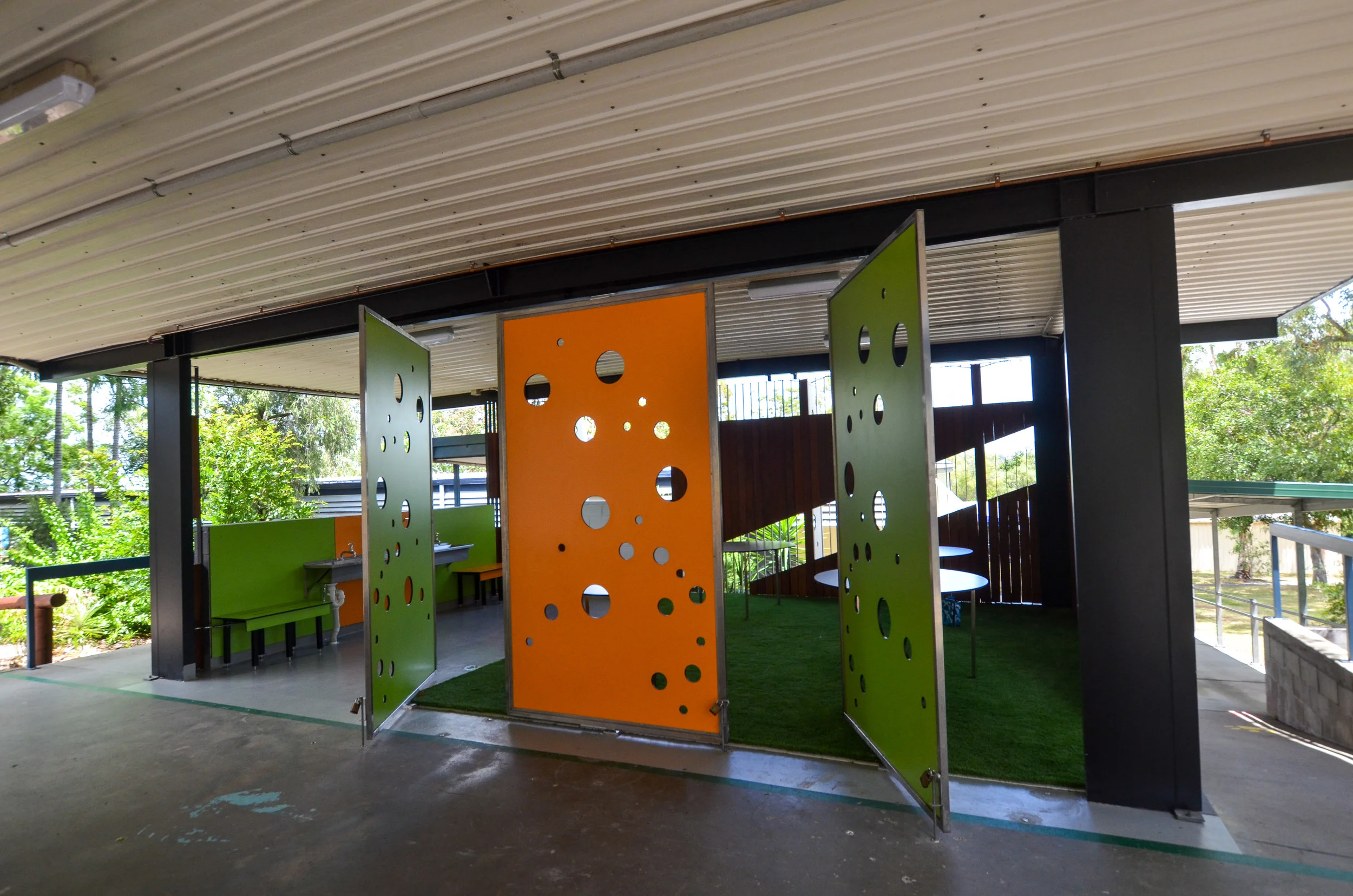
The existing amenities blocks at Springwood Road SS were completely enclosed, dark and unventilated. They were in desperate need of a makeover to provide a healthier, safer and cleaner environment that was more in keeping with current DET and parent expectations. Working with the existing structure the new works stripped out all the internal elements and opened up the exterior to allow passive staff surveillance. Full height cubicles provide privacy with a screened wash up zones facing the public space. Using a combination of timber and steel screens, perforated compact laminate and coloured / translucent ceilings the new spaces are light filled and completely naturally ventilated. Gender neutral colour schemes carry through to the new art zone with large rotating compact laminate panels that can open or close the space from the rest of the existing external covered space.




New Page
New Page
Currumbin SS - Junior Courtyard
This project is all about creating fun spaces that make outdoor learning exciting and double up function for play space and parent comfort. A series of courtyard spaces between existing buildings (and under existing roofs) are converted to include water play, terrace seating connecting the oval, soft fall turf and mounds, climbing elements and fun seating and platforms. Alternating surface finishes and meandering, wavy and curved seating overlap to provide a soft connection between spaces, each with their own purpose and identity. This is about taking the learning environment outside and coupling it with play, so both functions overlap. Socialising and learning spaces merge and therefore the act of learning is not isolated to the indoors but continues into the outside world.


Labrador State School
Labrador State School
labrador SS
This project involved repurposing an existing generic DET 70's GLA building into a new Administration building. It was to become the front of house for the public access to avoid the need for public entry into the school and give a new face. The school request was to have something neutral and modern while inviting. The main challenge with this project was to remove the stigma associated with the existing building and turn it into something exciting. To do this we lined the internal exposed trusses to maintain the volume but provide clean lines throughout. New lights are suspended between the trusses to modernise the space and hide the services behind.
A new entry structure opens up to the street exposing the entry while providing a covered seating area for parents on arrival and students while waiting for afternoon collection. This zone acts as the filter between the public street space and the private school yard. The reception area also has 2 entries, 1 for public 1 for student while be serviced from the same desk. This provides a separation of function while maintaining efficiency of resources. The tones are kept neutral in the base structure to set it apart from the rest of the school and to allow identity to be driven by furniture, signs and installations.


aquinas college
aquinas college
All education projects listed below were undertaken as Design Director for Lightwave Architectural. All images courtesy of Lightwave Internationa
aquinas college
Aquinas College has a reputation of delivering a quality curriculum but until recently did not have the facilities to match. As is the case with most schools minor additions and makeshift alterations had been the general course of action to accommodate shifting needs. With student numbers set to double within the next 3 years we carried out a complete audit of the existing facilities to determine what would be required and when. Coupled with the quantity issue we undertook a quality audit to identify how future works could improve aspects of the school that had been neglected over the years and provide an image of the college that more accurately reflected the quality education it provided.
Due to the massive amounts of work required to accommodate the new numbers the master plan was staged over 10 years to allow for continued operation and budget control. As part of the master plan precincts were identified to be re-invigorated at each stage so sections of the college could be closed or opened to minimise disruptions to general day to day operations. These the new insertions were also to assist with improving the existing facilities through improved connections and permeability, linking courtyards and providing more human scale and softer, shaded gathering spaces. As part of the new works there was a desire to try and integrate an aesthetic across the site to create a more unified appearance and incorporate a more tertiary orientated feeling to the spaces.
stage 2 - completed
The cultural precinct is located on the eastern side of the site and has a secondary street frontage. The existing Arts Building and Drama Centre were somewhat removed from the main circulation of the college although provided the opportunity to create a separate street entry with a new active cultural hub. Consisting of 2 new teacher kitchens, hospitality kitchen, textiles room, restaurant, 6 teaching spaces and a covered sports facility the new works formed a binding layer to all the cultural elements to create a unified precinct.
The new buildings were created to envelope the existing structures and open up a new courtyard back to the main movement paths of the college. Due to this area being off the main access route the negative space creates a juxtaposition to the main movement path and activates the change in direction. A new entry off the secondary street provides both student access and separate public entry for function nights. Located at a change in level the 2 and 3 storey buildings seamlessly connect the different ground levels to enable easy access to the new covered sports facility. Designed to allow future enclosure, the Covered Sports Facility will become a Performing Arts Centre that integrates with the arts and hospitality services.




stage 3-4 - Completed
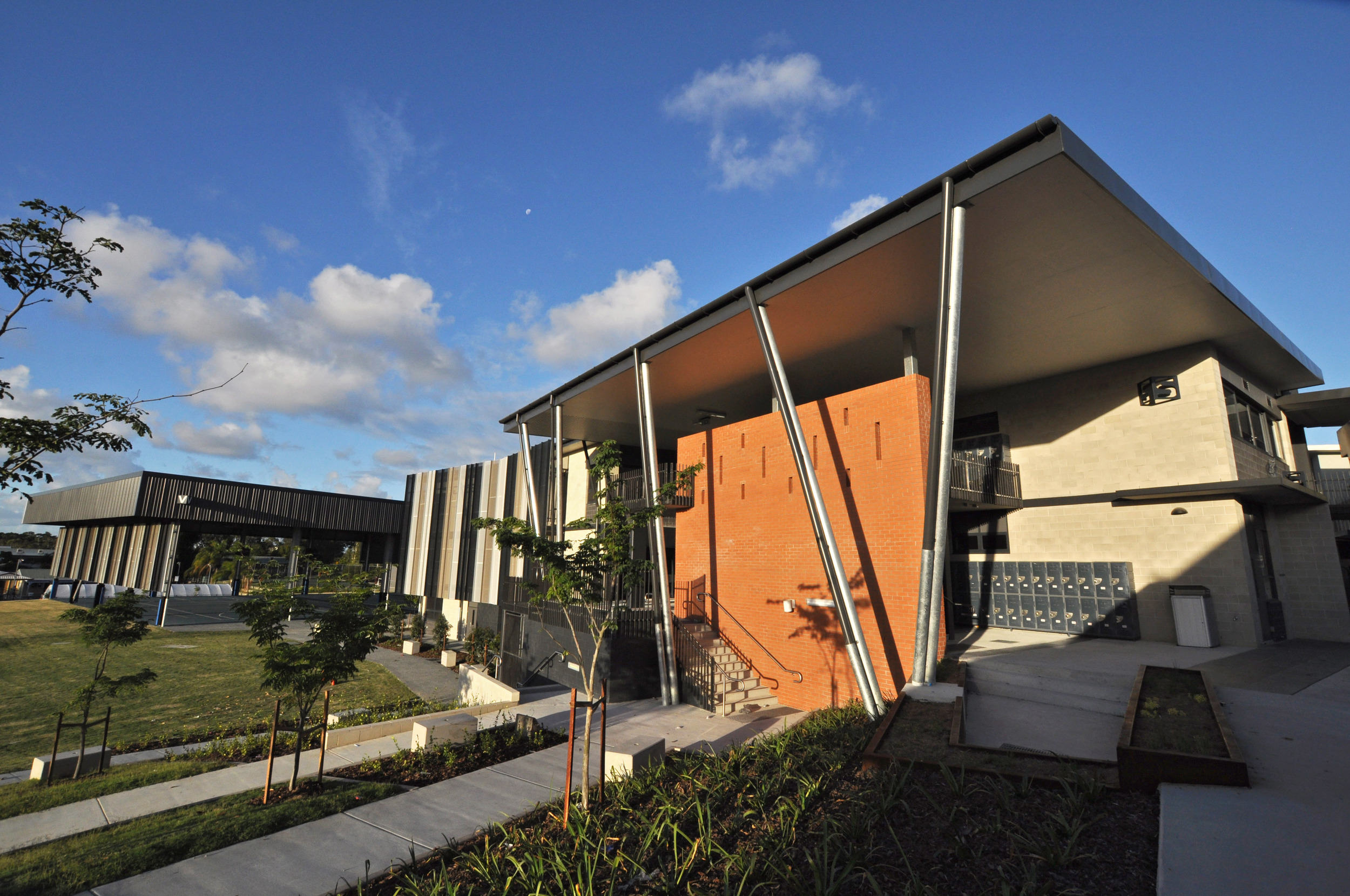
With the eastern part of the site (stage 2) now open the stage 3-4 works takes over the western side to become a science and technology precinct. By bringing the often neglected manual arts into the mainstream the 3 new workshops, CAD room, 2 science FLA's and additional 12 teaching spaces close off the western end of the site. Covered cascade seating connects the existing and new courtyards with the added bonus of providing external provides teaching space, lunch time recreation, outdoor performance and house meeting area. Using a similar aesthetic and layering of spaces the stage 3-4 works provides a bookend from the oval against the stage 2 works and integrates across the site.


stage 5 - concept design
Completed as Resonance d+a
The stage 5 works is to update the administration building and expand the resource centre to suite the advanced technology opportunities and teaching methods. Located at the front of the site these new works are going to remove small tack on elements and re-introduce the magnificent 60's entry feature as a reflection of the schools proud history. New 2 storey elements will create a stronger street presence and provide well monitored student gathering spaces.

enterprise centre
enterprise centre
All education projects listed below were undertaken as Design Director for Lightwave Architectural. All images courtesy of Lightwave International.
enterprise centre
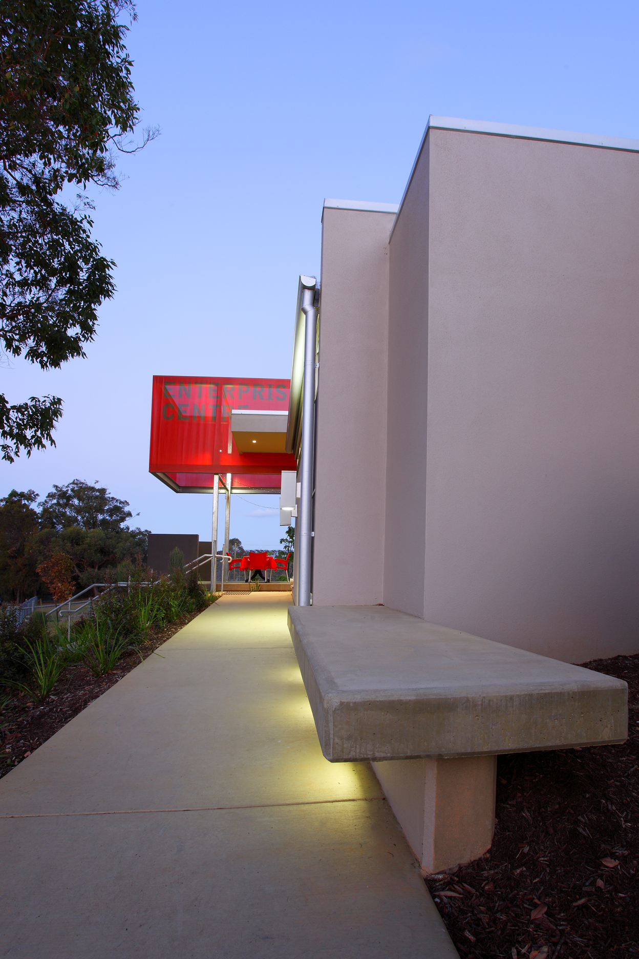
The Enterprise Centre is an integrated hub of private and public domains, where inside merges with outside in this state of the art facility. With a striking public face the centre provides a professional complex that showcases Southport State High as a school looking beyond traditional teaching methods. Incorporating a commercial quality kitchen, conference rooms, dining space and classrooms into a multi-purpose and adaptable enclave the Enterprise Centre serves current school requirements while providing quality spaces for community use as well.
The tight site and strict budget required careful consideration to the built form and the complex function of the development. The kitchens and classrooms were split to create two buildings with one large roof extension covering the semi-internal space. This active spine connects the street and the school to create both the main entrance, gathering and dining space. The manipulation of this transitional space provides the core of the development that offers additional spatial opportunities above and beyond the original brief.
The Enterprise Centre is the result of a dedicated and determined principal open to architectural interpretation of a complex brief and serves as an example of what can be achieved within the public system.



all images courtesy Lightwave International

BER projects
BER projects
BER projects
Building the education revolution projects were a fantastic opportunity to provide much needed facilities to long neglected schools. We were lucky to be involved with numerous projects and are pleased to say they were all very well received and provided renewed energy into the local communities. There were of course challenges along the way, so the trick was understanding where the blocks were and how to overcome these to deliver what the clients needed rather then what was being dictated.
Being involved with 1 builder for a large number of these projects enabled us to develop construction techniques and solutions that were both cost effective and repeatable to suite different applications and requirements. Understanding the bureaucratic process also allowed us to massage the brief to achieve both the political agenda and each schools individual requirements.




all images courtesy Lightwave International
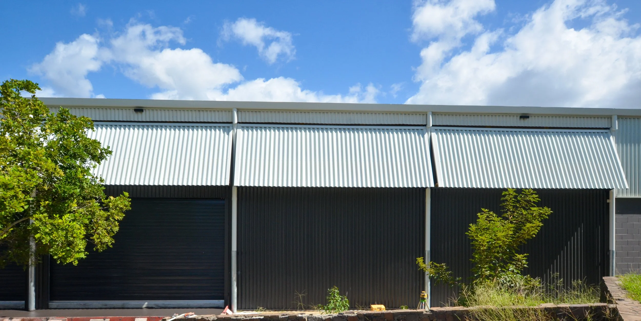
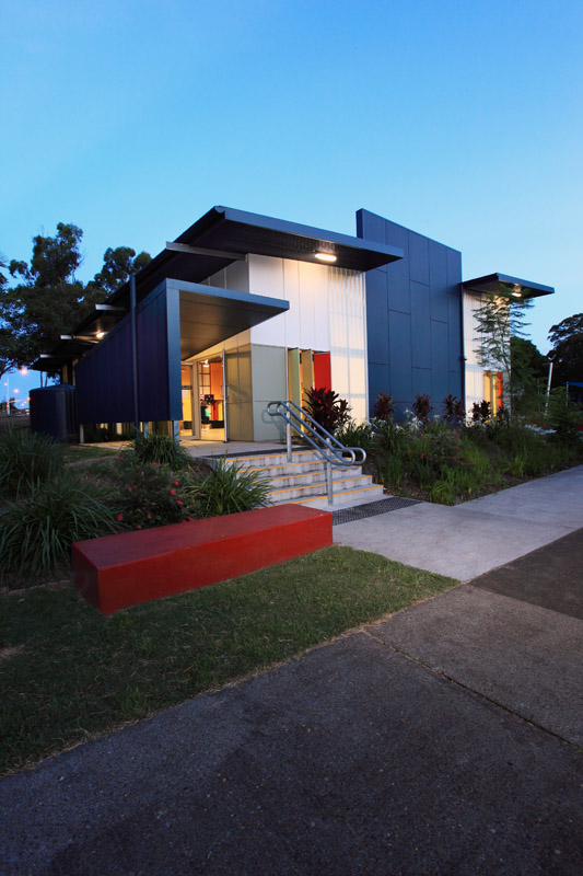
Challenging strict DET guidelines we developed a system to provide ample natural daylight and ventilation that was affordable and durable. Avoiding the use of low level glass full height strips of reinforced fiberglass provide an even distribution natural daylight without the glare. The light play at night reverses with the fiberglass strips lighting up to indicate publicly the hall is in use.
Ventilation is achieved by a series of tall multi-coloured narrow pivot doors between the fiberglass strips. Fitted to allow the panels to be set at a variety of angles to catch and direct the breezes they also form a changing and playful façade.

